FASHION

STEPHEN SPROUSE by Andy Goldsborough

DSC_1940.jpg

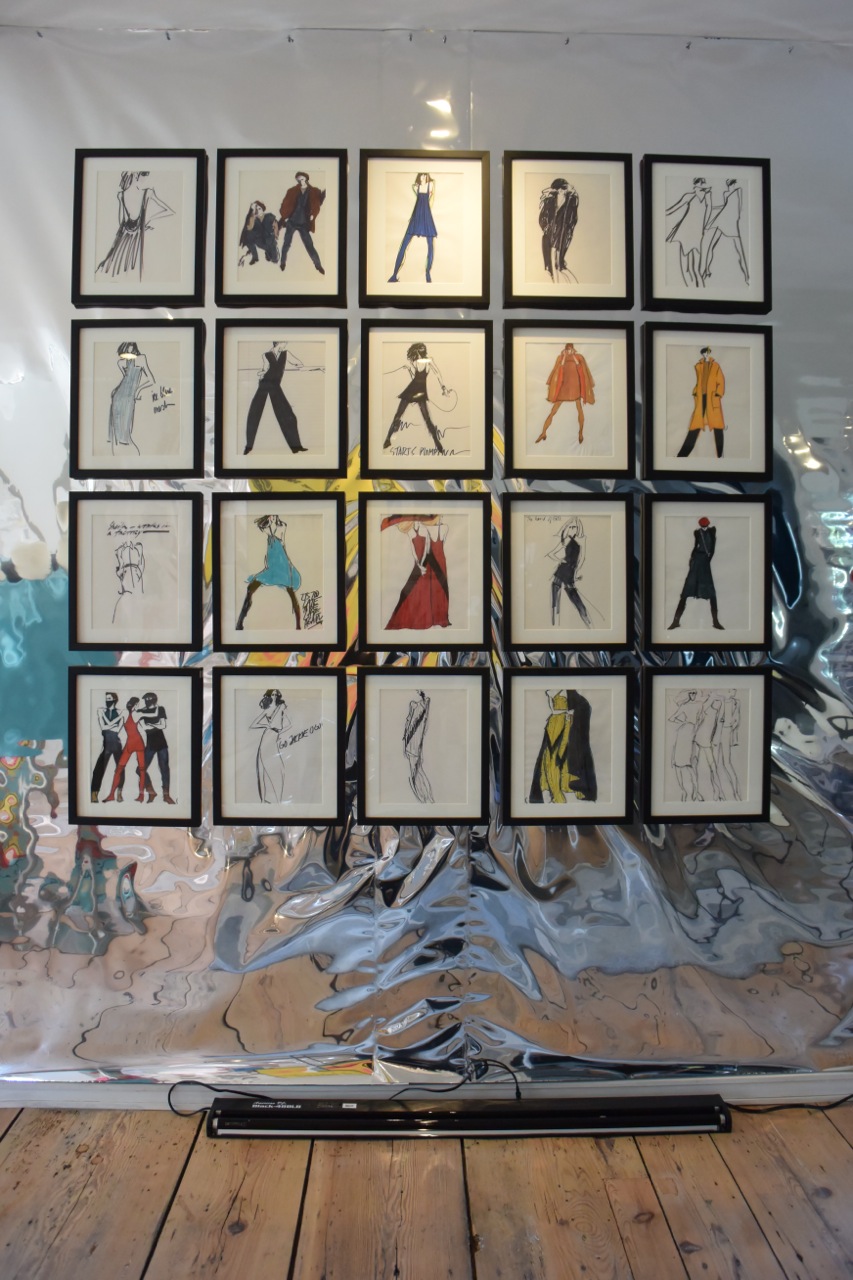
In 2001 on the way to buy my mom a birthday present, I was running down 14th street and rounded the corner onto Eighth Avenue and ran into Stephen Sprouse so hard I knocked him down onto the pavement. It wasn’t the first time I had seen him and I certainly knew who he was but I was mortified and embarrassed but also excited to have met someone I had admired and who had inspired me for so many years in New York City. I helped him up and he asked my name. I told him and he said I’m Stephen and I laughed and said I know who you are. After a brief hello in his unmistakably husky voice, he wrote Stephen and his number on the back of my business card in signature sharpie graffiti style. That began a year and several month friendship that was one of the most memorable times I’ve experienced since arriving in New York in 1989. Although I was not here for much of Stephen’s ups and down in the early to mid 80’s I was aware of the impact and how much he influenced the downtown fashion and art scene and how innovative his clothing, art and design process was.

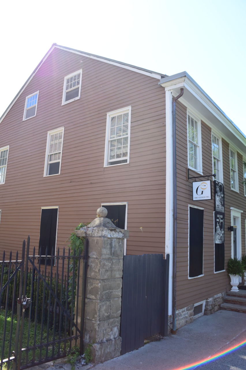
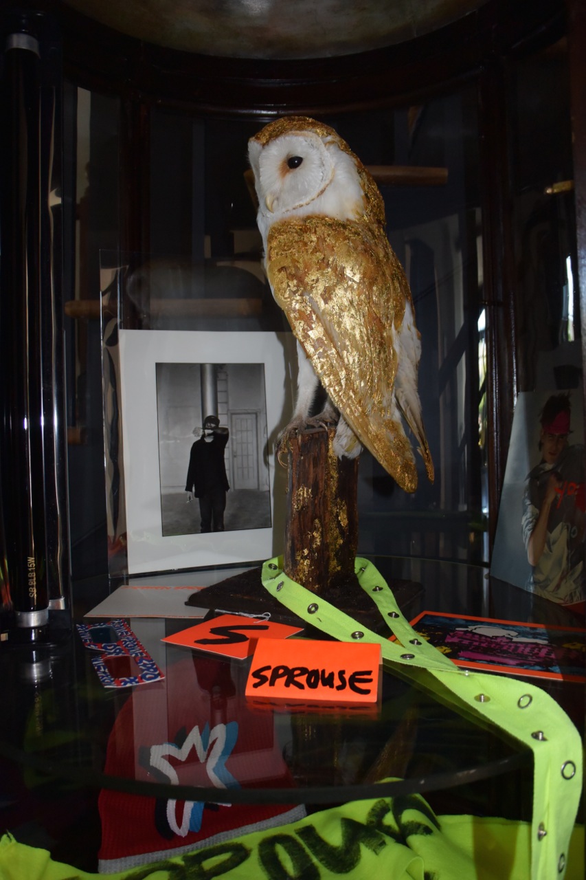
The Gilded Owl blacked out for the Stephen Sprouse book signing with screenprinted Harley Davidson banner by Sprouse

The Gilded Owl blacked out for the Stephen Sprouse book signing with screenprinted Harley Davidson banner by Sprouse

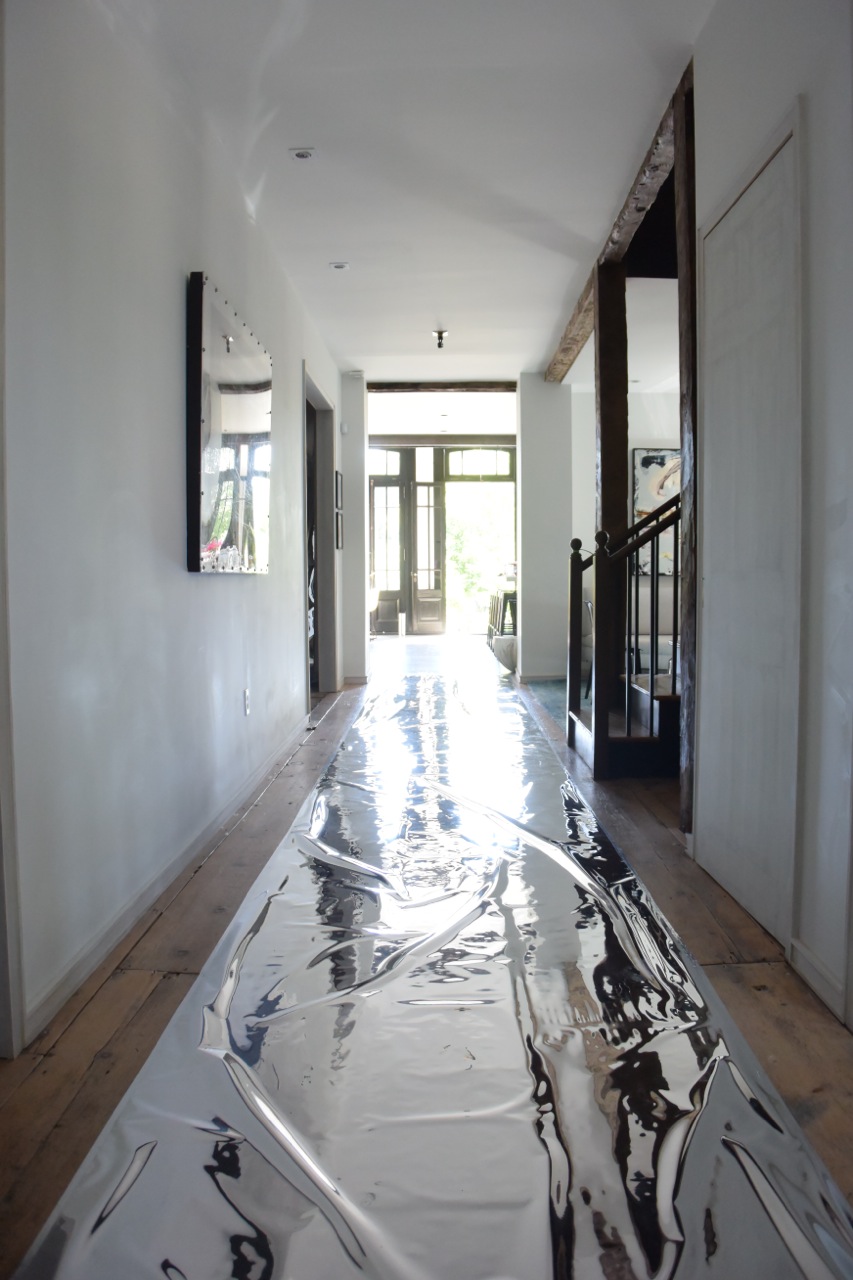
Silver mylar runway leading to the garden

Silver mylar runway leading to the garden

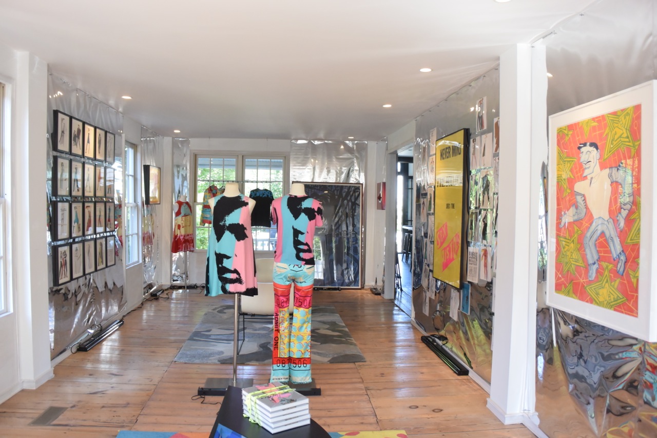
Gallery view

Gallery view

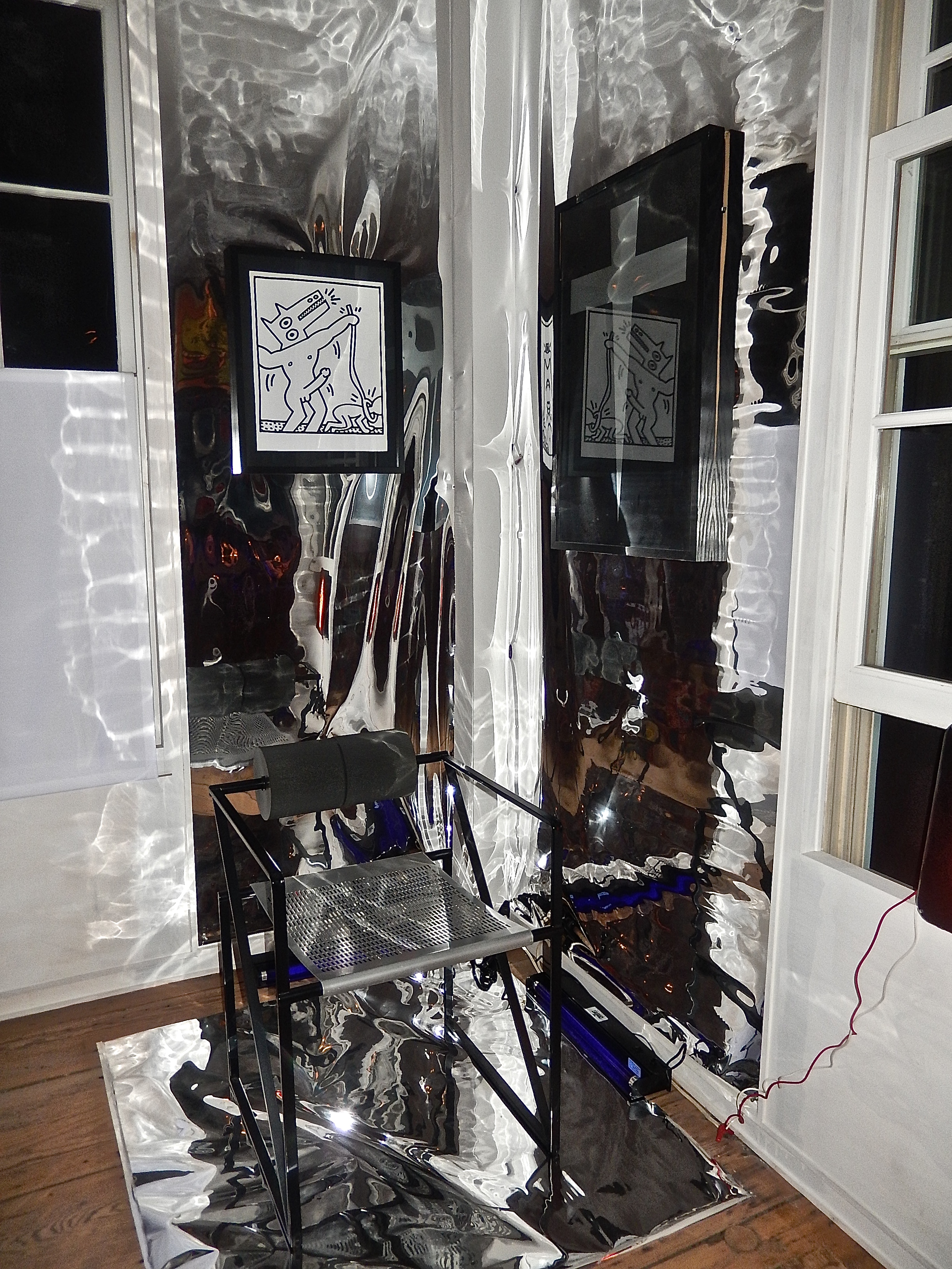
Keith Haring works and Mario Botta armchair

Keith Haring works and Mario Botta armchair

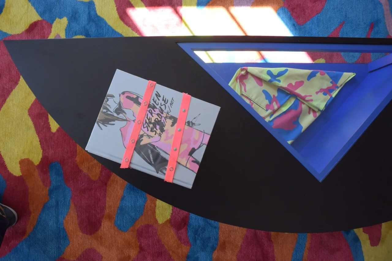
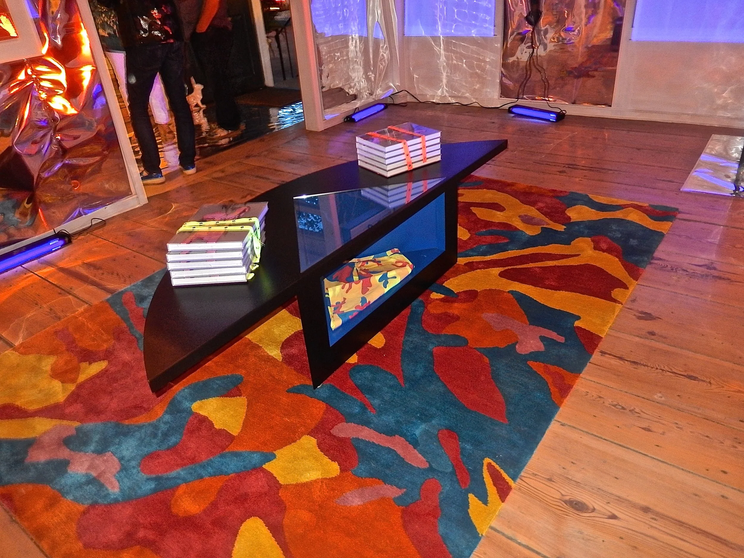
Sprouse books and shorts produced in collaboration with Andy Warhol

Sprouse books and shorts produced in collaboration with Andy Warhol

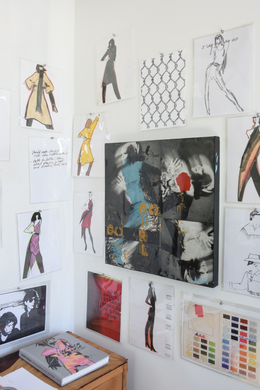
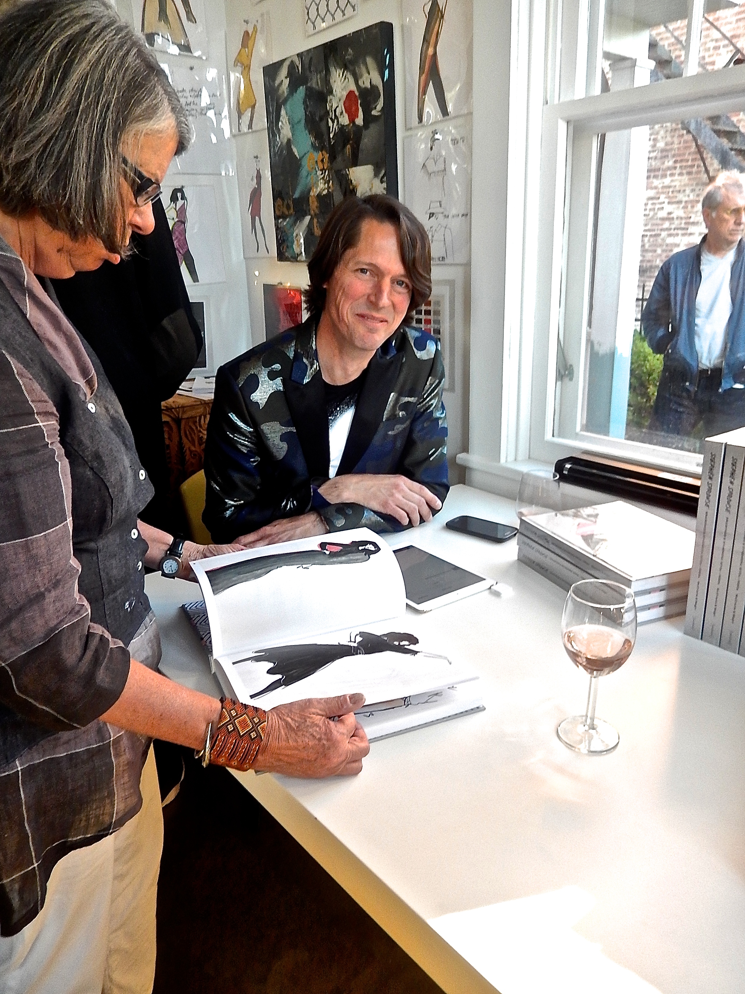
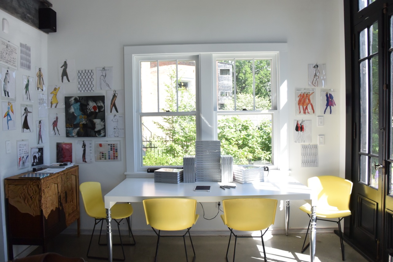
Books ready for signing and drawings by Stephen Sprouse

Books ready for signing and drawings by Stephen Sprouse

DSC_1926.jpg

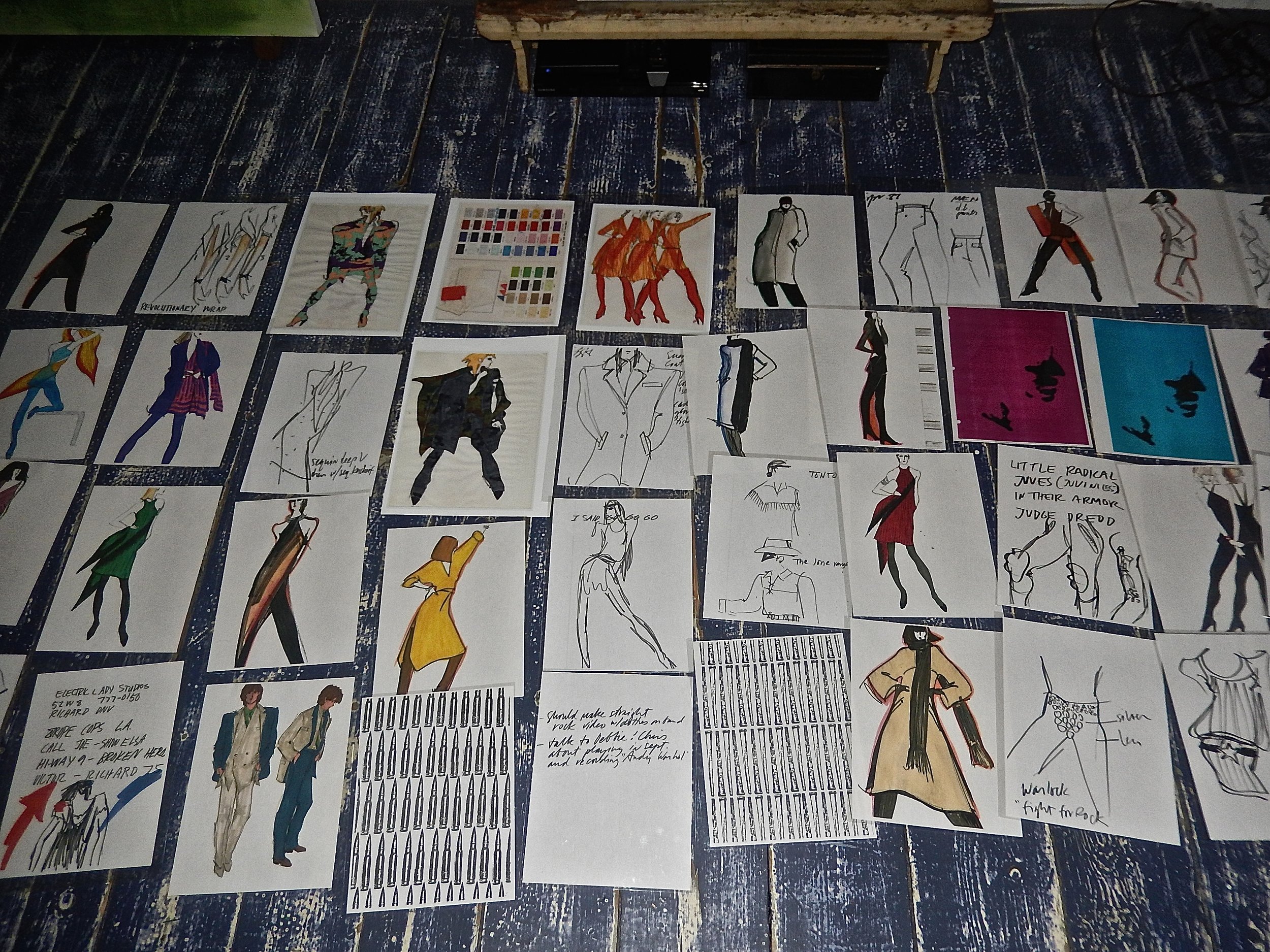
Fast forward to 2015 and Elizabeth Moore and I meet Carol McCranie, an art advisor and her husband Javier Magri who had recently purchased a house in Hudson, NY blocks away from our new gallery. In the depths of an otherwise empty dumpster on the day after a snowstorm in New York City Carol rescued an archive of Stephen Sprouses’ brilliant drawings from the mid-70’s to the late 80’s. More than 1500 trademark works categorized inside envelopes including fabric swatches have been beautifully edited by Carol and Javier into a tour de force book published by Damiani. Sprouse’s inspirations, Andy Warhol, Patty Smith, Debbie Harry, Jackie O and his other muses are all here and the book brilliantly captures the effortless cool of Stephen’s magnetic designs and electrifying drawings.

DSCN9785.jpg
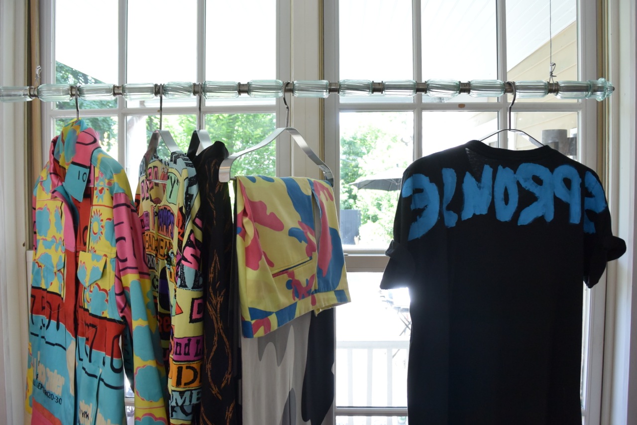
A selection of clothing designed by Sprouse and fabrics from his archive

A selection of clothing designed by Sprouse and fabrics from his archive

DSCN9849.jpg
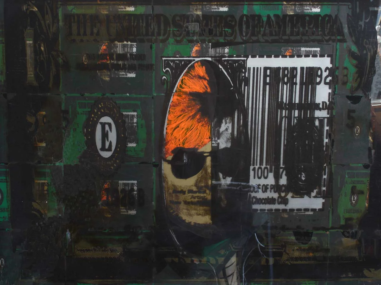
Stephen Sprouse “Gold Andy” 1980 in day-glo orange, gold, black and silver screen print on clear mylar mounted to panel under plexiglass

Stephen Sprouse “Gold Andy” 1980 in day-glo orange, gold, black and silver screen print on clear mylar mounted to panel under plexiglass

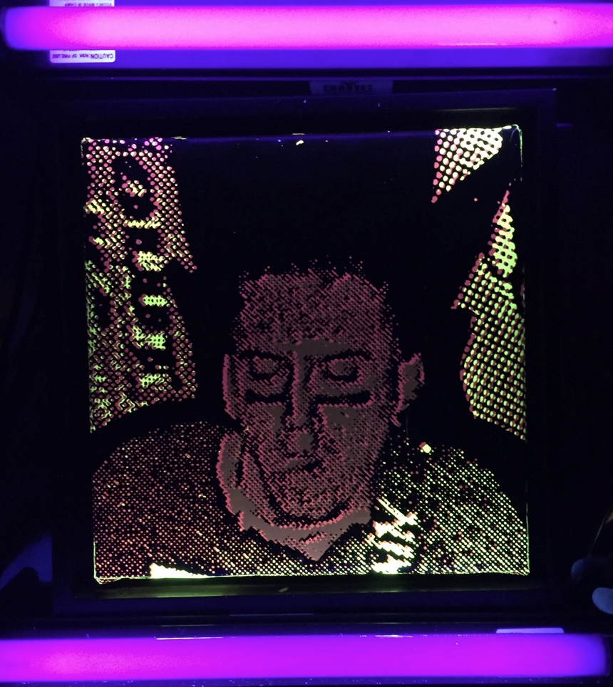
Stephen Sprouse “rocker detail” in day-glo screen printed on black canvas with blacklights

Stephen Sprouse “rocker detail” in day-glo screen printed on black canvas with blacklights

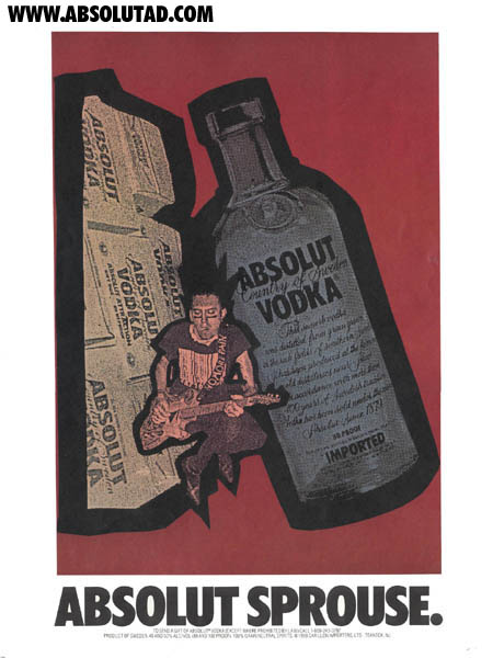
Absolut Sprouse ad campaign 1988

Absolut Sprouse ad campaign 1988

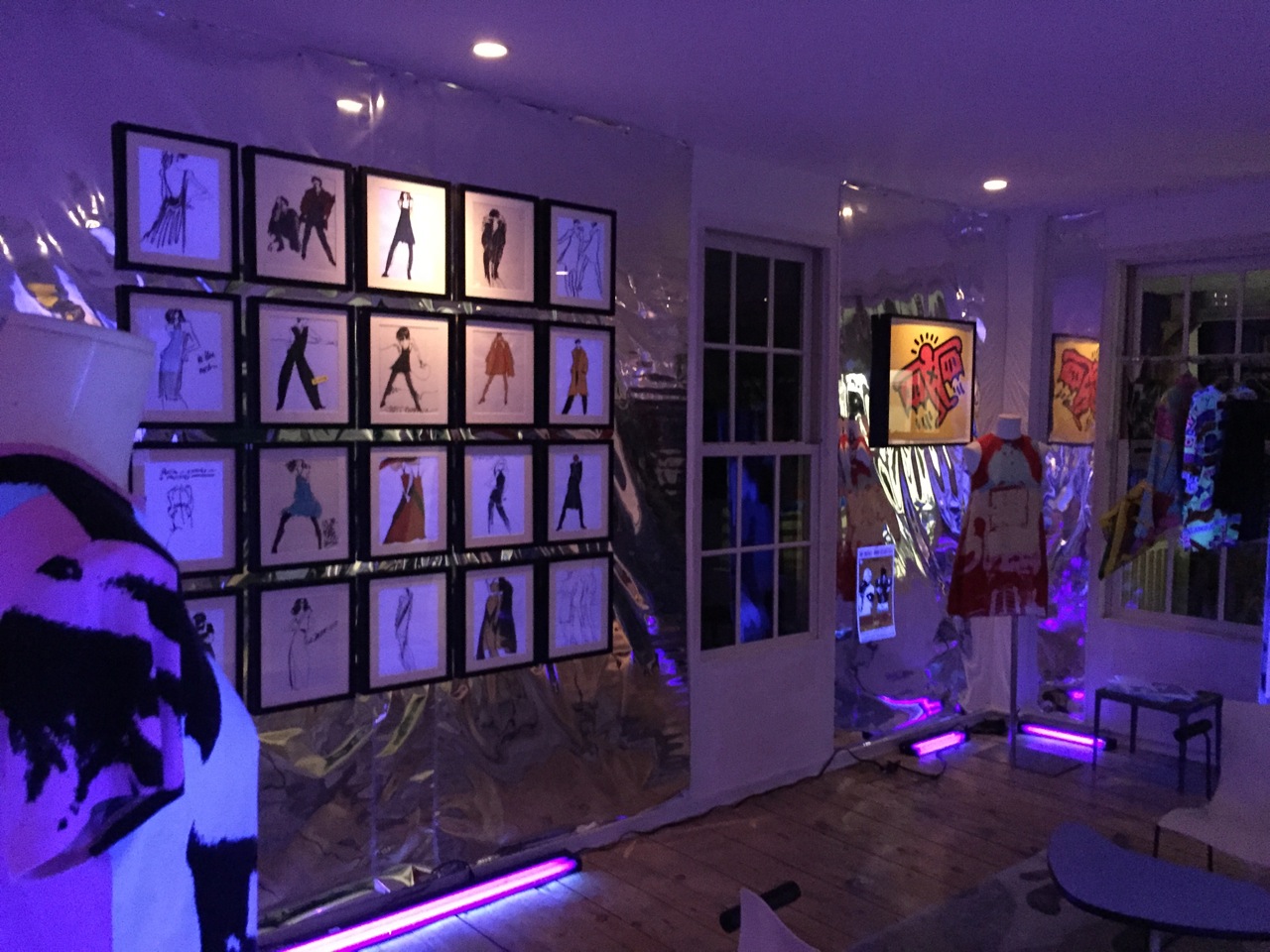
On Saturday, June 6th over 200 people gathered to celebrate the launch of the Damiani/DAPbook Stephen Sprouse Xerox/Rock/Art by Carol McCranie and Javier Magri. I carefully tried to re-create a combination of Stephen’s last apartment, studio and his infamous silver shop on Wooster Street. Black lights are a little tougher to come by these days but I was able to get 20 of them and black out the windows from the exterior to capture the intensity of the clothing collaborations he did with Andy Warhol and the day-glo ink used in two of his iconic paintings. “Gold Andy” the largest work he did of Andy Warhol depicts Andy as the president on a dollar bill with multiples surrounding the main image on silkscreened clear mylar with day-glo orange hair and a gold metallic face. Another Sprouse work was given as Christmas presents in 1988 when he did a second collaboration with Absolut Vodka. Stephen created small works 15″ square of his iconic rocker in pink and yellow day-glo ink on a black ground.

Gallery view with original Sprouse framed drawings

Gallery view with original Sprouse framed drawings

Sprouse portrait and memorabilia

Sprouse portrait and memorabilia

DSCN9847.jpg
Javier Magri and Carol Mccranie co authors of Stephen Sprouse xerox / rock / art with Jane Forth (center) Andy Warhol factory superstar

Javier Magri and Carol Mccranie co authors of Stephen Sprouse xerox / rock / art with Jane Forth (center) Andy Warhol factory superstar

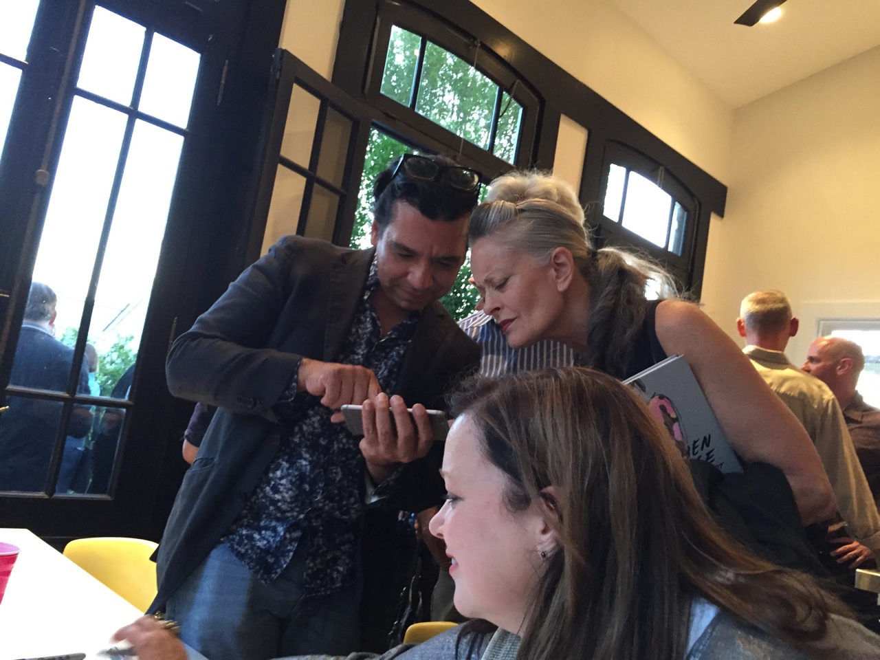
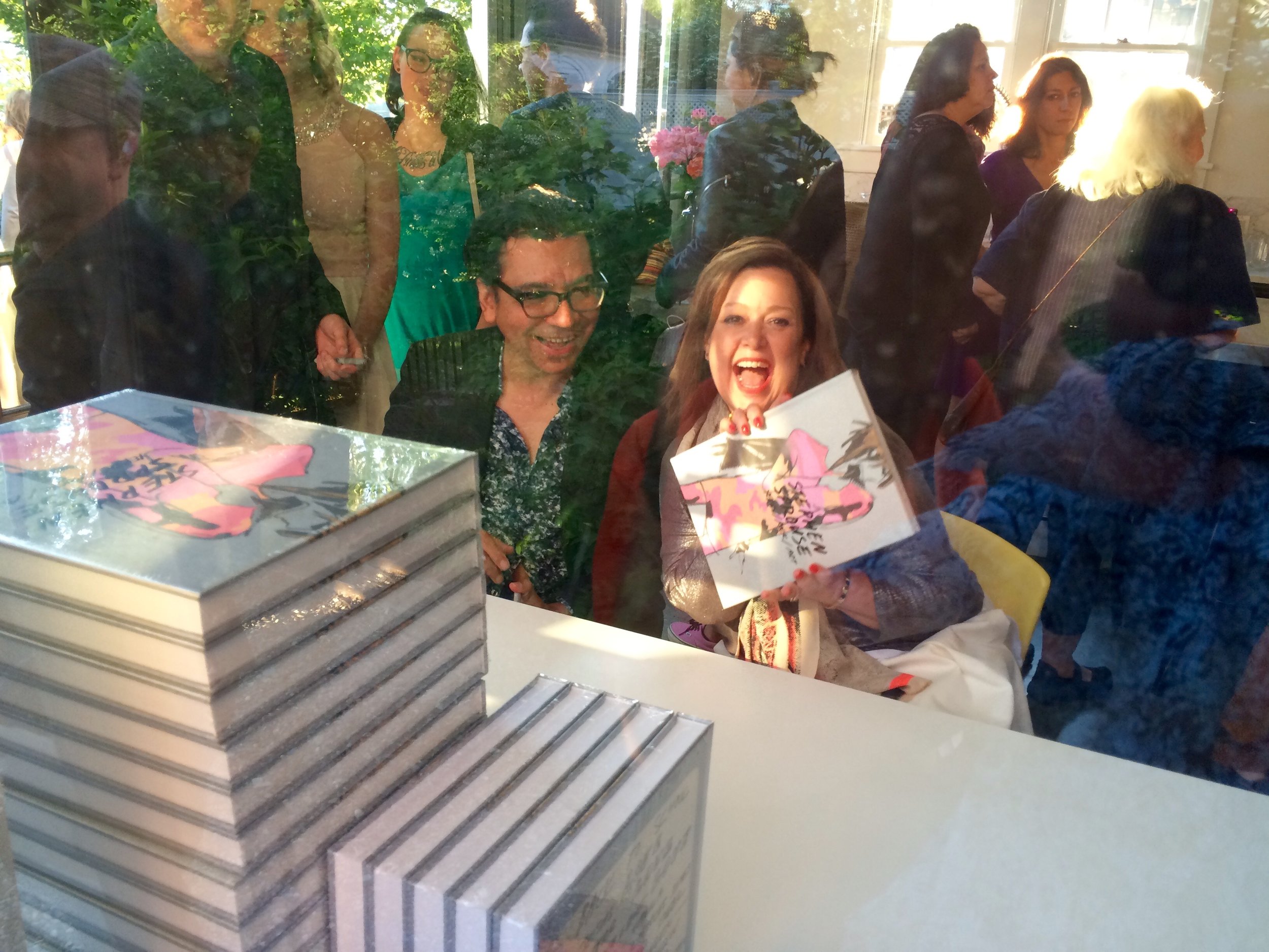
Javier Magri and Carol Mccranie, co authors of Stephen Sprouse xerox / rock / art

Javier Magri and Carol Mccranie, co authors of Stephen Sprouse xerox / rock / art

DSCN9809.jpg

Elizabeth and I also featured works by Julian Schnabel, Keith Harings last editioned prints from 1989 and a Karl Wirsum work as well as furniture and lighting by Massimo Vignelli for Knoll and Mario Botta to capture the mood and feeling of Stephen’s aesthetic. Stephen Sprouse Xerox/Rock/Art and 80’s design through July 4th weekend at The Gilded Owl.

Many thanks to our amazing bar staff headed by Devin Whittaker. You guys rocked!

Many thanks to our amazing bar staff headed by Devin Whittaker. You guys rocked!

Javier Magri, Elizabeth Moore with Louise, R.J. John and Wendy Kennealy

Javier Magri, Elizabeth Moore with Louise, R.J. John and Wendy Kennealy

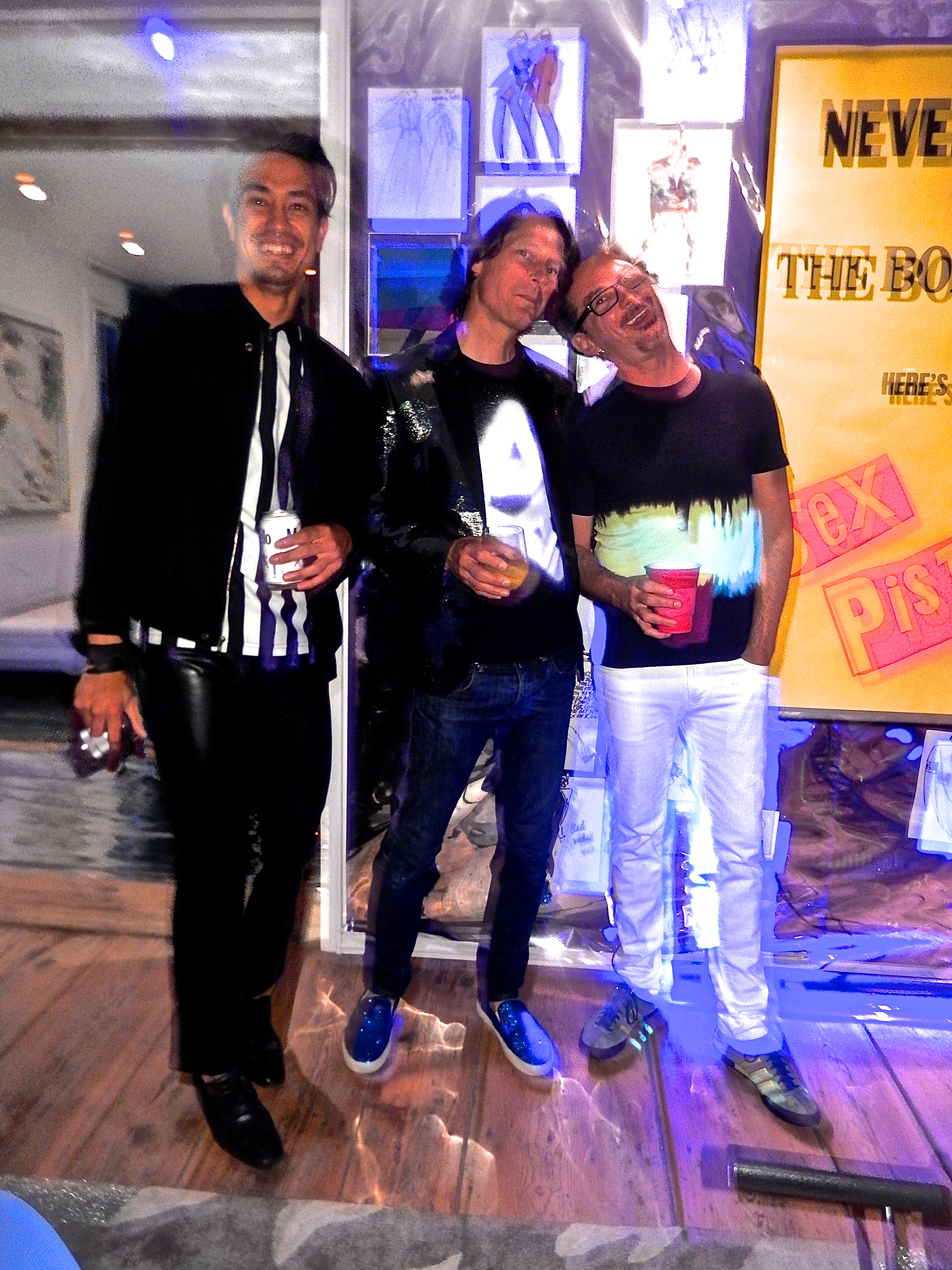
Tomm Roesch, me and Mark Barnett
Tomm Roesch, me and Mark Barnett
THE GILDED OWL GALLERY OPENING by Andy Goldsborough

DSC_0525-Version-2.jpg

On Saturday November 22nd THE GILDED OWL gallery officially opened at 105 Warren Street in Hudson, NY.  After exactly one year of renovation and construction Elizabeth Moore and I welcomed over one hundred and eighty five guests to celebrate our inaugural show in the 1785 Federal style house that is a now home to a realized version of our design, art, fashion and music journal. The brilliant Hudson based photographer Tomm Roesch documented our preparations and was on hand with us to capture the opening with his thoughtful eye.  Thank you to all who made the journey to our beautiful new gallery and here’s a glimpse into THE GILDED OWL.

https://www.youtube.com/watch?v=opYNxM24DFs

FREDERICK MALLE + STEVEN HOLL by Andy Goldsborough

DSC00211.jpg

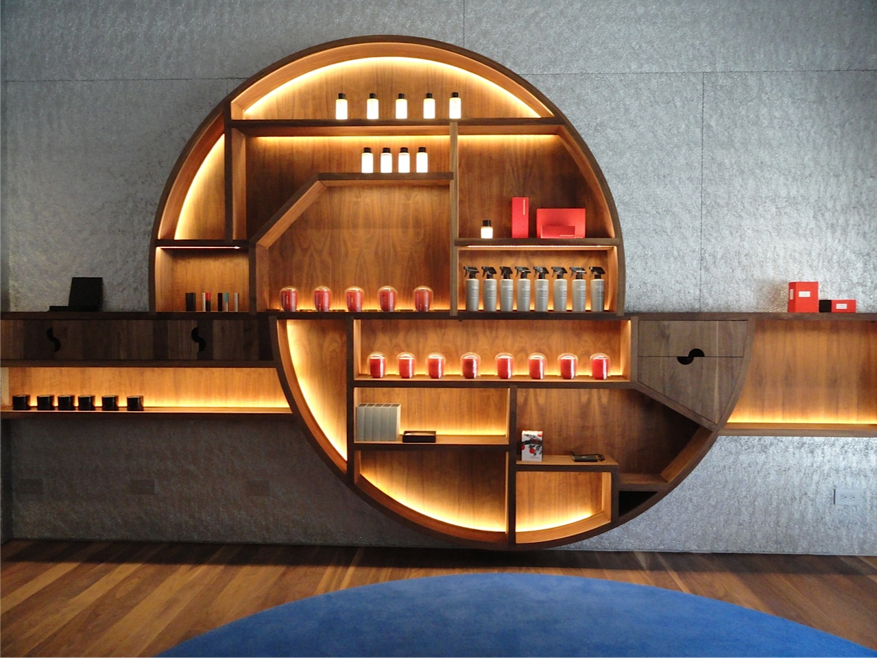
Sometimes collaborations produce extraordinary results and the new Frederic Malleboutique designed by Steven Holl on Greenwich Avenue is New York at its most inspiring.When Frederic Malle the perfumery genius decided to open his new Editions de Parfums in New York he wanted an important local architect that understood the city and would poetically interpret his vision with an extraordinary palette of materials and finishes. I visited the shop this week to photograph the details of this jewel box of an interior complete with its own tranquil garden in the back.

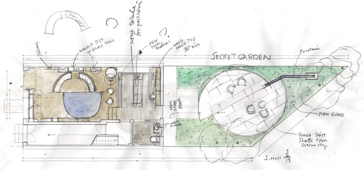
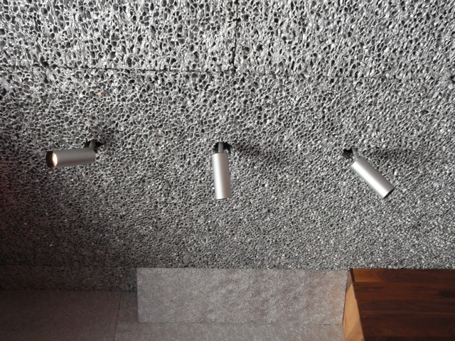
Steven Holl’s design for the boutique is based on two interconnecting semi circles, a motif that is carried throughout the architecture, walnut cabinetry, cobalt carpet, bronze door handle detail and in the garden fountain. The materials chosen create a very warm, inviting space but it is futuristic at the same time with walls clad of an aluminum material that have a dense texture and then a more open and airy version on the ceiling. Sleek silver spotlights pierce through the aluminum ceiling and highlight the twelve Editions de Parfum designers who have worked with Frederic Malle to create these exquisite fragrances. The lighting throughout sensitively incorporated into the display cases was conceived by lighting magician Herve Descottes who also worked closely with the late French interior designer Andre Putman.

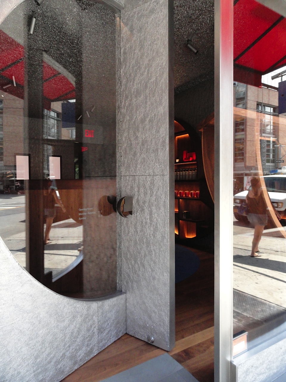
Frederic Malle storefront of aluminum, stainless steel and glass with walnut shelves inside .

Frederic Malle storefront of aluminum, stainless steel and glass with walnut shelves inside .

l-shaped door opening

l-shaped door opening

Detail of cast bronze door handle

Detail of cast bronze door handle

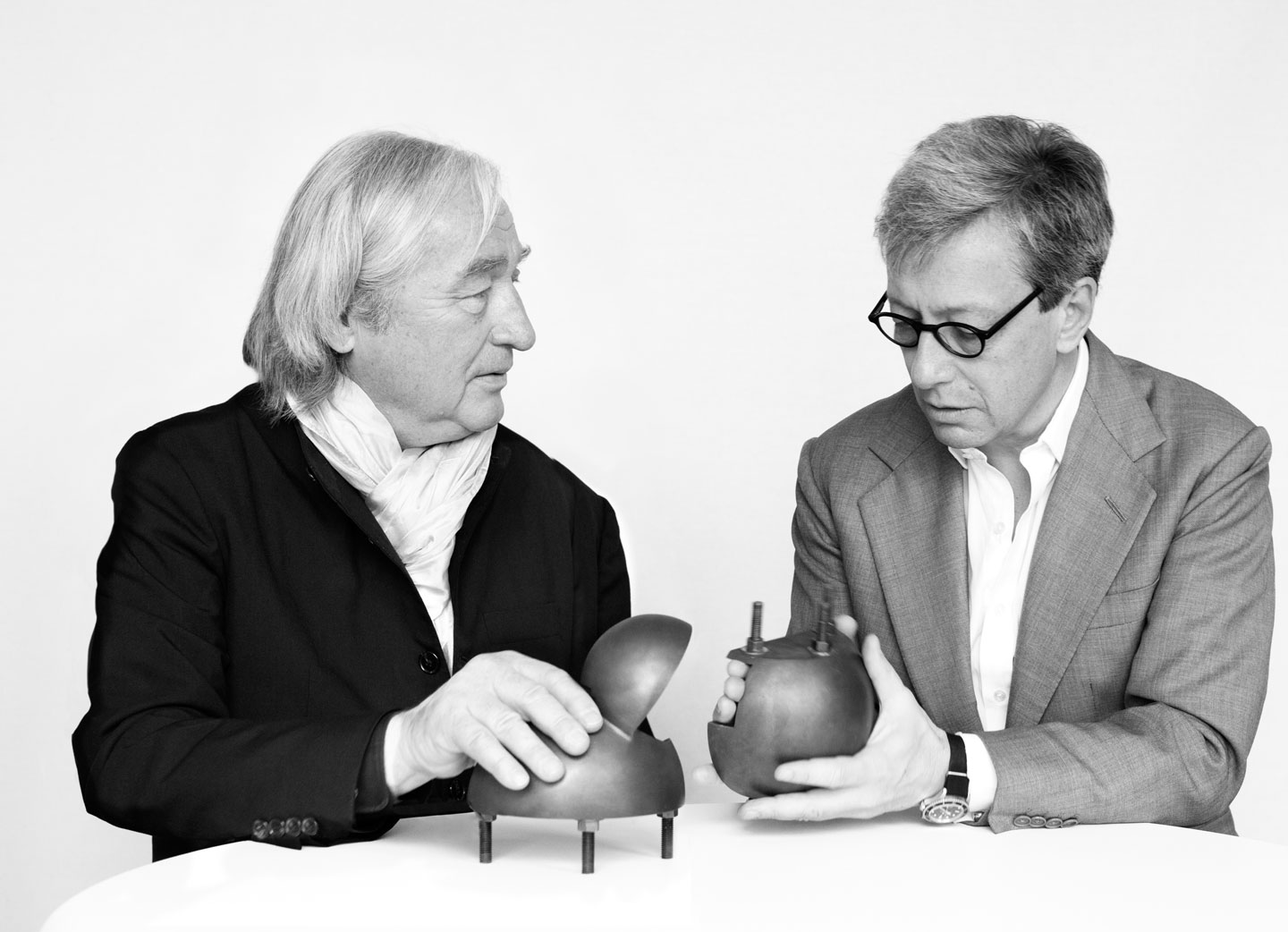
Steven Holl and Frederick Malle

Steven Holl and Frederick Malle

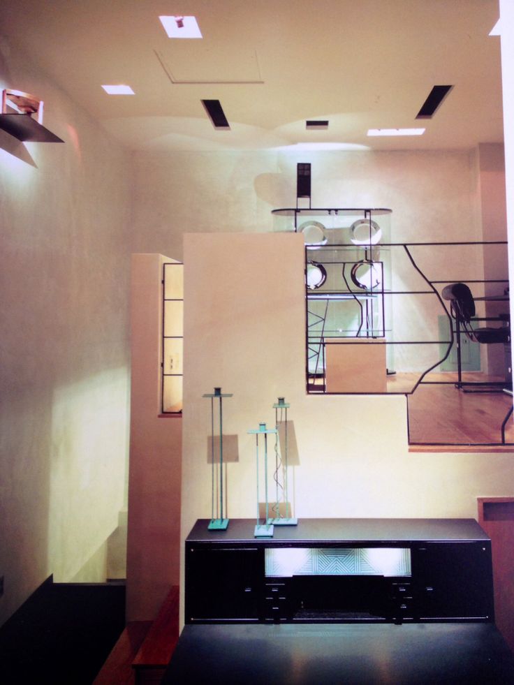
During architecture and design school I greatly admired the work of Steven Holl, his beautiful watercolor conceptual drawings, copper and plexiglass models of future houses and buildings and his thoughtful use of materials and finishes. On my first trip to New York in 1987 with a group of design students we visited his showroom for the Pace furniture collection at Madison Avenue and 72nd Street as well as a small boutique he designed for a women’s clothing line nearby. It was one of those moments that changed the way I thought about materials coming together, how lighting could directly affect the way I felt in a space and the relationship between the surrounding environment and what was being presented inside.

Pace showroom at madison avenue and 72nd street in 1986 by steven holl

Pace showroom at madison avenue and 72nd street in 1986 by steven holl

Conceptual layout of the boutique and secret garden by steven holl

Conceptual layout of the boutique and secret garden by steven holl

Conceptual watercolor by steven holl of facade for frederic malle editions de parfums

Conceptual watercolor by steven holl of facade for frederic malle editions de parfums

Steven holl watercolor detail study of store fixtures in aluminum and walnut

Steven holl watercolor detail study of store fixtures in aluminum and walnut

In the back of the shop there are three smelling devices where I tested several scents including Dominique Ropion’s Vetiver Extraordinaire and Jean Claude Ellena’s Angeliques Sous La Pluie. The lovely sales associate Dinara Tuleuova sprayed the compositions into these illuminated cylindrical windows and when the fragrances were evenly distributed I leaned inside to test the notes. Of course I couldn’t leave without at least one, and I was so enamored with the packaging as well that I picked up a bronze travel tube to take the scent wherever I go.

Portraits of the twelve editions de parfums collaborators and illuminated testing windows

Portraits of the twelve editions de parfums collaborators and illuminated testing windows

Travels cases including limited edition gradient colors by pierre hardy

Travels cases including limited edition gradient colors by pierre hardy

Following are more details of the materials, finishes and the rear garden thoughtfully designed by Steven Holl for Frederic Malle Editions de Parfums.

Detail of walnut display cabinet with cut-out finger pull of semi circular motif

Detail of walnut display cabinet with cut-out finger pull of semi circular motif

Walnut wall panel detail and aluminum interior cladding

Walnut wall panel detail and aluminum interior cladding

Light fixtures piercing open pore aluminum ceiling

Light fixtures piercing open pore aluminum ceiling

Interior bronze door handle detail

Interior bronze door handle detail

Wood and steel benches in the schist paved garden

Wood and steel benches in the schist paved garden

Cast concrete fountain in the secret garden

Cast concrete fountain in the secret garden

Cast brass discs detail

Cast brass discs detail

CARVEN / GUILLAUME HENRY by Andy Goldsborough

DSC08878.jpg

Sixty nine years ago Madame Carven launched her first Haute Couture collection at Rond-Point des Champs-Elysees in Paris.  In 2010 Guillaume Henry becomes Carven’s art director and in 2011 presents his first mens collection for the house.  Last month Henry opened Carvens’ first US shop at 83 Mercer Street in Soho in collaboration with architect Eric Chevallier and it’s a study in contrasts “day and night, sophisticated and casual, sexy and shy”.

When you enter the narrow space there is white tiled wall with an elevated display and a long black leather “Saint Sulpice” bench designed by Chevallier for Domeau and Peres leading to the marble enclosed cash wrap cube and a sparkling glass display fixture combining plants and accessories.  As you move further into the store six mirrored bays house four areas of the women’s collection with the two rear bays for men.  The mirrored columns and walls that delineate each of the bays seems to float above the floor, a nice unexpected detail allowing the clothing to have a lighter feeling hanging on the fixtures.  An undulating line of black corded light bulbs leads you front to back and goes on for infinity in the mirrored walls above creating an exciting rhythm throughout the space.  The floors are a combination of smooth poured concrete with red stained borders in the collection zones flanking an aniline dyed plywood runway down the center giving the spaces a comfortable feel.

The overall vibe of the space is refined and elegant with elements of French influence, hints at 80’s Memphis design but in a decidedly new and modern viewpoint.

Carmen de Tommasso, founder of Maison Carven, portrait by Henry Clarke

Carmen de Tommasso, founder of Maison Carven, portrait by Henry Clarke

Guillaume Henry portrait by Camille Vivier for Vice

Guillaume Henry portrait by Camille Vivier for Vice

DSC08887.jpg
DSC08886.jpg
Glass display for accessories

Glass display for accessories

Blue and green metallic encased lucite bangles

Blue and green metallic encased lucite bangles

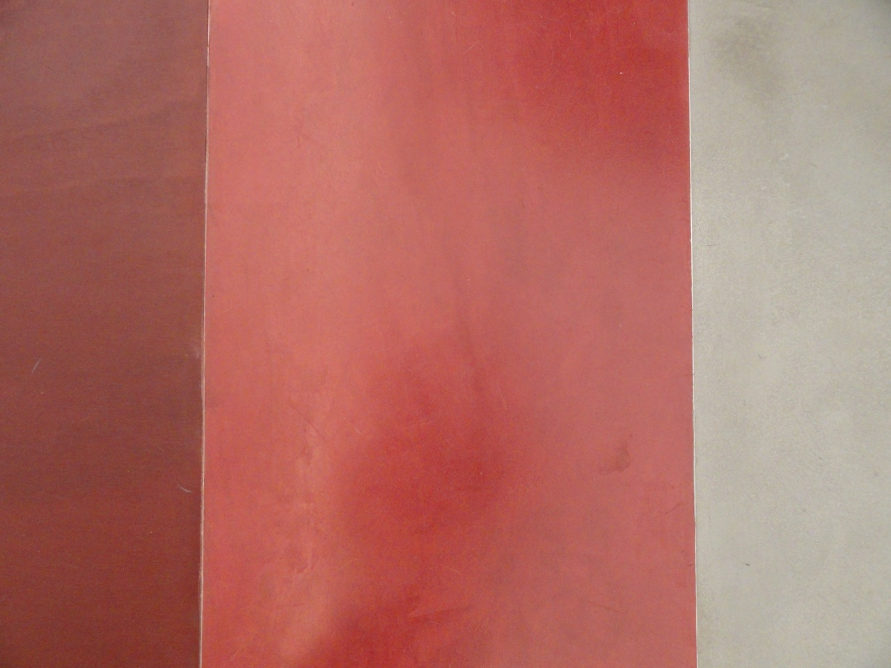
Detail of red aniline dyed wood floor with colored and natural concrete floor

Detail of red aniline dyed wood floor with colored and natural concrete floor

Womens SS 14 collection

Womens SS 14 collection

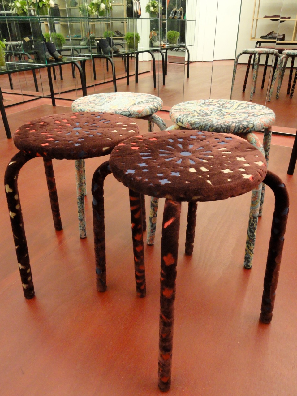
Detail of felt covered stools

Detail of felt covered stools

DSC08876.jpg

What really intrigued me this season-although I have been a fan of Carven since Guillaume Henry’s brilliant relaunch in 2011-is the relationship between interiors and fashion with Henry’s SS 14 mens collection.  His inspiration came from the colors of Southern France and the landscape and textures that inspired artists like Van Gogh and Picasso.  A very painterly palette of pale pastels in golden sunflower, wheat, and a range of blues from deep azure to periwinkle.

The Spring Summer 2014 campaign shot by Dutch photographer Viviane Sassen featuring Guerrino Santulliana perfectly captures the colors and mood with layers of vivid flowers superimposed over the collection.

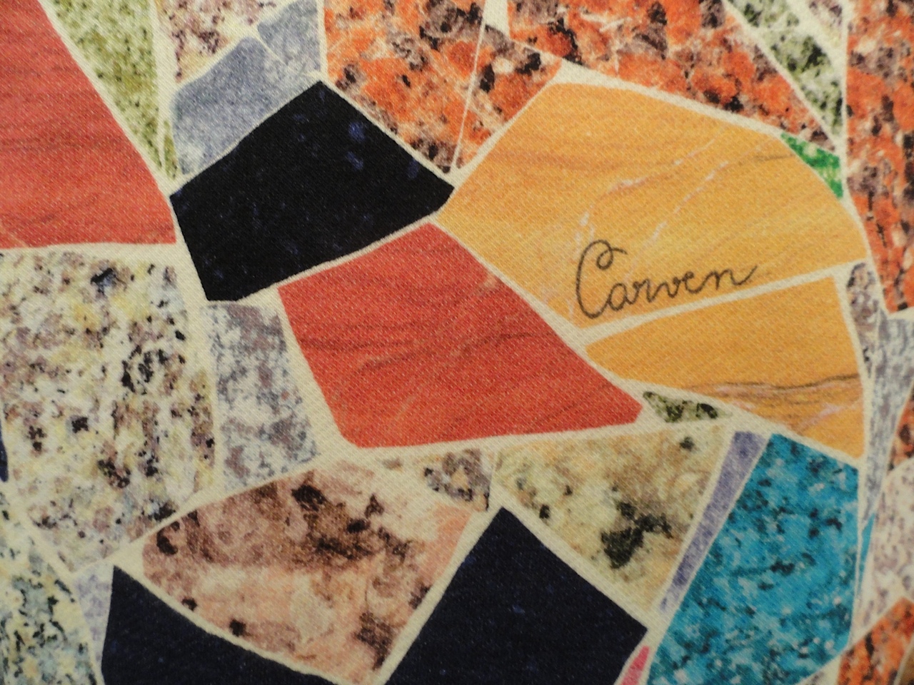
The textures of the clothes and the prints and weaving techniques are also intriguing.  There is a stunning coat made of an natural abaca material woven in the most extraordinary way with an exaggerated collar.  And sweatshirts and t-shirts with printed patterns resembling brightly colored terrazzo and marble.  A handsome cotton sweater in blue and white resembles a twinkling night sky.  I look forward to seeing what exciting directions Henry takes Carven next and I’m sure it will be inspired!

Carven SS 14 campaign by Viviane Sassen featuring Guerrino Santulliana

Carven SS 14 campaign by Viviane Sassen featuring Guerrino Santulliana

Mens Collection SS 14

Mens Collection SS 14

DSC08880.jpg
DSC08882.jpg
Detail of woven abaca coat

Detail of woven abaca coat

DSC08879.jpg
DSC08872.jpg

THE GILDED SHOES (FOR HER) BY ERIN HAZELTON by Andy Goldsborough

BGX1UKW_mz.jpeg

Ever since the moment I laid eyes on Dorothy’s ruby slippers I’ve had an obsession with “fancy” shoes.  As a three and four year old kid, I wore one pair of red shoes with everything.  It’s true:  red shoes go with everything.  I had other shoes, but those were the only ones I’d wear.  Around age six, I forced my mother to buy me a pair of turquoise loafers that looked like something Madonna would wear.  I wore those until the soles came unstitched.  At nineteen, I bought my first pair of Manolo Blahnik sandals.  They were gold.  It’s been downhill from there.  When it comes to shoes, I don’t discriminate, but I really, really have a soft spot for gilded shoes.  I don’t know what it is about gold shoes in particular, but when you wear them, you feel sexy, elegant…..I don’t know, like you are walking on gold?  They make you feel special.  And they definitely grab attention.  And yes, they can also be tacky….but that’s part of the fun.  This season Midas touched a lot of shoes….they are opulent and expensive.  Not for the weak of heart….here are a few of my favorites.

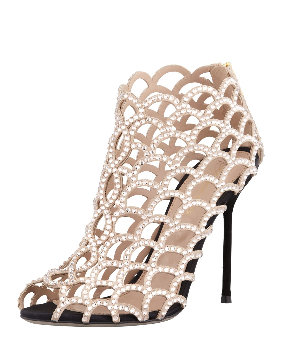
Caged crystal bootie by Sergio Rossi

Caged crystal bootie by Sergio Rossi (also seen above)

Caged crystal bootie by Sergio Rossi (also seen above)

These Golden Butterflies by artist/design icon/sculptress Gabriella Crespi for Sergio Rossi are beyond beautiful!

Gabriella Crespi for Sergio Rossi

Gabriella Crespi for Sergio Rossi

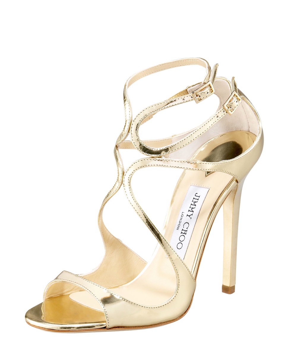
I don’t think there is a woman who has tried on this incredibly flattering shoe and hasn’t bought it.  Three women were wearing different versions of it at my friend Erin Fetherston’s wedding a few months ago….including the bride!  Jimmy Choo Lance Wavy Strap Sandal at Bergdorf Goodman

Jimmy Choo Lance Wavy Strap Sandal

Jimmy Choo Lance Wavy Strap Sandal

Elegant and simple with just a little flash:  Chaos by Manolo Blahnik at Barney’s New York

Manolo Blahnik Chaos

Manolo Blahnik Chaos

And sometimes it’s all in the details:  Suede Ruffle Pump by Nicholas Kirkwood at Kirna Zabete

Nicholas Kirkwood’s suede ruffle pump

Nicholas Kirkwood’s suede ruffle pump

THE GILDED SHOES by Andy Goldsborough

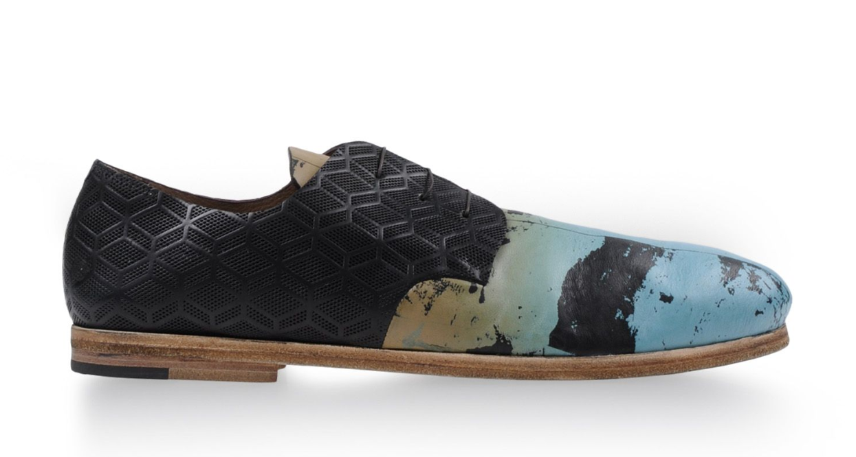
For the Fall / Winter 2013 collections embellishment and high tech materials that shine were on overdrive and fashion design took some key elements from interior design and architecture.  Alexandre Mattiussi of Ami combined green suede, black nylon, white mesh and a stripe of metallic blue patent leather to create one of the coolest sneakers of the season.  Carven laser cut black leather to create a new version of the classic lace up wingtip.  Acne channelled Tony Duquette and marbleized fall with a painterly wash of blues and greens.  Marsell transferred art even further onto their lace up shoe with laser cut embossed black leather.  And finally Sergio Rossi previewed their Spring / Summer collection with a gold and black knockout that relates to their Gabriella Crespi collaboration (more on that with Erin Hazelton). Here are some of the favorites that combine cutting edge materials, technology and innovation in men’s footwear and a peek into Spring/Summer 2014.

Ami suede and metallic leather sneaker

Ami suede and metallic leather sneaker

Carven laced laser cut black leather shoe

Carven laced laser cut black leather shoe

ACNE marble printed sneaker

ACNE marble printed sneaker

Marsell laser processed abstract painted laced shoe

Marsell laser processed abstract painted laced shoe

Sergio Rossi gold metallic and black leather lace up

Sergio Rossi gold metallic and black leather lace up

DAVID MALLETT BY ERIN HAZELTON by Andy Goldsborough

attendre-son-tour.jpg

I met David Mallett for the first time about nine years ago. Every time I went to Paris I was enamored with the way the Parisian women looked. They had this carefree elegance that I wanted to mimic. Their hair was never overdone; just well cut… the same went for their clothes.

I had been spending more and more time in Paris for work writing fashion and beauty articles, so I called one of the agents at Marilyn, one of the top modeling agencies in Paris, and I asked who gave the best haircut in Paris. David’s name was emailed back to me with no alternatives.

When I arrived at his salon, which was smaller then, but still in the same place, I was in love. It was my idea – everyone’s idea – of the perfect Parisian apartment. There was – and still is – an exotic array of taxidermy throughout the salon and a mix of modern furniture perfectly arranged amidst the architectural details of a 17th century French apartment.  David decorated the salon himself. Upon learning this fact (I had been Andy Goldsborough’s assistant before my time in Paris, so I appreciated good interior design when I saw it) – and this was before I met David face-to-face, before I knew about all the genius editorial he had done for several top magazines, before I knew that he styled the hair of the most beautiful French and American movie stars – I could see that his taste was insurmountable and I laid down any and all of the pre-haircut apprehension that I tended to carry with me into a salon. I was sick of bad highlights, rock-and-roll layers (this was the early 2000s) and, my personal favorite, up-dos that looked like I was going to a junior high semi-formal. I hadn’t had a good haircut in a long time and I was ready.

en-toute-sécurité.jpg

David ended up going for it and gave me my first crop of bangs since I was six years old. They looked amazing. When I went back to New York, everyone told me how “French” I looked. There is no bigger compliment in my book.

From that day forward David and I became friends. He was my go-to hair expert when I was writing about hair. He even gave me a beautiful, classic “Alexandre de Paris”-style chignon for my wedding. He also opened the salon for my bridesmaids and gave us all champagne. It is a wonderful wedding present and very glamorous memory to have.

19.jpg

That salon, like a David Mallett haircut, is perfect. Now that I am living in France, I want our very un-17th century house to look just like it. I know that this is impossible – we live in a medieval “chateau forte,” which is basically a burly, very masculine fortress where the charming woodwork that defines David’s salon would seem slightly amiss. But there are a few elements of David’s interior décor that I would love to implement into our home.
For one thing, his color palette is very much my style. It’s all grey. Anyone who visited us in our Soho apartment will know that we tend to shy away from crazy colors and try to make everything calm and soothing. Grey may sound cold, but done correctly (ask Andy) it can be quite comforting and inviting, just as it is in David’s salon. I also find it incredibly chic. Call me boring.

The main room that David uses to cut hair has the same hardwood, herringbone floors that we have in our “salon” – salon as in formal sitting room, not hair salon, although that would be amazing. The difference between his floors and ours is that his have a matte, natural, grey-toned stain on them and ours are varnished with an orange-y tone, high gloss finish. Very 1960s… but not in a good way. David is going to send me the name of the stain he used.

The furniture David put into his salon has all been collected on various trips to Paris’s Cligancourt, as well as flea markets in Belgium – which are apparently amazing (Andy – let’s go when you are here next week!).  The furniture that David has selected for the salon is a unification of 1950’s, 60’s and even 70’s pieces (think soft leathers on metal bases, Saarinen tables and lamps) and more ornate, Louis XIV chairs and mirrors. There is also the taxidermy: an ostrich, a leopard and two white peacocks. There is a horse head that fell off of a statue and a Poul Henningsen Artichoke Lamp that is suspended by a chain in the center of the “sink room.” I love staring at it as I get a luxurious head massage.

In a way, David’s salon feels a bit like a cleaner, greyer, more contemporary Carlo Mollino space…. If Carlo Mollino were French and not Italian, if that makes any sense.

The bones of each space demand a certain kind of decor, just like the body of each human should be dressed in a way that is most flattering to his or her form. David nailed his space… just like he nails haircuts.

couronner-la-tête.jpg
salon-en-hiver.jpg

David also recently launched a new line of beautifully packaged (no surprise) hair products. The minimal, old school “pharmacie,” yet very modern feel of the black bottles of the products will make any bathroom look a little more chic.

By Erin Hazelton

Photos by Nisuc

http://david-mallett.com/index.html

GILDED SHOES FOR SPRING by Andy Goldsborough

6_14_10_Tom_Sachs29852-e13357415367821.jpg

In anticipation of Tom Sachs: SPACE PROGRAM: MARS Show opening May 16th at the Park Avenue Armory, I’ve spotted a few gilded shoes to get you in the spirit for spring.

Marc Jacobs
Park Gold Metal Heel

Marc Jacobs Park Gold Metal Heel

Marc Jacobs Park Gold Metal Heel

Dior Homme

Dior Homme

Costume National

Costume National

Hugo Boss
Embossed Patent Leather Lace Up ‘Everso’

Hugo Boss Embossed Patent Leather Lace Up ‘Everso’

Hugo Boss Embossed Patent Leather Lace Up ‘Everso’

Maison Martin Margiela
Navy blue canvas lace up

Martin Margiela navy blue canvas lace up

Martin Margiela navy blue canvas lace up

CAMO + COMEBACK = TIMELESS by Andy Goldsborough

selfportraitcamoflageaw1986torsofrombehindaw1977_2.jpg

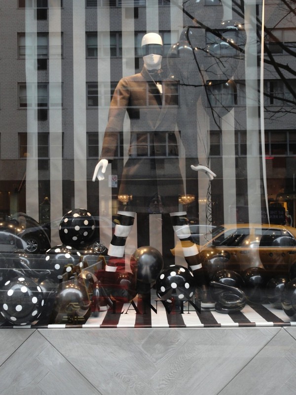
This Spring it’s hard not to notice the resurgence of camouflage and it’s enduring impact on the fashion industry.  From men’s style icon Nick Wooster to a broad spectrum of fashion designers this season – Lanvin, Dries Van Noten, Prada, Jimmy Choo and Kenzo’s Carol Lim & Humberto Leon – camoflauge is everywhere in the men’s collections and in so many inspired variations.  The graphic has become so prominent I decided to look into the history of it’s beginnings and try and decifer what makes this nature motivated pattern so hypnotic.

Lanvin camo silk bow tie at Bergdorf Goodman

Lanvin camo silk bow tie at Bergdorf Goodman

Prada camouflage sequin evening loafer at Bergdorf Goodman

Prada camouflage sequin evening loafer at Bergdorf Goodman

Jimmy Choo Sloane Men’s Calf Hair Slipper at Bergdorf Goodman

Jimmy Choo Sloane Men’s Calf Hair Slipper at Bergdorf Goodman

Introduced by the French army in the First World War in 1917, artists known as camoufleurs were employed to disguise tree observation posts and help soldiers blend into their environments.  Ship and plane camouflage soon followed in other countries and became a primary means of eluding the enemy and then finally into combat gear worn by the soldiers.  Many animals, fish, insects and other wildlife have this crypsis, or ability to avoid observation by other predators, so naturally we would use the same methods to protect ourselves.

129_001-Version-2.jpg
Britannica_Color_Chart_camo.jpg
Example of crypsis

Example of crypsis

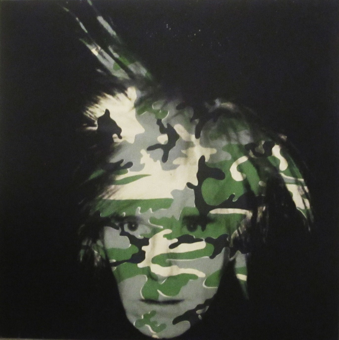
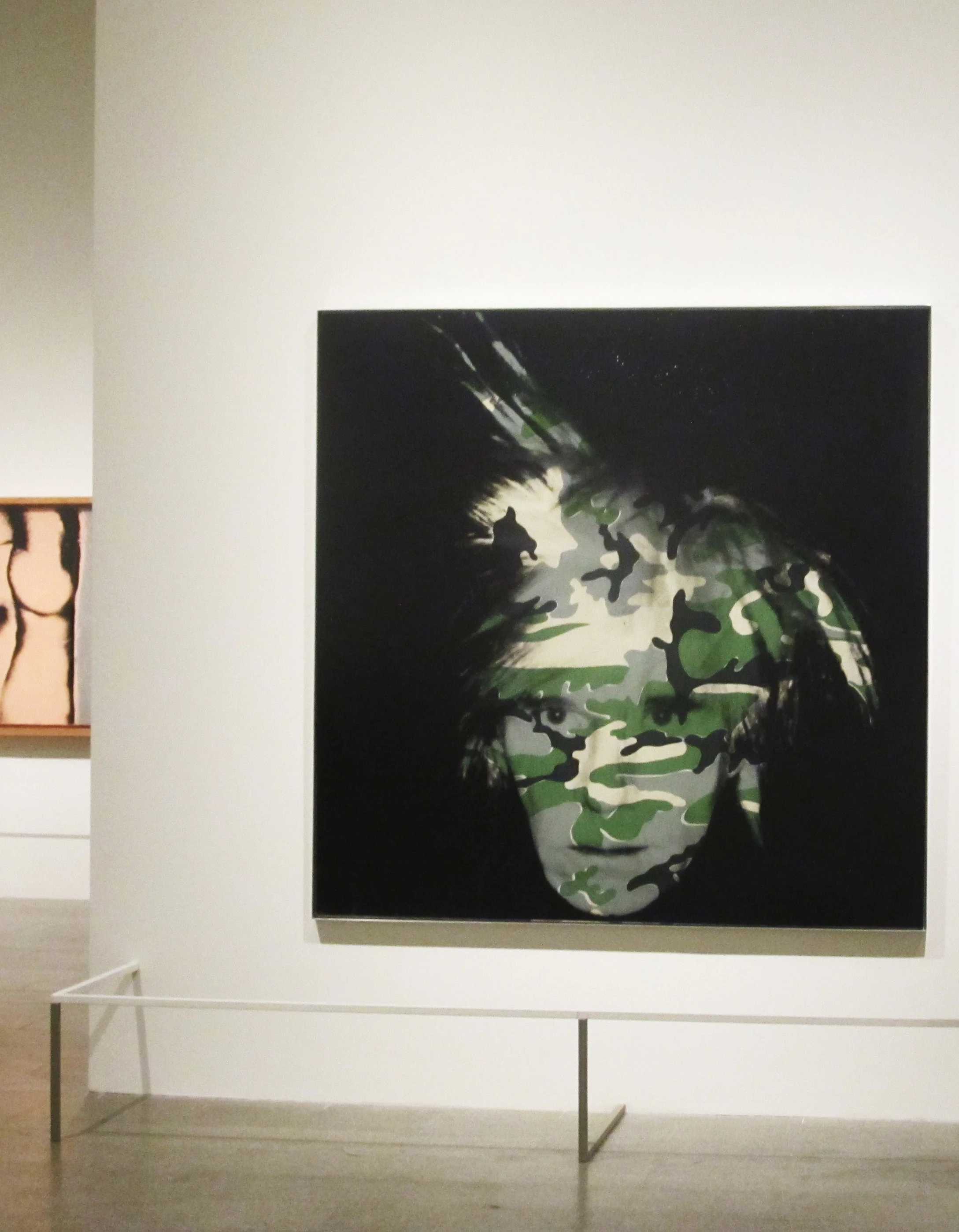
Although I’ve never been hunting in my life, except once with my father where I sat alongside he and my brother in horror and fear of what would happen to the poor creatures in the woods, I was immediately drawn to the camouflage gear and clothing.  I guess that was my first clue that I would not be following in their footsteps but pursuing a creative design path instead.  My first awareness of camouflage as an art medium was in Andy Warhol’s extensive study of multiple color variations and then in his haunting self portrait of 1986 before his death the following year overlaying different color palettes of the pattern over his face.  The Metropolitan Museum of Art has the traditional color camo version of the portrait in its permanent collection and the Philadelphia Museum of Art houses the pink and red version.

Stephen Sprouse was given permission to use Warhol’s camouflage paintings and explored the pattern further with his fashion designs in 1987 and 1988, his cover design for Debbie Harry’s solo album Rockbird in 1997 and his graffiti camo for Knoll textiles in 2003.  I incorporated Stephen’s graffiti camo into a loft project I was doing in Soho at the time and my client loved it!  His designs still inspire me today and I won’t forget our many dinners and discussions about design and the way he expertly combined luxurious fabrics in a pop futuristic way.  One weekend upstate at Stephen’s house at Bear Mountain he even asked me to make draperies for the living room out of a day-glo fleece we found at a local fabric store and we talked about combining camo with his signature day glo colors.  I hope Knoll will reintroduce his camo textiles one day, they were so ahead of their time as were all of his designs.

Andy Warhol “Camouflage Self-Portrait” in the Metropolitan Museum of Art

Andy Warhol “Camouflage Self-Portrait” in the Metropolitan Museum of Art

Andy Warhol “Camouflage Self-Portrait” Philadelphia Museum of Art

Andy Warhol “Camouflage Self-Portrait” Philadelphia Museum of Art

Stephen Sprouse sequin camouflage dress

Stephen Sprouse sequin camouflage dress

Stephen Sprouse artwork and graffiti for Debbie Harry’s Rockbird album cover

Stephen Sprouse artwork and graffiti for Debbie Harry’s Rockbird album cover

Stephen Sprouse Graffiti Camo for Knoll color card (a prized possession in my fabric arsenal)

Stephen Sprouse Graffiti Camo for Knoll color card (a prized possession in my fabric arsenal)

Sprouse graffiti camo on silver Knoll Saarinen chair

Sprouse graffiti camo on silver Knoll Saarinen chair

Jussara Lee created a bespoke camouflage jacket for me eleven years ago and it still feels new and bold.  When I wear it I certainly don’t blend into my environment but feel like I am part of an energetic New York City that is alive with creativity and forward thinking.  Who knows, maybe camouflage still has many other ways of being interpreted and redesigned to make it’s way into our homes in another medium.  It’s definitely something that I would like to explore in my own design aesthetic and I will!

Jussara Lee bespoke camo jacket

Jussara Lee bespoke camo jacket

THE HUNT For STYLE By ERIN HAZELTON by Andy Goldsborough

Screen-Shot-2013-03-17-at-3.34.52-PM.png

When I was a kid all I did was look for inspiration; beauty. I religiously flipped through my mother’s monthly Better Homes and Gardens and her occasional Town & Country picking out the prettiest girls, the best dresses and the nicest rooms. I made it a game and I’d challenge my mother to see if she had the same ability as me to select the “right one.”

I subjected my Barbie dolls to the same sort of competition, laying them side-by-side in their outfits, flinging the “ugly” ones off to the side. I only wanted storybooks with beautiful illustrations and charming characters. Even the flowers in my neighbor’s gardens were subject to my quality control: I’d pluck the most perfect buds before they’d die and trot home with a bouquet for my mother, who would in turn scold me because Mrs. So-and-so called saying she saw me, again, destroying her garden.

My select tastes were reflected in my wardrobe. I was mostly concerned with wearing as many “pretty” things as possible and all at the same time. My favorite dress (usually my Christmas dress) didn’t necessarily match my favorite pink tights nor did any of it go with my turquoise suede loafers or my white Easter hat. But I liked each piece and was convinced they stood on their own, so I was only making a more interesting outfit by wearing them together. And so I did.

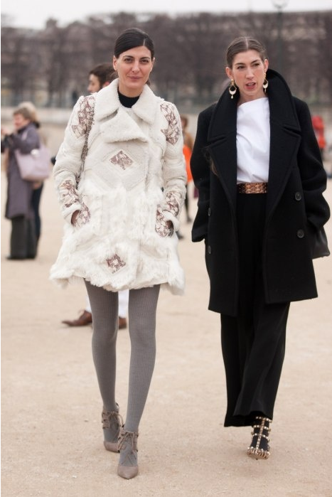
With Giovanna Battaglia on the way to a show in les Tuileries

With Giovanna Battaglia on the way to a show in les Tuileries

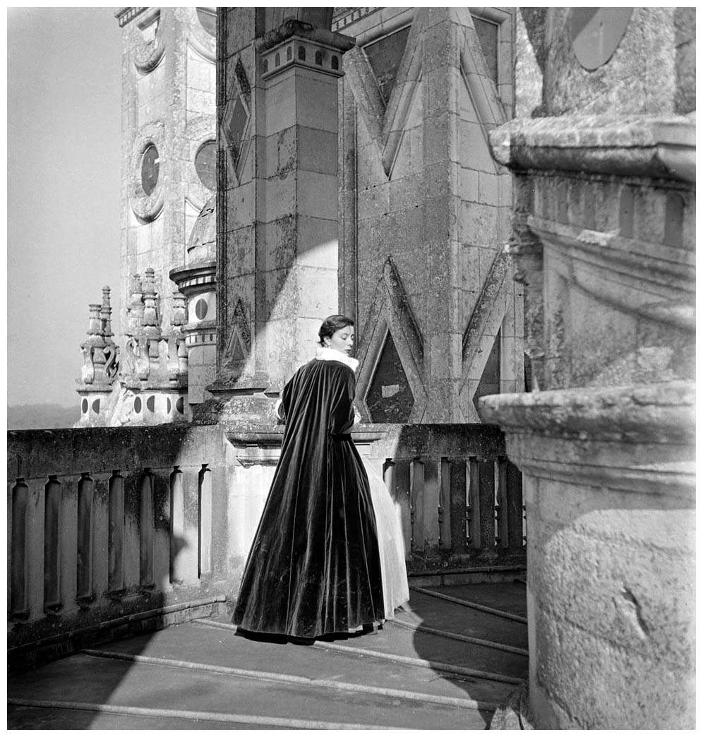
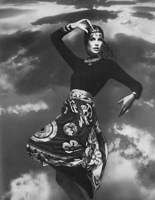
Mary Jane Russell in an oriental inspired pantsuit, 1953. Photo by John Rawlings.

Mary Jane Russell in an oriental inspired pantsuit, 1953. Photo by John Rawlings.

As I grew up, I became more concerned with melding the overall look, but I was still teased for my fashion sense. Oddly enough, I never let the other kids’ comments deter me. If fitting in meant melding into a homogenous group of Gap-clad kids, I didn’t want to. Eventually they accepted my eccentricities and I forgave them finally acknowledging that fashion wasn’t for everybody.

This difference was one of the main reasons I moved to New York when I was eighteen. I had been accepted to a few different universities, but NYU was in the middle of Manhattan and I knew that’s where all the magazines were, where all the designers lived and where all the crazies went to embrace their craziness. I knew I’d be able to fully splay my fashion feathers and I wouldn’t look like a weirdo doing it.

And so I did. The sidewalks became my runway and for the first time I knew people were looking at me because they liked my look; because I was a little out of the ordinary and it was interesting, not intimidating. So I pushed things a little further. I’d try my best to translate what I saw in the pages of Vogue and I’d wear necklines that were a little too deep (“But I don’t have big boobs, so it isn’t vulgar!”). I wore pointy shoes when most college kids didn’t realize they were chic just yet… just a little witchy. My Gucci bellbottoms? People were still a little confused, but maybe I was cool? And my bright red Dolce & Gabbana military coat? As conservative as it was – it was a calf-length coat! – it’s brazen color was like a wearing a red light, and I suddenly found myself accosted by a bunch of would-be johns. A pair of multi-color, wide-leg Tuleh trousers fresh off the runway? Apparently they belonged on a curtain rod according to a young man I passed on the street in Paris one day.

W Magazine’s Stefano Tonchi and Giovanna Battaglia

W Magazine’s Stefano Tonchi and Giovanna Battaglia

I liked to take chances and to figure out what made me feel best. Or what made me feel confident, or sexy, or intelligent, or cool, or whatever way I wanted to feel. These days, with street fashion and blogs, everyone is on top of fashion. The world is a runway and everyone wants to stand out. Okay, not everyone, but a lot of people. Even where I live, in a small village in the French Alps, people seem to get it. I’m not saying they all get it, I’ve seen some purple highlights, numerous facial piercings and some really bad shoes in the parking lot at my son’s school, but I have felt, on several occasions, a bit sorry that I didn’t try harder with my outfit when it came time to pick-up my son.

That said, because fashion is becoming more mainstream, I suddenly find it less inspiring. I’m not floored like I used to be by magazine editorials. And I really miss Carine Roitfeld at French Vogue! Now I pretty much look to my friend, the stylist and street style icon, Giovanna Battaglia for inspiration… literally and figuratively. She always looks perfectly polished, yet not too uptown lady. She’s cool and funny and incredibly chic. She does fashion in a real way and doesn’t (often) look like a fashion superhero like so many other newly minted street fashion stars do.

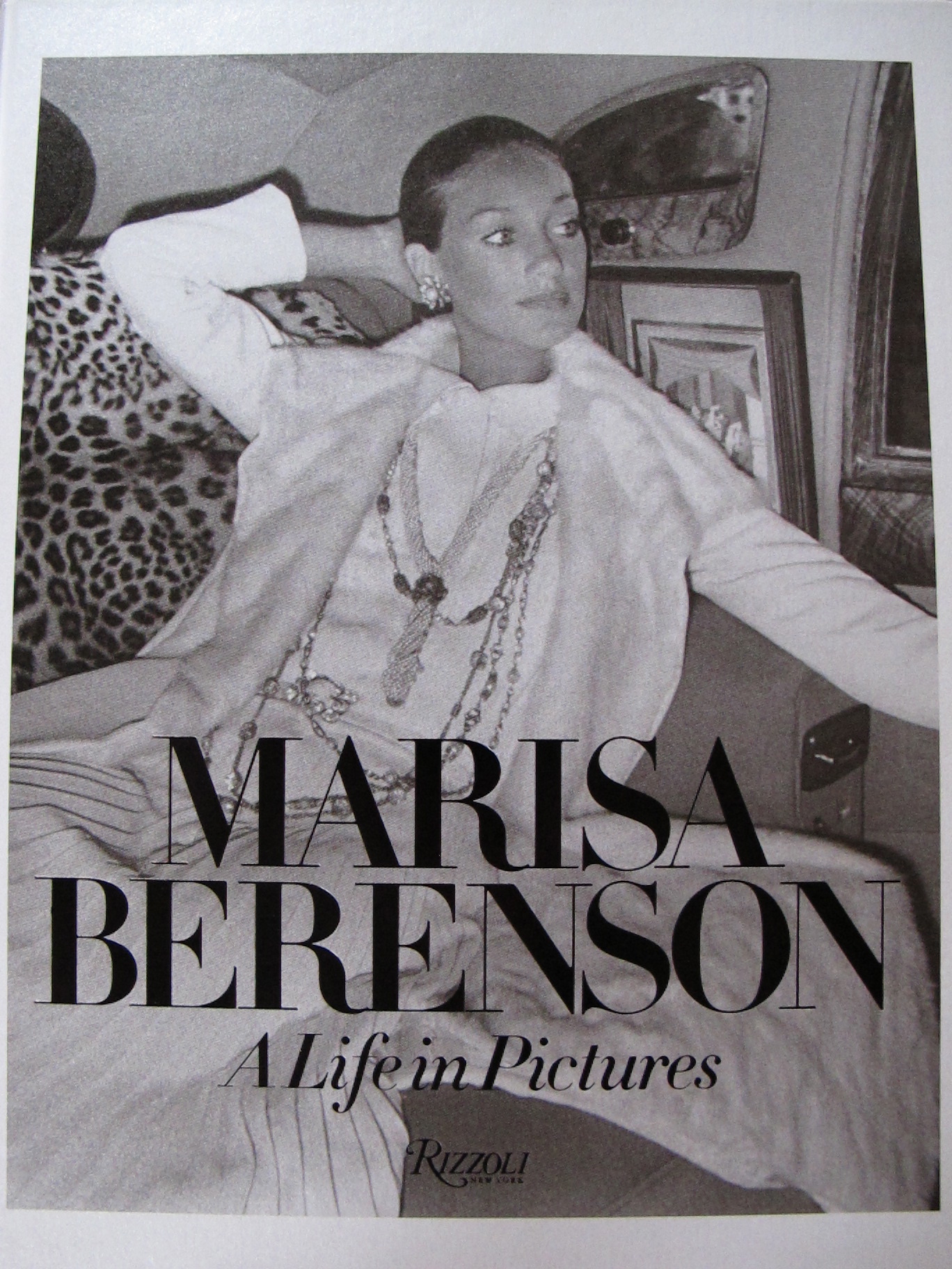
So I started to do what Giovanna – and every real stylist – does when she’s preparing for a shoot: I started pulling out books and old magazines for inspiration. I ordered Diana Vreeland’s The Eye Has to Travel, Guy Bourdin’s In Between and every other book containing his images, Marisa Berenson: A Life in Portraits, and Bals: Legendary Costume Balls of the Twentieth Century. I began scouring the Internet for 1950’s and 60’s Vogue and Harper’s Bazaar images. I went through my mother-in-law’s modeling portfolio from the late 60’s/early 70’s. I began following “shrimptoncouture” on instagram and her daily feeds of vintage images became part of my fashion sustenance.

IMG_7862.jpg

The elegance and ingenuity of all of these old images, the quiet sensuality (and perhaps not so quiet in the Bourdin images) invigorated me. The hell with trends, I began to think, I just want to metamorphasize into these images. I’m not saying I’m only going to wear vintage, but I’m definitely bringing the old Bill Blass dress and jacket set that is a size or two too big to the tailor tomorrow, along with the amazing 60’s Geoffrey Beene ensemble I found at Patina last weekend in New York (I really, really wish Lenore Newman wasn’t closing that store!). I’m also going to save my pennies and invest in the latest Valentino, Rochas, Thom Browne and Oscar de la Renta collections, where femininity is embraced and accentuated.

Lanvin leather coat and belt, two vintage Geoffrey Beene dresses and Azzedine Alaia in my closet

Lanvin leather coat and belt, two vintage Geoffrey Beene dresses and Azzedine Alaia in my closet

I’m done with trying to find myself. I can express who I am, how I’m feeling within a tighter fashion vocabulary. I’m all grown up now and as much as my childhood tendency for piling on as many fads as possible, and as much as I want to try out every new style that pops out of the fashion machine every time I walk past a Zara, I’ve finally stylistically matured.

From now on I will be a lady. I will embrace my waist. I will show off my neck. I will knot my hair into tidy chignons. I will utilize my jewelry with unfettered abandon. I will not be scared of full skirts, nor will I shy away from a pencil skirt, even if she makes it difficult for me to walk. I will tuck my turtlenecks into my high-waisted trousers and skirts. I will wear clutches even in the day, if, of course, there is a reason for it (which usually only means during fashion week). I may even buy a cape.  I’ll never say no to an evening glove and in a few years, when I’m officially old, I’ll probably start wearing hats.

I will never be boring, nor will I look like an old lady that lives in the Upper East Side, or Geneva, for that matter (it’s closer to home now), though I will look to them for inspiration. You better believe my jewelry will be big and that my shoes will always be bold and over-embellished. I will always wear leopard prints… any animal print, for that matter.

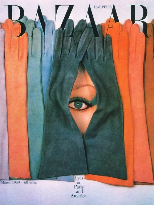
Harper’s Bazaar cover; March 1959, Photo by Ben Rose, art director Henry Wolf.

Harper’s Bazaar cover; March 1959, Photo by Ben Rose, art director Henry Wolf.

Screen-Shot-2013-03-17-at-2.46.13-PM.png
Giovanna Battaglia in two trends of the season, animal prints and a cape

Giovanna Battaglia in two trends of the season, animal prints and a cape

I will continue to unearth the past and yank it into the future. I will make the little girl I used to be proud of whom she’s become.

The Gilded Owl is honored and excited to have Erin Hazelton as its  contributing fashion editor – always on the hunt for style!  Erin also  writes about people influencing fashion, design, culture and more on her  brilliant blog The People I Li…

The Gilded Owl is honored and excited to have Erin Hazelton as its contributing fashion editor – always on the hunt for style!  Erin also writes about people influencing fashion, design, culture and more on her brilliant blog The People I Like.

AEDES DE VENUSTAS by Andy Goldsborough

DSC_0014-e1361209128543.jpg

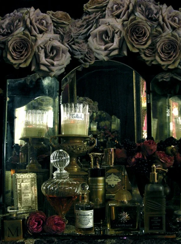
Robert Gerstner and Karl Bradl’s opulent perfume boutique on Christopher Street in the village has an old world patina on the exterior but as you enter the shop your senses are stimulated like no other space I have ever encountered.
They opened Aedes De Venustas or “Temple of Beauty” in 1995 and have the most curated and exclusive collection of fragrances for the home and perfumes imaginable. The interiors are decorated with sparkling, cloudy crystal chandeliers and carved and gilded display vitrines that set off the stunning cut crystal perfume bottles and candles to great effect. Taxidermy peacocks and velvet draperies further enhance the experience likened to a Renaissance painting. Aedes carries some of the oldest European fragrances but also continues to update their inventory with newer lines. Testing the fragrances is just part of this sensory experience, the packaging and the attention to detail they give to gift wrapping is extraordinary. Sometimes the past and present meet harmoniously in a perfect crafted environment as evidenced in Aedes de Venustas!

1.8-e1361209251299.jpg
1.7-e1361209625164.jpg
AedesGroup2007-e1361209678110.jpg
Some of the perfume lines artfully displayed in the shop

Some of the perfume lines artfully displayed in the shop

Detail of one of the crystal chandeliers

Detail of one of the crystal chandeliers

DSC_0052-e1361209912436.jpg
DSC_0021-e1361210041385.jpg

For the perfect gift or to enhance your own home Aedes De Venustas is worth a trip. The shop is located at 9 Christopher Street, just off of Greenwich Avenue. Thank you to Rafael Santiago for the beautiful images captured here.
www.Aedes.com

SANTONI / RUBELLI + GIO PONTI by Andy Goldsborough

'.jpg

For my upcoming first gallery show of The Gilded Owl this spring I wanted the focus to be on design that I had previously covered over the past year that recognized outstanding craftsmanship. Since I was going to include works by Gio Ponti, Carlo Mollino and a collection of Chiavari chairs both old and new I decided to approach Rubelli, the renowned textile company founded in 1858 in Venice. Punteggiato is just one of six textiles Gio Ponti created for Rubelli in 1934 and they reintroduced the collection in conjunction with their Rizzoli monograph Rubelli: A Story of Silk In Venice.

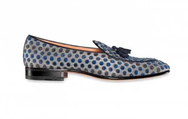
The shoe manufacturer Santoni produced a capsule collection made of these exquisite fabrics and began producing them last month. Santoni was founded in 1975 by Andrea Santoni and his son Giuseppe now runs the 400 employee luxury shoe business. The made-to-measure shoes combine old world detailing and craft with innovative technology of today and the company also happens to be 90% sustainable with a state of the art facility where the use of natural resources allow lower levels of energy consumption. Great design and good for the environment but at the same time creating extraordinarily beautiful design, following are Santoni’s collection featuring Gio Ponti/Rubelli textiles.

downloadFile.php_.jpg
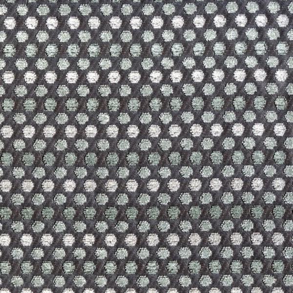
Gio Ponti Punteggiato in Cina for Rubelli

Gio Ponti Punteggiato in Cina for Rubelli

Punteggiato, designed by Gio Ponti, is a velvet pointillist pattern rich in subtle tonalities and available in 7 colorways. The relief in playful placement and rigid geometry broken down into a feeling of fun two-pile ciselé velvet, cut and loop, on a metallic ground. This new version of the pattern, originally woven by hand since 1934 by Rubelli itself, maintains the features of the original design.

Santoni-Rubelli_Natasha-600x598.jpg
Punteggiato_Rubelli_LR11-e1358388544201.jpg
Santoni men’s shoes in Gio Ponti silk velvet Punteggiato for Rubelli

Santoni men’s shoes in Gio Ponti silk velvet Punteggiato for Rubelli

Gio Ponti Punteggiato in Madreperla for Rubelli

Gio Ponti Punteggiato in Madreperla for Rubelli

1-image004-e1358378673868.jpg

Santoni + Rubelli, the Venetian firm that represents a point of reference worldwide for high-end fabrics combines two excellencies of made in Italy sharing the same passion for timeless elegance. The result is a small romantic masterpiece of pure Venetian taste, a collection where baroque suggestions blend with the design mastery of Gio Ponti’s avant-garde spirit.

taccuino-visto-su-elle-luxe-L-dvtWtf-600x480.jpeg
slide_01-600x300.jpg
phpThumb_generated_thumbnailjpg-600x532.jpg

LANVIN / MR ARCHITECTURE + DECOR by Andy Goldsborough

utf-8DSC07360-e13580193674031.jpg

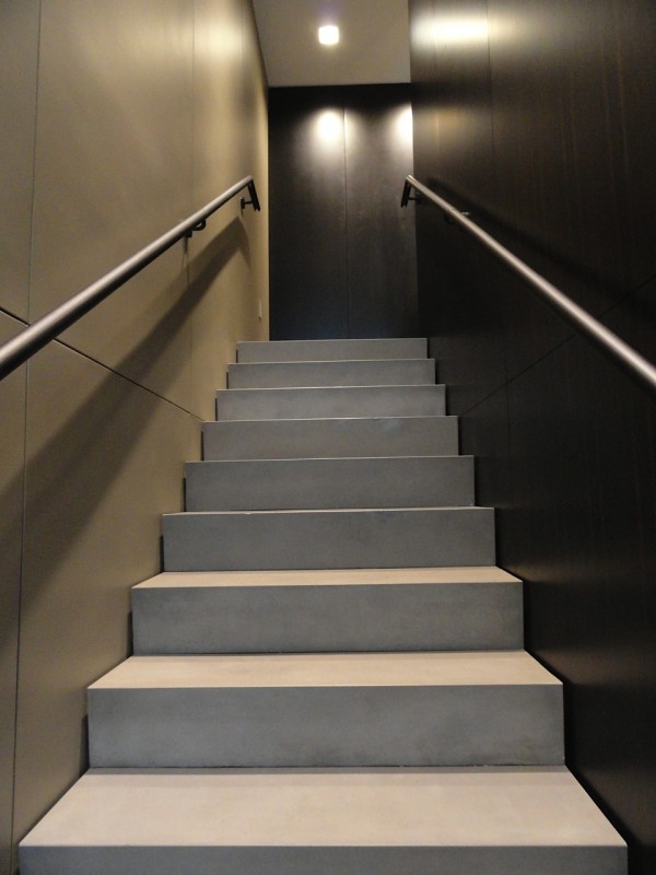
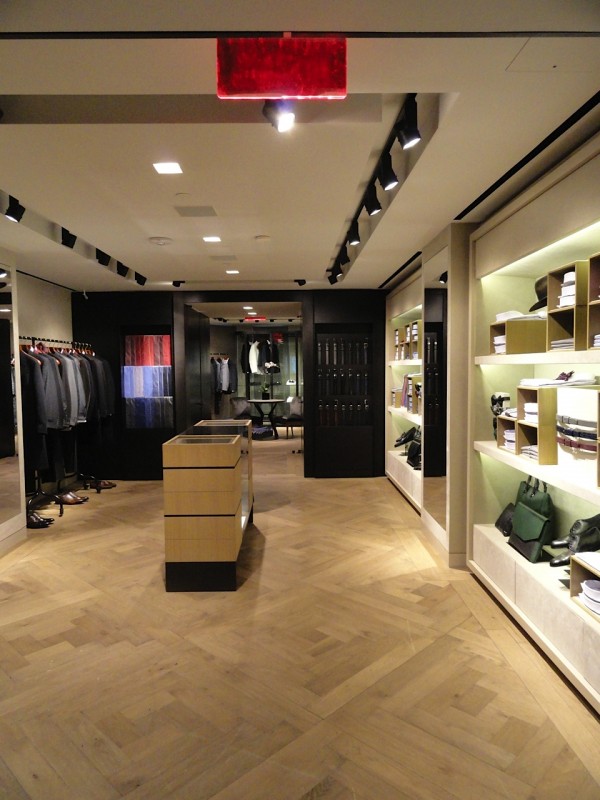
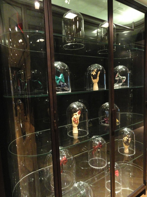
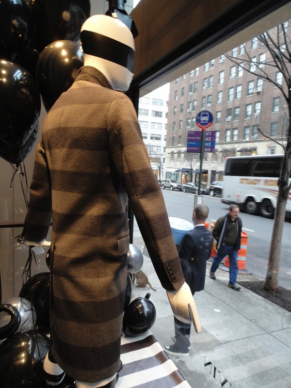
The new Lanvin men’s store opened Saturday in New York and I was there to get a first glimpse. Designed by David Mann / MR Architecture + Decor, it is a stunning addition to Madison Avenue and takes menswear to another level. From the minute you enter there is a sense of design mastery with the double height rosewood paneled wall, the polished tinted concrete that looks as smooth as suede and a multi-tier custom crystal and steel chandelier which sets the tone for the rooms beyond. The first level focuses on outerwear with a steel cubicle display wall for shoes and a lounge like area in the back with more casual wear highlighted by an Italian chandelier and mid-century furnishings. As you ascend the concrete and steel staircase that is separated from the outer walls with razor like precision you enter the formal wear area highlighted by a curved glass and steel display vitrine full of the most beautiful bowties I have ever seen. The back of the second level contains a pair of art deco chairs and a custom chagrin table flanked by minimalist dressing rooms with suede upholstered walls and felt benches. But the shop needs to be seen in person to appreciate the thoughtfulness and masculine material selection that create a whole new look for the brand while keeping the Lanvin aesthetic intact!

Window display with grey oak woodwork detail

Window display with grey oak woodwork detail

utf-8DSC07355-e1358021187766-600x800.jpg
Ground floor with cowhide rug and vintage furnishings

Ground floor with cowhide rug and vintage furnishings

utf-8DSC07356-600x800.jpg
Shoe boutique with custom bench

Shoe boutique with custom bench

utf-8DSC07358-600x800.jpg
Detail of steel handrail

Detail of steel handrail

Landing on upper level overlooking the entrance

Landing on upper level overlooking the entrance

Entry chandelier from second floor

Entry chandelier from second floor

Upper level accessories and formal wear

Upper level accessories and formal wear

Bowties displayed in glass and steel vitrine

Bowties displayed in glass and steel vitrine

utf-8DSC07366-600x800.jpg
Dressing room with suede upholstered walls and custom felt and leather bench

Dressing room with suede upholstered walls and custom felt and leather bench

utf-8DSC07368-600x800.jpg

Lanvin www.lanvin.com
David Mann / MR Architecture + Decor www.mrarch.com

EMILIO PUCCI NEW YORK by Andy Goldsborough

DSC06992-e13551412485201.jpg

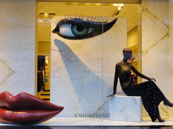
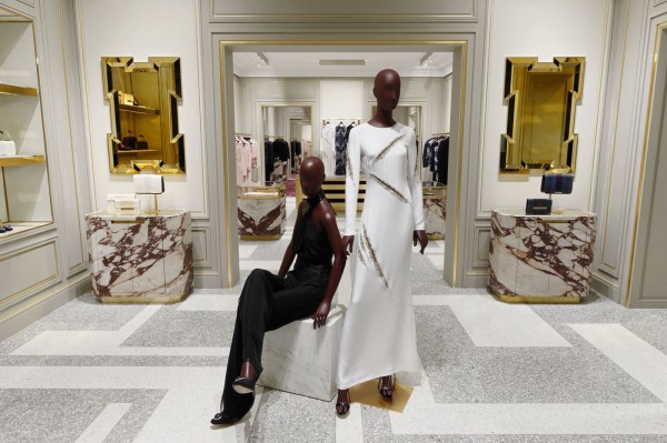
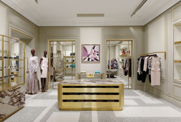
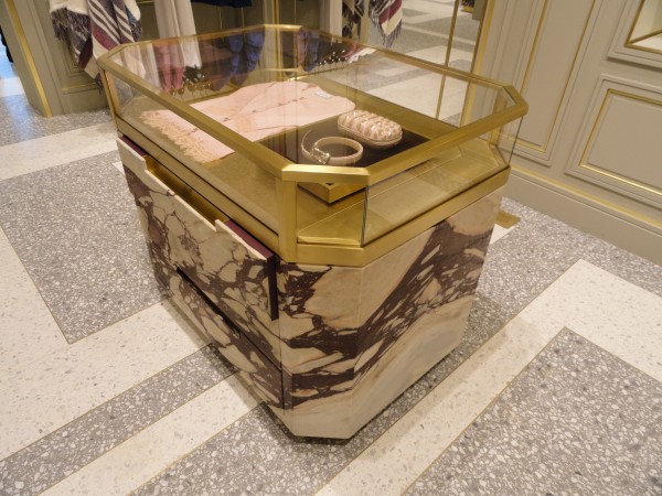
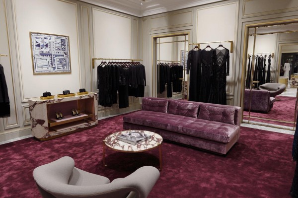
The new Emilio Pucci store on Madison Avenue designed by Joseph Dirand opened last month and was inspired by the palazzo in Florence, Italy. A collaboration between the new Creative Director Peter Dundas and French architect Joseph Dirand, the design combines classical elements with modern sensibilities. The marble windows on Madison Avenue create a facade within a facade in this elegant landmark building. Inside a color palette of purple, cream and gold create the perfect backdrop for the colorful, patterned clothing that Pucci is known for. Breccia dei Medici purple veined marble found in the Palazzo Pucci has been used in combination with brass and glass to create display cases set upon a patterned two tone terrazzo floor to create the ultimate shopping experience.

Two tone grey and white terrazzo entry with Breccia dei Medici display cabinets and brass and gold glass mirrors

Two tone grey and white terrazzo entry with Breccia dei Medici display cabinets and brass and gold glass mirrors

621228_10151137074150267_1273811965_o-600x404.jpg
Detail of brass shelving display

Detail of brass shelving display

“The new concept screams sophistication, craftsmanship and luxury totally in line with the history of the House”, adds Emilio Pucci Vice President and Image Director Laudomia Pucci, “all of which are key Made in Italy values. But they have been considered through a very fresh lens. It’s a great moment for us, and a superb evolution for the brand.”

The eveningwear room with Pierre Paulin “Ribbon Chairs from 1966 and custom aubergine silk carpet and sofa

The eveningwear room with Pierre Paulin “Ribbon Chairs from 1966 and custom aubergine silk carpet and sofa

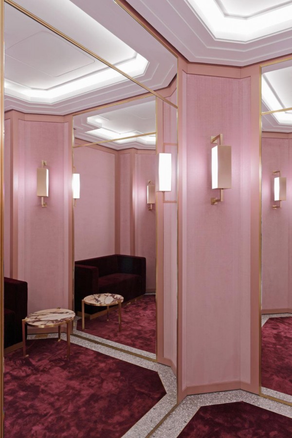
The oversize fitting rooms with pink velvet upholstered walls, silk carpet and custom brass light fixtures and details

The oversize fitting rooms with pink velvet upholstered walls, silk carpet and custom brass light fixtures and details

DSC06989-e1355142376546-600x800.jpg

www.emiliopucci.com

ANTONIO AZZUOLO S/S 13 by Andy Goldsborough

DSC06024-e13472262451061.jpg

At the Antonio Azzuolo Spring/Summer 2013 show yesterday, the look was a mix of New York swagger street fashion and the art of being well dressed. At Milk Studios with the Hudson River as a backdrop, Azzuolo showed a stunning collection full of energy and detail. With every collection Azzuolo explores the archetypes of youth, while expanding on the concept of building the basic foundation of a men’s wardrobe. Colors ranged from white, ivory, blue, navy and black with accents of pink, coral and neon multi-colored panels. The craftsmanship was impeccable and there were details of platinum leather trim on the lapels of jackets and intricate jacquards that made the garments luxurious. But the day-glo soled nike sneakers kept the looks fresh and modern making the transition from casual day and work to evening easy. These hand-tailored pieces are new classics with a poetic edge.

DSC06022_2-600x651.jpg
DSC06037-600x450.jpg
DSC06026-e1347233180931.jpg
DSC06018_2-600x348.jpg
DSC06021-600x450.jpg
DSC06016-600x450.jpg
DSC06028-e1347288441154.jpg
DSC06037_2-600x405.jpg
DSC06020-600x450.jpg

See the full collection at Style.com. Thanks to Antonio Azzuolo and Matt Kays at Bradbury Lewis for inviting me to the show!

JUSSARA LEE by Andy Goldsborough

DSC05643-e13381203858521.jpg

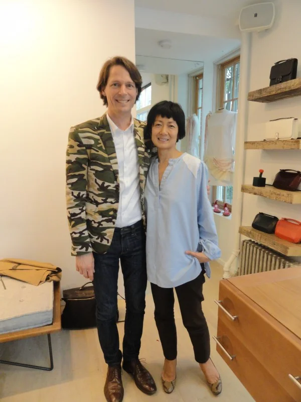
I met Jussara Lee 11 years ago at her perfectly appointed minimally furnished shop on Little West 12th Street. This was before the Meat-packing district had become another retail destination and I lived a couple of blocks away. A camouflage blazer would be my first hand tailored purchase from her shop and to this day, still one of my favorites. Not only because of how I feel when I wear it, but because it’s so incredibly beautiful to look at the stitching, the working buttons on the sleeves and it was made for me! Jussara Lee’s heritage is Korean but her parents immigrated to Brazil and she grew up with fashion on her mind. Even as a child, she would take apart the outerwear that her parents would bring home and restructure and tailor the clothes into something that she deemed stylish.

DSC05559-600x450.jpg

In 1991 Jussara launched her signature line of highly structured clothing based on fit, proportion and craftsmanship and Bergdorf Goodman and Barney’s soon placed orders. Japan and Hong Kong soon followed and the line began to grow at a rapid pace. After many years of designing collections for mass production, she decided to scale down and get back to what she originally started out doing, making beautiful hand made clothing and perfecting her patterns one by one.

DSC05641-600x450.jpg
DSC05647-e1338133508891-600x800.jpg
Pants from the men’s Spring/Summer collection with top stitch pocket detail

Pants from the men’s Spring/Summer collection with top stitch pocket detail

DSC05651-e1338133841244-600x800.jpg

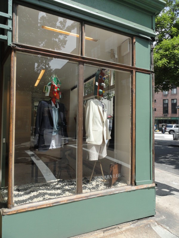
The new shop at the corner of Bedford and Morton Streets in Greenwich Village is sparingly furnished with classic pieces from Espasso by famed Brazilian furniture designer Sergio Rodriques. The Bianca chest functions as a working counter to pin clothing and as a standing desk while the Katita lounge chair and Mac side table with glass top give the shop a warm, relaxed feeling.

Sergio Rodrigues Bianca chest of drawers from Espasso

Sergio Rodrigues Bianca chest of drawers from Espasso

Custom hanger detail

Custom hanger detail

The thoughtfulness that Jussara places on every single item down to the custom charcoal cotton jersey wrapped hangers that are each stitched by hand is evident throughout the shop. There are no scratchy labels inside shirt collars, instead she sews a hand screen-printed soft cotton band inside of each garment. All of the clothing is made locally in Long Island City and in the shop.

In my bespoke camouflage jacket with Jussara

In my bespoke camouflage jacket with Jussara

DSC05648-e1338133264766-600x800.jpg

A special thank you to Jussara for spending an afternoon with me and sharing her new collection!
Jussara Lee 60 Bedford Street New York, NY 10014 Telephone 212-242-4128