DESIGN

DON FREEMAN / MY FAMILIAR DREAM by Andy Goldsborough

DF-01.jpg

The Gilded Owl is pleased to present DON FREEMAN / My Familiar Dream / 1994-2108.

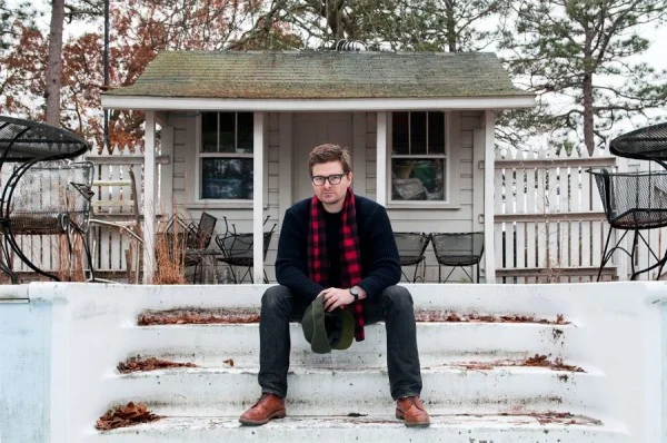
Don Freeman is an American photographer, best known for his large, monochrome prints that depict subject matter, be it landscape, human forms or architectural fragments, in states of transmogrification. He divides his time between New York City and a house in the Catskill Mountains that he shares with his partner Garo Sparo and his dog Louie.

In the early years, Don mined religious iconography and images of classical antiquity to produce his hybrids of painting and photography. It was during this time that Don discovered photographic print toning and abandoned painting completely and started working with only his camera and his toning chemicals, creating work that explored tonality, depicted blurred and often fragmented images. The toners that Don chose to work with were single color, dye based, manufactured by Edwal. Dye toning kits were the domain of the amateur photographer who wanted to evoke a mood and nostalgia. In Don’s hands, these kitsch materials were transformed into a highly nuanced color system. The resulting image is no longer a traditional black and white photograph as the toning bath creates a chemical reaction that transforms the metallic silver in the paper to a dye.

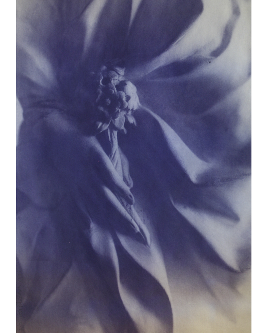
Over the years Don pushed the envelope on what a photograph could be, he next moved on to using architectural blue printing to create a series of highly nuanced prints of flowers and Greek and Roman antiquities. As the blueprint process is highly unstable, something that Don was aware of, the images would degrade when exposed to light, creating ghosts of the original images.  Then he thought about how to preserve them-the “race to stop the process of aging”. He talked to a conservationist at the National Gallery in Washington and got some tips on how they were protecting Robert Rauschenberg’s “Blueprints”. “If its beautiful, people will find a way to keep it around ” she said.  Don’s blueprints were first exhibited at The Elga Wimmer gallery in New York in 1994, and will be on view at The Gilded Owl.

BLUEPRINT-angel.jpg
INSTAGRAM-bluehand.jpg

Don’s work is shot on 35mm black and white negative film. He uses high-speed, Tri-X, film for its inherent graininess. Don has created a catalog of images over the years; photos of flowers, antiquities, letters and architectural details that function as his noumenon awaiting their transformation by Don into subjective, tangible images. Don refers to his collection of images as, “a sort of Noah’s Ark.” Being very influenced by cinema, specifically the films of Andrei Tarkovsky, and more specifically Tarkovsky’s film Mirror, in which Tarkovsky creates a visual narrative that combines past and present, dreams and reality, color and black-and-white; themes at the core of Don’s interests.

His hand-made book “My Familiar Dream” (1991) a collection of images that include his ghostly series “Pompeii, and Alabaster Vessels, “I am all you have to contain your fears” reflect his belief that there is a collective unconsciousness to all things, and his camera a tool to bring that out.

The Branches: “My branch series is an ongoing project. I like the idea of coming face to face with something beautiful without anything coming between the image and me. I often carry around a white card with me when I go on walks through the woods and use it as a background to isolate the branches I find, like a portable studio. I’m not going after a Blossfeldt type approach, they’re very graphic and probably reflect my formal training as a graphic designer. When I exhibit them they’re presented like a checkerboard, one black, one white, after the other, across the wall.”

Elco_2018_Branch3_24X30_1-copy.jpg
Elco_2018_Branch4_24X30_1-copy.jpg

The Curtains: “They’re from a confessional in a church in Arezzo. I was taken in by the minute, human detail; you can actually see that they were stitched by hand. I think they express ideas that are deeper than words.”

curtain.35.5X50-copy-1250x888.jpg

When I shoot portraits I often like to make people look like statues. None of my work is photo shopped. I shot my friend Katherine under a tree and the sunlight filtering through the leaves created this dappled effect and made her take on the appearance of a weathered statue – the idea of turning someone into marble. It’s based on my favorite myth, Pygmalion, only in reverse. My lighting experiments don’t always work – I often need to see the contact sheet to see if a succeeded, but this one certainly did.”

FA_KATHERINE.jpg

Don’s latest work in process “Stone Faces” are digitally manipulated photographs from his archives of black and white negative film. “I want to create a library of images, using my original negatives in a modern digital way. Recently I had all of my Super8 Black and White film digitized from a project I began 30 years ago in Paris, which is loosely based on “Nadja” by Andre Breton. Last year I returned to Paris with my Super8 camera and together, with we finished the film, finding just the right ending-30 years later. All it takes is time.”

stonefaces_postcard_763.jpg
stonefaces_postcard_710-1.jpg

The Gilded Owl will also be screening Don’s documentary “Art House” (2015). The film explores the handmade homes created and lived in by eleven distinguished American artists, including Frederic Church, Paolo Soleri, George Nakashia and Wharton Esherick.

For further information contact andy@thegildedowl.com and elizabeth@thegildedowl.com
THE MYSTERY OF BEAUTY “IL MISTERO DELLA BELLEZZA / WORKS BY INDIA EVANS & ROOMS INSPIRED BY CARLO MOLLINO by Andy Goldsborough

IMG_6981.jpg

On February 27th THE GILDED OWL opened it’s fourth show The Mystery of Beauty “Il Mistero della Bellezza” in Hudson, New York.  Inspiration for the show comes from the inspired architecture and interiors of Italian architect Carlo Mollino intertwined with the expressive feminine collages by India Evans.
Carlo Mollino was born in Turin and created surrealist interiors which manipulated space in extraordinary ways. His use of materials, luxurious and sensual especially in his final home on the River Po served as a backdrop for the mysterious polaroids he took of dancers and other women. Alongside his organic furniture pieces and carefully placed accessories, costumes and wigs his photographs in his final residence are still collected today and his furniture pieces are setting record prices at auction.

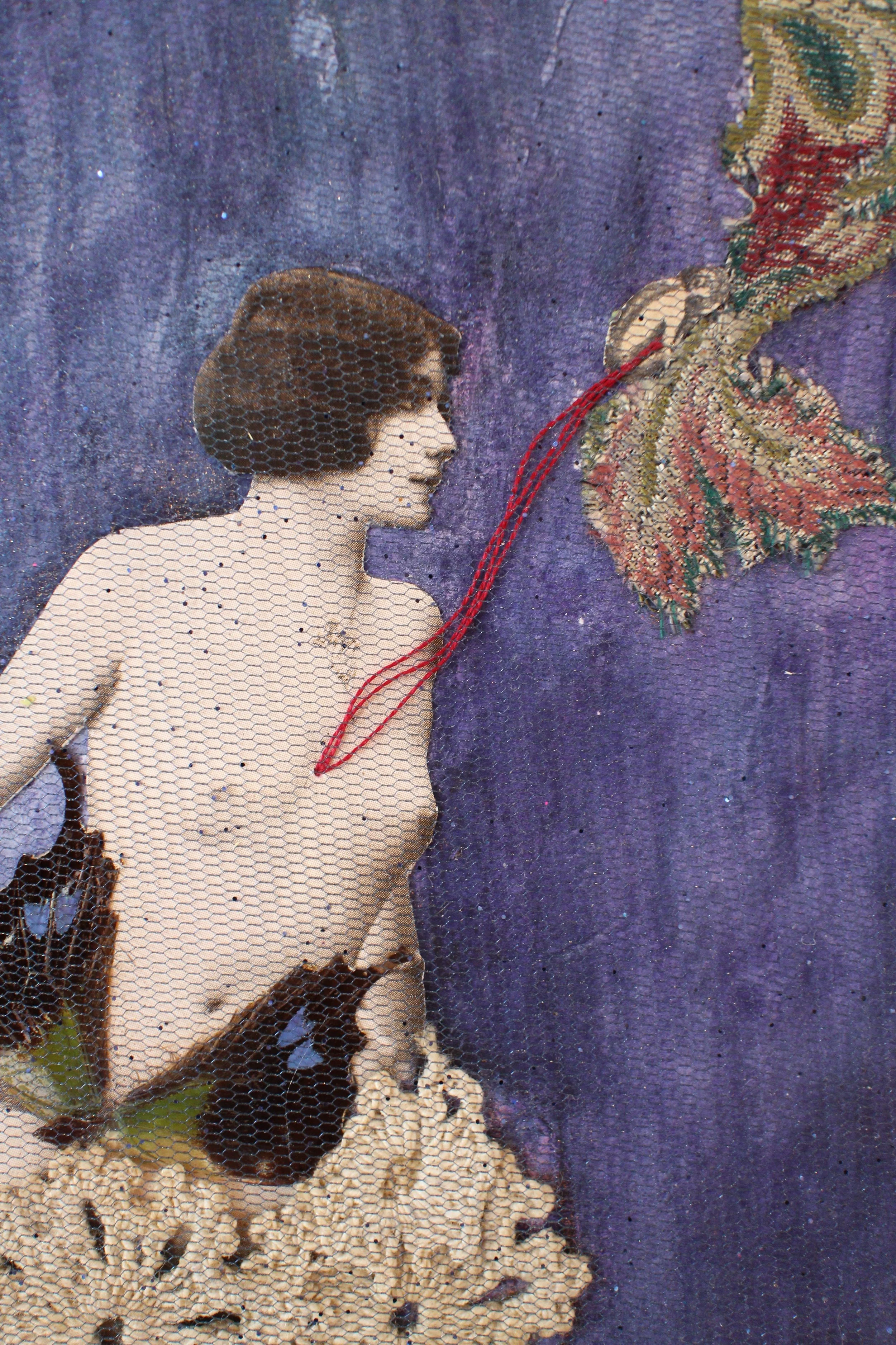
Collage artist India Evans uses objects as a vocabulary of feelings and her work explores intuitively various stages of feminine awareness. Through the recycling and juxtaposition of various objects (forgotten, discarded and seemingly worthless), she attempts a transformation towards a precious recollection. Resurrecting memories, collective yet intimate, visceral yet tender……piecing together beauty as if telling a story.

India Evans “The Night Bird” 2103, 11 1/2″ x 9 1/2″

India Evans “The Night Bird” 2103, 11 1/2″ x 9 1/2″

“I am inviting the viewer to explore their childhood innocence and fantasies through their adult nostalgia and sensuality. I hope to create a romantic and playful portrait of the female identity with the possibility of entering dreams: my own or someone else’s, as when a child plays dress up….full of the yearnings for beauty and mystery.”

In rooms inspired by Carlo Mollino’s work and India Evans’ haunting collage works we invite you to experience The Mystery of Beauty “Il Mistero della Bellezza”.
Opening Saturday February 27th 6:00-8:00 pm at 105 Warren Street Hudson, NY

For further information, full PDF of all 34 works or press inquiries please contact

andy@thegildedowl.com
elizabeth@thegildedowl.com

India Evans “Reflected Time” 2009, 7 1/2″ x 5″

India Evans “Reflected Time” 2009, 7 1/2″ x 5″

APPARATUS STUDIOS + CINNAMON PROJECTS by Andy Goldsborough

APPARATUS-STUDIO-CENSER-AGAINST-WHITE-WITH-INCENSE-BB.jpg

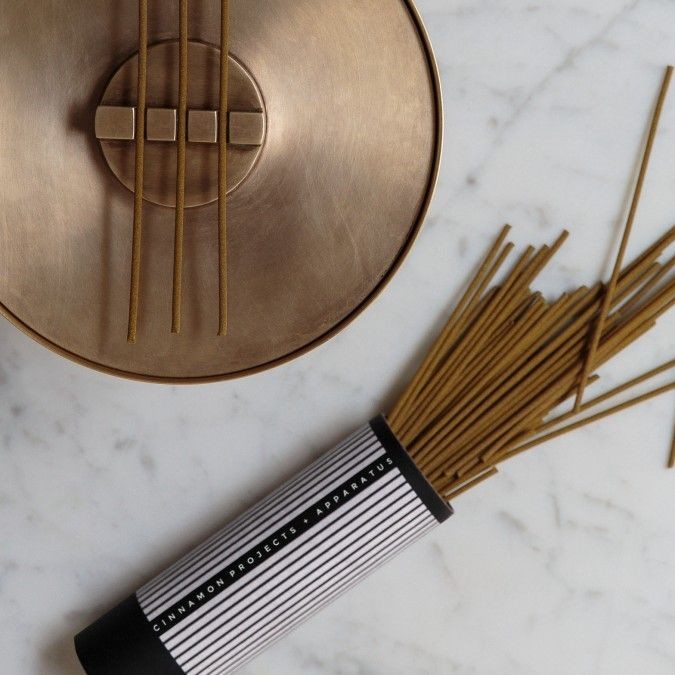
This week as we countdown to THE GILDED OWL gallery opening on Saturday night we will preview some of the artists and designers work kicking off our inaugural show! First up is the collaboration between APPARATUS STUDIOS + CINNAMON PROJECTS.  APPARATUS STUDIOS’ Gabriel Hendifar and Jeremy Anderson created the stunning spun cast and machined satin brass CENSER to be a multifunction incense and candle diffuser.  The design of this modern chalice may look simple with it’s delicate glowing porcelain dome when used with a candle but when removed the vessel can be used in a multitude of other ways. The detail of the incense burner inside is so beautifully crafted and can be removed to hold a votive candle or store personal treasures.

Censer in spun machined brass with porcelain dome diffuser

Censer in spun machined brass with porcelain dome diffuser

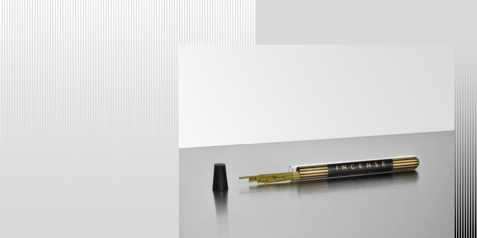
Andrew Cinnamon and Charlie Stackhouse of CINNAMON PROJECTS masterfully created six different incense sticks to “evoke the hours of a most inspired day”. 11 AM combines ginger, neroli, oud, tonka and violet……while at the other end of the spectrum 2 AM features notes of amber, cedar, cinnamon, honey and vetiver. All six incense fragrance compositions are sensational but the packaging alone is so beautiful we want all of them!

CINNAMON PROJECTS have also created two other burner options. CIRCA combines two solid brass geometric forms that can be combined in multiple ways while LINEA makes a fantastic travel companion.

Circa brass diffuser

Circa brass diffuser

Solo travel companion incense

Solo travel companion incense

Linea travel burner in solid satin brass

Linea travel burner in solid satin brass

Combining ancient and new concepts this collaboration brings handmade detail and craftsmanship to an entirely new sensory level for both home and travel.

APPARATUS-STUDIO-INCENSE-PACKAGING-B.jpg

ARMAND JONCKERS SEBASTIAN + BARQUET by Andy Goldsborough

Screen-shot-2014-03-04-at-1.47.59-PM.png

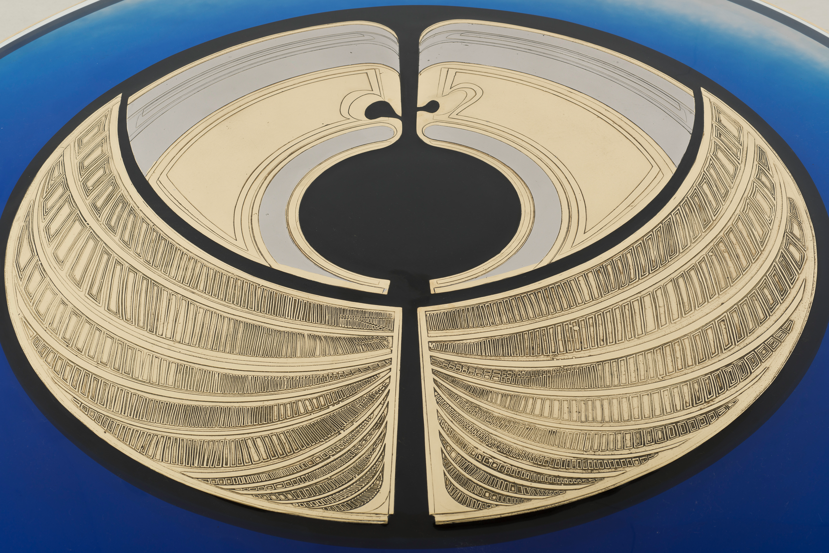
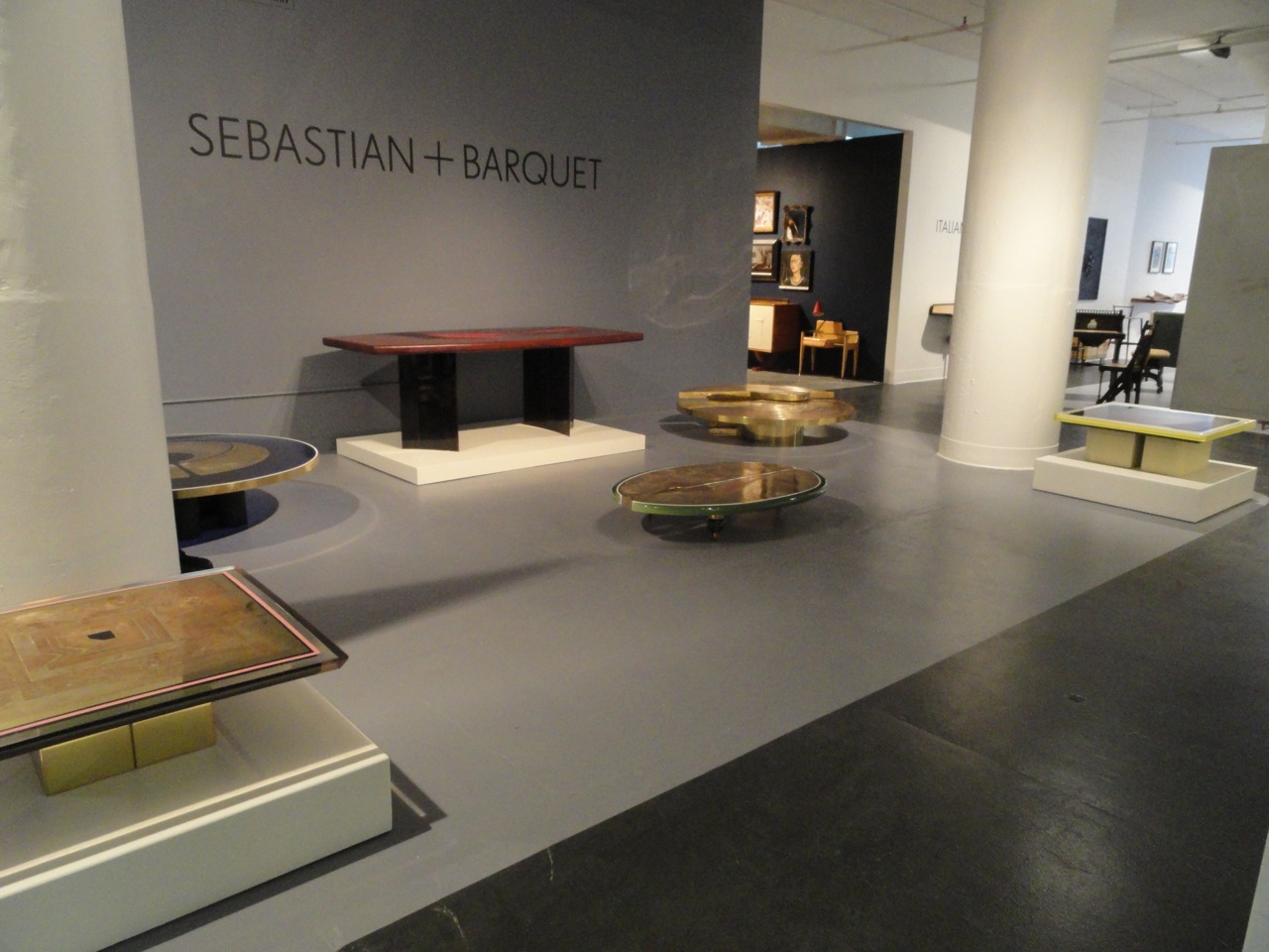
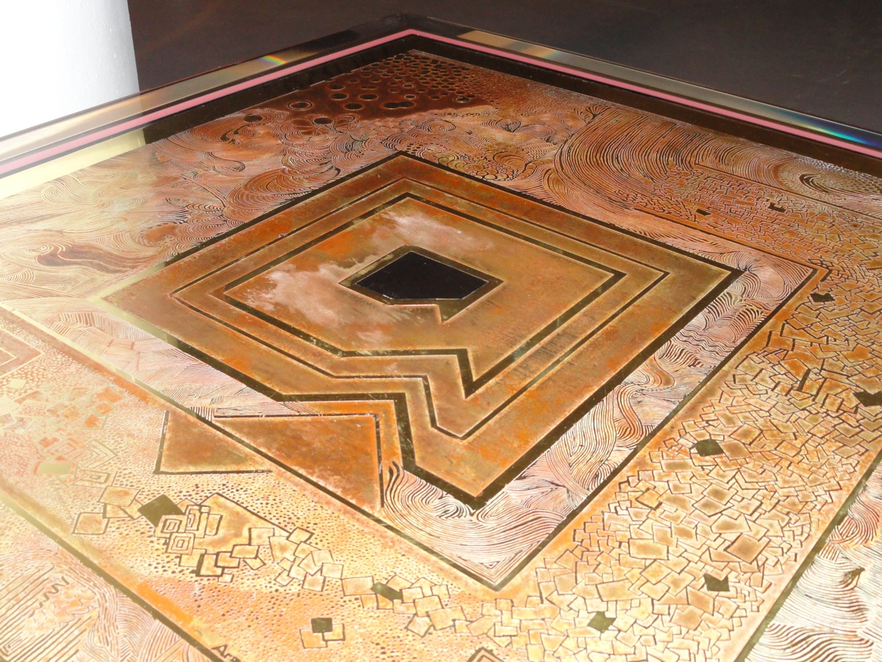
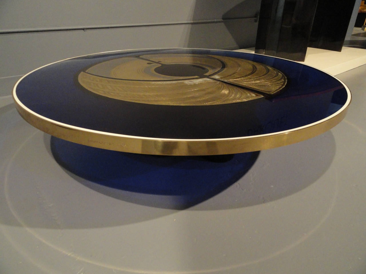
Currently on view at Sebastian + Barquet is a stunning collection of tables from 1973-1983 by Armand Jonckers, the Belgian furniture designer. The seven works on view are from Jonckers own personal collection and indeed worth seeing in person simply for the intricate detail involved in the combining of etched brass, resin and leather to create these beautiful tables. Because there is very limited information about Jonckers work that has been published in the US, I am including excerpts from an interview Number 33, October, November 2012, ‘Juliette and Victor‘, a French magazine. “Armand Jonckers is an unclassifiable artist. Sculptor, antiquarian buff about mineralogy and mostly decorator, he willingly defines himself as handyman.  When you enter Armand Jonckers’ workshop, it is quite difficult to define what he has created, or even, identify what is in front of you. Between workshop and depository, the place is mainly a shelter for thousands of finds gleaned over time, rows in aisles of shelves rise to the ceiling, to serve one day as freaky new creations.  Among antique items dating mainly from 1930’s-1960’s, classified by kind, or by material type, you can find old giant pieces of wood taken from industrial sites which stand next to a collection of glassware, huge ostrich eggs and quartz pieces:  the raw material of an infinity of possible projects.

Unique “Lola” low table 1983, clear colored and opaque resins, acid-etch and engraved brass, 10″ h x 32″ w x 34″ d

Unique “Lola” low table 1983, clear colored and opaque resins, acid-etch and engraved brass, 10″ h x 32″ w x 34″ d

Detail of “Lola” table

Detail of “Lola” table

Unique low table 1980, clear and colored resins, engraved and acid-etched brass, painted iron, 13 1/2″ h x 56″ w x 56″ d

Unique low table 1980, clear and colored resins, engraved and acid-etched brass, painted iron, 13 1/2″ h x 56″ w x 56″ d

Detail of underside of low table

Detail of underside of low table

Born in 1939 to a Belgian father and a French mother, Jonckers studied sculpture at the Lausanne’s school of fine arts between 1957 and 1962. He set up a workshop upon graduation near a Beaujolais castle where he used to spend every summer with his parents. He then became a middle man between Belgium and Lyonnais antiquarians, specializing in black mourning furniture created for high society, made as symbols of their frustration in respect of the revolution. This allowed him to open a shop in the Louise’s gallery that he kept until the eighties, La Calade, a place that made him known to the general and art public. Tireless and self-educated, he became interested in mineralogy, and passionate about a little unknown town in Germany called Idar-Oberstein. The town is famous internationally for its jewelers that have specialized since the IX century in gemstone work. Workers from the town have been making crowns for all major European dynasties of the X and XI century. In 1965, an antiquarian, (well known in the art world for having some of the best pieces), befriended Jonckers and introduced him to these sensitive works. After some purchases made at random, Jonckers gained a passion for gems and travelled worldwide for several years looking for mines, searching for the most uncommon gems.

Unique low table 1979, engraved and acid-etched brass, brass. 12 1/2″ h x 59 1/2″ diameter

Unique low table 1979, engraved and acid-etched brass, brass. 12 1/2″ h x 59 1/2″ diameter

Detail of two part low brass table

Detail of two part low brass table

Around the same time, Jonckers invested himself in his first decorating projects for individuals and shops. One of his best projects, the club Le fashion, became very well known to the elite at this time. In the clothing shop Lollipop he created a maze of podiums where none of the clothes were displayed but hung from the ceiling. The clothing would appear when pulling on cables. The seventies and eighties were a special period in terms of the stunning creations he produced during this time and projects in Belgium were abundant. He had the opportunity to work with the designer DeCapitani who always loved challenges and between 1978 and 1983 he collaborated with him on the decoration of two Saudi Arabian palaces. He then began designing furniture with a predilection for recycling objects and old materials or old art deco ironwork. Jonckers liked the idea of transmitting craftsmanship which had been little by little disappearing over time. His style is referred to as baroque with a touch of humor. He prefers working with wood over metal saying that it is easier to sculpt. Jonckers is said to be the opposite of Brancusi (his most admired artist) who spent hours and hours polishing the same piece and works in a much faster style.

Unique dining table, 1980. hand-tooled and painted leather over wood, oxidized copper. 30″ h x 43 1/2″ w x 67″ d

Unique dining table, 1980. hand-tooled and painted leather over wood, oxidized copper. 30″ h x 43 1/2″ w x 67″ d

DSC09126.jpg
Detail of hand tooled and painted leather top dining table

Detail of hand tooled and painted leather top dining table

Unique “two-face” low table 1978. colored and opaque resins, painted wood. 12″ h x 34 1/2″ x 34 1/2″ d

Unique “two-face” low table 1978. colored and opaque resins, painted wood. 12″ h x 34 1/2″ x 34 1/2″ d

Detail of two face low table translucent resin edge

Detail of two face low table translucent resin edge

Jonckers has never duplicated the same work twice and works mostly by commission although he has not had a formal gallery show. Some recent projects include making a bar for Portuguese wine bar from a colored enamel sheet ordered from a really old Alsatian enameling and disassembling factory engine coils in which you find different copper colors to create other coffee tables.” The private collection being shown at Sebastian and Barquet currently are part of a greater body of work created with a specific focus on engraved and etched brass, with some tables also combining resin and other metals and found objects. For the past ten plus years, his two sons and his daughter have also worked with him in shop in Ixelles, Belgium creating these intriguingly beautiful pieces. A special thank you to Tara DeWitt at Sebastian + Barquet for sharing Armand Jonckers work with The Gilded Owl! The collection is on view through March 18th at 601 West 26th Street Suite 300.

Unique low table 1973. colored and opaque resins, acid-etched and engraved brass, brass and copper. 9″ h x 53″ w x 37 1/2″ d

Unique low table 1973. colored and opaque resins, acid-etched and engraved brass, brass and copper. 9″ h x 53″ w x 37 1/2″ d

Underside of low table copper and brass legs

Underside of low table copper and brass legs

DSC09141.jpg

KRIEST / KRISTIN VICTORIA BARRON by Andy Goldsborough

In 2002 my business was celebrating it’s one year anniversary, I had signed the lease on my first office at Union Square and Kristin Victoria Barron became my second assistant.  It was an exciting time for me and Kristin is one of those incredibly talented people that have so many tricks up their sleeve – extraordinary artist and sculptor, thoughtful and insightful designer and exquisite taste – it was obvious we would become fast friends and collaborators! Barron received a B.A. in Art History and Ceramic Sculpture from New York University and then a Masters in Interior Design from Pratt.

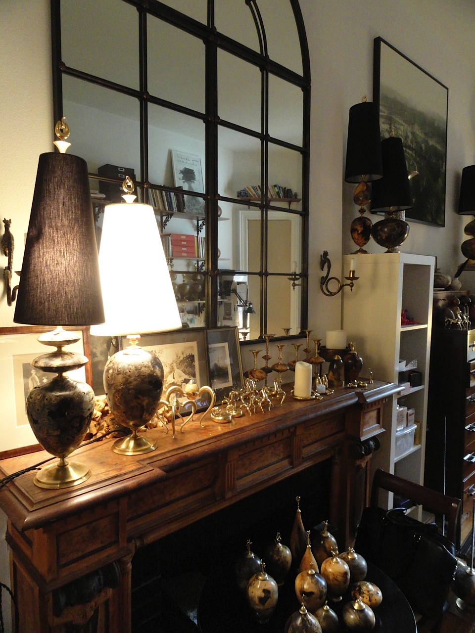
I was introduced to Barron through Erin Hazelton, my first assistant and discovered her haunting doll sculptures that were so beautifully made I was instantly intrigued and wanted to know more about her.  Her time me with me was short lived but we remained great friends and I’ve always been curious about what she would do next. In 2010 she founded her design firm Kriest and launched her first collection of lighting and objects inspired by the “aether element” or dream world and the pieces are both delicate and unexpected, just like her. Kristin invited me to her Irving Place atelier to preview the collection and here are some of the images of her handsome studio space where these magical pieces came to life.

DSC08467.jpg
DSC08459.jpg
DSC08468.jpg

The Orchis collection was derived from mythical archetypes and personal dream sequences Barron culled over a period of time. Inspired by a variety of sources ranging from Lascauxcave paintings and talismanic objects like the Venus of Willendorf and Nepali Shaman sculptures, all of them have Kristin’s otherworldly sensibility that makes them so alluring. Barron’s childhood in Florida and the pygmy deer that eat orchids and roses off the coast as well as ancient Chinese horse renderings provided further inspiration for her unique first collection. The objects, finials and lids to some of the exquisite vessels were sculpted in Nepal and then cast in solid polished brass and fabricated in New York and the elegant Aesculus wood columns were turned from fallen burl trees. I asked Barron a few questions about the collection.  Where is the collection produced?  “All the finished work is done in New York City, the wood is turned in Colorado, and some of the metal work is done in Michigan, where I was born”.

Hathalop vases and vessels in aesculus wood with brass finials

Hathalop vases and vessels in aesculus wood with brass finials

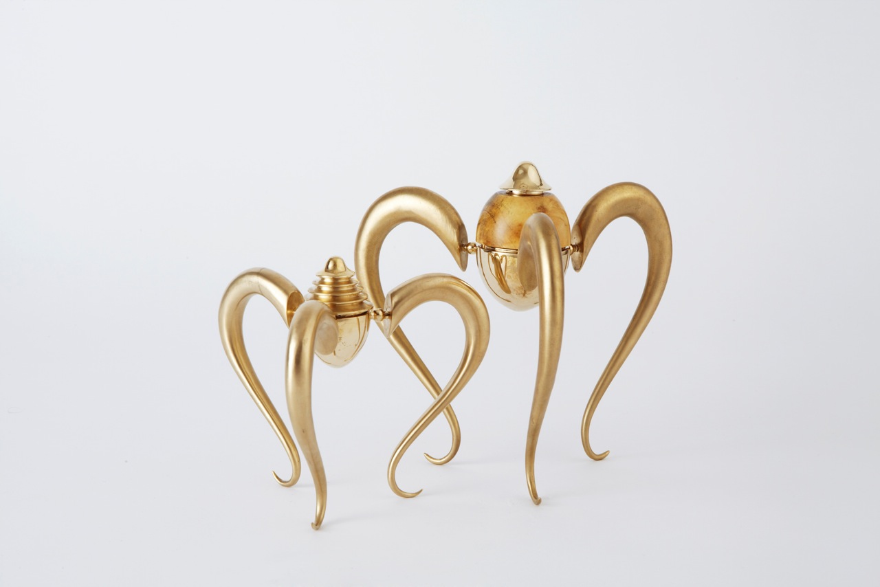
Hathalop snakes in polished brass

Hathalop snakes in polished brass

Orchis vessels in aesculus wood and polished brass

Orchis vessels in aesculus wood and polished brass

Triechi vessels in polished brass

Triechi vessels in polished brass

Hathalop domes in aesculus wood and polished brass

Hathalop domes in aesculus wood and polished brass

Hathalop deer in polished brass

Hathalop deer in polished brass

How are the pieces fabricated and is there a team involved in the production? We work exclusively with other artists/artisans, people who really love the process and enjoy the challenges of making new things. There are obviously a lot of different hands that touch the pieces before they are finished but, our wood turner Keith Gotschall has been really central to our education about wood as well as a continual delight in our day. In bringing together our team we really focused on working with curious, big-hearted individuals. It’s made the process so incredibly rewarding.

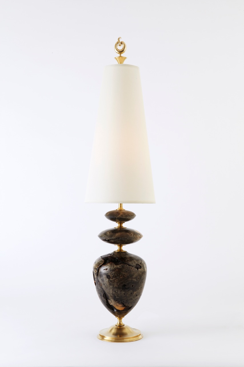
Triorchis jasper table lamp in aesculus wood, carnelian and polished brass

Triorchis jasper table lamp in aesculus wood, carnelian and polished brass

Orchis japser table lamp in aesculus wood, carnelian and polished brass

Orchis japser table lamp in aesculus wood, carnelian and polished brass

Diorchis major table lamp in aesculus wood and polished brass

Diorchis major table lamp in aesculus wood and polished brass

Triorchis major table lamp in aesculus wood and polished brass

Triorchis major table lamp in aesculus wood and polished brass

Barron had an enviably diverse design portfolio before founding her own interiors studio in 2010.  She designed a USB music stick for Ghostly Records which was sold at Moss in New York’s Soho, a futuristic vending machine for Coca-Cola, and a line of artisan-made furniture. But even now that she spends her days conjuring ambience into residential projects and restaurants, Barron is above all a maker. After studying sculpture as an undergrad and moving on to craft elaborate puppets based on the analysis of a Jungian dream expert, she’s now engaged in a collection of lighting and small scale sculptural home accessories under the tutelage of New York artist Vladimir Rodin. Her work has been featured in the New York Times, German Architectural Digest, V magazine, Lonny Magazine, and Interior Design online.

Kristin Victoria Barron

Kristin Victoria Barron

The Orchis collection of objects, vessels and lighting is available exclusively at Mondo Cane174 Duane Street in Tribeca and Gaspare Asaro at 251 East 60th Street.

All photos of the Orchis Collection by Joseph De Leo

2014 THE YEAR AHEAD by Andy Goldsborough

littlegildy.jpg

As I begin a new year I can’t help but look back on 2013 and think about all of the amazing people I have met through the world of interior design and blogging, a place that I never thought I belonged or would be able to contribute to in a meaningful way.  I started The Gilded Owl with the idea of creating a journal about craftsmanship in design, a travel log of significant places of interest and in the process brought along some friends I respected tremendously to contribute on art, fashion and music as well, personal interests of mine.  Elizabeth Moore, art advisor extraordinaire and my best friend for twenty four plus years has tipped me off to the most significant art openings in New York and beyond.  Erin Hazelton, my first design assistant and the most fashionable and stunningly beautiful friend writing with wit and thoughtfulness about her fashion experiences.  And David Shebiro, another friend of twenty plus years that I have attended numerous concerts I will never forget but who has an ear for music like no one else and the coolest record store in New York, Rebel Rebel Records.  I thank you all and am grateful for being part of this journey.

Erin shooting the Casa Mollino in Turin and me capturing her. one of our many journeys together in 2013 and a future post.

Erin shooting the Casa Mollino in Turin and me capturing her. one of our many journeys together in 2013 and a future post.

It took a lot of nudging from my colleagues and friends to get me motivated to spend the time and energy needed to write from a personal perspective about design but it’s one of the most rewarding things I’ve ever done.  After years of teaching at Parsons School of Design and Auburn University where I studied under Gaines Blackwell, Sheri Schumacher, Bobby McAlpine, David Braly and so many other architecture and design heroes of mine I hope that I can give back some of the things they instilled in me when I was an eager student with eyes open to all the design world had in store for me.

Detail of an exquisite mural by my auburn university professor, mentor and friend David Braly

Detail of an exquisite mural by my auburn university professor, mentor and friend David Braly

But through this blog the people that I’m so thankful to have met in the past year are my fellow designers and bloggers who have encouraged me and enhanced my life in so many ways.  Their words and images that they put into the social media stratosphere have enriched my life and perspective on design so much and for that I am truly blessed.  Following these extraordinary designers, writers and thinkers have pushed me to new levels in the past year and I look forward to the year ahead.   Here’s to 2014 and all that it has in store and follow these innovators for more inspiring design!  I thank you all for your friendship and for inspiring me!
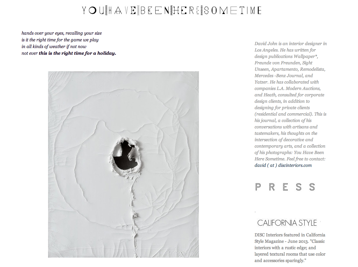
David John / You Have Been Here Sometime

A visual masterpiece in blogging in my opinion, David writes from the heart and with a sensitive eye on detail in design from past to present.

Screen-Shot-2014-01-01-at-10.14.42-AM.png

Carl J Dellatore / cjdellatore.com

Thank you for writing about my design work this year and your friendship means the world to me.  But it’s the thoughtful and enlightening things you write about design and your introduction to Carl Lana and Anthony Costa that I am so grateful for.

Screen-Shot-2014-01-01-at-10.21.17-AM.png

Erin Hazelton / The People I Like

Another great year for us and our travels throughout Switzerland, France and Italy I will never forget, nor working together on yet another Interior Design project!  Her blog is a personal look into the lives of the most fashionable including her own.  Can’t wait for you to get back to New York!

Screen-Shot-2014-01-01-at-10.23.26-AM.png

Caroline Mattar and Margot Weller of Knoll / Knoll.com/shop/inspiration

Caroline for the introduction and Margot for including me in the new Knoll.com and personal inspirations feature on their beautifully redesigned website.

Patrick J Hamilton / Ask PatrickOne of the nicest, most talented guys I have met in my career and someone everyone should have the good fortune of meeting.

Patrick J Hamilton / Ask Patrick

One of the nicest, most talented guys I have met in my career and someone everyone should have the good fortune of meeting.

Screen-Shot-2014-01-01-at-10.36.08-AM.png

MAARTEN BAAS CARPENTERS WORKSHOP GALLERY DESIGN MIAMI by Andy Goldsborough

Screen-Shot-2013-12-13-at-11.39.50-AM.png

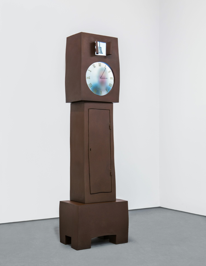
Design Miami was sensational this year and every gallery present pulled out all the stops to make their exhibition spaces spectacular and compelling.  There was so much thought put into the spaces themselves and the design innovation and craftsmanship was of an extraordinary level but one designer took top prize in my opinion for creating two functional objects that were so poetic I was speechless.  I’ve admired Maarten Baas‘ work for many years and purchased one of his burnt Argyle Chairs from 2005 for a client from MOSS in Soho in the past, but this year he created two clocks for Carpenters Workshop Gallery, a grandfather (in corten steel) and grandmother (in brass) that truly resonated with me. Expanding on the idea of a grandfather clock, he created his and hers versions with live characters inside the faces of these beautiful towers.  Filming two actors in real time with digital equipment, Bass filmed them carefully writing the numbers by hand with a black marker denoting all 24 hours in the day and wiping away the drawings as the minutes pass by underneath a hazy etched glass face.

Grandfather Clock, 2013, corten steel and digital equipment, h90.5 l 25.5 w16.5 in limited edition of 8 + 4 ap

Grandfather Clock, 2013, corten steel and digital equipment, h90.5 l 25.5 w16.5 in limited edition of 8 + 4 ap

Screen-Shot-2013-12-13-at-12.03.29-PM.png
Detail of grandfather clock in cor-ten steel

Detail of grandfather clock in cor-ten steel

Grandmother Clock, 2013, brass and digital equipment h78.7 l 28.4 w15.4 in limited edition of 8 + 4 ap

Grandmother Clock, 2013, brass and digital equipment h78.7 l 28.4 w15.4 in
limited edition of 8 + 4 ap

Detail of grandmother clock

Detail of grandmother clock

Continuing his exploration of sculpted forms Baas welded a COR-TEN steel grandfather clock and a patinaed brass grandmother clock.  The Roman numerals on the face of the grandfather clock give it a stately presence while the softer numerals and curved shape of the tower give the grandmother clock a more sensual form.  I took many images of both clocks watching carefully as the actor and actress hand drew the numbers and gently erased time and gazed at both pieces almost in a trance.  Until the crowds grew larger and I gave others a chance to discover these fascinating pieces.  Following are my images in sequence of both clocks evolution of time.

20131206_123531_resized.jpg
20131206_123530_resized.jpg
20131206_123528_resized.jpg
20131206_123524_resized.jpg
20131206_123518_resized.jpg
20131206_123516_resized.jpg
20131206_123513_resized_1.jpg
20131206_123512_resized_1.jpg

Sometimes form and function come together in very original ways and I think these pieces by Maarten Baas do just that!

Thank you so much to Marie Duffour and Carpenters Workshop for sharing these images with me and The Gilded Owl.

www.maartenbass.com

www.carpentersworkshopgallery.com

www.designmiami.com

www.mosspop.com

HECHIZOOJORGE LIZARAZO by Andy Goldsborough

hechizoo-11-de-septiembre-de-2013395910-r.jpg

Last week I was invited by my friend Cristina Grajales to preview the work of Jorge Lizarazoand his textile company Hechizoo before his second show opened Thursday night.  I was very familiar with his work and have been following him for several years since Cristina introduced me to his extraordinary carpets and sculptures intricately woven of metallic fibers.  But his new show Voyages/Explorations focuses on his love of nature combined with the most detailed embroidery taking weaving to an entirely new dimension.  Also featured is a wall hanging made of horn that gradates from darker to lighter translucent pieces from end to end.  As well as ottomans of varying sizes and incredible sculptures using rubber tubing from tires and a canoe floating in the gallery that is completely covered in the tiniest glass beads evoking all of the colors of the sea.  I tend to gravitate towards surfaces that have a sheen or reflective quality in my work and Jorge uses copper, aluminum and gold as well as every other color in the rainbow in combination with natural materials from Columbia to create pure magic.


Detail of caribbean rain carpet, embroidered aluminum and colored copper wire

Detail of caribbean rain carpet, embroidered aluminum and colored copper wire

Horn wall hanging in varying tranlucency

Horn wall hanging in varying tranlucency

Luiz in the atelier with woun, wouna & chanco ottomans made of tubing and copper, aluminum and black colored copper wire

Luiz in the atelier with woun, wouna & chanco ottomans made of tubing and copper, aluminum and black colored copper wire

Hand cutting and etching the leaves in copper, aluminum and gold plated metal

Hand cutting and etching the leaves in copper, aluminum and gold plated metal

Gallery installation of copper, aluminum and gold plated metal leaves etched on both sides. a collaboration with a master craftsman

Gallery installation of copper, aluminum and gold plated metal leaves etched on both sides. a collaboration with a master craftsman

Jorge Lizarazo was born in 1968 and studied architecture at Los Andes University.  He then moved to France and worked in the offices of both Santiago Calatrava and Massimiliano Fuksas gaining a masterful knowledge of modern architecture and new technology in construction methods that would have a profound influence on his future work.  Being exposed to the uses of technology and materials in both architecture offices combined with his love of nature Lizarazo set out to redefine what could be done with weaving techniques.  Part of the appeal of this extraordinary self taught weaver is his ability to use materials that would not typically be perceived as textile-friendly and making them have such a tactile and three dimensional quality.  He founded his weaving atelier in 2000 and has achieved incredible success in a short time with his staff of Jorge’s work is already in the permanent collections of the Museum of Art and Design and the Cooper Hewitt National Design Museum.

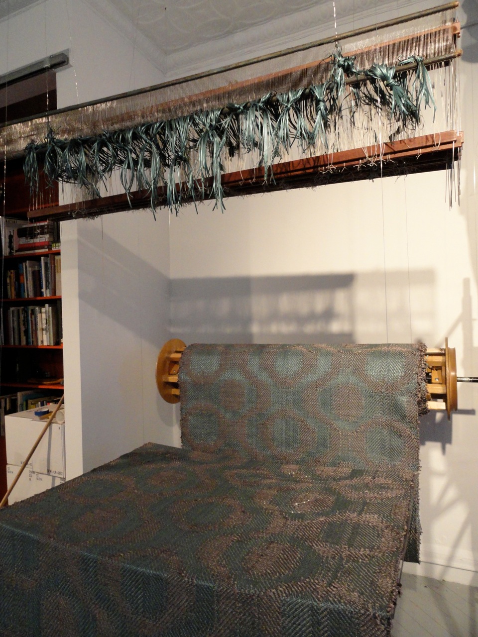
One of the looms installed in the gallery to show the weaving technique

One of the looms installed in the gallery to show the weaving technique

Detail of textile pattern

Detail of textile pattern

Walking jade carpet in nylon monofilament and colored metal

Walking jade carpet in nylon monofilament and colored metal

Detail of walking jade carpet

Detail of walking jade carpet

The title of the show Voyages/Expeditions stems from Lizarazo’s interest in the indigenous communities in the south of Columbia, an area known as Putumayo.  This region has a great biological diversity and is home to many ancestral cultures and the new work follows his quest to understand forgotten crafts and traditions associated with these territories.  On one of his travels to this area, Jorge acquired a canoe which was previously used to transport coca leaves on the Putumayo river. Indians and Campesinos who plant Coca (the sole crop that gets a decent price on those remote and isolated areas) are the weakest link in the drug trade, a booming industry fueled by consumption in First-world countries which has had devastating effects in terms of deforestation of the jungle, violence and the breaking up of whole communities.  Jorge worked with the Inga family from this region to completely render the canoe covered in glass beads with an intricate and colorful geometric pattern.  Underneath the canoe is a twenty foot by ten foot wide carpet inspired by the Moreira Salles Institute in Rio de Janeiro by architect Olavo Redig and features a large yarumo tree.  When this beautiful tree sheds it’s leaves they are silvery gray in color and Jorge captured this with aluminum seen through the architectural window wall of this landmark residence.  More than eight master craftsman assembled this enormous embroidered masterpiece with each window alternating natural fibers of woven cumare and fique.

Canoe covered in glass beads in a geometric pattern

Canoe covered in glass beads in a geometric pattern

Detail of canoe with carpet below

Detail of canoe with carpet below

Detail of moreira salles inspired carpet, aluminum embroidery, cumare and fique

Detail of moreira salles inspired carpet, aluminum embroidery, cumare and fique

Yarumo leaf detail

Yarumo leaf detail

Detail of Moreira Salles House

Detail of Moreira Salles House

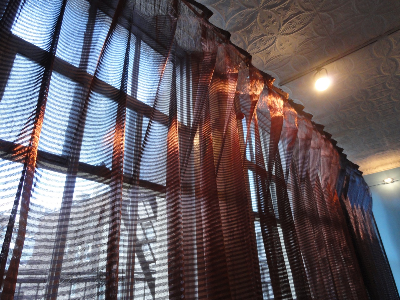
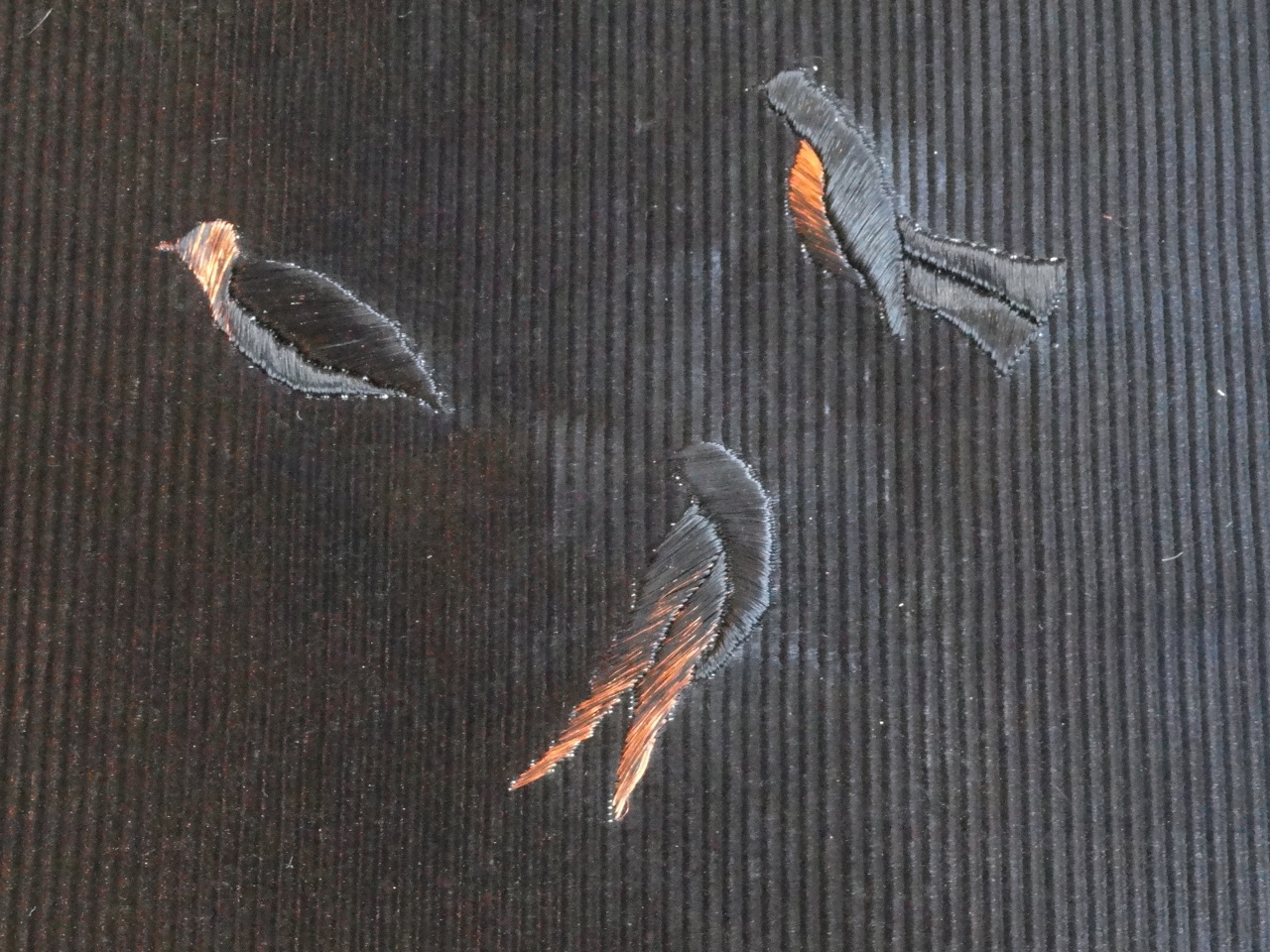
When you enter the gallery there is woven copper drapery panel that extends the width of the space with varying degrees of open and more dense areas hanging from the most beautiful custom copper hardware.  Lying beneath is a black copper and copper carpet with birds embroidered in flight and beyond an undulating sculpture inspired by the rubber trees native to Columbia.  The sculpture is lit from below capturing the handmade work of this incredible factory and it must be seen in person to experience fully and understand the labor and skill involved in the creation of such masterful hands.  Hechizoo Voyages/Explorations is on view at Cristina Grajales Gallery until January 31st, don’t miss this extraordinary show.

Custom woven copper drapery panel

Custom woven copper drapery panel

Detail of copper drapery and hardware

Detail of copper drapery and hardware

Carpet of black copper and natural copper with embroidered birds

Carpet of black copper and natural copper with embroidered birds

Creating the rubber sculpture covered in copper wire

Creating the rubber sculpture covered in copper wire

A completed section of the rubber and copper wire tree sculpture

A completed section of the rubber and copper wire tree sculpture

Jorge Lizarazo

Jorge Lizarazo

FROMENTAL by Andy Goldsborough

Goldsborough-Doro.jpg

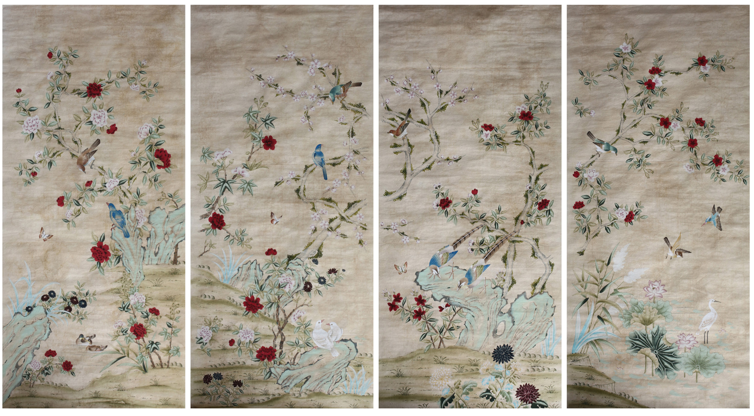
I first discovered Fromental in 2006 when I was working on a house in Alabama and wanted something special and unusual for a powder room.  We were looking at different plaster finishes and hand troweled surfaces but once we saw the intricately embroidered wallpaper called Peace Blossom from Fromental we were sold.  I was in the George Smith showroom and thought that I had exhausted all the wallpaper lines trying to find something that was both beautifully crafted and had an Eastern influence but needed to be decidedly modern for this particular installation.  The wallpaper worked perfectly and gave the space a different dimension and depth with the embroidered blossoms floating on a hand painted tree that was custom designed to wrap the bath.  I’ve been a fan ever since and had the opportunity to meet with Tim Butcher, who founded the company with his partner Lizzie Deshayes and Melissa Mittag, the US director of Sales and Marketing in my office recently to see the new collection.  Following is a preview of some of the exquisite new designs.

Brock hand painted and layered wallpaper by Fromental

Brock hand painted and layered wallpaper by Fromental

Fantasy marble hand painted wallpaper by Fromental

Fantasy marble hand painted wallpaper by Fromental

Borgeas hand painted on silk by Fromental

Borgeas hand painted on silk by Fromental

Fromental was founded in 2005 by Tim Butcher and Lizzie Deshayes.  Tim spent a couple of years in tailoring, producing silks for designers including Paul SmithTimothy EverestDuchamp and Ralph Lauren after graduating in textile design as a weaver.  During his seven years as Creative Director at chinoiserie house de Gournay, his creative focus was as much on the technology and process as the visuals of design.  He established new production abilities and launched a fabric and fashion business for the wallpaper house, including collaborations with Matthew WilliamsonOscar de la Renta and Christina Kim (dosa).  Butcher’s focus began to shift from fashion to interiors and he worked with several leading players in the London interior design scene creating unique custom installations for many private and public spaces.  Lizzie also studied textile design and began her career creating prints for silk neckwear prior to becoming a personal designer for Anthony Little of Osborne and Little.  Deshayes then ventured into freelance work as a decorative artist for de Gournay, Fortnum and Mason, dosa, handbag designer Alessandra Ferreira and Clarence House.  Together with Butcher, she established the handmade interiors house Fromental primarily working as the Design Director displaying strong draughtsmanship skills which often help complete the complex installations of their stunning wallpapers.  Butcher serves as the company’s Creative Director as the company has gone from strength to strength continually breaking boundaries in the field of bespoke wallpaper design.  Below is inspiration and a larger sample panel of Doro, one of my favorite new patterns inspired by a bed designed by Osvaldo Borsani and Arnaldo Pomodoro in 1960 for Tecno.  The bed images were taken from a recent auction at Wright in Chicago and the drawings intricately capture the sheen of the brass frame and the multicolored fire enameled brass onto hand painted silk.

Osvaldo Borsani and Arnaldo Pomodoro bed design, 1960 from a recent wright auction in Chicago

Osvaldo Borsani and Arnaldo Pomodoro bed design, 1960 from a recent wright auction in Chicago

Osvaldo Borsani and Arnaldo Pomodoro bed detail

Osvaldo Borsani and Arnaldo Pomodoro bed detail

Original image from L’arredamento Moderno, settima serie, aloi courtesy of wright auctions in Chicago

Original image from L’arredamento Moderno, settima serie, aloi courtesy of wright auctions in Chicago

Doro hand painted silk panel by Fromental

Doro hand painted silk panel by Fromental

Doro installation at Dragonette in Los Angeles for design week

Doro installation at Dragonette in Los Angeles for design week

In addition to these incredible new designs that bridge traditional and modern design, Fromental is also introducing two new hand painted patterns Lalo and Marquise both inspired by Lalique crystal.  Lalo feels like bubbles floating in space and form stunning new patterns with their fluid composition and Marquise, a faceted crystal rays shine on fields of ebony, silver and champagne colored silk with delicate ivory and gold.  I caught up with Tim Butcher and asked more about the genesis of these two sparkling new compositions.  “Marquise is inspired by cut glass door panels from the 20’s, Lizzie and I developed the sketch for Lalo some time ago as just recently it feels its time had come. In fact the original swept curve and texture came from a detail of a cast bronze sculpture. The original was deep brown with bright green verdigris. A colourway that will be included as we roll out the design.”

Lalo drawing by Fromental

Lalo drawing by Fromental

Lalo colorways by Fromental

Lalo colorways by Fromental

Lalo installation at Dragonette in Los Angeles for design week

Lalo installation at Dragonette in Los Angeles for design week

Marquise colorways by Fromental

Marquise colorways by Fromental

Fromental is also expanding their Chinoiserie line and experimenting with embossing and gold highlighted relief patterns with birds and florals.  There is a breathtaking embroidered pattern of pampas grass blowing in dunes that I hope to use in an upcoming project.  The colors are so soft and still have the hand painted feeling of some of their most delicate designs but the gold embroidered fronds of grass have the same timeless appeal of the Chinese influenced works.

Embroidered and hand painted pampas grass by Fromental

Embroidered and hand painted pampas grass by Fromental

Antique chinoiserie by Fromental

Antique chinoiserie by Fromental

Mishima embossed detail by Fromental

Mishima embossed detail by Fromental

KNOLL / OLIVARES CHAIR by Andy Goldsborough

4389.jpg

Every once in a while a chair comes along that is destined to become a classic and Jonathan Olivares’ new indoor/outdoor chair for Knoll is just that!  Although the end result is an ergonomic and organic streamlined chair that looks quite simple, the process and research that went into creating the piece required meticulous exploration and innovation. After nearly four years of development and experiments with hydro-forming, stamping and multiple means of manipulating metal Olivares’ studio was able to cast the chair out of a single piece of sculpted aluminum.  Working in die cast aluminum enabled the seat portion of the chair to be as slim and elegant as possible.  My personal interest in the design of the chair stems from finding out that Olivares’ inspiration for the design, weight and visual lightness came from three of furniture’s great chair design masters Harry Bertoia and the team of Marco Zanuso and Richard Sapper.  Bertoia’s wire chairs are now iconic in Knoll’s collection and Marco Zanuso and Richard Sapper designed the square faceted counterpart to Olivares’ rounded form in their handsome Lambda chair of which I am the proud owner.  The chair is part of both the Vitra Design Museum and MoMA’s permanent design collections.  Designed in 1959 this chair places high in my personal collection and the construction of the aluminum shell seat and connection to the legs is very similar to the further developments Olivares’ studio made to his new design for Knoll.

INSP_Olivares_9.jpg
Marco Zanuso and Richard Sapper lambda chair from my collection

Marco Zanuso and Richard Sapper lambda chair from my collection

Prototype models of the Olivares chair in development

Prototype models of the Olivares chair in development

INSP_Olivares_3.jpg

Prior to designing the new chair, Olivares researched the design, evolution and function of chairs in his book A Taxonomy of Office Chairs published in 2011.  The book is a thoughtful and astute look at the way we live with chairs and posed the questions that made him strive to design the perfect indoor/outdoor chair for today.  Weight was a critical concern and the Olivares’ chair clocks in at just under 15 lbs. making it not too heavy and but just heavy enough for both applications.  The way that the chair legs in extruded aluminum connect to the wavy seat is almost seamless and beautifully crafted.  Knoll’s design team and engineering experts partnering with Olivares’ studio have launched a chair that is both visually arresting, comfortable but certainly packs a powerful punch with color!

a-taxonomy-office-chairs-1.jpg
Pages from a Taxonomy of office chairs studying chair bases in wood, aluminum and plastic from 1885-1984.

Pages from a Taxonomy of office chairs studying chair bases in wood, aluminum and plastic from 1885-1984.

Pop colors of the Olivares chair

Pop colors of the Olivares chair

Jonathan-Olivares-Aluminum-Chair-Knoll-21.png
Jonathan-Olivares-Aluminum-Chair-Knoll-31.png
Jonathan-Olivares-Aluminum-Chair-Knoll-41.png

David Hockney’s paintings as well as Italian futurist artist Ennio Morlotti’s works inspired the color palette Benjamin Pardo helped develop.  They are vibrant, explosive colors that truly feel like light shooting through a prism as well as black, white and grey.  The chair can also be painted in a two tone finish with interior shell and outer portion of varying tones.  And finally because the chair is meant for both indoor and outdoor use the single hole placed in the center of the seat breaks up the surface of the chair and functionally allows for drainage.  But most importantly, it shows the thin gauge of the elegantly cast aluminum and how much time went into getting it “just right”!

Jonathan-Olivares-Aluminum-Chair-Knoll-51.png
Detail of underside of seat with Knoll stamp

Detail of underside of seat with Knoll stamp

Thank you to Caroline Mattar and Ryan Jacobs at Knoll!

www.knoll.com

www.jonathanolivares.com

GIO PONTI VIVERE ALLA PONTI by Andy Goldsborough

D.153.1-Armchair.png

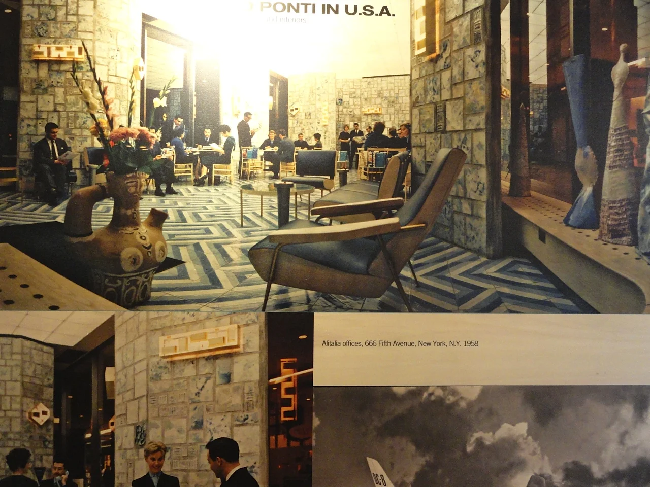
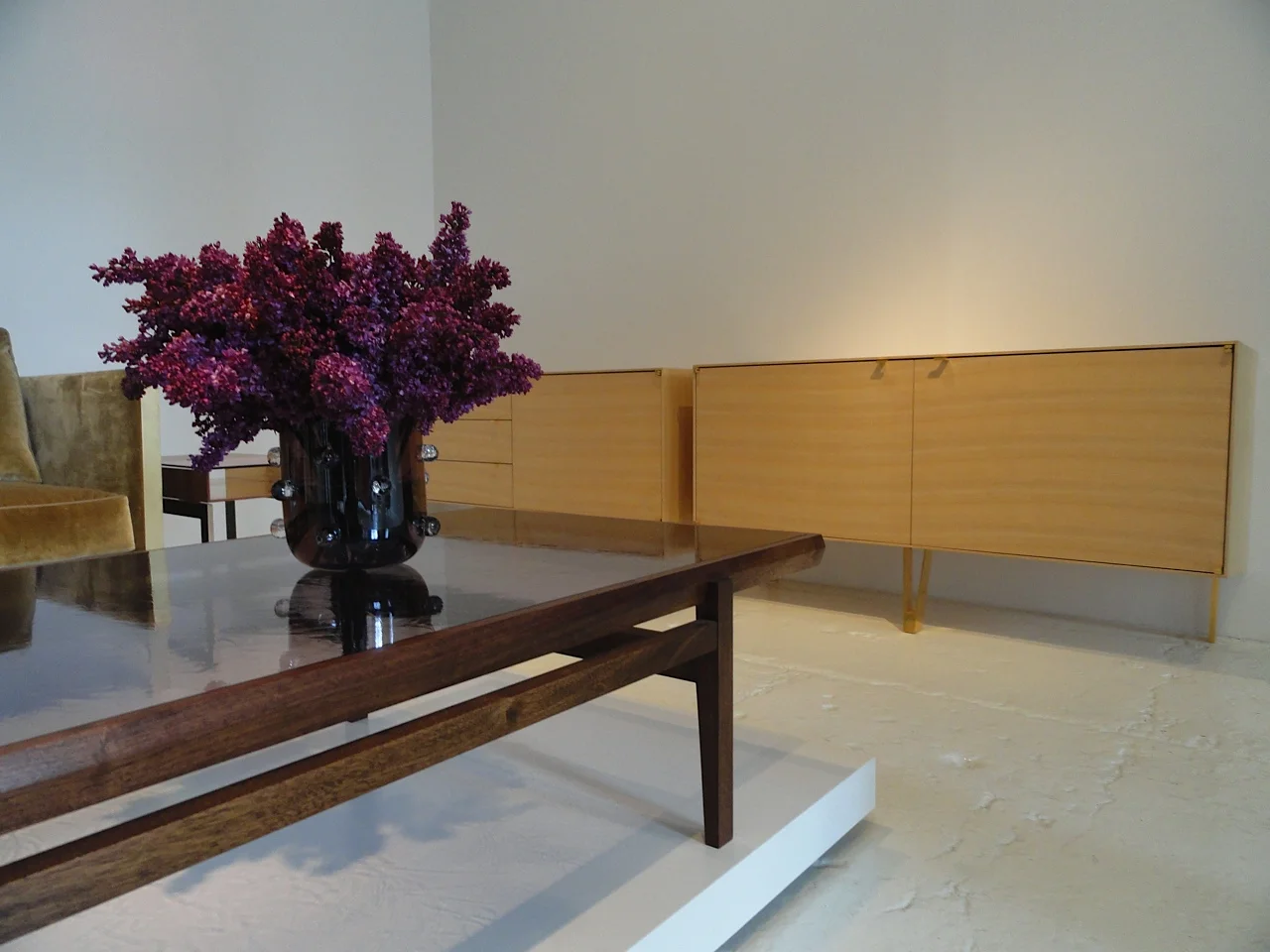
Recently the Italian Cultural Institute of New York exhibited the houses inhabited by Gio Ponti and the furniture he designed out of experiments in domestic life and architecture for both working and living.  As a collector of Gio Ponti’s furniture, fabrics and over twenty five books on his architecture and design, I can truly say he is one of the main sources of inspiration in my work.  Last year on a trip to Milan I had the good fortune of meeting his grandson Salvatore Licitra at Ponti’s studio on via Dezza.  After being buzzed into the gate in the same building where Ponti lived, Salvatore shared with me more of Ponti’s work and archive and it was one of the most thrilling experiences I have ever had.  To be in the space he worked in with the irregular geometric multi-colored marble floor and see some of his furnishings and drafting tables all preserved immaculately was really quite surreal.  So when I heard last year that Molteni&C were working with the Ponti family and archives to reissue 6 pieces this year in Milan I was more than excited and the first in line to see the newly produced work.  Following is an excerpt from the show at the Italian Cultural Institute and the reasoning behind why this collection is so relevant now, almost sixty years later.

utf-8DSC08053.jpg
utf-8DSC08045.jpg
Gio Ponti with his family at home

Gio Ponti with his family at home

“Living alla Ponti was born from an impossible encounter with Gio Ponti:  the architect, the man that we would have liked to interview, look into his eyes, and see at work.  This encounter took place thanks to Lisa, Letizia, Giulio, Salvatore and Paolo, his children and grandchildren and nieces and nephews but also through drawings, photographs, family albums, letters, and words that Gio Ponti scattered in over 50 year of work.  He bears witness to his time, aware the worth of his work.  The reason for this encounter was the reissue of Gio Ponti’s furnishings which Molteni&C started two years ago.  This piqued curiosity about reconstructing the historical and cultural setting where those furnishings were born, understanding the professional needs and the technical solutions, interviewing the collaborators, and writing the history of the design with the evidence, traces and clues found in the Gio Ponti Archives and CSAC – Study Centre and Communication Archive in Parma.  Some of these many documents appear in this small traveling exhibition.”

IMG_20130524_141929-e1371412416865.jpg
The Gio Ponti collection for Molteni displayed at the Italian Cultural Institute

The Gio Ponti collection for Molteni displayed at the Italian Cultural Institute

This research approach revealed an unknown Ponti, a more intimate, less official one.  Inside his homes, the Milanese homes of the Ponti family on Via Randaccio, via Brin, and then via Dezza, but even inside the Ponti Studio among drafting tables and editors of Domus and friends like Bruno Munari who measured the floor with a yardstick, we collected threads of history.  Then we made a trip to the country house in Civate, along with architects Figini and Pollini and family.  We gathered fragments of life, and rewove the threads of stories.  Finally, we concluded with his first designs for the workplace, among the desks of the Montecatini Building, the better known Pirelli offices, and in the company of the young ladies of the 1950’s at the Vembi-Burroughs company.  These places were thought out for the people who live them, for the happiness of children, the comfort of office workers, and the efficiency of work.  These are places where architecture, interiors, and furnishings harmoniously come together, designed to Live all Ponti.”

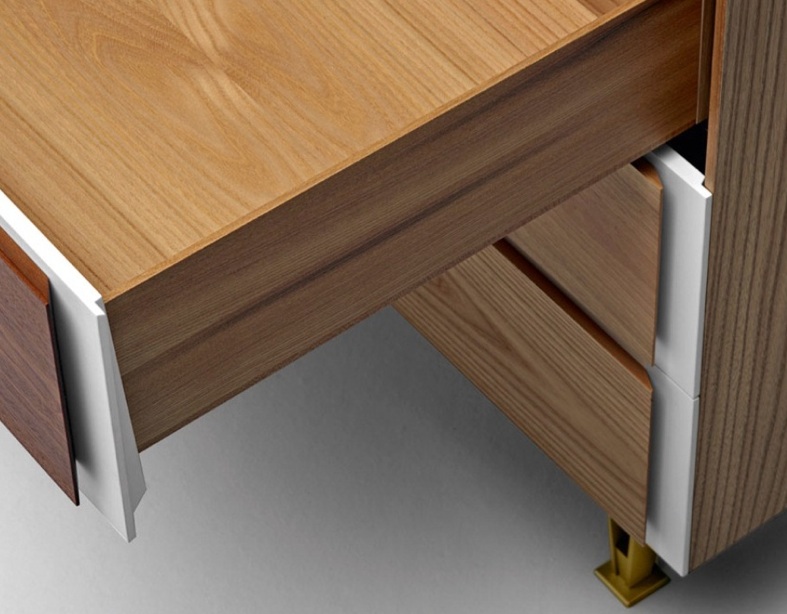
Molteni&C d.655.1 chest of drawers by Gio Ponti 1952-1955

Molteni&C d.655.1 chest of drawers by Gio Ponti 1952-1955

Detail of chest in elm and mahogany woods and white lacquer with brass feet

Detail of chest in elm and mahogany woods and white lacquer with brass feet

utf-8DSC08044.jpg
Original drawings of the chest of drawers and details of the materials used

Original drawings of the chest of drawers and details of the materials used

The new Molteni&C collection consists of seven pieces designed by Gio Ponti between 1935 and 1955.  The oldest piece in the collection is the Montecatini chair designed for the rst. Palazzo Montecatini in Milan in 1935.  Made entirely of polished aluminum the structure seat and back of the chair fabricated in extruded folded aluminum and the glossy finish created by mechanical brushing and polishing.  There are two sizes of the chest of drawers originally executed from 1952-1955 in different variations featuring applied wooden handles in elm, Italian walnut, mahogany and rosewood over a white lacquer wooden frame with satin brass splayed feet, one of Pont’s design trademarks.  The bookcase was originally designed for the Casa Ponti on via Dezza in 1956-1957 and is made of multi-layer elm wood and white lacquered wood.  The pony skin rug, designed in 1954 is made up of several different cattle hide pony skin colors with a linen blend under layer.  The coffee table made of painted metal in red, black, gray and white with a clear crystal top was also designed in 1954-1955 again for Ponti’s house in via Dezza.  The armchair designed in 1953 comes in a blue and white leather combination with satin brass legs and armrests as well as a limited edition version in a reintroduced velvet by Rubelli.  And lastly there are a series of mirrored frames designed in 1954 in white hand painted wood.

Polished aluminum Montecatini chair

Polished aluminum Montecatini chair

Bookcase designed in 1956-1957 in elm and white lacquer

Bookcase designed in 1956-1957 in elm and white lacquer

Pony skin rug in black, two natural shades and white designed in 1954

Pony skin rug in black, two natural shades and white designed in 1954

Ponti reclining in the armchair at home

Ponti reclining in the armchair at home

The collection is now available at Molteni&C www.molteni.it

KHOURI GUZMAN BUNCE LIMITED by Andy Goldsborough

utf-8DSC07789.jpg

Rarely does furniture design strike me as so beautiful and the details so thoughtful that I’m jealous I didn’t think of it myself.  As a contant seeker of the best new design I am always looking for innovative ways of thinking but what usually grabs my attention is design that takes the best cues from past masters and pushes it into the future.  That’s exactly how I feel about KGB Limited, the stunning showroom in Chelsea combining the talents of architects David Khouri and Roberto Guzman with Christiaan Bunce’s furniture and art expertise.

Khouri Guzman Bunce Gallery in Chelsea with Duran coffee table and Mayweather sofa in foreground

Khouri Guzman Bunce Gallery in Chelsea with Duran coffee table and Mayweather sofa in foreground

Detail of Duran coffee table combining silicon bronze and rippling pyrex glass

Detail of Duran coffee table combining silicon bronze and rippling pyrex glass

I met David Khouri and Roberto Guzman over 15 years ago and always admired their architecture knowledge and expertise with materials.  David and Roberto both hold Bachelor and Master degrees from Columbia in architecture and founded Comma in 1998.  Their architecture work has been widely published in the US, Europe and Japan.  Christiaan Bunce studied Fine Arts at the University of Washington and founded Girth Design in 1999 focusing on furniture design.  He expanded the business in 2004 to include interior design as well.  Christiaan has also taught sculpture and furniture design at Pratt since 2001.  In 2010 they joined forces and created the stellar furniture design company Khouri Guzman Bunce Limited in a beautiful sparklingly white gallery space in Chelsea on West 25th Street.  The floor gleams with I don’t know how many coats of an epoxy white resin, but I’ll say with a couple more you’ll probably be able to see your reflection and the details on the bases of the exquisite furniture designs on display.

Famechon sofa in mustard yellow leather and Zaragosa coffee table combining calacatta marble and walnut with box joint detail

Famechon sofa in mustard yellow leather and Zaragosa coffee table combining calacatta marble and walnut with box joint detail

Baer table

Baer table

Baer table silicon bronze hairpin leg detail

Baer table silicon bronze hairpin leg detail

Baer table top detail combining bronze and solid lengths of rift cut fumed oak, marquetry of a different kind

Baer table top detail combining bronze and solid lengths of rift cut fumed oak, marquetry of a different kind

In addition to the details of some of the pieces like the Gavilan barstool and Duran and Frazier tables -with their flush mount screws connecting elegant, slender warm silicon bronze legs together in such a beautiful way- there is in integrity and timelessness to the materials used in every piece they design.  Sure, I see Italian masters Gio Ponti, Ico and Luisa Parisi as well as American sculptor Scott Burton as influence in some of these designs but they’ve inspired them in ways that are so new and details that make you want to touch every material and investigate the thoughtful assemblage of these pieces further.  The upholstered pieces that have already become new classics in my mind, like the Mayweather and Famechon sofas, Mancini chair bring jolts of color and texture to the tables and cabinets on display.  They’ve even collaborated with a textile designer who created a fabric out of moult peacock feathers and rayon giving the seat to the gravity- defying Mancini bench an other worldly iridescence and elegance.


Gavilan barstool

Gavilan barstool

Gavilan barstool seat detail of silicon bronze, walnut and tangerine leather seat

Gavilan barstool seat detail of silicon bronze, walnut and tangerine leather seat

Precision captured in the Gavilan barstool base in silicon bronze and walnut

Precision captured in the Gavilan barstool base in silicon bronze and walnut

Maxim bench in walnut, silicon bronze and peacock upholstery

Maxim bench in walnut, silicon bronze and peacock upholstery

Detail of peacock upholstery on maxim bench

Detail of peacock upholstery on maxim bench

Felix bench hewn from a single slab of statuary marble

Felix bench hewn from a single slab of statuary marble

As a professor of an advanced materials and finishes course at Parsons for many years I strive to think about the uses of materials and the properties that make them perfect for certain applications in interior design and custom furniture design.  Khouri Guzman Bunce combines marble, wood and metal in delicate but sensual ways that take detail to another level.  The Demarco dining table and side tables accomplish what I’ve always wanted to design myself, a pedestal table that is both sculptural and is an alternative to the eponymous Saarinen dining table combining form + function.  And the blackened steel base of the Overlin sofa table supporting the curvy block of statuary marble also elicits the same visual harmony to my eye.  Combining Japanese Sen wood and silicon bronze the Saxton cabinets and side table float above the ground with a center leg and two back legs and the Johansson cabinet juxtaposes exotic walnut burl with lacquered aluminum in a piercing green with milled copper pulls of linear precision.

Demarco dining table combining statuary and nero marquina marbles

Demarco dining table combining statuary and nero marquina marbles

Saxton cabinets with Pintor coffee table in foreground

Saxton cabinets with Pintor coffee table in foreground

Saxton cabinet detail

Saxton cabinet detail

There is a mastery of materials that these pieces have captured and will continue to be at the top of my list for future projects when clients are looking for timeless design and auction worthy furniture of tomorrow and beyond.  Thanks so much to David Khouri and Roberto Guzman for sharing your exquisite designs with The Gilded Owl and to Ford Lininger for making it happen.

Khouri Guzman Bunce is located at 555 West 25th Street, 2nd Floor New York, NY 10001

www.kgb-limited.com

Downloadable PDF catalog

All photos by Andy Goldsborough

Armstrong bronze frame armchair and booker side table in quartered east indian rosewood and cast colored italian glass. both new to the collection.

Armstrong bronze frame armchair and booker side table in quartered east indian rosewood and cast colored italian glass. both new to the collection.

ALBERTO BIAGETTI by Andy Goldsborough

groupage_1.jpeg

I’ve always been fascinated by the 80’s Memphis design and architecture group founded by Ettore Sottsass in 1981.  The name was taken from a Bob Dylan song “Stuck Inside of Mobile with the Memphis Blues Again” and was inspired by Art DecoPop Art and 50’s futuristic design.  The group fabricated and exhibited furniture and objects annually from 1981 until 1988 and their debut at the Salone del Mobile in Milan drew great acclaim.  The stellar group that Sottsass assembled were designers and architects Alessandro MendiniAndrea BranziMichele de LucchiNathalie du PasquierMichael GravesHans Hollein, , Arata IsozakiShiro KuramataMatteo ThunJavier Mariscal, journalist Barbara Radice and continuing the movement today Alberto Biagetti.

1984 Memphis group poster for exhibition

1984 Memphis group poster for exhibition

Alberto Biagetti was born in Santarcangelo di Romagna, Italy in 1971 and now lives and works in Milan.  He opened his Atelier in 2003 with the idea of creating an aesthetic factory that deals with fashion, art, design and architecture without distinction, creating a bridge between established forms of expression and new digital ones.  His work is the result of multiple inventions that end up being furniture objects, interiors, paintings, virtual dresses and installations in galleries and private collections.  Biagetti connects the real and virtual world, from excellent artisanship (collections designed for Venini) to the art direction of some of the most important websites (Yoox.com).  In addition he has worked with the Memphis – Post Design, DeVecchi and Zerodisegno.  His works have been exhibited in galleries including the Maraconi Gallery, Hangar BicoccaCartiere Vannucci and together with Antonio Colombo Arte Contemporanea.  In 2011, he presented a collection of unique pieces called “Diamonds” for the exhibit Mineralogy.

Treasure chest hand painted with acrylics. electronic opening device with wooden key from diamonds collection 2011

Treasure chest hand painted with acrylics. electronic opening device with wooden key from diamonds collection 2011

Post Design is the brand name under which Memphis S.r.l produces its new collections.  Post Design showcased Sottsass’ most recent works and the collections of international designers such as Johanna Grawunder, Pierre Charpin, Denis Santachiara, Nathalie Du Pasquier, George J. Sowden, Nanda Vigo, Alessandro Mendini and Ron Arad.  Post Design is also the name of the Milanese gallery that exhibits Memphis’ productions and following are highlights and descriptions of Alberto Biagetti’s beautifully crafted 2012 works.

The sky group features digital print sky as seen from above the studio in Milan with opaque brass bases and ultra white low iron glass

The sky group features digital print sky as seen from above the studio in Milan with opaque brass bases and ultra white low iron glass

Sky piece detail showing high gloss red lacquer interior

Sky piece detail showing high gloss red lacquer interior

The wire seat with varnished iron base, covered with natural leather and varnish colour gradation. Available in three colour combinations

The wire seat with varnished iron base, covered with natural leather and varnish colour gradation. Available in three colour combinations

Things you need to know about Alberto Biagetti Text by Angela Rui

“In the same way nature and its purest elements are contemplated as raw materials through which the design is developed. Fundamental and inevitable as the form, earth and sky, rivers and territories (Post Design 2012), traces of the purest pigments remain on the furniture (The River Armchair) and their eloquent surfaces.

A “light” presence not because they are as light as a feather, but because they are like paintings that create their own space. Others are ethereal and act as a tool for the imagination: the Sky, photographed above his studio in Milan, enters shyly as a mark and décor upon the furniture’s surfaces (The Sky Pieces). And imagining a downward trajectory, the carpets (The Grounds) hand knotted and made in Kathmandu, photograph portions of territories as if seen from a satellite.”

The river group sofa, armchairs and ottoman made of memory-foam with leather covering and varnish colour gradation.

The river group sofa, armchairs and ottoman made of memory-foam with leather covering and varnish colour gradation.

The ground carpet the sky cabinet and the river armchair

The ground carpet the sky cabinet and the river armchair

The Ground carpet, The Sky cabinet and The River armchair

The Ground carpet, The Sky cabinet and The River armchair

The wire table with opaque brass base and wood top, sandwich panel made of multilayered canadian pine wood

The wire table with opaque brass base and wood top, sandwich panel made of multilayered canadian pine wood

Alberto Biagetti

Alberto Biagetti

Thank you to Alberto Biagetti and his Senior Assistant Iris Roth for sharing these images with The Gilded Owl.  For more information visit

http://biagetti.net/

http://www.memphis-milano.com/

CAMO + COMEBACK = TIMELESS by Andy Goldsborough

selfportraitcamoflageaw1986torsofrombehindaw1977_2.jpg

This Spring it’s hard not to notice the resurgence of camouflage and it’s enduring impact on the fashion industry.  From men’s style icon Nick Wooster to a broad spectrum of fashion designers this season – Lanvin, Dries Van Noten, Prada, Jimmy Choo and Kenzo’s Carol Lim & Humberto Leon – camoflauge is everywhere in the men’s collections and in so many inspired variations.  The graphic has become so prominent I decided to look into the history of it’s beginnings and try and decifer what makes this nature motivated pattern so hypnotic.

Lanvin camo silk bow tie at Bergdorf Goodman

Lanvin camo silk bow tie at Bergdorf Goodman

Prada camouflage sequin evening loafer at Bergdorf Goodman

Prada camouflage sequin evening loafer at Bergdorf Goodman

Jimmy Choo Sloane Men’s Calf Hair Slipper at Bergdorf Goodman

Jimmy Choo Sloane Men’s Calf Hair Slipper at Bergdorf Goodman

Introduced by the French army in the First World War in 1917, artists known as camoufleurs were employed to disguise tree observation posts and help soldiers blend into their environments.  Ship and plane camouflage soon followed in other countries and became a primary means of eluding the enemy and then finally into combat gear worn by the soldiers.  Many animals, fish, insects and other wildlife have this crypsis, or ability to avoid observation by other predators, so naturally we would use the same methods to protect ourselves.

129_001-Version-2.jpg
Britannica_Color_Chart_camo.jpg
Example of crypsis

Example of crypsis

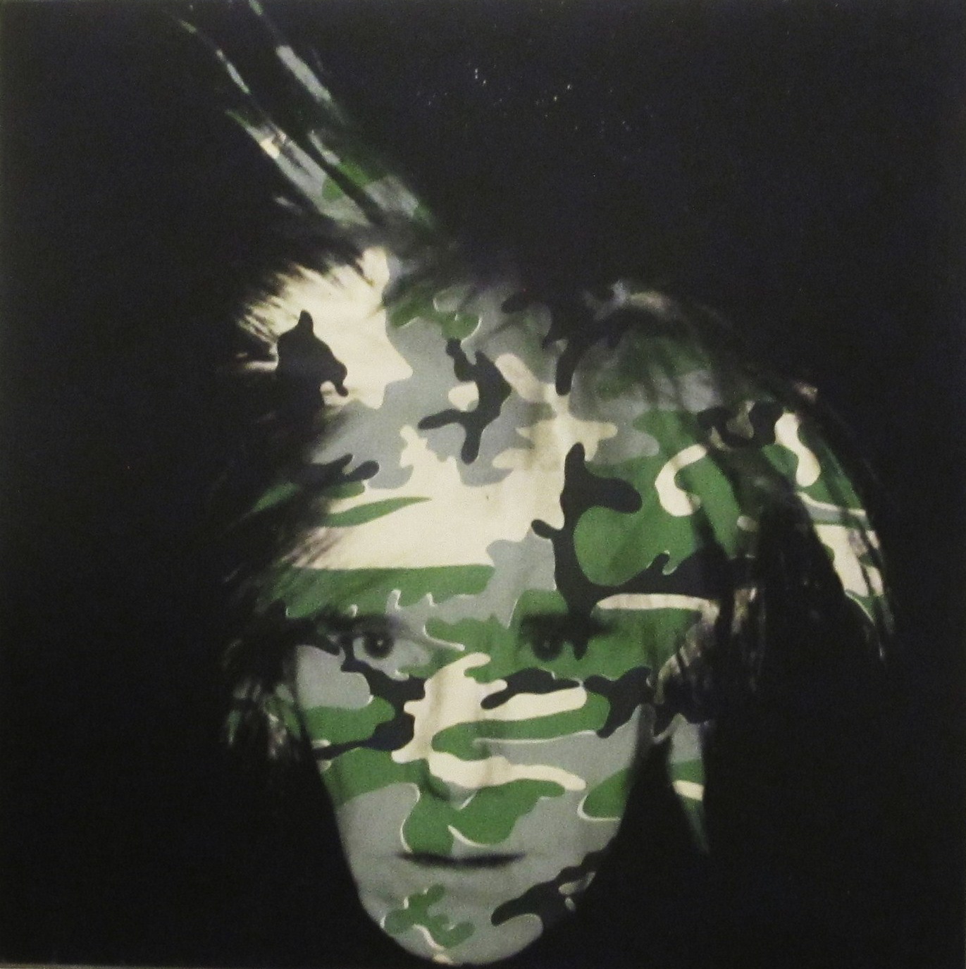
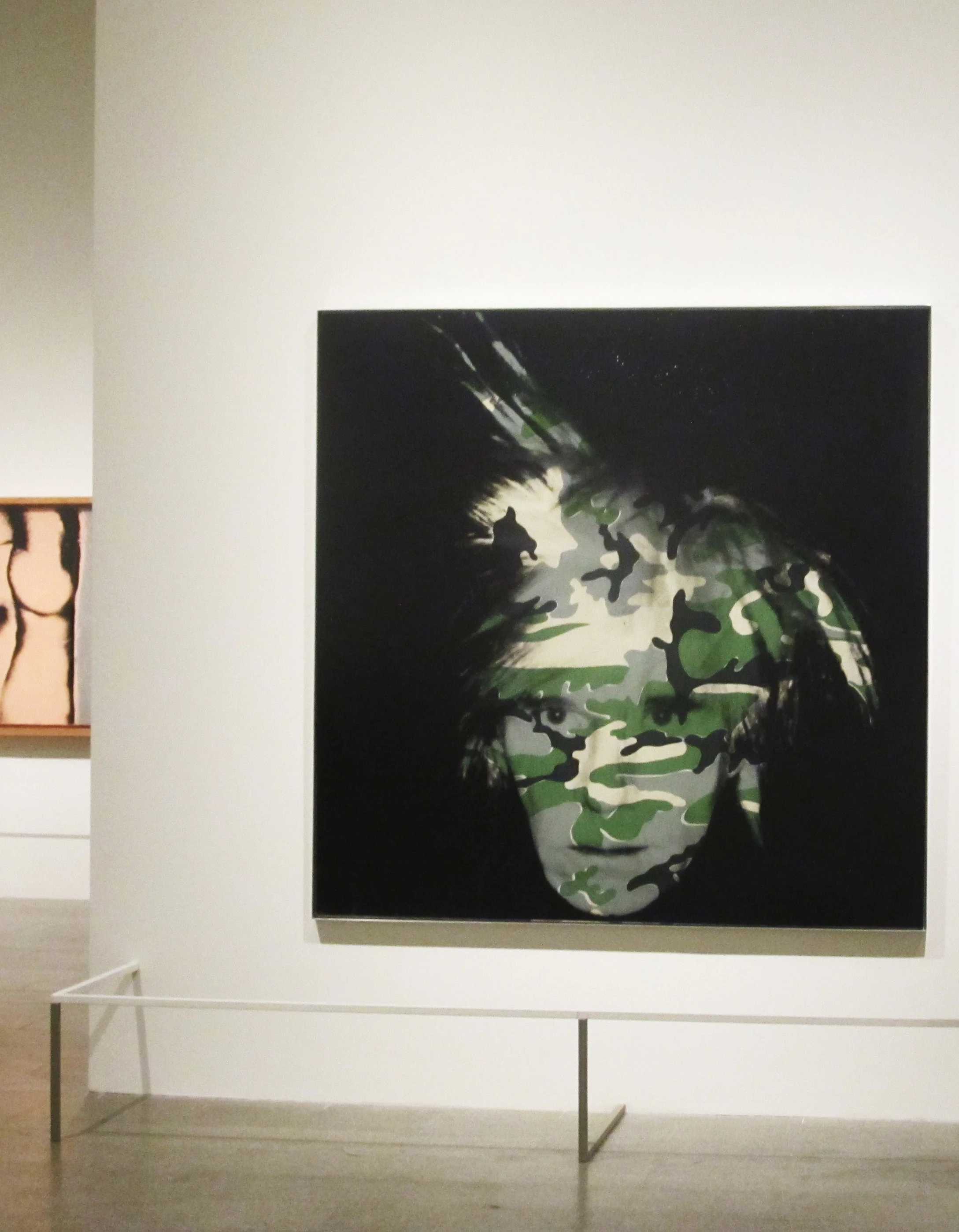
Although I’ve never been hunting in my life, except once with my father where I sat alongside he and my brother in horror and fear of what would happen to the poor creatures in the woods, I was immediately drawn to the camouflage gear and clothing.  I guess that was my first clue that I would not be following in their footsteps but pursuing a creative design path instead.  My first awareness of camouflage as an art medium was in Andy Warhol’s extensive study of multiple color variations and then in his haunting self portrait of 1986 before his death the following year overlaying different color palettes of the pattern over his face.  The Metropolitan Museum of Art has the traditional color camo version of the portrait in its permanent collection and the Philadelphia Museum of Art houses the pink and red version.

Stephen Sprouse was given permission to use Warhol’s camouflage paintings and explored the pattern further with his fashion designs in 1987 and 1988, his cover design for Debbie Harry’s solo album Rockbird in 1997 and his graffiti camo for Knoll textiles in 2003.  I incorporated Stephen’s graffiti camo into a loft project I was doing in Soho at the time and my client loved it!  His designs still inspire me today and I won’t forget our many dinners and discussions about design and the way he expertly combined luxurious fabrics in a pop futuristic way.  One weekend upstate at Stephen’s house at Bear Mountain he even asked me to make draperies for the living room out of a day-glo fleece we found at a local fabric store and we talked about combining camo with his signature day glo colors.  I hope Knoll will reintroduce his camo textiles one day, they were so ahead of their time as were all of his designs.

Andy Warhol “Camouflage Self-Portrait” in the Metropolitan Museum of Art

Andy Warhol “Camouflage Self-Portrait” in the Metropolitan Museum of Art

Andy Warhol “Camouflage Self-Portrait” Philadelphia Museum of Art

Andy Warhol “Camouflage Self-Portrait” Philadelphia Museum of Art

Stephen Sprouse sequin camouflage dress

Stephen Sprouse sequin camouflage dress

Stephen Sprouse artwork and graffiti for Debbie Harry’s Rockbird album cover

Stephen Sprouse artwork and graffiti for Debbie Harry’s Rockbird album cover

Stephen Sprouse Graffiti Camo for Knoll color card (a prized possession in my fabric arsenal)

Stephen Sprouse Graffiti Camo for Knoll color card (a prized possession in my fabric arsenal)

Sprouse graffiti camo on silver Knoll Saarinen chair

Sprouse graffiti camo on silver Knoll Saarinen chair

Jussara Lee created a bespoke camouflage jacket for me eleven years ago and it still feels new and bold.  When I wear it I certainly don’t blend into my environment but feel like I am part of an energetic New York City that is alive with creativity and forward thinking.  Who knows, maybe camouflage still has many other ways of being interpreted and redesigned to make it’s way into our homes in another medium.  It’s definitely something that I would like to explore in my own design aesthetic and I will!

Jussara Lee bespoke camo jacket

Jussara Lee bespoke camo jacket

HERVE VAN DER STRAETEN RALPH PUCCI by Andy Goldsborough

12.jpg

For many years I have been following the work of the uber talented French furniture, lighting and jewelry designer Herve Van Der Straeten. His inventive use of contrasting materials, mastery of proportion and unique treatment of surfaces have made him one of the most sought after and collected designers working today. Van Der Straeten began his career designing jewelry but quickly parlayed those forms into bronze chandeliers and sculptural furniture so beautiful that Ralph Pucci and many other design curators took notice.  In addition to jewelry and furniture design Van Der Straeten also designed the now iconic J’adore perfume bottle for Dior.  Some of his furniture designs have already been purchased by the Mobilier National, which has collected works of important artists since the 17th century.  An extraordinary achievement for a current contemporary designer but Van Der Straeten is in a league of his own.

Herve Van Der Straeten at home

Herve Van Der Straeten at home

J’adore perfume bottle designed by Van Der Straeten for Dior

J’adore perfume bottle designed by Van Der Straeten for Dior

425 Console Propogation and 445 Miroir Nebuleuse

425 Console Propogation and 445 Miroir Nebuleuse

Lacquered steel, bronze, colored resin, glass and gold leaf are used in the most interesting combinations to create Van Der Staeten’s arresting work.  Many of the pieces are reflective and have an incredible amount of depth to the surfaces and take serious amounts of time to produce.  Visible to the eye upon close inspection is the care that Van Der Straeten takes in designing and fabricating these pieces with his twenty plus master craftsmen in a suburb of Paris, called Bagnolet.  These pieces are being sanded, welded and polished in ways that are not seen in today’s furniture market and he even uses automotive painting techniques to produce the mirror finish surfaces in some of the new works that are fetching upwards of $100,000.00 as a result.  There is a clarity to the designs that seems to come from having so many talented metal, wood and other material experts crafting the works in one place with Van Der Straeten directing the show. It’s an old world way of working but as a team they are producing things that are very innovative and pushing boundaries in materiality.  In addition to the works on view currently at Ralph Pucci in New York, close up views of some of the jewelry, light fixtures and spectacular furniture is captured in his Paris gallery here on Interieurs.fr

416 Meuble Epines

416 Meuble Epines

424 Bout de Canape Inclination, 414 Console Passage Aluminum and 446 Miroir Lollypop on view at Ralph Pucci

424 Bout de Canape Inclination, 414 Console Passage Aluminum and 446 Miroir Lollypop on view at Ralph Pucci

446 Miroir Lollypop

446 Miroir Lollypop

5.jpg
7.jpg
Candlesticks from the “Dissonances” series

Candlesticks from the “Dissonances” series

414 Console Passage Aluminum Laque Rouge

414 Console Passage Aluminum Laque Rouge

Thank you Ralph Pucci and Geordy Maish for sharing Herve Van Der Staeten’s show with The Gilded Owl.  The Herve Van Der Straeten exhibition will continue through May 15th at Ralph Pucci 44 West 18th Street 12th floor Penthouse New York, NY.

Galerie Van Der Straeten is located at 11, rue Ferdinand Duval 75004 PARIS

Photographs of the Ralph Pucci gallery exhibition by Antoine Bootz.

Portrait by Kourtney Roy.

www.ralphpucci.net

www.vanderstraeten.fr/en/

BIRMINGHAM, AL RESIDENCE by Andy Goldsborough

DSC07220-e13571738152651.jpg

One of the projects that has proven to be the most rewarding I have designed is a house for my best friend, her husband and their family in Birmingham, Alabama. It is also the first project I have done in Alabama, which has special meaning to me being that it’s home. The house was built in the 60’s and I started the project in 2006 with an addition of a playroom and three new children’s bedrooms as well as a double height family room and custom kitchen. The first phase took approximately two years to complete and the clients decided to take a much needed break and focus on their family afterwards. Phase two began in 2010 and involved updating the existing house and adding a new entrance and master bedroom suite and bath as well as a new powder room. Following are a few of the images of the house nearing completion that I photographed over the holidays and furniture installation will happen over the next few months. Thank you to my wonderful clients and friends for this labor of love project!

New copper and stone entry

New copper and stone entry

Entry with vintage Poliarte sconce in metal and glass

Entry with vintage Poliarte sconce in metal and glass

Living room and dining room

Living room and dining room

Dining room with custom embroidered wallpaper from Fromental and Angelo Lelli chandelier for Arredoluce

Dining room with custom embroidered wallpaper from Fromental and Angelo Lelli chandelier for Arredoluce

Stilnovo chandelier in foyer outside the master bedroom

Stilnovo chandelier in foyer outside the master bedroom

View from master bedroom to the pool

View from master bedroom to the pool

Master bath shower

Master bath shower

Master bath vanities with Fontana Arte sconces from Donzella

Master bath vanities with Fontana Arte sconces from Donzella

DSC07246-600x450.jpg
DSC07203-e1357597957477-600x800.jpg
Dressing area with Venini chandelier

Dressing area with Venini chandelier

Powder room with etched aluminum mirror by Lorenzo Burchiellaro, 1970 and carrara marble sink by Stone Forest.

Powder room with etched aluminum mirror by Lorenzo Burchiellaro, 1970 and carrara marble sink by Stone Forest.

Family room with Philip and Kelvin Laverne coffee table and kitchen beyond

Family room with Philip and Kelvin Laverne coffee table and kitchen beyond

Wenge, glass and bronze staircase

Wenge, glass and bronze staircase

Thank you to all of the amazing craftsmen and fabricators that made this project so special. As well as my favorite furniture dealers and friends in New York. I can’t wait to install all of the beautiful furniture and objects my clients and I have collected over the past year!

Credits:
Stephen Dorsky / Day Star Construction www.daystarconstruction.com
Stone Source, NY / www.stonesource.com
K. Flam Associates, NY
Donzella, NY / www.donzella.com
Bernd Goeckler Antiques, NY / www.bgoecklerantiques.com
Fred Silberman, NY / www.fredsilberman.com
Van Den Akker, NY / www.vandenakkerantiques.com
Le Lampade, Sag Harbor / www.lelampade.1stdibs.com
BDDW, NY / www.bddw.com

DESIGN AT FAIRCHILD SITTING NATURALLY by Andy Goldsborough

DSC07166-e13552236422351.jpg

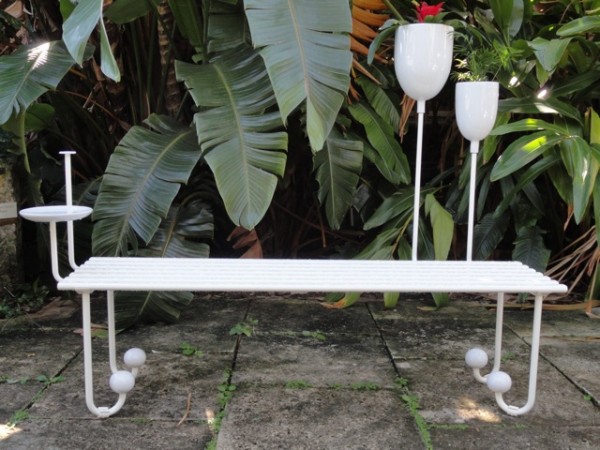
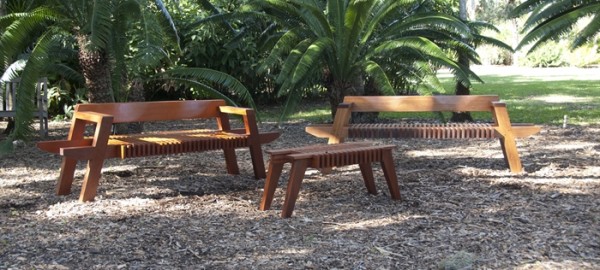
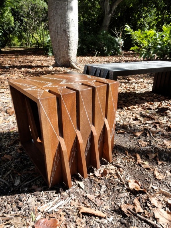
This year as part of Design/MiamiThe Fairchild Tropical Botanic Garden asked Cristina Grajales Gallery to commission seven of her brightest design stars to create site specific outdoor furniture (mostly benches) for its inaugural design initiative. I toured the gardens with Cristina and two of her artists, Sebastian Errazuriz and Sam Baron, a group of design admirers, and Nannette Zapata and Paula Fernandez de los Muros of the Fairchild and it was one of the major high points of the fair. We started the tour in the newly opened Butterfly Conservatory which is truly magical. We continued by tram and the first stop was Sebastian Errazuriz’s “Dawn Before Time Bench”. Using wood, iron and crystal, Errazuriz created a bench that resembles a traditional garden bench but has incorporated his trademark sense of humor and romance with the addition of a crystal chandelier that has been anchored to the bench and able to withstand the outdoor elements. Next up was Sam Baron’s “La Marie-Lou” and “La Georgette” benches. Made of white lacquered metal and ceramic, they both invite the user to add their own portion of the garden into one of the planters integrated into the design and the La Georgette offers shade with a movable umbrella as well.


Dawn Before Time bench by Sebastian Errazuriz

Dawn Before Time bench by Sebastian Errazuriz

La Marie-Lou Bench by Sam Baron in lacquered metal wood and ceramic

La Marie-Lou Bench by Sam Baron in lacquered metal wood and ceramic

La Georgette bench by Sam Baron

La Georgette bench by Sam Baron

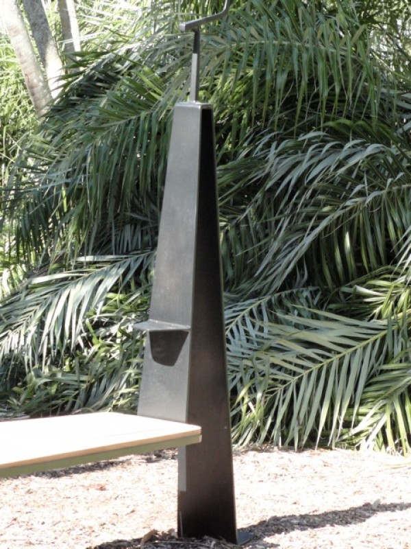
Around the bend seeing rare palms that are nearing extinction John Paul Philippe’s “Bird Perch Benches” elegantly provide a place for the native birds of the garden to sit upon steel perches that become part of the frame that supports the generous mahogany platforms. Michele Oka Doner used Australian Pine to create her organic “Chitra Benches” that blend harmoniously into the environment.


Bird perch benches by John Paul Philippe

Bird perch benches by John Paul Philippe

Detail of Bird Perch bench by John Paul Philippe

Detail of Bird Perch bench by John Paul Philippe

Chitra Bench by Michele Oka Doner

Chitra Bench by Michele Oka Doner

Gael Appler crafted Honduran Mahogany into a slatted “Salt Point Bench” that is molded to comfort sitting in the garden as well as the “Salt Point Table”. Pedro Barrail used steel and marble to create his animated “Keep Walking Benches” and burned-in wood etching technique used by the the Pai-Tavytera Amazonian tribe in the “Melancholia Stool”. Both of Barrail’s designs were situated beneath an enormous tree that Jorge Pardo has illuminated with hundreds of red orange and white powder coated lanterns reminiscent of blooming flowers. Upon our return to the pavilion Sebastian Errazuriz’s second design “The Guardian Bench” was nestled at the edge of the rainforest along the south edge of the Bailey Palm Glade, one of the most photographed areas of the gardens. Again Sebastian cleverly referenced past civilizations being overturned, placing two busts of Caesar beneath a marble plinth.

Salt Point Bench (2) and Salt Point Table by Gael Appler

Salt Point Bench (2) and Salt Point Table by Gael Appler

Melancholia Stool and Keep Walking Bench by Pedro Barrail

Melancholia Stool and Keep Walking Bench by Pedro Barrail

Detail of Keep Walking Bench in marble by Pedro Barrail

Detail of Keep Walking Bench in marble by Pedro Barrail

Garden lights by Jorge Pardo

Garden lights by Jorge Pardo

Detail of Jorge Pardo’s garden lights

Detail of Jorge Pardo’s garden lights

We ended our tour with Christophe Come’s Infinity and Post Benches, both made of mahogany and iron using techniques he has employed in his furniture designs in Paris. All of these works will remain on view at Fairchild Tropical Botanic Garden through May 31, 2013.

Detail of Christophe Come’s Infinity bench

Detail of Christophe Come’s Infinity bench

DSC07164-600x450.jpg

The “Sitting Naturally” works are available through Cristina Grajales Gallery in limited editions.

ALI TAYAR / PARALLEL DESIGN by Andy Goldsborough

DSC06113-e1348523091905.jpg

I recently visited architect Ali Tayar’s exquisite apartment and offices to go behind the scenes and find out what inspires the details and construction techniques in his work. I’ve known Ali for over twenty years and since the minute we met I’ve always been in awe of the complexity behind his architecture, furniture and product designs. On the surface, the connections and production techniques look simple, but the curved forms and perforated metal and wood that compose much of his work are the results of masterful planning and machine-made materials and finishes engineered with major impact!

Ali was born in Istanbul and began his architecture career at the University of Stuttgartfollowed by a Masters in Architecture at M.I.T. When he was eighteen years old and visited the Museum of Modern Art for the first time, standing in the sculpture garden he looked up at the Rockefeller Apartments across the street and thought, “That’s where I want to live.” The stunning views and curving brick facade of this building designed by Harrison & Fouilhoux in 1937 to many architects is one of the most beautiful residential buildings in New York.

The Rockefeller Apartments built in 1937

The Rockefeller Apartments built in 1937

Luckily for Tayar, his dream came true when he was able to buy one of the apartments and begin a year long transformation of the space, restoring every detail to it’s original state. While doing this, he created a museum of his own, furnishing the apartment and injecting his design sensibility into every piece of furniture, light fixture and accessory. The fireplace was one of the only pieces that was not original so he cast an aluminum Brancusi inspired mantelpiece that looks as if it was always there. When Tayar begins a design or furniture project his focus “is on the manufacturing process and the link between the structural concept and production.” He considers all of the furniture, objects and light fixtures he’s designed “little structures and larger projects have become more object-like relating the smaller scale studies.” Following are the images of Tayar’s apartment, furniture and details.

Carbon Fiber and mahogany strathisla console in the foyer , above a painting by Nuri Iyem

Carbon Fiber and mahogany strathisla console in the foyer , above a painting by Nuri Iyem

Perforated aluminum supports and mahogany and maple combine to form Anna’s shelving

Perforated aluminum supports and mahogany and maple combine to form Anna’s shelving

Detail of Anna’s shelving with a collection of cast aluminum fittings and wood prototypes

Detail of Anna’s shelving with a collection of cast aluminum fittings and wood prototypes

Tayyar’s bridge table with vintage chairs and seats covered in maharam Gio Ponti fabric. The table is a cube that has been carved away to create legs in laminated plywood.

Tayyar’s bridge table with vintage chairs and seats covered in maharam Gio Ponti fabric. The table is a cube that has been carved away to create legs in laminated plywood.

The dining room with Tayar’s maryana table and rasamny chairs faces the Moma sculpture garden.

The dining room with Tayar’s maryana table and rasamny chairs faces the Moma sculpture garden.

Cast aluminum and white oak ice bucket for omnia hotel project

Cast aluminum and white oak ice bucket for omnia hotel project

Kitchen with wood and yellow laminate and custom pulls by Ali Tayar

Kitchen with wood and yellow laminate and custom pulls by Ali Tayar

Detail of kitchen cabinetry and Tayar designed pulls

Detail of kitchen cabinetry and Tayar designed pulls

Tayar designed the laminated mdf bed and nightstands

Tayar designed the laminated mdf bed and nightstands

Hawkeye system nightstand in cast aluminum, laminated plywood and mahogany veneer with solid mahogany doors

Hawkeye system nightstand in cast aluminum, laminated plywood and mahogany veneer with solid mahogany doors

Nick’s Trivet table in mahogany with glass top and Rasamny chair

Nick’s Trivet table in mahogany with glass top and Rasamny chair

Detail of Rasamny chair in laminated oak and aluminum

Detail of Rasamny chair in laminated oak and aluminum

Tayar’s office looks like a design laboratory with fittings, models and furniture prototypes that have been built for clients projects as well as a MOMA installation “Workspheres”.

Ali Tayar/Parallel Design Offices

Ali Tayar/Parallel Design Offices

Drawings and prototypes by Ali Tayar

Drawings and prototypes by Ali Tayar

Thank you Ali for sharing your apartment and studio and continuing to inspire me and others with your architecture and design work!
For more information on Ali Tayar / Parallel Design go to www.alitayar.com

CHRISTOFLE STEPHANE PARMENTIER by Andy Goldsborough

utf-8DSC05753-e13460229726531.jpg

The first time I remember discovering Christofle was in college seeing a Gio Ponti designed mask, Il Diavolo in a design magazine and that began my life long admiration of the architect and designer’s work.

Gio Ponti Il Diavolo Mask

Gio Ponti Il Diavolo Mask

Recently, at the ICFF off-site show Wanted Design I was re-introduced to Christofle and met the new flagship store designer Stephane Parmentier. Charles Christofle founded the company in 1830 in Paris and ten years later it became one of France’s most important jewelry companies. In 1842 he acquired the patents for gold and silver plating electolysis, creating a new material. Christofle began producing silverplate objects as well as sterling silver creations for Napoleon III and the Czar of Russia. One of the most notable commissions were the statues that sit atop the Paris Opera. As early as 1928, Gio Ponti began collaborating with Christofle on a variety of objects, flatware, and serving pieces. Stephane Parmentier, the French interior designer of the new store on Madison Avenue has created a space that combines Ponti’s design aesthetic and the Art Deco style of New York’s Chrysler Building. Following is a visual tour of Parmentiers’ Christofle flagship store bringing together the companies rich tradition with a new modernism. Parmentier wanted to create a space full of atmosphere and sensorial stimulation “A venue bursting with the sparks that fly when you fall in love,” and it certainly feels that way.

Christofle 846 Madison Avenue storefront

Christofle 846 Madison Avenue storefront

Aborescence table and wall sconces by Ora-Ito reflected in the mirrored ceiling

Aborescence table and wall sconces by Ora-Ito reflected in the mirrored ceiling

Interior view with Stephane Parmentier designed Altair collection wood tables

Interior view with Stephane Parmentier designed Altair collection wood tables

Detail of Stephane Parmentier Altair collection tables

Detail of Stephane Parmentier Altair collection tables

The store is a masterfully crafted contrast of materials and finishes combining rich, warm polished wood and highly reflective silver details complementing the flatware, jewelry and objects which Christofle created. Although the ceiling height is kept at a minumum, the mirrored surface overhead gives the illusion of an endless space above and visually reflects all of the product in an innovative way.

utf-8DSC05751-e1346023936968.jpg
Christofle jewelry collection

Christofle jewelry collection

utf-8DSC05747-600x450.jpg
Christofle bee symbol of hard work and excellence etched into the curved wall

Christofle bee symbol of hard work and excellence etched into the curved wall

Visit Christofle and Stephane Parmentier for more information as well as Ormond Editions. The Gilded Owl will feature Parmentier’s brilliant furniture design in an upcoming post, stay tuned.

FREDERICK MCSWAIN / BRAD ASCALON by Andy Goldsborough

Turntable-2-e13433347449681.jpg

At this year’s ICFF in New York, Elizabeth Moore and I met Brad Ascalon at the Wanted Design off site show in Chelsea. He and Frederick McSwain were showing their first collaborative furniture and product line together made of primarily CNC milled and anodized aluminum. I’ve known Frederick for many years from Cappellini in Soho but had not met Brad until the show. They teamed with NFS / Neal Feay Studio, a sixty-plus year old state of the art industrial design production company in Goleta, California. NFS is primarily known for making music production products in metal and when Frederick and Brad collaborated with NFS on their first line of colorful aluminum furniture and objects the results were truly sensational. I recently sat down with them for lunch to learn more about both their backgrounds and the thought process behind “Reinvention; Writing History in Aluminum”.

Lift-1-copy-600x401.jpg
Frederick Mcswain

Frederick Mcswain

Brad Ascalon

Brad Ascalon

Frederick McSwain grew up in Elizabethtown, North Carolina and studied at the University of North Carolina at Wilmington. Majoring in Biology and Fine Arts, he graduated and began working with a restauranteur in his hometown. They came to New York to the ICFF in 1997 and 1998 and began buying and reselling examples of mid-century design. His interest grew and he decided to move to New York and start a career in design. Working in galleries in Chelsea and at Conran’s he started honing in on his own design work and then took a position with Cappellini, the famed Milan based Italian furniture furniture company, known for it’s prestigious designer roster including Shiro KuramataJasper Morrison and Marcel Wanders.

An early work by Frederick Mcswain

An early work by Frederick Mcswain

When Tobias Wong, the innovative designer and Frederick’s close friend passed away, he created “Die” assembling 13,138 dice on the floor to create a portrait of the artist.

“Die” portrait of Tobias Wong by Frederick Mcswain

“Die” portrait of Tobias Wong by Frederick Mcswain

Brad Ascalon grew up outside Philadelphia in Cherry Hill New Jersey and studied at Rutgers undergrad majoring in Communications and then received his masters in industrial design from the Pratt Institute. Brad’s father, David Ascalon, is a sculptor and stained glass artist as was his grandfather, Maurice Ascalon, a sculptor and industrial designer so design definitely runs in the family. Brad began his career in New York working in advertising and the music industry. His love of music and thoughtful connections of materials inspired some of his first designs for Ligne RosetBernhardt and Fasem as well as the Turntable collaboration with Frederick.

Untitled Square, an early work by Brad Ascalon

Untitled Square, an early work by Brad Ascalon

Menorah by Brad Ascalon for Design Within Reach

Menorah in polished carrera marble by Brad Ascalon / Permanent collection of the National Museum of American Jewish History

Menorah in polished carrera marble by Brad Ascalon / Permanent collection of the National Museum of American Jewish History

Both Frederick and Brad were part of a group show called “Love It Or Leave It” at Gallery R’Pure during the ICFF as well. Each piece was a designer’s personal interpretation of some aspect of American life, celebratory, critical or simply observational. The exhibition was intended to question what American life is, whether real or perceived.

A detail of “Cells” by Frederick Mcswain

A detail of “Cells” by Frederick Mcswain

A detail of “The Dream” by Brad Ascalon

A detail of “The Dream” by Brad Ascalon

Frederick’s work titled “Cells” was a series of 84 polaroids taken by his mother, a bail bondsman along with 3 beautiful machined anodized aluminum crates evoking his memory as a child waiting on his mother on the dairy crates outside the jail. The word ‘Cells’ commonly refers to the smallest unit of living matter, but it’s also synonymous with subjects ranging from statistical spreadsheets to terrorist organizations. In language, as in life, environmental factors play a vital role in shaping one’s self-identity and perception of the world. From the moment of birth, each of us is exposed to a continuous stream of information. Collectively, these people, places, and things guide not only our emotions but also our practical decision-making. Meticulously organized, the human brain has the incredible ability to decipher and store these real-world snapshots for retrieval at a later time. We’re all simply the sum of our parts and that was the exploration of McSwain’s intriguing work.

“Cells” by Frederick Mcswain from the “Love it or Leave it” exhibition

“Cells” by Frederick Mcswain from the “Love it or Leave it” exhibition

Brad’s installation called “The Dream” inverted the typical Suburban symbol of a white picket fence in order to make a commentary about the state of the American Dream today, “nearly impossible for most Americans to realize.” “Within the boundaries of a society largely living above its own means, an unregulated banking system that plays by its own rules, and a government that idly stands by as millions of homes are being foreclosed upon, there lies an absolute truth, the direction we’re moving as a society has become unsustainable. This is the new promise of the American dream.”


“The Dream” by Brad Ascalon for the “Love it or Leave it” exhibition

“The Dream” by Brad Ascalon for the “Love it or Leave it” exhibition

Frederick and Brad both had a great love of music and were interested in creating furniture and products that had a sense of history to them. When they found NFS, they realized the potential to make very precise aluminum forms that would have optical effects as the viewer walks around the pieces. They wanted the pieces to have a 3D effect and to expose the manufacturing process in the completed products. The colors are limitless in anodizing since the pigment is added to a chemical acid bath and depending on the length of time the pieces are submerged they can go from pale pastel to vibrant intense color. Following are the pieces that comprise the new collection they designed together and fabricated with Neal Feay Studio.

Turntable in grey/gold

Turntable in grey/gold

Turntable detail

Turntable detail

The Timber table was based on rural farmland across the country which have become strip malls over the past decades, depicting nature trying to re-establish itself in these areas. McSwain and Ascalon detailed the table legs in natural woods piercing the textured aluminum table tops in such an elegant way and saying “nature will always defeat the manmade”.

Timber table

Timber table

Timber-2-600x400.jpg
Timber table detail

Timber table detail

The anodized aluminum shoe horn in a range of colors

Lumen was inspired by the “Memphis” movement in Italy in the early 1980’s and was designed as a geometric prism of the elements of air, water and fire.

Lumen was inspired by the “Memphis” movement in Italy in the early 1980’s and was designed as a geometric prism of the elements of air, water and fire.

Lumen vase, candle holder and ashtray

Lumen vase, candle holder and ashtray

Suspension light fixture in gold and turquoise anodized aluminum

Suspension light fixture in gold and turquoise anodized aluminum

Matter will carry the Turntable and Timber tables and CHCM will soon stock the shoe horn.
Click on Frederick McSwain and Brad Ascalon for more of both of these innovators inspiring work. Thank you to Frederick and Brad for sharing your new collection with The Gilded Owl!