Sixty nine years ago Madame Carven launched her first Haute Couture collection at Rond-Point des Champs-Elysees in Paris. In 2010 Guillaume Henry becomes Carven’s art director and in 2011 presents his first mens collection for the house. Last month Henry opened Carvens’ first US shop at 83 Mercer Street in Soho in collaboration with architect Eric Chevallier and it’s a study in contrasts “day and night, sophisticated and casual, sexy and shy”.
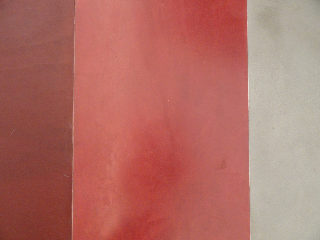
When you enter the narrow space there is white tiled wall with an elevated display and a long black leather “Saint Sulpice” bench designed by Chevallier for Domeau and Peres leading to the marble enclosed cash wrap cube and a sparkling glass display fixture combining plants and accessories. As you move further into the store six mirrored bays house four areas of the women’s collection with the two rear bays for men. The mirrored columns and walls that delineate each of the bays seems to float above the floor, a nice unexpected detail allowing the clothing to have a lighter feeling hanging on the fixtures. An undulating line of black corded light bulbs leads you front to back and goes on for infinity in the mirrored walls above creating an exciting rhythm throughout the space. The floors are a combination of smooth poured concrete with red stained borders in the collection zones flanking an aniline dyed plywood runway down the center giving the spaces a comfortable feel.
The overall vibe of the space is refined and elegant with elements of French influence, hints at 80’s Memphis design but in a decidedly new and modern viewpoint.
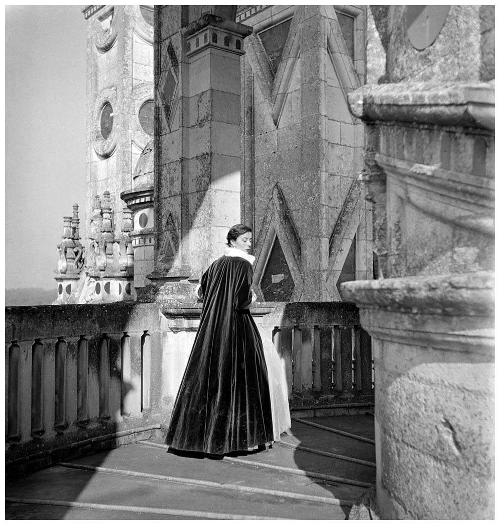
Carmen de Tommasso, founder of Maison Carven, portrait by Henry Clarke
Guillaume Henry portrait by Camille Vivier for Vice
Glass display for accessories
Blue and green metallic encased lucite bangles
Detail of red aniline dyed wood floor with colored and natural concrete floor
Womens SS 14 collection
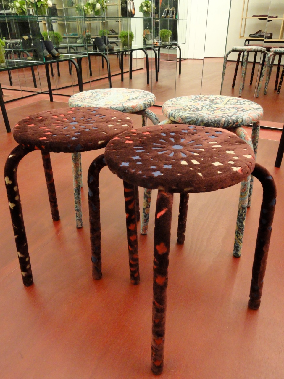
Detail of felt covered stools
What really intrigued me this season-although I have been a fan of Carven since Guillaume Henry’s brilliant relaunch in 2011-is the relationship between interiors and fashion with Henry’s SS 14 mens collection. His inspiration came from the colors of Southern France and the landscape and textures that inspired artists like Van Gogh and Picasso. A very painterly palette of pale pastels in golden sunflower, wheat, and a range of blues from deep azure to periwinkle.
The Spring Summer 2014 campaign shot by Dutch photographer Viviane Sassen featuring Guerrino Santulliana perfectly captures the colors and mood with layers of vivid flowers superimposed over the collection.
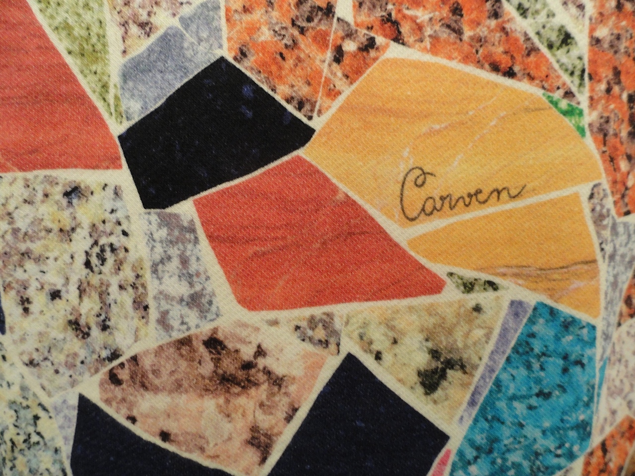
The textures of the clothes and the prints and weaving techniques are also intriguing. There is a stunning coat made of an natural abaca material woven in the most extraordinary way with an exaggerated collar. And sweatshirts and t-shirts with printed patterns resembling brightly colored terrazzo and marble. A handsome cotton sweater in blue and white resembles a twinkling night sky. I look forward to seeing what exciting directions Henry takes Carven next and I’m sure it will be inspired!
Carven SS 14 campaign by Viviane Sassen featuring Guerrino Santulliana
Mens Collection SS 14
Detail of woven abaca coat


