ARCHITECTURE

FREDERICK MALLE + STEVEN HOLL by Andy Goldsborough

DSC00211.jpg

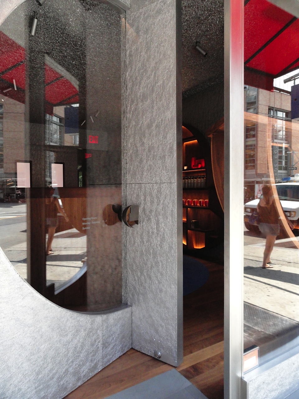
Sometimes collaborations produce extraordinary results and the new Frederic Malleboutique designed by Steven Holl on Greenwich Avenue is New York at its most inspiring.When Frederic Malle the perfumery genius decided to open his new Editions de Parfums in New York he wanted an important local architect that understood the city and would poetically interpret his vision with an extraordinary palette of materials and finishes. I visited the shop this week to photograph the details of this jewel box of an interior complete with its own tranquil garden in the back.

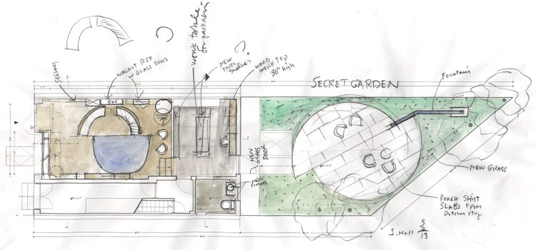
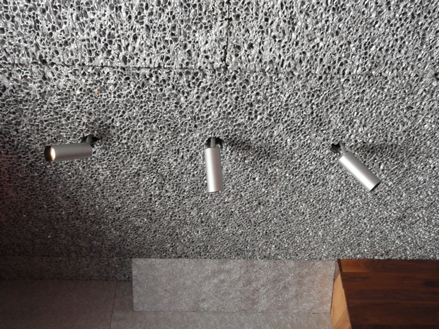
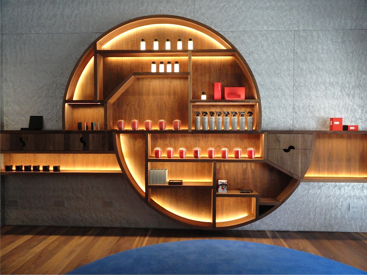
Steven Holl’s design for the boutique is based on two interconnecting semi circles, a motif that is carried throughout the architecture, walnut cabinetry, cobalt carpet, bronze door handle detail and in the garden fountain. The materials chosen create a very warm, inviting space but it is futuristic at the same time with walls clad of an aluminum material that have a dense texture and then a more open and airy version on the ceiling. Sleek silver spotlights pierce through the aluminum ceiling and highlight the twelve Editions de Parfum designers who have worked with Frederic Malle to create these exquisite fragrances. The lighting throughout sensitively incorporated into the display cases was conceived by lighting magician Herve Descottes who also worked closely with the late French interior designer Andre Putman.

Frederic Malle storefront of aluminum, stainless steel and glass with walnut shelves inside .

Frederic Malle storefront of aluminum, stainless steel and glass with walnut shelves inside .

l-shaped door opening

l-shaped door opening

Detail of cast bronze door handle

Detail of cast bronze door handle

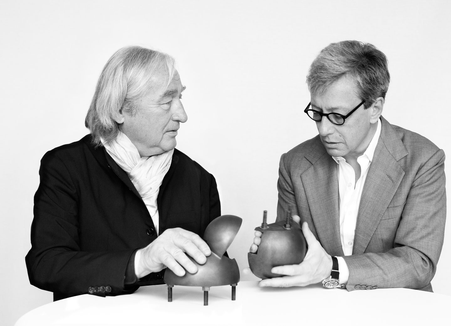
Steven Holl and Frederick Malle

Steven Holl and Frederick Malle

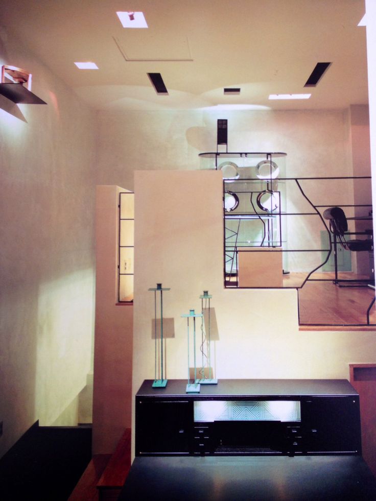
During architecture and design school I greatly admired the work of Steven Holl, his beautiful watercolor conceptual drawings, copper and plexiglass models of future houses and buildings and his thoughtful use of materials and finishes. On my first trip to New York in 1987 with a group of design students we visited his showroom for the Pace furniture collection at Madison Avenue and 72nd Street as well as a small boutique he designed for a women’s clothing line nearby. It was one of those moments that changed the way I thought about materials coming together, how lighting could directly affect the way I felt in a space and the relationship between the surrounding environment and what was being presented inside.

Pace showroom at madison avenue and 72nd street in 1986 by steven holl

Pace showroom at madison avenue and 72nd street in 1986 by steven holl

Conceptual layout of the boutique and secret garden by steven holl

Conceptual layout of the boutique and secret garden by steven holl

Conceptual watercolor by steven holl of facade for frederic malle editions de parfums

Conceptual watercolor by steven holl of facade for frederic malle editions de parfums

Steven holl watercolor detail study of store fixtures in aluminum and walnut

Steven holl watercolor detail study of store fixtures in aluminum and walnut

In the back of the shop there are three smelling devices where I tested several scents including Dominique Ropion’s Vetiver Extraordinaire and Jean Claude Ellena’s Angeliques Sous La Pluie. The lovely sales associate Dinara Tuleuova sprayed the compositions into these illuminated cylindrical windows and when the fragrances were evenly distributed I leaned inside to test the notes. Of course I couldn’t leave without at least one, and I was so enamored with the packaging as well that I picked up a bronze travel tube to take the scent wherever I go.

Portraits of the twelve editions de parfums collaborators and illuminated testing windows

Portraits of the twelve editions de parfums collaborators and illuminated testing windows

Travels cases including limited edition gradient colors by pierre hardy

Travels cases including limited edition gradient colors by pierre hardy

Following are more details of the materials, finishes and the rear garden thoughtfully designed by Steven Holl for Frederic Malle Editions de Parfums.

Detail of walnut display cabinet with cut-out finger pull of semi circular motif

Detail of walnut display cabinet with cut-out finger pull of semi circular motif

Walnut wall panel detail and aluminum interior cladding

Walnut wall panel detail and aluminum interior cladding

Light fixtures piercing open pore aluminum ceiling

Light fixtures piercing open pore aluminum ceiling

Interior bronze door handle detail

Interior bronze door handle detail

Wood and steel benches in the schist paved garden

Wood and steel benches in the schist paved garden

Cast concrete fountain in the secret garden

Cast concrete fountain in the secret garden

Cast brass discs detail
Cast brass discs detail

THE DR. OLIVER BRONSON HOUSE by Andy Goldsborough

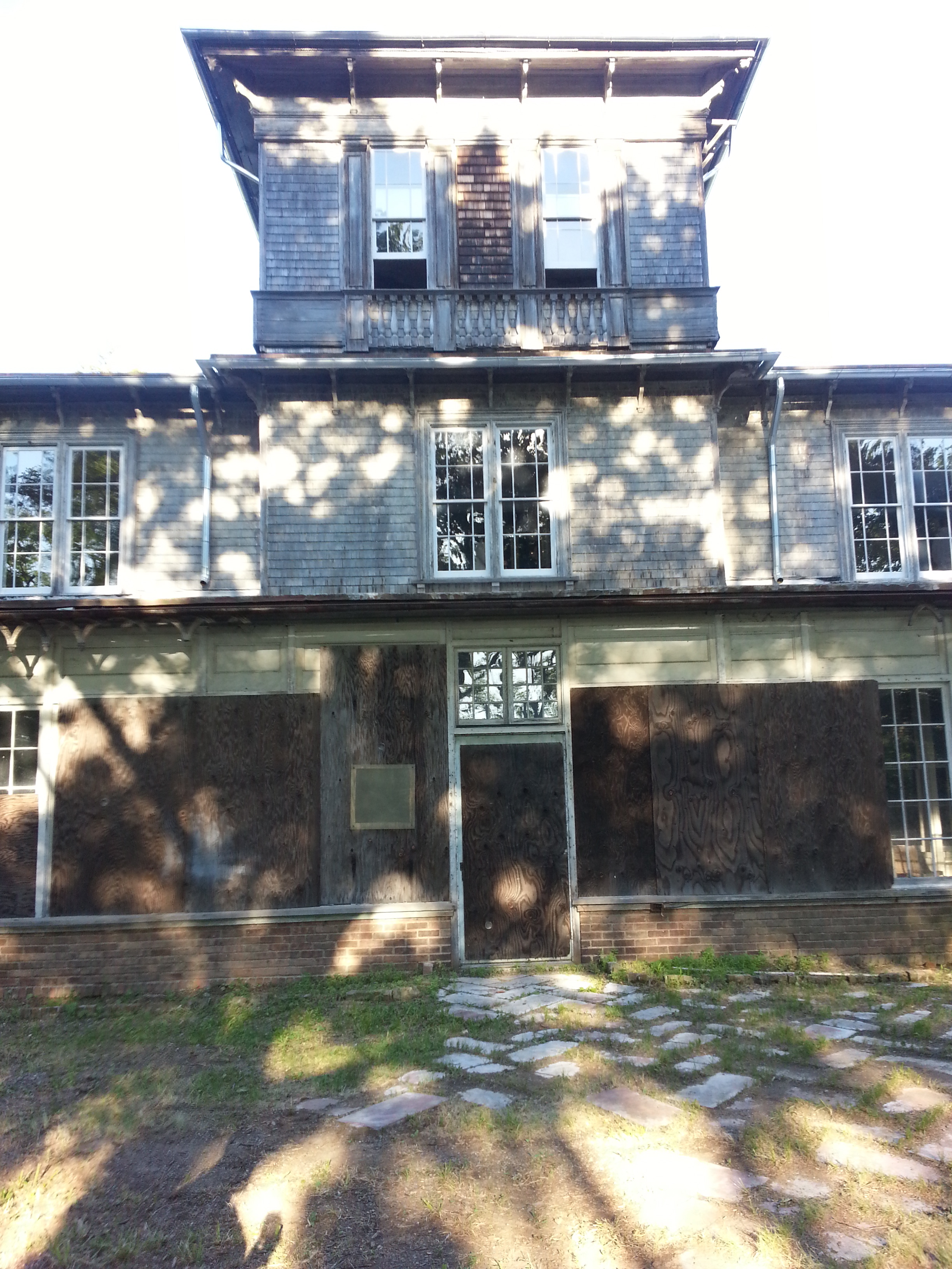
Last weekend while continuing to ready The Gilded Owl gallery for a summer opening, I attended the first weekend of annual fundraising for The Dr. Oliver Bronson House in Hudson, New York.  On a stunningly beautiful day, while sipping rosé with Elizabeth Moore, Gary Purnhagen, Carl and Julie Muehleisen we toured this extraordinary house built in 1812 for Samuel Plumb, a wealthy Hudson merchant in the tow-boat business.  Extensively redesigned for Dr. Oliver Bronson from 1799-1875 by architect Alexander Jackson Davis. The original Neo-Classical landscape design was clarified in 1839 when A.J. Davis eliminated outbuildings and fencing reworking the approach to the house and refitting the east facade to take advantage of the picturesque theories of Hudson River School artists and intellectuals.

20140607_180130.jpg
Detail of doors to sitting room

Detail of doors to sitting room

The spectacular three-story elliptical staircase

The spectacular three-story elliptical staircase

Exterior of the sunroom facing the hudson valley

Exterior of the sunroom facing the hudson valley

Davis also extended the second floor roof eaves and added ornamental brackets an egg-and-dart vergeboard and an elaborate trelliswork veranda with a concave metal roof to give a more Romantic character to the house.  Capitalizing on the views of Mt. Merino to the southwest and the Catskills in the distance, the redesign of the house made great use of it’s dramatic setting high above the Hudson River.  One of the crowning highlights of the interior is the remarkable three story elliptical staircase.

The Dr Oliver Bronson House in 1839

The Dr Oliver Bronson House in 1839

Fretwork and moldings to be restored

Fretwork and moldings to be restored

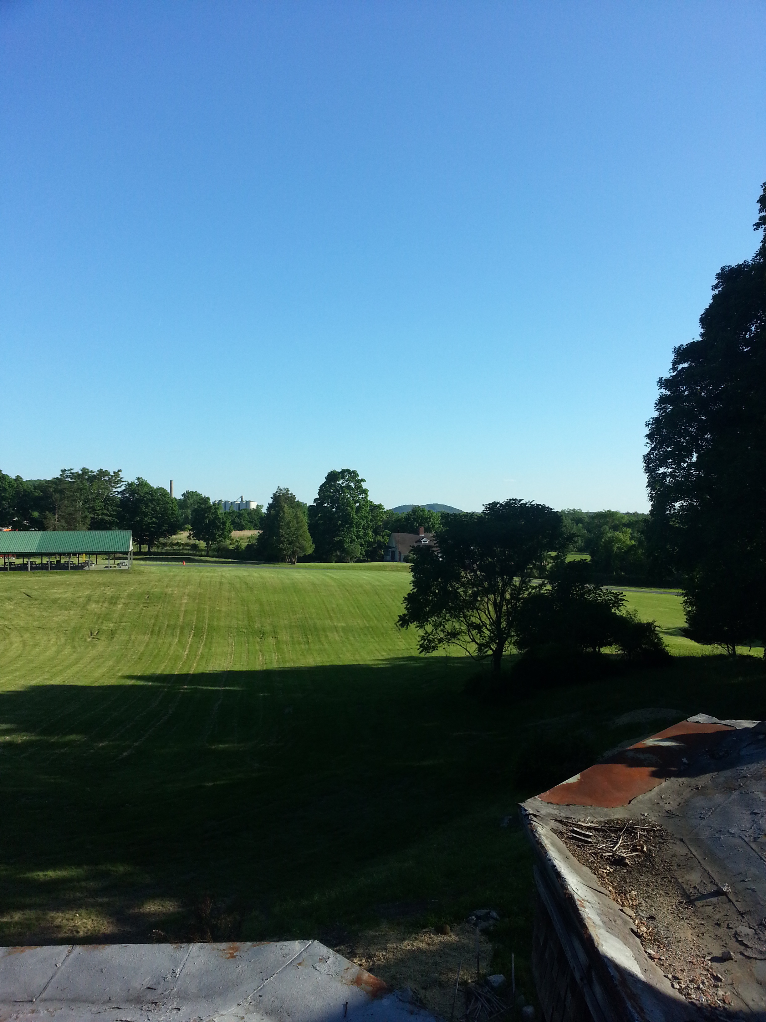
View from one of the second floor bedrooms

View from one of the second floor bedrooms

Rear elevation at sundown

Rear elevation at sundown

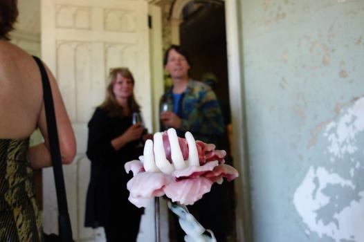
This year three artists works were shown in the beautifully proportioned rooms throughout this Federal-style masterpiece.  On the ground floor in the front parlor and opposite sitting room, Valerie Hammonds wonderful and haunting wax drawings and sculptures perfectly inhabited these elegant spaces as if they always belonged there.  The first room contains Pensee, a work in wax, silk and wire from 2010 placed on a stand with one bamboo side chair and a large drawing entitled Touch in pigment, colored pencil and wax on paper from 2011.  As you continue to the rear of the house Constellation, a blue wax hand with glass beads and pins is placed upon another stand with a thick glass top in the gorgeous bay window facing the lawn.

Valerie Hammond’s pensee wax sculpture in the foreground and touch wax drawing behind

Valerie Hammond’s pensee wax sculpture in the foreground and touch wax drawing behind

Valerie Hammond’s Constellation sculpture

Valerie Hammond’s Constellation sculpture

Transition 2, 2008 wax, silk and wire

Transition 2, 2008 wax, silk and wire

Kiki Smith’s wonderful large scale ink drawings on Nepal paper with gold and silver leaf and her sister Seton Smith’s photographs filled the rooms of the second and third floors.

an ink work on nepal paper with silver leaf by Kiki Smith

an ink work on nepal paper with silver leaf by Kiki Smith

one of the rear bedrooms facing the mountains with afternoon sunlight

one of the rear bedrooms facing the mountains with afternoon sunlight

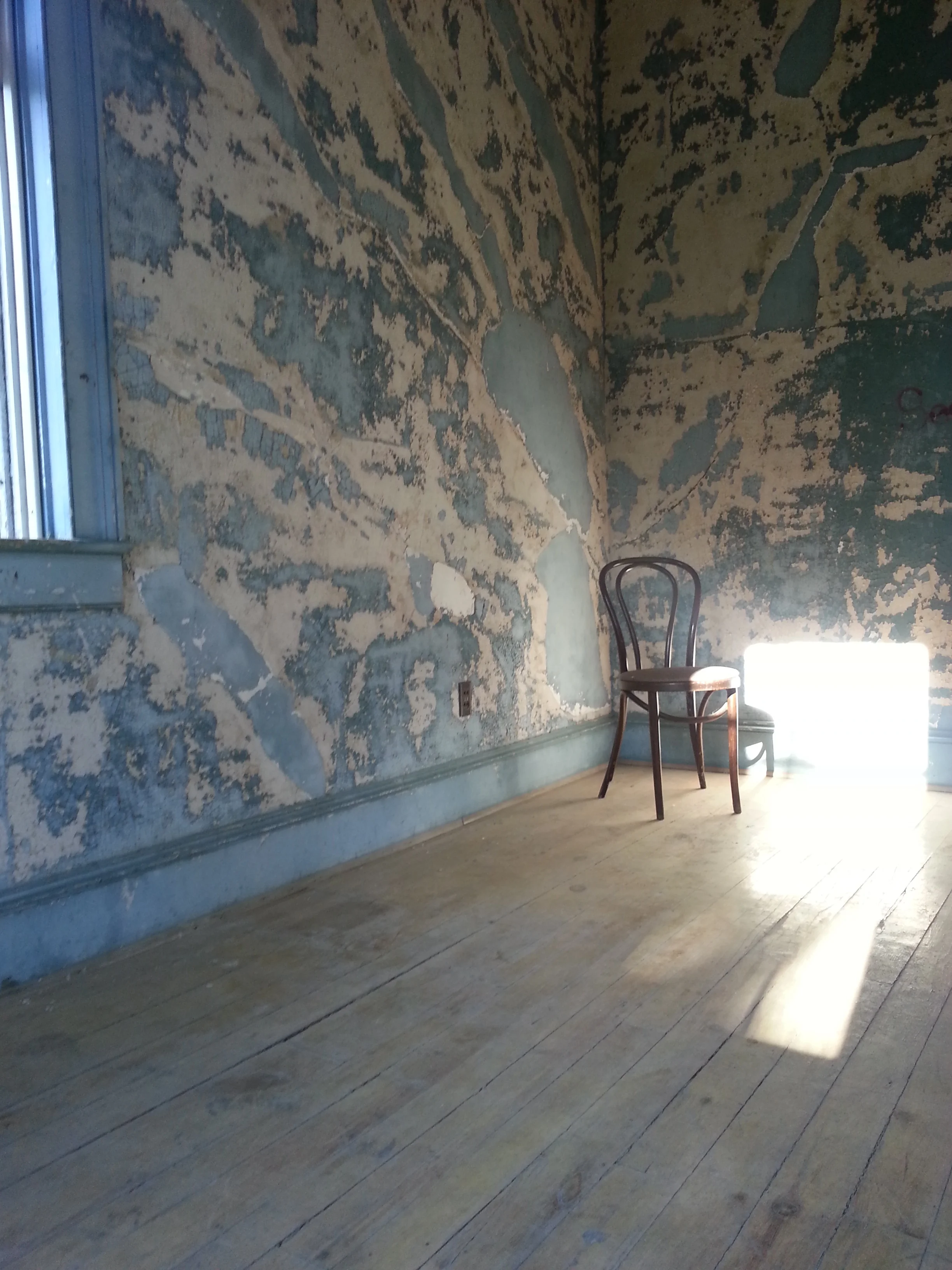
Detail of cracked and peeling paint

Detail of cracked and peeling paint

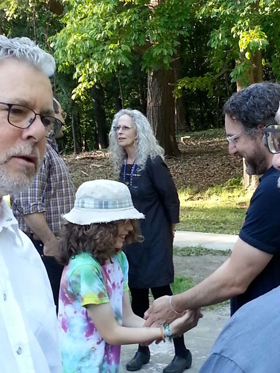
Gary Purnhagen and Kiki Smith with guests

Gary Purnhagen and Kiki Smith with guests

Historic Hudson’s commitment to The Dr. Oliver Bronson House and it’s extensive renovation began in 1997 and continues to generate support for this National Historic Landmark. Historic Hudson’s Path Through History Weekends continue June 14th and 15th.  Don’t miss this opportunity to contribute to a worthy part of New York history and a peak inside one of the most important Federal style houses. You can also contribute by clicking the link below.

www.househudsonvalley.com

www.historichudson.org

www.valeriehammond.com

www.kikismith.com

www.setonsmith.com


with Elizabeth Moore in the sitting room

with Elizabeth Moore in the sitting room

CASA MALAPARTE by Andy Goldsborough

DSC039541.jpg

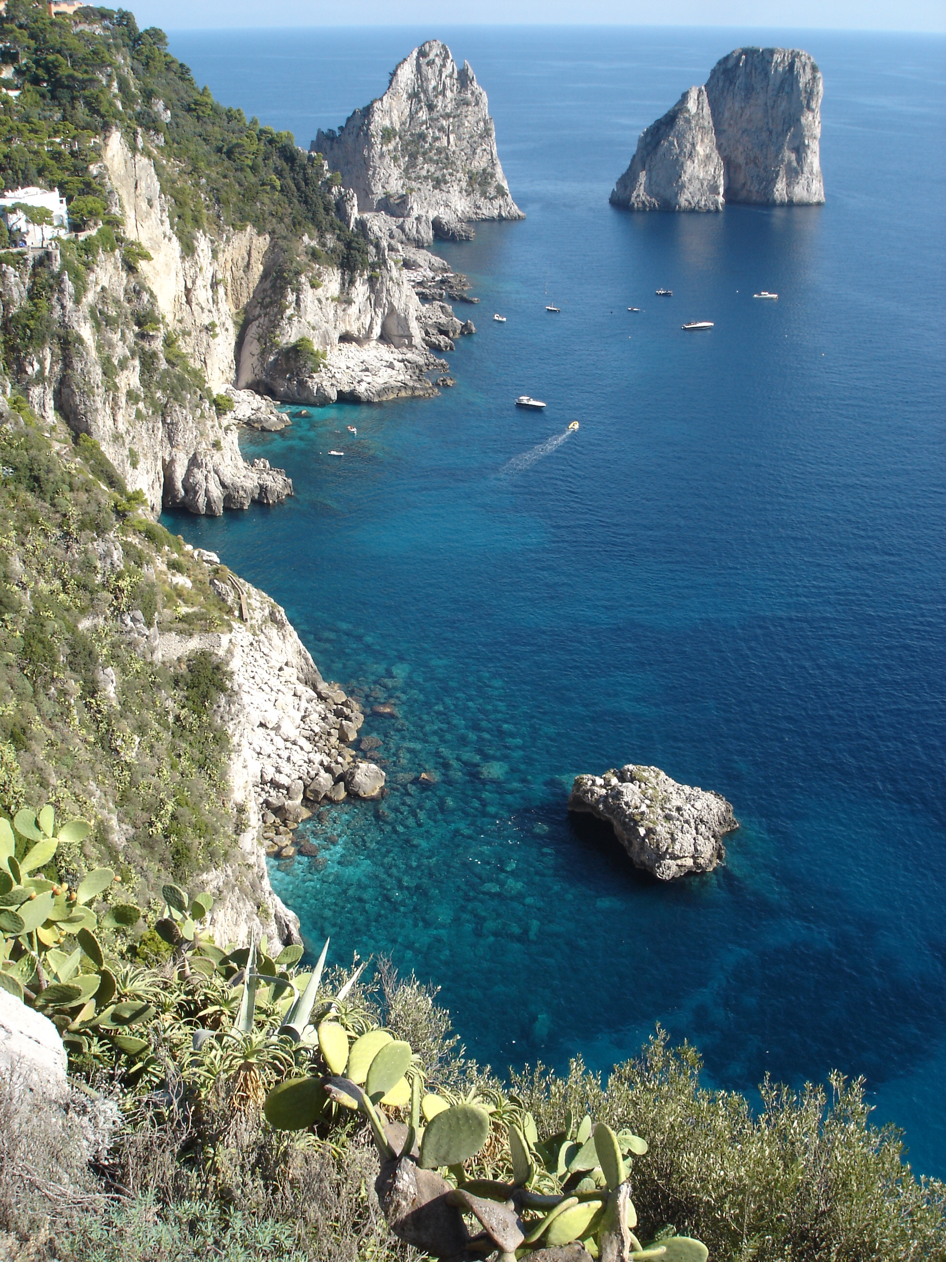
Perched on the eastern side of the island of Capri on Punta Massullo is one of the most captivating houses I have ever seen.  I first visited Capri in 2007 and soon after we arrived at our hotel, my mother and I were on our first of several journey’s to see the magnificent Casa Malaparte.  It’s a breathtaking walk to get there and the views of the spectacular Faraglionilimestone rocks perched alongside one another and an azure horizon of sky meeting sea is like a dream.  Lizards crossing our path basking in the sun as we climbed incredibly steep and winding stone trails with bougainvillea in white and shades of peach and fuschia trailing everywhere.  I sat and contemplated how the man that designed this house could have chosen such an amazing site and then designed something so timeless and architecturally significant.  But I couldn’t linger too long on my first trip to the house.  Mom needed to see more of the island but I could have stayed there all day gazing at the sun beaming down on the water and the glowing red brick and flashes of light reflecting off the water and then glistening into the glass of this incredible house.


Casa Malaparte located on the eastern side of Capri overlooking the gulf of Salerno

Casa Malaparte located on the eastern side of Capri overlooking the gulf of Salerno

View of the Faraglioni on the walk to Casa Malaparte

View of the Faraglioni on the walk to Casa Malaparte

Casa Malaparte seen from my boat ride around the island of Capri

Casa Malaparte seen from my boat ride around the island of Capri

DSC03963.jpg

Designed in 1937 by Italian architect Adalberto Libera for the journalist, novelist and diplomat Curzio Malaparte. Born Kurt Erich Suckert, Malaparte’s chosen surname which he used from 1925 means “evil/wrong side” and is a play on Napoleon’s family name “Bonaparte” meaning in Italian, “good side”.  Malaparte rejected Libera’s design for the house and ended up building it himself with the help of Adolfo Amitrano, a local stonemason and the house was completed in 1942.  The house is composed of three floors with the private rooms, bathrooms and a library on the lower levels and then a grand salone on the upper level for living and dining with furniture Malaparte designed himself.  The minimalist pieces included oversized sofas and chairs, lamps and an altar like table made of concrete bases topped with wood planks that were polished but with live edges.  The floor of the grand space was made up of large broken pieces of stone but the centerpiece of the room is the sensational fireplace.  Made up of three sections of sculpted concrete capped with a wood mantle the outer sections for wood storage flank a window made of heat resistant glass framing another view of the waves and landscape below.

Fireplace with view of the sea beyond by Francois Halard

Fireplace with view of the sea beyond by Francois Halard

Interior salon by Francois Halard from his blog

Interior salon by Francois Halard from his blog

Salon floor and window detail by Francois Halard

Salon floor and window detail by Francois Halard

Curzio Malaparte in the main salon living space

Curzio Malaparte in the main salon living space

Casa Malaparte floor plans

Casa Malaparte floor plans

Casa Malaparte section view

Casa Malaparte section view

Casa Malaparte played a significant role in Jean-Luc Godard’s 1963 film Contempt (Le Mepris) when a tumultuous relationship between Brigette Bardot and Michel Piccoli comes to a head on the terrace overlooking the craggy rocks below.  The tapering stairs built into the design of the house are used to dramatic effect as is the swirling white painted concrete wall that resembles a sail atop this striking architectural masterpiece.  Bardot famously sunbathes topless in the film and wanders aimlessly in another scene as she contemplates her torn feelings between her husband and Jack Palance.  The gorgeous film score by Georges Deleruefurther enhances this beautiful film in which half of the movie takes place at the Casa Malaparte.  Following is the original movie poster and stills from the film.


Contempt film poster from 1963

Contempt film poster from 1963

Michel Piccoli on the approach to Casa Malaparte

Michel Piccoli on the approach to Casa Malaparte

LeMepris-0010.jpg
029-contempt-theredlist.png
Bardot and Piccoli on the roof of Casa Malaparte

Bardot and Piccoli on the roof of Casa Malaparte

contempt23.jpeg
LeMepris-0013.jpg

Many books have been written about Malaparte’s dramatic house and it’s conceptual origin, design and relationship to the landscape of Capri.  I have been collecting volumes for years and following are some of my favorites.

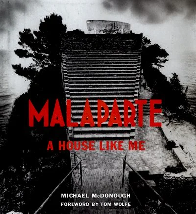
“Malaparte a House Like Me” by Michael Mcdonough, 1999

“Malaparte a House Like Me” by Michael Mcdonough, 1999

“Casa Malaparte” by Karl Lagerfeld published, Steidl 1999

“Casa Malaparte” by Karl Lagerfeld published, Steidl 1999

Villa Malaparte Francois Halard, Actes Sud 2003

Villa Malaparte Francois Halard, Actes Sud 2003

In the past three years Casa Malaparte has also served as a backdrop for fashion and fragrance launches including this year’s UOMO by Ermenegildo Zegna and 2011’s Hugo Boss Spring Summer collection.  Ermenegildo Zegna’s website for the new fragrance gives a brief history of the house and relates it to the UOMO man with this description. “Casa Malaparte was envisioned and built in 1942 on the Isle of Capri by Italian journalist and writer Curzio Malaparte and it is a testament to masculine determination, a place where the Uomo man – who lives with passion and steps up to claim his destiny – acts out a compelling chapter of his own autobiography.” Here are some of the images from both campaigns highlighting details of the house and it’s materials and finishes and bold contrasting colors with the landscape of Capri.  Persol even designed a collection of sunglasses last year based on the architecture of the house called the Capri Edition.

Uomo, Ermenegildo Zegna’s new fragrance

Uomo, Ermenegildo Zegna’s new fragrance

Another image from the Zegna Uomo fragrance launch

Another image from the Zegna Uomo fragrance launch

Ermenegildo Zegna Uomo promotional image

Ermenegildo Zegna Uomo promotional image

Hugo Boss spring summer 2011 campaign

Hugo Boss spring summer 2011 campaign

Hugo Boss spring summer 2011 campaign

Hugo Boss spring summer 2011 campaign

Hugo Boss spring summer 2011 campaign

Hugo Boss spring summer 2011 campaign

Persol Capri edition sunglasses

Persol Capri edition sunglasses

Persol Capri edition sunglasses detail
Persol Capri edition sunglasses detail

Malaparte called this surreal work “a house like me” since he was exiled there by Mussolini in 1933 but I can’t imagine a more picturesque place to build his dream home.  On my last night in Capri I watched the sunset one more time over this beautiful place and this incredible house that I will always remember and captured this image of Malaparte’s inspiring architecture.

DSC04023_2.jpg

More images and details of Casa Malaparte can be seen here as well as reviews of Jean-Luc Godard’s film Contempt.

www.lareviewofbooks.org 

www.nytimes.com / Architecture review by Herbert Muschamp

www.nytimes.com / A.O. Scott looks back at Jean-Luc Godard’s avant garde film

www.lolamcly.com / Additional history of Casa Malaparte

www.francoishalard.blogspot.com / Interior images of Casa Malaparte by Francois Halard

www.domusweb.it / John Hejduk’s description of Casa Malaparte in Domus magazine from 1980

www.youtube.com / UOMO the new fragrance by Ermenegildo Zegna

www.youtube.com / An essay on Jean-Luc Godard’s Contempt and Jean-Jacques Beineix’s Diva

www.archoffilm.blogspot.com / More film stills from Jean-Luc Godard’s Contempt

www.zegna.com 

www.hugoboss.com

www.ellengoebel.com / Art direction for Hugo Boss collection shot by Mario Sorrenti at Casa Malaparte

www.persol.com / The Capri edition video with architectural footage of Casa Malaparte

LE CORBUSIER CABANON 1952 / CASSINA by Andy Goldsborough

ricostruzione-Cabanon01-e13551842157811.jpg

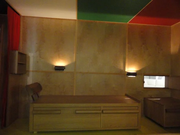
At Design/Miami this year Cassina rebuilt a replica of Le Corbusier’s Cabanon interior designed in 1952 and I was thrilled to attend a preview of the show. Le Corbusier has always been a constant inspiration in my work and to see this masterpiece recreated with such exacting detail was a revelation! Exclusive rights to Le Corbusiers’ work have been held by Cassina since 1965 and this project truly shows the craftsmanship and innovative design ideas of this master architect. Conceived as a birthday present for his wife, Le Corbusier designed the entire cabin in a cafe and ended up using the space frequently himself. Le Corbusier had always been fascinated by boats and made the cabin in the likeness of a ships interior, sitting above the French Riviera in Cap-Martin overlooking the Bay of Monaco. Even the brightly colored ceiling panels were removable for storage above since the space was designed at the most minimal size to live comfortably. The only function he left out of the cabin was a kitchen since he and his wife dined at the local L’Etoile de Mer restaurant nearby. This remarkable example of micro-architecture truly shows that less is much, much more.
Drawings of the Cabanon

Drawings of the Cabanon

Le Corbusier in the 1952 Cabanon

Le Corbusier in the 1952 Cabanon

The original Cabanon exterior

The original Cabanon exterior

Entry into the cabin with Le Corbusiers’ original painting and coat hooks

Entry into the cabin with Le Corbusiers’ original painting and coat hooks

Bed with pull out storage

Bed with pull out storage

DSC07083-600x450.jpg

Cassina has reintroduced the LC 14 01 Tabouret Cabanon stool in chestnut and oak finishes to coincide with the reconstruction. Openings on each side create handles and the unique dovetail joint on each corner is exclusive and highlights the workmanship of the solid wood and exalts its qualities.
Lc 14 01 Tabouret Cabanon

Lc 14 01 Tabouret Cabanon

Lc 14 01 Tabouret Cabanon detail

Lc 14 01 Tabouret Cabanon detail

Le Corbusier’s mark in the cabin entry

Le Corbusier’s mark in the cabin entry

Le Corbusier: The Interior of the Cabanon. The Cassina reconstruction will remain on view in the Miami Showroom: 3800 NE Miami Court, Miami Design District December 6, 2012- January 12, 2013

FOUR FREEDOMS PARK / LOUIS KAHN by Andy Goldsborough

utf-8DSC06931-e13532765234141.jpg

On September 24th, 1973, Nelson A. Rockefeller, Governor of New York, and John V. Lindsay, Mayor of New York City, invited 800 guests for the renaming of Welfare Island to Roosevelt Island in honor of Franklin Delano Roosevelt. Historian Arthur M. Schlesinger Jr. and former Governor Averell Harriman spoke at the ceremony and announced their plans for a memorial that would be built on the four southernmost acres of the island and that Louis Kahn would design the park. Kahn’s design for the park was completed in 1974 but he died unexpectedly of a heart attack and at the time New York City verged on bankruptcy and the project was put on hold for almost thirty years. After Louis Kahn’s son, Nathaniel, produced a documentary about his father’s work entitled “My Architect”, interest was regenerated to begin fund raising mostly from the private sector.

Approach to the stairs and the triangular lawn

Approach to the stairs and the triangular lawn

Stainless steel scroll handrail detail
Stainless steel scroll handrail detail

The park was built with absolute precision by a passionate construction crew who were guided and motivated by the genius of Louis Kahn’s design for this project. The memorial is a distillation of Kahn’s thoughts on architecture and pure form. The project was built in phases beginning with the south end or “The Room” as it was named by Kahn where Roosevelt’s Four Freedoms are inscribed into the massive slabs of granite. These 36-ton slabs are placed one inch apart and become a floating, contemplative space anchored by the buildings of the United Nations. The granite disappears into the sky on a gray day and becomes one with the water and on a clear day the stunning whiteness of the stone contrasts the blue sky and the city’s colors.

The triangular lawn framed by allees of littleleaf linden trees

The triangular lawn framed by allees of littleleaf linden trees

Littleleaf linden tree walk to the “room” and roosevelt bronze sculpture

Littleleaf linden tree walk to the “room” and roosevelt bronze sculpture

The colossal bronze of President Roosevelt by Jo Davidson

The colossal bronze of President Roosevelt by Jo Davidson

The four freedoms inscribed on the reverse side of the Roosevelt sculpture inside “the room”

The four freedoms inscribed on the reverse side of the Roosevelt sculpture inside “the room”

Inside “the room” facing west

Inside “the room” facing west

Inside “the room” facing south

Inside “the room” facing south

Detail of the 36-ton granite blocks placed one inch apart

Detail of the 36-ton granite blocks placed one inch apart

The scale of the granite blocks and the meaning of everything about architecture that Kahn contends with is captured in the design of the park: majesty, shelter, protection, perspective, relativity, and history. But it must be experienced to fully perceive this work that will continue to inspire all who visit.

Exiting the park through one of the forced receding perspectives created by the sloped garden plane

Exiting the park through one of the forced receding perspectives created by the sloped garden plane

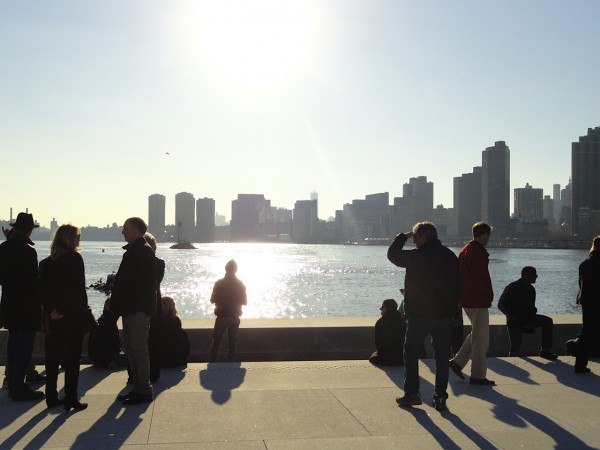
Aerial view of the four freedoms park from the Roosevelt Island tram

Aerial view of the four freedoms park from the Roosevelt Island tram

The Four Freedoms Park can be accessed by the Roosevelt Island Tram and the Queens bound F train. Details at www.fdrfourfreedomspark.org

THE MORGAN LIBRARY & MUSEUM by Andy Goldsborough

DSC05482-e1338334715794.jpg

Although I have lived directly behind the Morgan Library for more than 5 years, I had not fully rediscovered the library and museum until recently at the Dan Flavin Drawing show. Last week after seeing the incredible drawings and a few select light sculptures by Dan Flavin I decided to revisit the library and study the details of this McKim, Mead and Whitearchitectural masterpiece. Pierpont Morgan, a great financier of the turn-of-the-century assembled a collection of artistic objects, rare books and manuscripts beginning in 1890 and within a decade his collections grew so large he needed a place to house the works.

DSC05491-600x450.jpg

The grandest and largest room in the building is the library with ceilings soaring to thirty feet and lined with triple tier bookcases of bronze and inlaid Circassian walnut. Two concealed staircases in the corners of the room provide access to the balconies and a pair of stained glass casement windows illuminate the room from the north.

DSC05486-e1338336664615-600x800.jpg
Detail of circassian walnut and bronze bookcase

Detail of circassian walnut and bronze bookcase

DSC05489-600x450.jpg

The original library on 36th Street between Madison and Park Avenues was completed in 1906 by architect Charles McKim and was designed as a Renaissance-style palazzo with very elegant details and considered by many to be his masterpiece. Adjacent to Morgan’s home on the corner of 36th Street and Madison, the library was constructed of Tennessee pink marble. The construction of the building was so precise that the blocks of stone were set with virtually no mortar. A pair of lionesses flank the recessed portico featuring double ionic columns and a bronze door.

Model of the Morgan Library by Mckim, mead & white

Model of the Morgan Library by Mckim, mead & white

Above the entry artist Andrew O’Connor (1874-1941) created the sculpted lunette with two putti supporting the logo of Aldus Manutius, the great Renaissance scholar and the dedicatory panel on the cornice. A student of Augustus Saint-Gaudens, Adolph Weinman (1870-1952) sculpted the reliefs on the facade and the Assyrian lionesses were the work of Edward Clark Potter (1857-1923). Potter later created the pair of lions that guard the entry to the New York Public Library.

Edward Clark Potter’s lioness guards the old entrance to the library

Edward Clark Potter’s lioness guards the old entrance to the library

The mantelpiece on the east wall of the Library is carved of Istrian marble in the Renaissance style. Above is a tapestry, The Triumph of Avarice, with a moralizing Latin inscription that translates, “As Tantalus is ever thirsty in the midst of water, so is the miser always desirous of riches.” The tapestry belongs to a series depicting the Seven Deadly Sins, designed by Pieter Coecke van Aelst (1502–50), the father-in-law of Pieter Bruegel the Elder. It was produced in Brussels in 1545 by the workshop of Willem de Pannemaker (active 1535–78). Four other tapestries from the series are in the Spanish royal collections, and a complete series of seven is in Vienna’s Kunsthistorisches Museum.

Istrian marble mantelpiece and “triumph of avarice” tapestry

Istrian marble mantelpiece and “triumph of avarice” tapestry

Renaissance style Istrian marble mantelpiece in the library

Renaissance style Istrian marble mantelpiece in the library

Morgan Library rotunda

Morgan Library rotunda

View into the library from the rotunda

View into the library from the rotunda

Librarian’s office

Librarian’s office

Detail of bronze handrail in the librarian’s office

Detail of bronze handrail in the librarian’s office

The Morgan Annex was built in place of the original Morgan home at the corner of 36th and Madison west of the McKim, Mead and White library in 1928. Project architect Benjamin Wistar Morris’ mission was to design a building that would double the size of the original library and integrate architecturally with the library. The main entry was also moved to 29 East 36th Street once the addition was completed.

Morgan Campus Annex built in 1928

Morgan Campus Annex built in 1928

New entry for Morgan Campus

New entry for Morgan Campus

Ceiling of the new entry

Ceiling of the new entry

The Morgan house at the corner of 37th and Madison was acquired in 1988 as a residence for Morgan’s son Jack and his family. It was the only surviving brownstone from the original Morgan complex and is a New York City landmark.

Morgan Brownstone

Morgan Brownstone

Morgan Brownstone music room now serves as the museum bookstore

Morgan Brownstone music room now serves as the museum bookstore

In 1991 the Renzo Piano garden court conservatory opened connecting all three structures centrally.

Renzo Piano present day entry connecting the Morgan Brownstone and Annex

Renzo Piano present day entry connecting the Morgan Brownstone and Annex

Renzo Piano conservatory and stairs leading to Morgan library

Renzo Piano conservatory and stairs leading to Morgan library

The Dan Flavin drawing show runs through July 1st at the Morgan Library.

GIO PONTI / PARCO DEI PRINCIPI SORRENTO by Andy Goldsborough

DSC03927-e13347982409281.jpg

Recently, I took my mom on a trip to Italy that I will never forget. We started in Rome (more on that later) and then traveled south to Sorrento for a weekend at Gio Ponti’s Parco dei Principi, designed in 1962. The approach to the hotel is through a lush garden that feels much more like a tropical Brazilian landscape but once you reach the blue and white facade, it’s unmistakably Ponti.

Entry gate to the Parco dei Principi

Entry gate to the Parco dei Principi

Garden approach to the hotel

Garden approach to the hotel

Parco dei Principi facade

Parco dei Principi facade

After checking in, we dashed up to the room and I was truly speechless, gazing at the view and the spare but 100% Ponti designed furnishings and tile floor. Gio Ponti has influenced my design work since college and I will cover his architecture, furniture and lighting, accessories and ceramics in a future post.

Gio Ponti vanity/desk and superleggera chair

Gio Ponti vanity/desk and superleggera chair

Wardrobe

Wardrobe

Console table and valet

Console table and valet

Headboard detail

Headboard detail

Mom making a quick call before we head downstairs for a drink……the view of the ocean beyond

Mom making a quick call before we head downstairs for a drink……the view of the ocean beyond

Next, we were off to the bar but the weather was so beautiful a waiter asked if we’d like to sit outside?

Mom at the bar

Mom at the bar

Of course, but we didn’t see any furniture by the pool.

Pool

Pool

DSC03816_2-600x450.jpg

He disappeared and all of sudden we had our own table on the veranda with the pool behind us and the view of the Amalfi Coast in front of us.

DSC03919-600x450.jpg

Following are my pictures of the interior and exterior during taken over our 3 day stay in one of Gio Ponti’s most iconic buildings.

Jetty below the hotel

Jetty below the hotel

Lounge

Lounge

DSC03861_2-600x450.jpg
View of hotel from the jetty below

View of hotel from the jetty below

DSC03843-600x800.jpg
DSC03851_2-600x800.jpg
DSC03933-600x800.jpg
The blue lounge at night

The blue lounge at night

DSC03872-600x450.jpg
Lobby and reception desk

Lobby and reception desk

Restaurant

Restaurant

mailbox designed by gio ponti

mailbox designed by gio ponti

Link to the hotel below

Hotel Parco dei Principi

VILLA NECCHI CAMPIGLIO MILAN by Andy Goldsborough

DSC04398-e13348342093881.jpg

On my recent trip to Chiavari, I also spent a few days in Milan and visited the magnificent Villa Necchi.
This architectural masterpiece at no. 12 Mozart was designed by Piero Portaluppi between 1932 and 1935 for Angelo Campiglio and the Necchi sisters, Nedda and Gigina, Angelo’s wife.They were important producers of cast iron and enameled sewing machines. In the mid 1940’s Tomaso Buzzi was brought in to renovate and decorate the house as the Necchi family’s tastes changed. Thankfully, in 2001 the residence was given to the Italian Fund for the Environment and opened to the public in 2008. Now, you can take a tour of the entire house and examine every detail as I did. Following are the images I took in sequential order capturing a truly inspiring tour of the Villa Necchi.


Approach through the garden from via Mozart

Approach through the garden from via Mozart

Entry and facade

Entry and facade

Entry hall with L’amante Morta (Deceased Lover) by Arturo Martini at foot of the stairs

Entry hall with L’amante Morta (Deceased Lover) by Arturo Martini at foot of the stairs

The library featuring rosewood bookcases and game table by Guglelmo Ulrich

The library featuring rosewood bookcases and game table by Guglelmo Ulrich

The intricate stucco ceiling of the library

The intricate stucco ceiling of the library

The veranda with travertine and green marble in a pattern of wide interwoven bands

The veranda with travertine and green marble in a pattern of wide interwoven bands

Original ‘s’-shaped sofa in the veranda

Original ‘s’-shaped sofa in the veranda

Custom lapis lazuli table in the veranda

Custom lapis lazuli table in the veranda

Custom Lapis Lazuli table in the veranda

Custom Lapis Lazuli table in the veranda

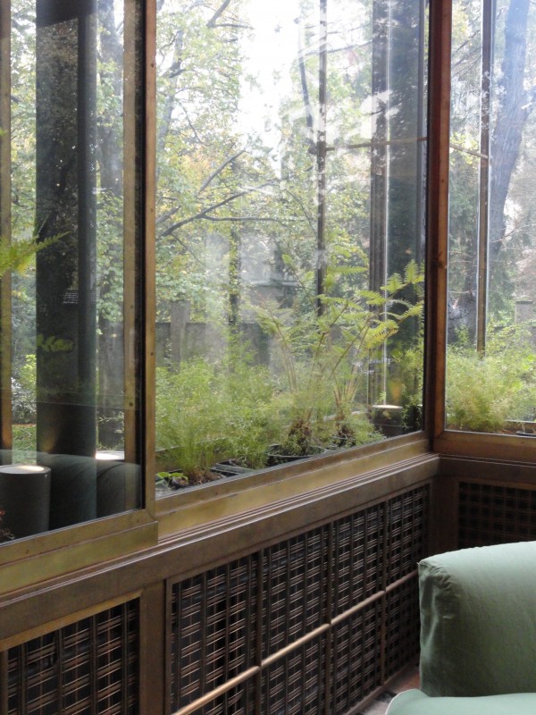
Light filtering through the double glass wall greenhouse with brass radiator detail

Light filtering through the double glass wall greenhouse with brass radiator detail

Detail of window hardware at double walled glass panels

Detail of window hardware at double walled glass panels

German silver sliding doors from the veranda into the library

German silver sliding doors from the veranda into the library

Dining room centerpiece by Alfredo Ravasco in lapis lazuli, agate and coral

Dining room centerpiece by Alfredo Ravasco in lapis lazuli, agate and coral

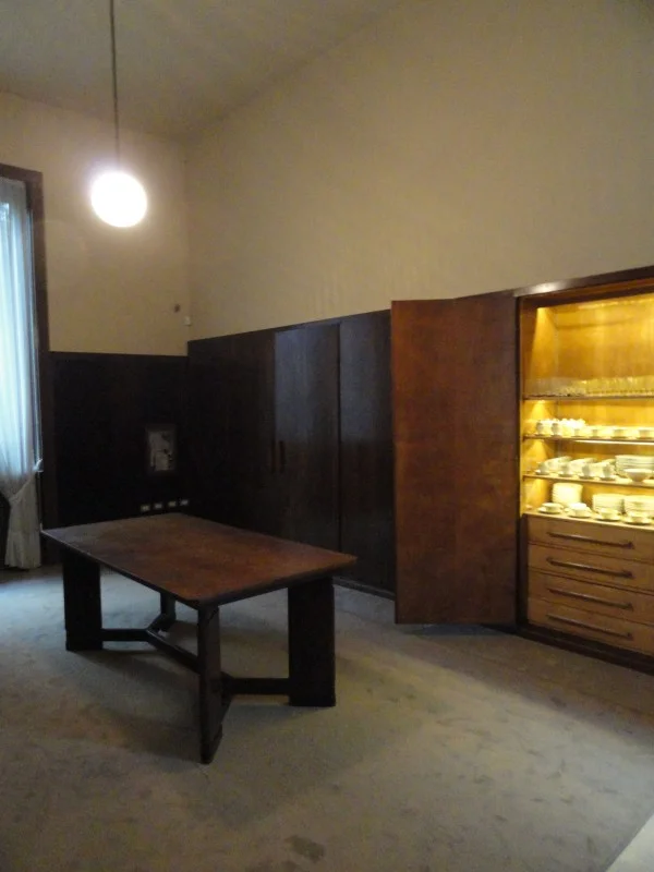
Butler’s pantry (second office) exposes china designed by Portaluppi as well

Butler’s pantry (second office) exposes china designed by Portaluppi as well

The gallery separating the sisters’ bedrooms identically composed

The gallery separating the sisters’ bedrooms identically composed

Sitting area outside the master bedroom

Sitting area outside the master bedroom

Master bath

Master bath

Guest bedroom with walnut and briarwood furnishings

Guest bedroom with walnut and briarwood furnishings

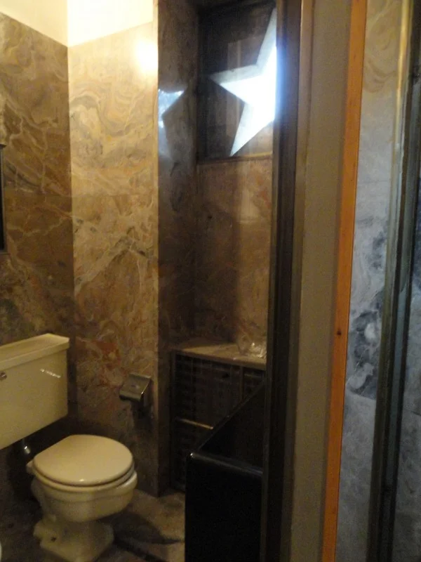
Bathroom with star window detail in marble

Bathroom with star window detail in marble

Descending the stairs to the entry hall

Descending the stairs to the entry hall

DSC04407-600x450.jpg

Tilda Swinton starred in “I Am Love” last year in which the house played an important role.

Link to the Villa Necchi Campiglio Museum
The Villa Necchi


TADAO ANDO / THE MODERN FORT WORTH by Andy Goldsborough

DSC05224-e13346107081491.jpg

Once I had taken in the Kimbell, I strolled over to the Modern Museum of Art by Tadao Ando, completed in 2002. The museum is a series of 5 glass and concrete pavilions floating on a 1.5 acre pond.

Concrete cantilevered roof

Concrete cantilevered roof

As you approach the building Richard Serra’s Vortex, a tall swirling kaleidoscope of steel.

Richard Serra “Vortex” 2002

Richard Serra “Vortex” 2002

View inside Richard Serra’s “Vortex”

View inside Richard Serra’s “Vortex”

The modern entrance

The modern entrance

The main entrance has an enormous cantilevered concrete entry with views onto the pond in the distance. Once inside, I was struck by the forty foot tall Y-shaped concrete columns that support the elegant roof and walls of glass reflecting in the water.

DSC05227-600x450.jpg
DSC05238-600x800.jpg

Hidden from view are clerestory windows that bring light into the galleries much like the skylights in the Kimbell but on a much grander scale.

DSC05243-600x450.jpg

The permanent collection works on view included Anselm Kiefer’s Book with Wings and Martin Puryear’s Ladder for Booker T. Washington as well as Andy Warhol and Donald Judd to name a few.

Anselm Kiefer “Book with Wings” 1992-1994

Anselm Kiefer “Book with Wings” 1992-1994

Martin Puryear “Ladder for Booker T. Washington” 1996

Martin Puryear “Ladder for Booker T. Washington” 1996

Donald Judd “Untitled” 1967

Donald Judd “Untitled” 1967

The restaurant at The Modern is also a great place for lunch and the round pavilion floating on the lake offers the best views of Tadao Ando’s elegant building.

DSC05231-600x800.jpg

LOUIS KAHN / KIMBELL ART MUSEUM by Andy Goldsborough

DSC05193-e13345946809361.jpg

I’ve just returned from Dallas, Texas and visited the Kimbell Art Museum by Louis Kahn. I’ve always admired Kahn’s work and studied the building in architecture school, but visiting the museum in person took my admiration to a whole new level after seeing the details of this incredible building designed in 1972.

Exterior view of vaults

Exterior view of vaults

DSC05191-600x800.jpg

Kahn designed the museum with the idea of creating a space that evoked “the luminosity of silver” and that was certainly what I felt on this cloudy day looking at the Impression show currently on view.

Central vault with museum shop at right

Central vault with museum shop at right

Maillol’s “l’ air” cast bronze 1967, designed 1938 in the courtyard

Maillol’s “l’ air” cast bronze 1967, designed 1938 in the courtyard

The concrete, unfilled travertine and stainless steel used in the construction of the museum further expand on this vision and come together beautifully.

Concrete vault and stainless steel lighting diffuser detail

Concrete vault and stainless steel lighting diffuser detail

Stainless steel and mesh lighting diffuser

Stainless steel and mesh lighting diffuser

Exterior concrete detail

Exterior concrete detail

Unfilled travertine

Unfilled travertine

The craftsmanship of the interior and exterior create galleries that are illuminated in a soft but effective way with no glare from the natural light that comes in through slits in the tops of the vaults and washes the concrete ceiling. Gently curved stainless steel and mesh panels with concealed lighting further enhance this silvery light quality throughout the galleries.

DSC05194-600x450.jpg

One of the details that I found most intriguing was the stainless steel handrail which is made from one piece of formed stainless steel and felt so incredible to my hand. The light that reflects on the shiny surface of the handrail travels all the way from the upper to the lower levels, truly inspiring!

Double vault view with handrail in foreground

Double vault view with handrail in foreground

DSC05204-600x800.jpg

Renzo Piano, who worked in Kahn’s office has been chosen to design a new building extenision scheduled for completion in 2013. The building will also utilize concrete and stainless steel as the primary construction materials. I highly recommend a trip to the Kimbell Museum of Art and The Modern Museum of Art by Tadao Ando across the street and will write further about it in my next post.