THE GILDED OWL

PAUL JACOBSEN IN THROUGH THE OUTSIDE AND BERLIN DEKO by Andy Goldsborough

We opened our current show Paul Jacobsen “In Through the Outside” and Berlin Deko, a collection of furniture, lighting and objects by German architects from 1910 to 1930 this week with a stellar turnout and the installation will be on view through November 18th in our 105 Warren Street gallery.

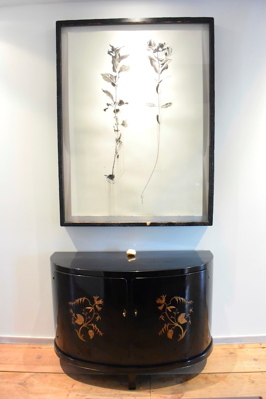
All of the works ( 5 oils and 2 large scale charcoals ) evoke a sense of the life Paul has made here in the Hudson Valley. Initially, the drawings appear to be straight forward renditions of the wild weeds that envelope the artist’s studio and the acreage surrounding his home. But on closer observation, we notice that Jacobsen has imbued a gorgeous elegance and given a quiet stillness to the lucky ones chosen as subjects.  By separating these particular specimens  from the rest of the knotted weed sprawl which has a grand presence on Paul and Laura’s land, we are given the opportunity to stop, be still and notice every detail that the Milkweed, Nettles and Sumac have to offer. Strength and delicacy coexist within the drawings reminding the observer of the many mysteries, struggles and unexpected wonders that the land in Germantown constantly reveals.

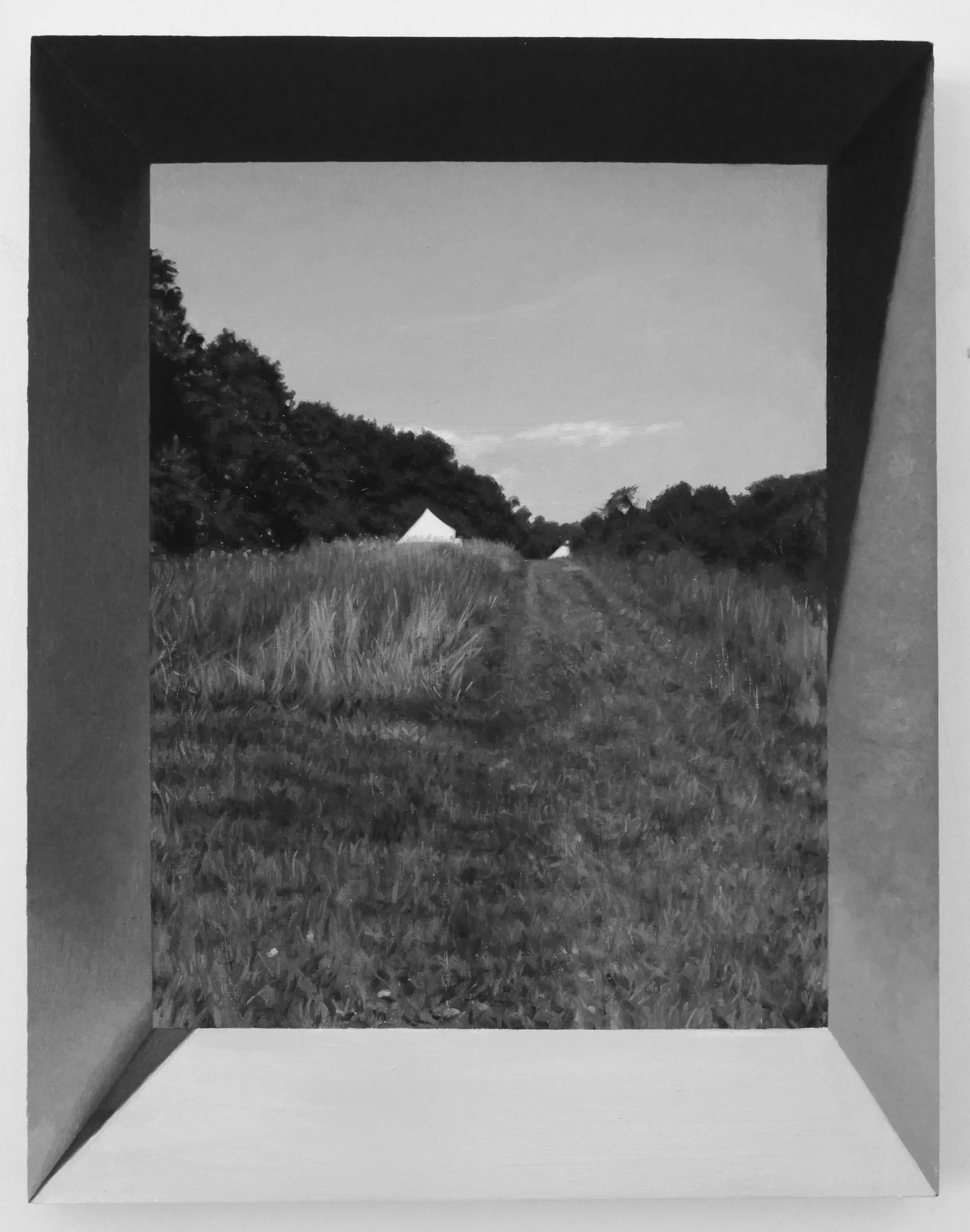
Each of the 5 oils  produced specially for this exhibition tells a different story and reflect the ongoing ideas and observations Jacobsen has grappled with while living on the land and incorporating into his work. UNTITLED LANDSCAPE, 2017 and UNTITLED CRYSTAL, 2017 are perhaps most closely associated with the charcoal drawings because of the predominate use of black and white but whereas the artist gives an expansive amount of freedom to the wandering weeds, Jacobsen cleverly traps the viewer into his exact  perspective and mathematically precise observations of the land, it’s distance from us and, at the same moment, by adding elements of the real world ( dangling crystals, portraits, flags, everyday kitchen items and tools ) the artist reminds us that the land actually supports our physical existence.  All of this beauty is seen through the pin point precision of a lens and is encapsulated within the artist’s hand painted frames.

The-Whitenness-of-the-Whale.jpeg

William Morris and Herman Melville serve as intriguing subject matter for Jacobsen. Both of these iconic figures represent the artist’s continued fascination with historic men and their relationships with their respective crafts. Morris was and English textile designer, artist and writer and is most closely associated with the English Arts and Crafts Movement. A close friend of Morris and his wife, Jane Burden, Phillip Webb the architect designed, for the couple, a house in the rural countryside which Morris wanted to be “Modern” but would portray a spirit of the Medieval which is exactly what Webb delivered. Their new habitat was named Red House and Morris spent 2 years decorating the place with the help of artist friends. The rug which Paul Jacobsen designed and was crafted by Equator Production is, in a sense, an homage to William Morris and to his illustrious patterns which were most popular in the wallpapers and textiles he continued to design throughout Morris’s life. The small portrait UNTITLED, WILLIAM MORRIS is an example of Jacobsen’s painterly use of bright colors and juxtapositioning of the figure seen up close, dangling from a thread and push pin and the lush landscape which supports the figure and creates a tension between the foreground and background. Illusion is hard at work here as is the precise technique the artist is so adept at which ultimately pulls the viewer in.

William-Morris-oilo-on-panel.jpg

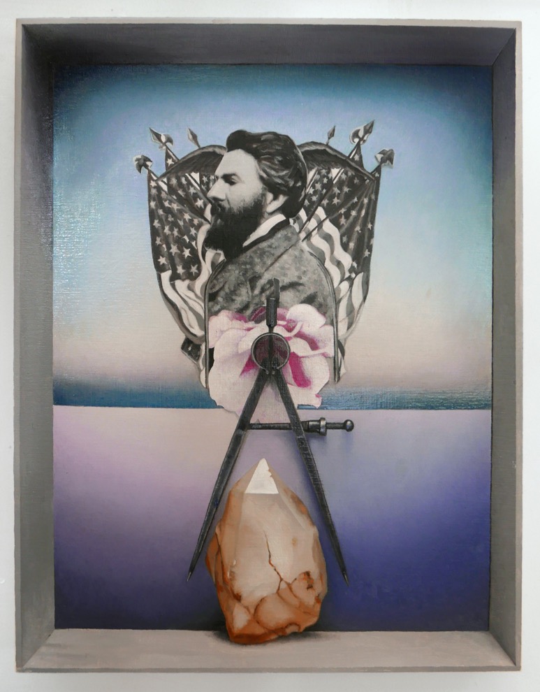
Jacobsen’s UNTITLED (PORTRAIT OF HERMAN MELVILLE) is directly related to chapter 42, the Whiteness of the Whale where Melville describes the voids and curiosities of the universe through the metaphor of the White Whale. In essence whiteness is not so much a color but the visible absence of color. In the artist’s portrait of Melville, Jacobsen incorporates symbols, American Flags, an architect’s compass, a golden crystal which upon close study reveals a small but pure white triangle, all of this painted against a vast, horizontal ocean which harbors the White Whale and provided a way for Melville to set sail on his 3 year journey at sea. The artist, Jacobsen,  has intentionally left images of the whale out of the painting and focuses on the author himself, his symbols and the white triangle containing all of the colors of the universe resting a top the crystal . This is an important portrait in context of the exhibition since Melville was a visitor to Hudson and in Moby Dick he uses imagery of the whale to describe man’s relationship to nature in terms drawn from 18th Century Aesthetic Philosophy which Jacobsen also  beautifully threads throughout his work.

The-Whitenness-of-the-Whale.jpeg

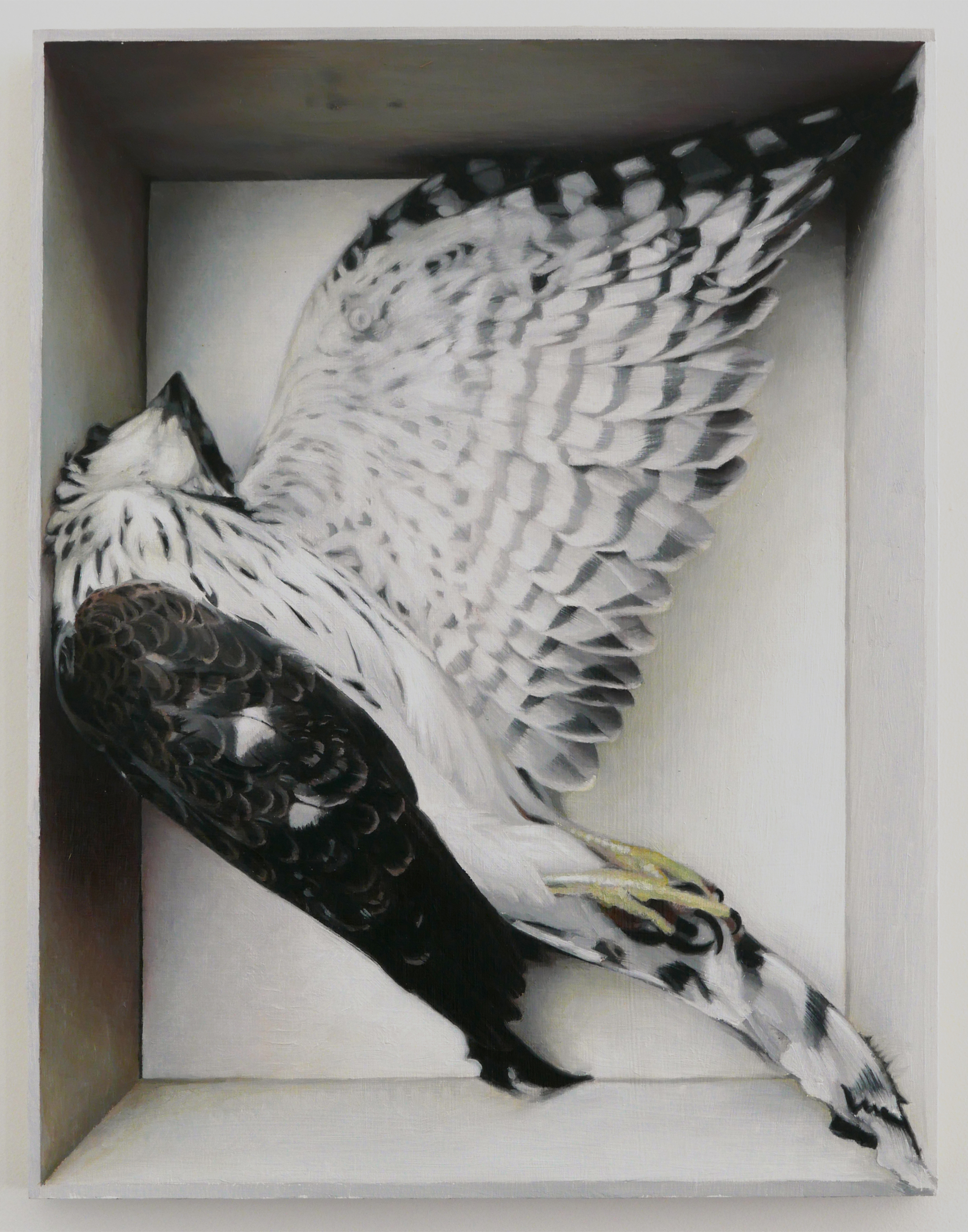
UNTITLED ( COOPERS HAWK ) is perhaps the most direct  portrait in the exhibition, a life study of the bird Jacobsen found on his land in Germantown, it’s twisted body still warm from the fall that took place after he flew into a pane of glass and died. Feathers, greenish talons, a tiny black beak and a regal display of soft , gently patterned black and white feathers all became the perfect subject matter for the artist. After taking the hawk to his studio, Jacobsen rearranged it’s body delicately and then respectfully placed it into a wooden box, photographed the body before any signs of rigamortis set in, preserving the beauty and dignity of death. The portrait is gorgeous, reminiscent of and Old Master work painted with the hand of brilliance.

The Gilded Owl and Lampedo Gallery presents an exhibition devoted exclusively to furniture designed by Berlin architects between 1910 and 1930. The six-week show, “Berlin Deko – German furniture 1910 – 1930″ is a comprehensive survey of German design to look beyond the Bauhaus movement. It aims to highlight the long-overlooked significance and legacy of Berlin as an important European center of architecture and design. Among the protagonists are Leo Nachtlicht, Bruno Paul, Eduard Pfeiffer and Lajos Kozma.

DSC_4238.jpg
22281680_10154969820470318_5343909586258917561_n.jpg

Because Berlin has attracted artists from abroad for centuries, the city has also been a crossroads for a variety of approaches to art and design that originated in near and far corners of the world. These distinct influences and their many hybrids will unfold throughout the exhibition. The objects shown will span a vast arc from futurism to expressionism, from the avant-garde to the traditional, with an underlying current of the exotic and the baroque, which is typical of the period.

Over the past twenty years German interior design from this period has often been reexamined and found its way into private and public collections such as those of the Kunstgewerbemuseum Berlin, the Wolfsonian in Miami, or the Metropolitan Museum of Art in New York. To capture the truest essence of Berlin in the Deco Years, Lampedo invited Arne Sildatke to write an essay for the show. Mr. Sildatke, who wrote his doctorate paper on Art Deco Interiors in Weimar Germany, is a key expert who reevaluated German design of that era and gave it a new position in the history of art.

DSC_4240.jpg

Established in 2004 in Berlin, Lampedo Gallery is focused on European continental furniture. In 2009 it relocated to New York. Owner Markus Winter has introduced furniture by architects such as Karl Friedrich Schinkel, Ludwig Mies van der Rohe, Bruno Paul or Gio Ponti into both public and private collections. In 2004 he curated, along with Brian Kish, the first exhibition in America on Guglielmo Ulrich and in 2008 he organized the first exhibition on Luisa and Ico Parisi in Germany.

Paul Jacobsen “In Through the Outside” and Berlin Deko will be on view at 105 Warren Street through November 18th.
GEORGE HOFFMAN FRAGMENTS / DUCCIO . HOURS . BREVIARY by Andy Goldsborough

George-Hofmann-Hours-1-2012-acrylic-on-birch-board-30-x-24-in. (1).jpg

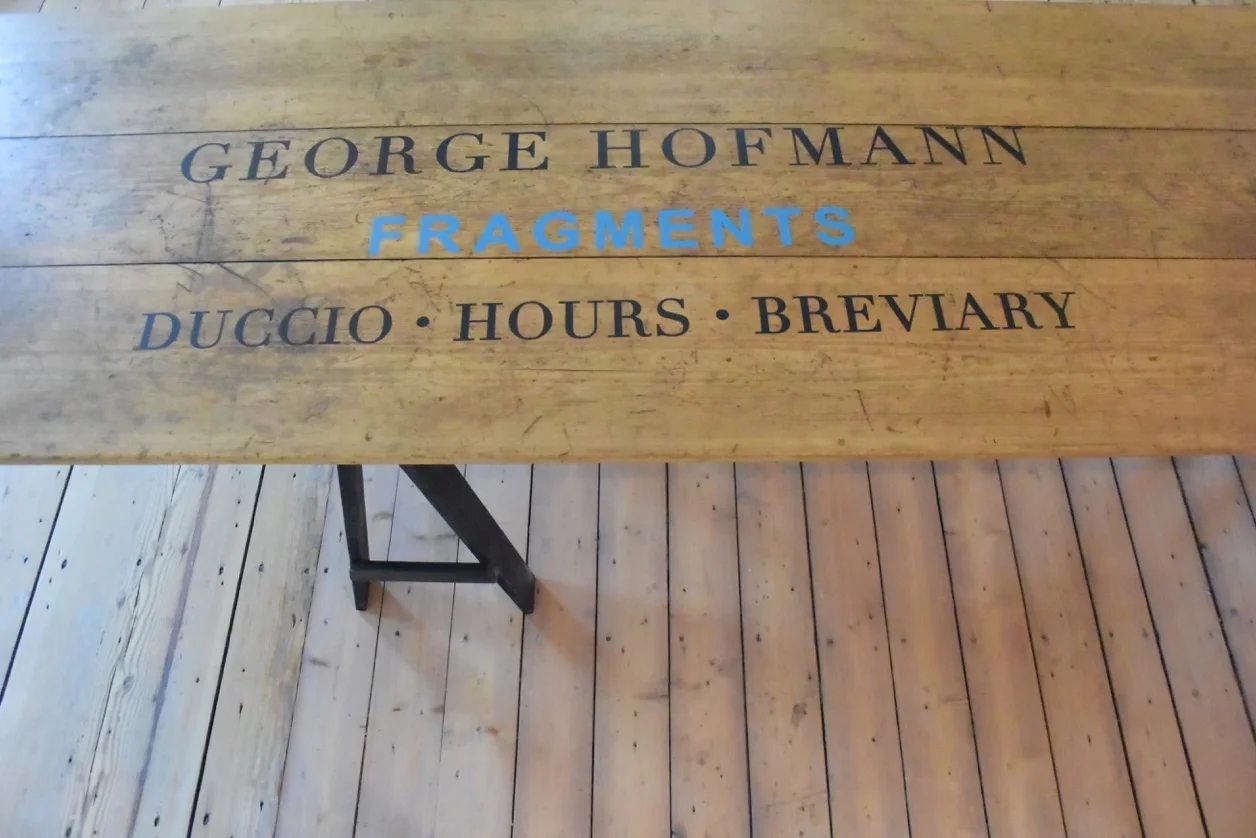
The Gilded Owl is pleased to present it’s fifth exhibition titled FRAGMENTS; paintings on panel by the artist, George Hofmann. On view in the galleries are 3 bodies of work dating from 2011 & 2012, each of which refer to their respective titles including Duccio, Breviary & Hours. Following are selected works and insight from Hofmann.

DSC_3651.jpeg
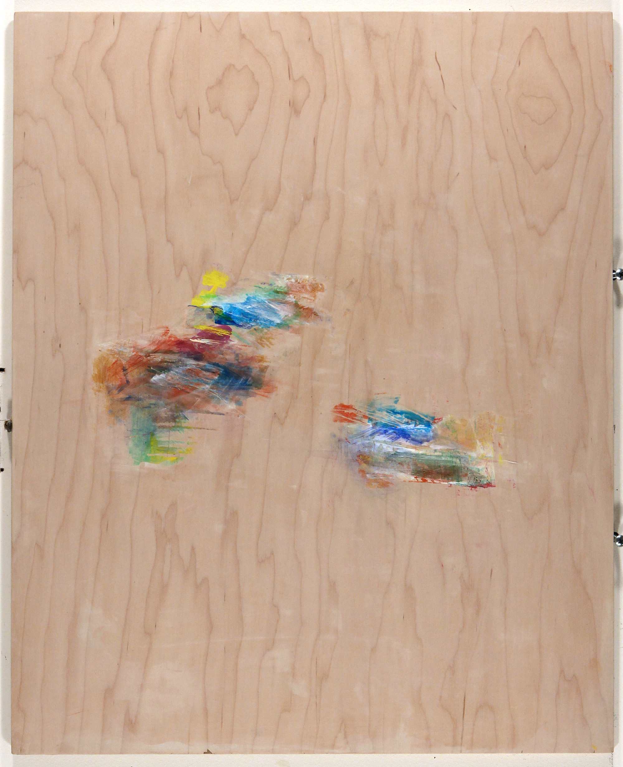
Hours 4 2012 acrylic on birch board, 30″ x 24

Hours 4 2012 acrylic on birch board, 30″ x 24

“Like most artists, I look to the past – to see how it was done, for inspiration, and for guidance.
Increasingly, in recent years I have looked to the early Renaissance – probably kicked back further than I was looking before by the acquisition of the Duccio Madonna by the Metropolitan Museum some years ago. This simple tiny picture of the Madonna and Child – of which there are many – especially struck home because of the tiny gesture of the child’s raising its finger – a simple gesture, yet a departure, in expression, and a most moving one. How very much feeling there is in Duccio! Even the simplest compositions, like the depiction of Jesus and the fisherman in the National Gallery in Washington, are full of simple, and honest, emotion.
This is belief, and it is found, similarly, in the Books of Hours and Breviaries of the Middle Ages, in the simple color plates of adorations and other depictions in these Psalters, made by humble artists, and meant for clergy and lay alike – so honest, so simple…
Was there another time when such feeling triumphed in art? 

George-Hofmann-Hours-5-2012-acrylic-on-birch-board-30-x-24-in..jpg

I think the Annunciations, in particular, found their way, compositionally, into my work: this why there is duality in many of my pictures, a right and left side. In thinking about it, it struck me that the improbable meeting of the Heavenly and the Human must have seemed to the artists of the time something so inexplicable as to be almost undepictable. And yet, they tried, in their way, to show these otherworldly creatures coming to the awestruck woman (can we even imagine such an encounter?) who is, for the most part, dumbstruck.
I love the Greeks, and all times, in art, where the form, in its highest development and true feeling merge into one. But in an overly mechanistic and technological age, it seems right to be drawn to those periods in art richest in feeling. And all that I have learned in life about human emotion seems to me to be the richest source, now, for us, in art.”

Duccio fragment 3, 2011 acrylic on board 30″ x 24″

Duccio fragment 3, 2011 acrylic on board 30″ x 24″

“This is painting of emotional life – endless, fluid, recurring.
Gradually we become aware of ourselves in life – our experiences run deep, and are not without trial. Eventually awareness dawns – then it is a matter of sorting out. This painting is somewhat of a record of that.
Initially, Abstract Expressionism was a record of primality of emotion. It has to be remembered that many of those artists were born before electric light.
I am exaggerating, but think how, in their lifetimes the life of the psyche raised its profile in the modern world! Freud was only influential in a big way in the post WW2 years, and that was in my own childhood. The real examination of the psyche has been going on almost secretly since then, now discredited, now elevated, but largely unacknowledged.
But the emotionality of life has been showing up more and more in the work of younger artists, and breaking through in older artists.
I try to strip away, as in therapy, all that is extraneous, to lay bare the essential, and maybe, with luck, the beautiful.”

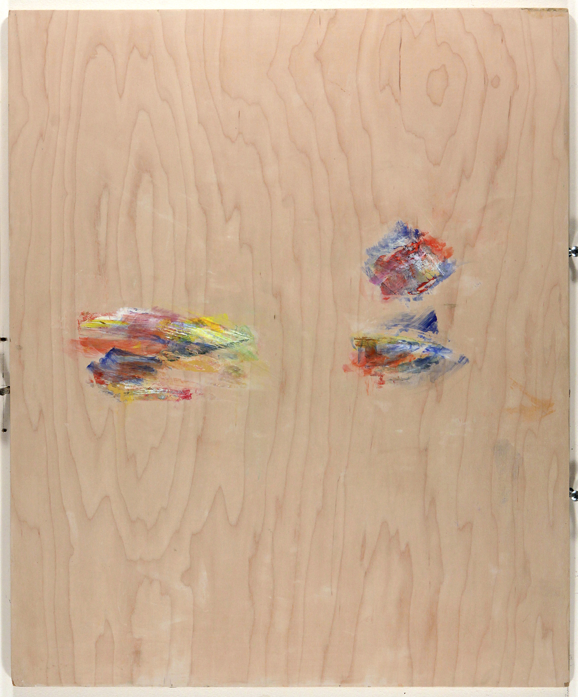
Codex minor 4 2016, acrylic on maple board 30″ x 24″

Codex minor 4 2016, acrylic on maple board 30″ x 24″

George Hofmann FRAGMENTS will remain open through September at THE GILDED OWL 105 Warren Street Hudson, NY.  For a complete list of works and PDF please email andy@thegildedowl.com

www.georgehofmann.com

BLACK WHITE + ALEX P WHITE by Andy Goldsborough

TheGildedOwl_17.jpg

THE GILDED OWL is pleased to present it’s third exhibition in Hudson, New York titled BLACK / WHITE + ALEX P WHITE. Inspiration for the show comes from combining Alex P White’s design sensibility and our love of all things black & white.

A diverse grouping of images including works by VALIE EXPORT, Marina Abromovic, Sol Lewitt, Peter Blume, Sharon Brant, Klemens Gasser, Kahn & Selsnick, Jack Roth and Paul Jacobsen are uniquely paired with sculpture and objects created by Courtney Smith, Bill Stone, Cameron Shaw, Eric Fertman and Valerie Hammond. Furnishings and lighting designed by Alex P White are shown along with these works marrying the idea behind THE GILDED OWL’S vision which is to include the combination of art and furniture in a living environment focused on craftmanship.

Clockwise from bottom, works by Valerie Hammond, Courtney Smith, Paul Jacobsen, Cameron Shaw, Cameron Shaw, Johannes Dorflinger, Eric Fertman, Sol Lewitt and Al Held

Clockwise from bottom, works by Valerie Hammond, Courtney Smith, Paul Jacobsen, Cameron Shaw, Cameron Shaw, Johannes Dorflinger, Eric Fertman, Sol Lewitt and Al Held

An exceptional pair of hand dyed cotton and viscose lounge chairs playfully referred to as “The Creatures” are shown alongside White’s faceted black lacquer tables that can be reconfigured in multiple ways. “The Modules” come in custom colors as well.

Klemens Gasser “There will be snowy owls without you” hangs above Alex P. White’s “modules” with a Paul Jacobsen “Shadow Box Arrangement”

Klemens Gasser “There will be snowy owls without you” hangs above Alex P. White’s “modules” with a Paul Jacobsen “Shadow Box Arrangement”

Alex P. White’s “The Creatures” in the foreground with Paul Jacobsen’s “Charcoal Flag”

Alex P. White’s “The Creatures” in the foreground with Paul Jacobsen’s “Charcoal Flag”

In the front gallery “Betwixt”, a sensational wire brused cerused oak bench is positioned so that viewers can see if from all sides with it’s legs gesturing in different directions.

“Betwixt” bench by Alex P. White with Hella Jongerius black porcelain roses bowl, Eric Fertman’s “Boutonniere”, Eduardo Chillida and Paul Jacobsen

“Betwixt” bench by Alex P. White with Hella Jongerius black porcelain roses bowl, Eric Fertman’s “Boutonniere”, Eduardo Chillida and Paul Jacobsen

And in the center hall positioned next to THE GILDED OWL, White’s “Eclipse” lamp made of hand carved foam, poured aqua resin and neon illuminates the three story staircase.

The Gilded Owl with Alex P. White’s “Eclipse”

The Gilded Owl with Alex P. White’s “Eclipse”

The austere simplicity of the THE GILDED OWL’S 1785 ship captains house combined with art that is pure and direct and otherworldly furniture and objects result in BLACK / WHITE + ALEX P WHITE.

The show runs through October 11th.
For press inquiries or information on any of the works in the show please contact

Andy Goldsborough / andy@thegildedowl.com

STEPHEN SPROUSE by Andy Goldsborough

DSC_1940.jpg

In 2001 on the way to buy my mom a birthday present, I was running down 14th street and rounded the corner onto Eighth Avenue and ran into Stephen Sprouse so hard I knocked him down onto the pavement. It wasn’t the first time I had seen him and I certainly knew who he was but I was mortified and embarrassed but also excited to have met someone I had admired and who had inspired me for so many years in New York City. I helped him up and he asked my name. I told him and he said I’m Stephen and I laughed and said I know who you are. After a brief hello in his unmistakably husky voice, he wrote Stephen and his number on the back of my business card in signature sharpie graffiti style. That began a year and several month friendship that was one of the most memorable times I’ve experienced since arriving in New York in 1989. Although I was not here for much of Stephen’s ups and down in the early to mid 80’s I was aware of the impact and how much he influenced the downtown fashion and art scene and how innovative his clothing, art and design process was.
The Gilded Owl blacked out for the Stephen Sprouse book signing with screenprinted Harley Davidson banner by Sprouse

The Gilded Owl blacked out for the Stephen Sprouse book signing with screenprinted Harley Davidson banner by Sprouse

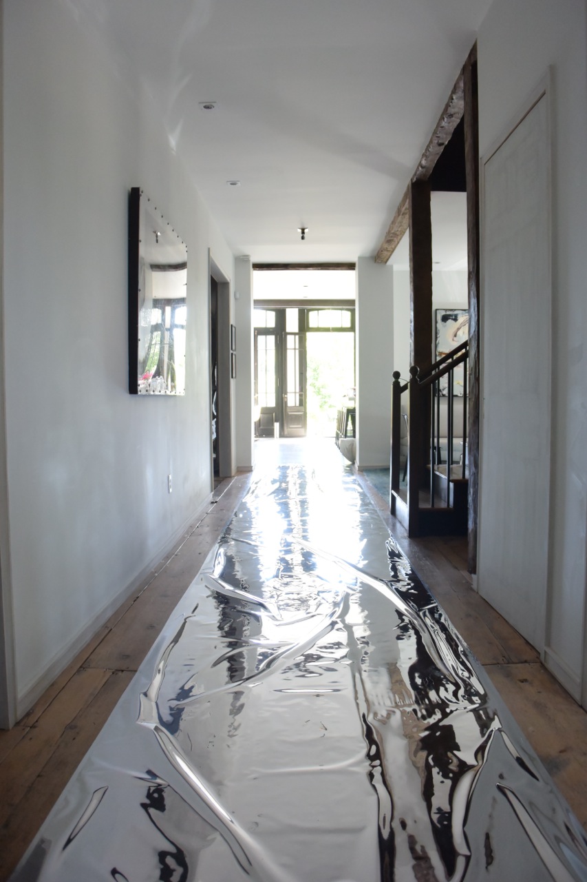
Silver mylar runway leading to the garden

Silver mylar runway leading to the garden

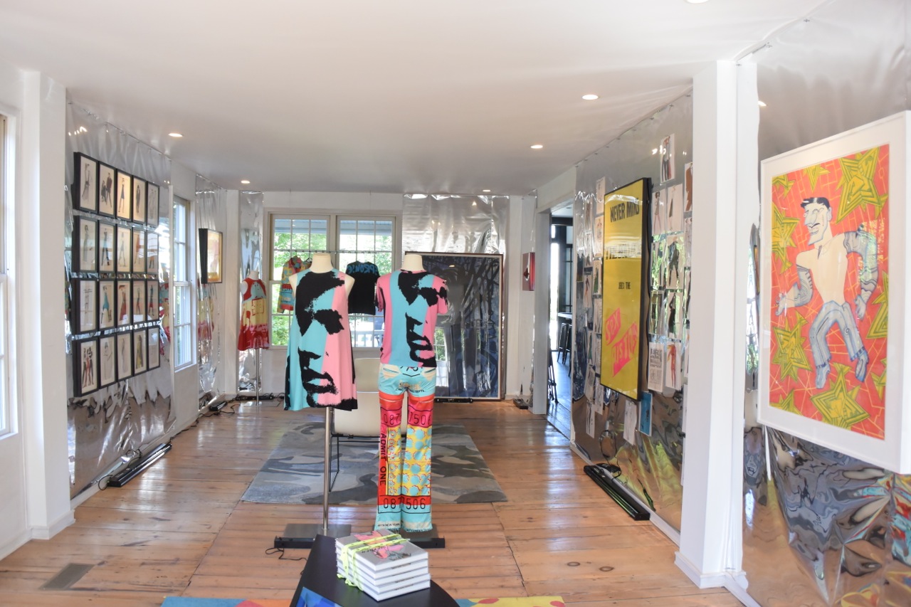
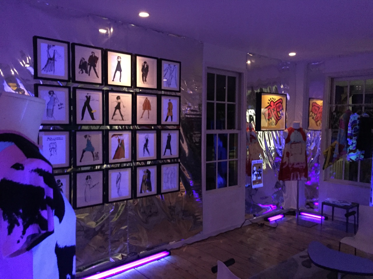
Gallery view

Gallery view

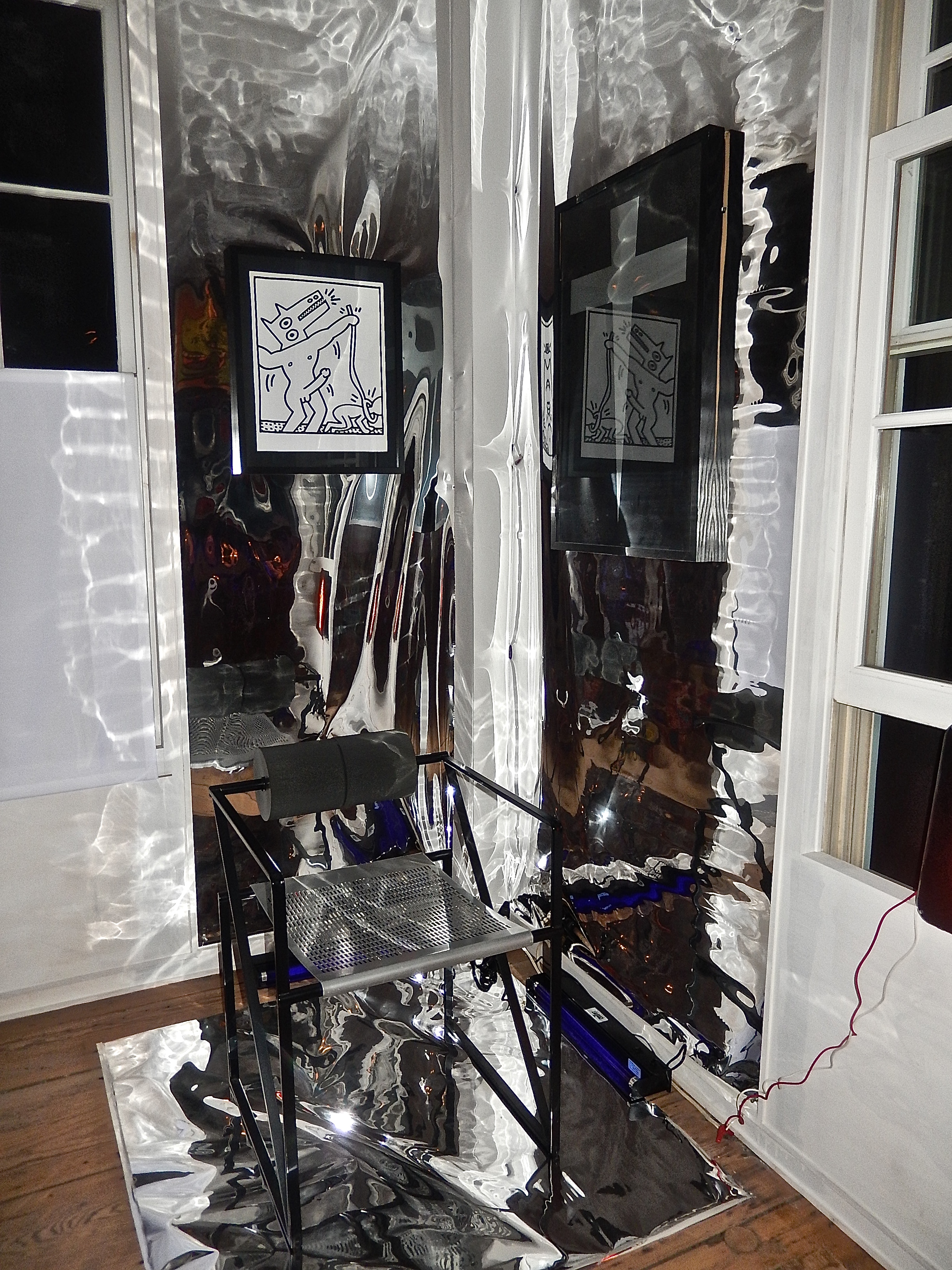
Keith Haring works and Mario Botta armchair

Keith Haring works and Mario Botta armchair

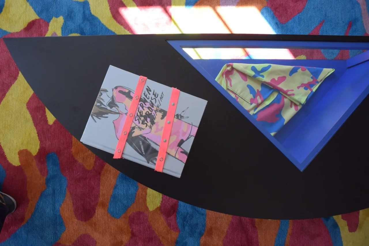
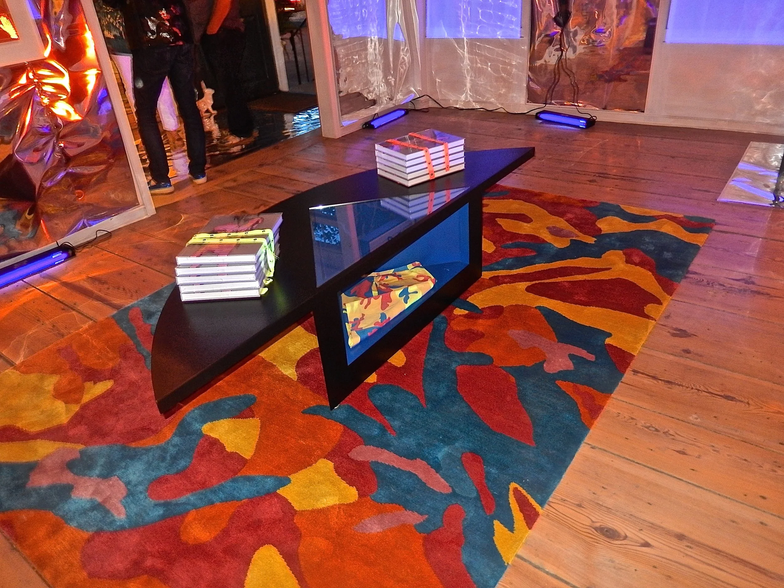
Sprouse books and shorts produced in collaboration with Andy Warhol

Sprouse books and shorts produced in collaboration with Andy Warhol

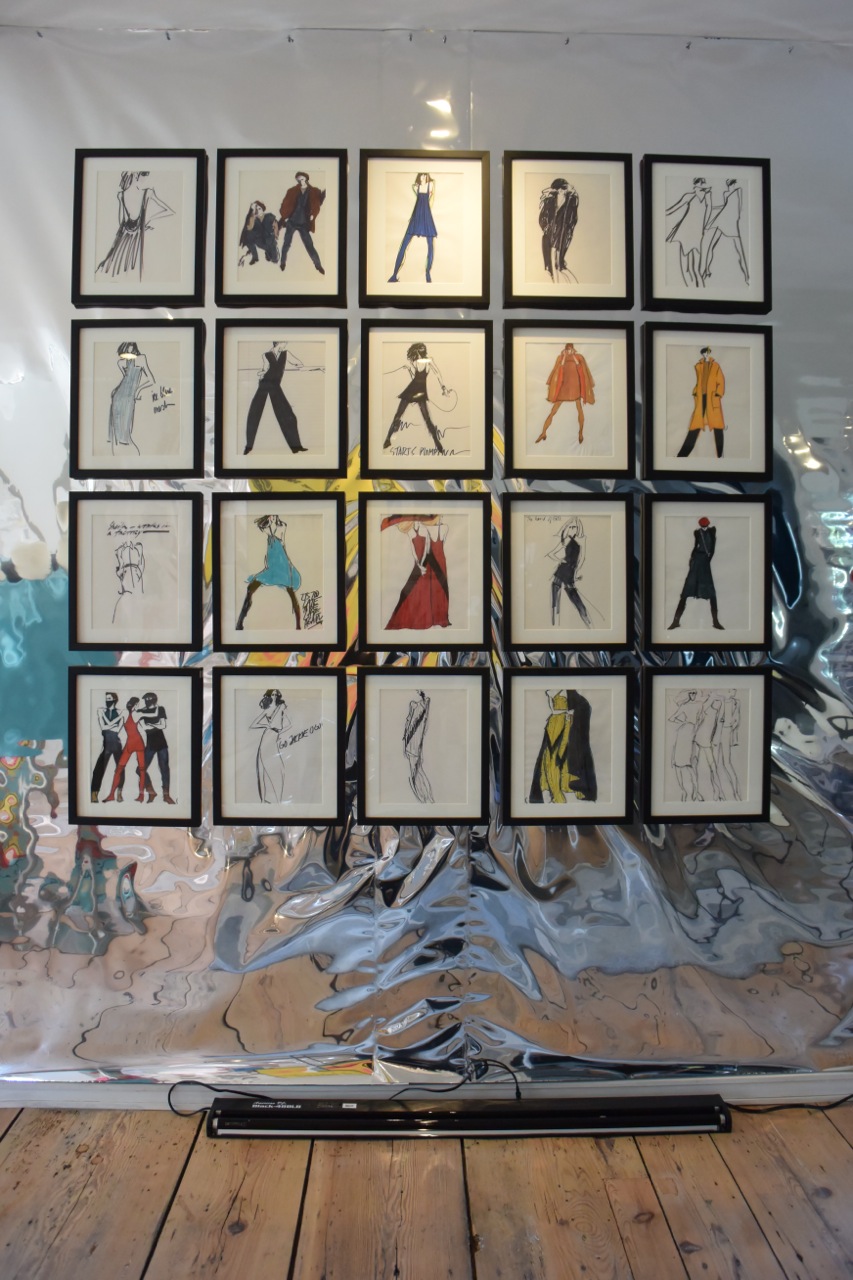
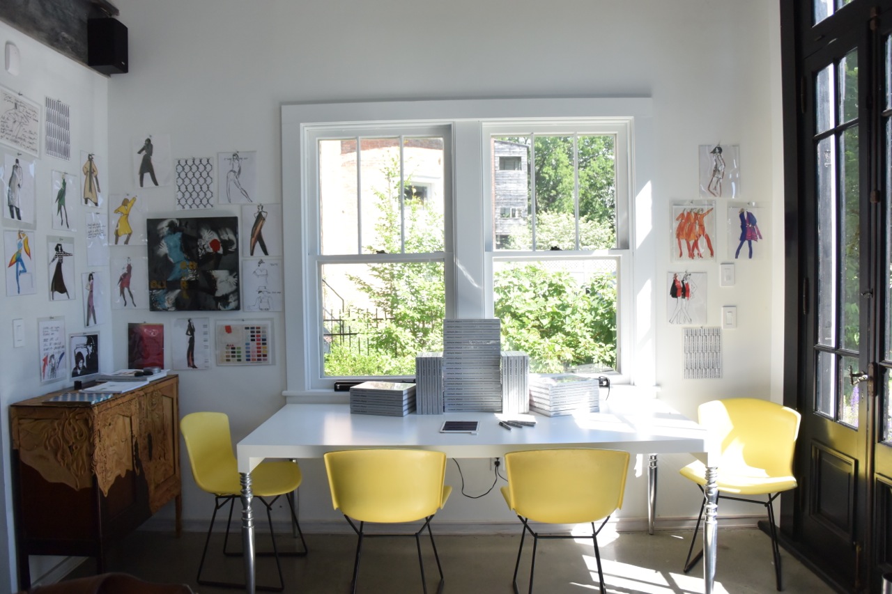
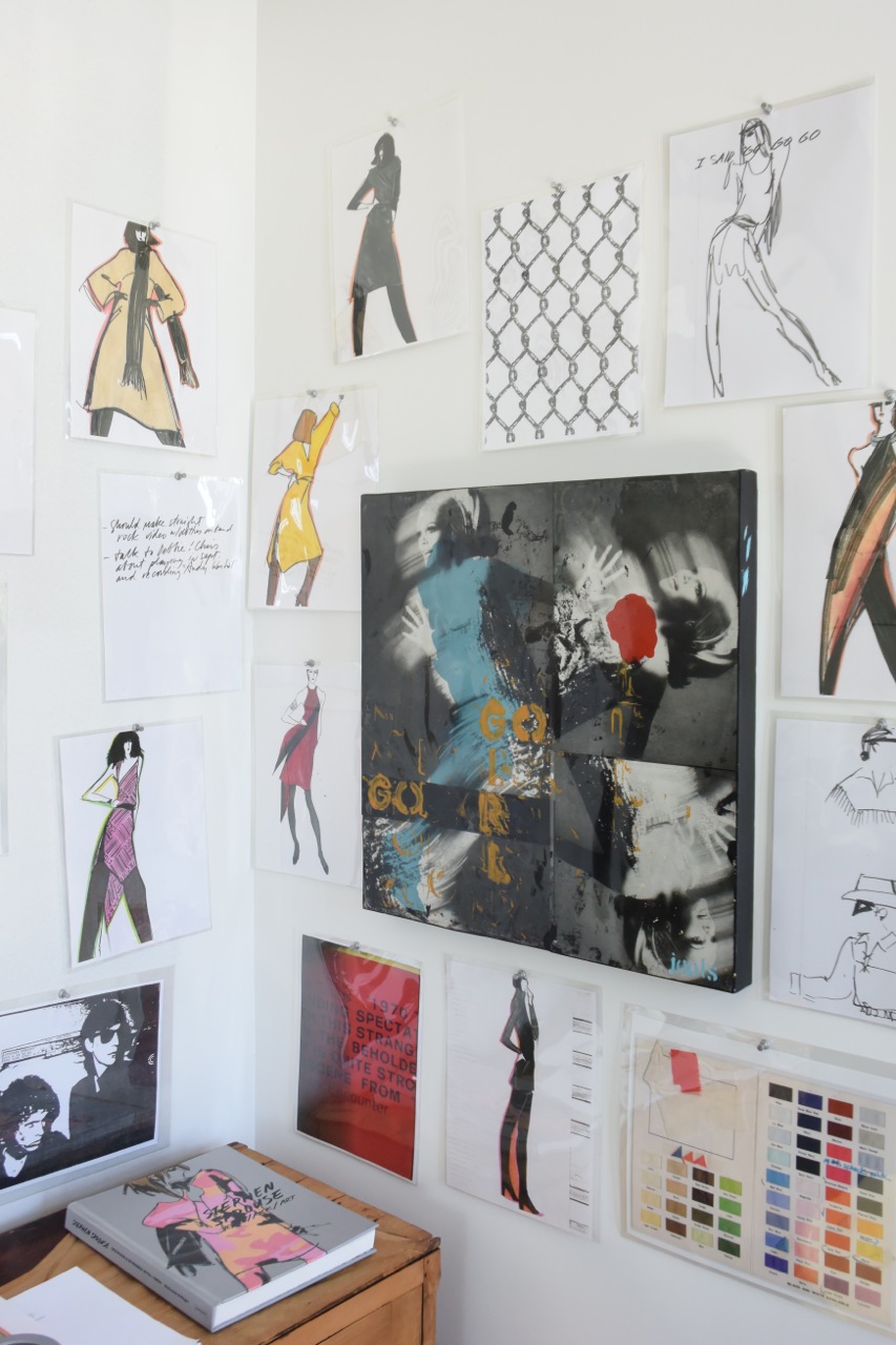
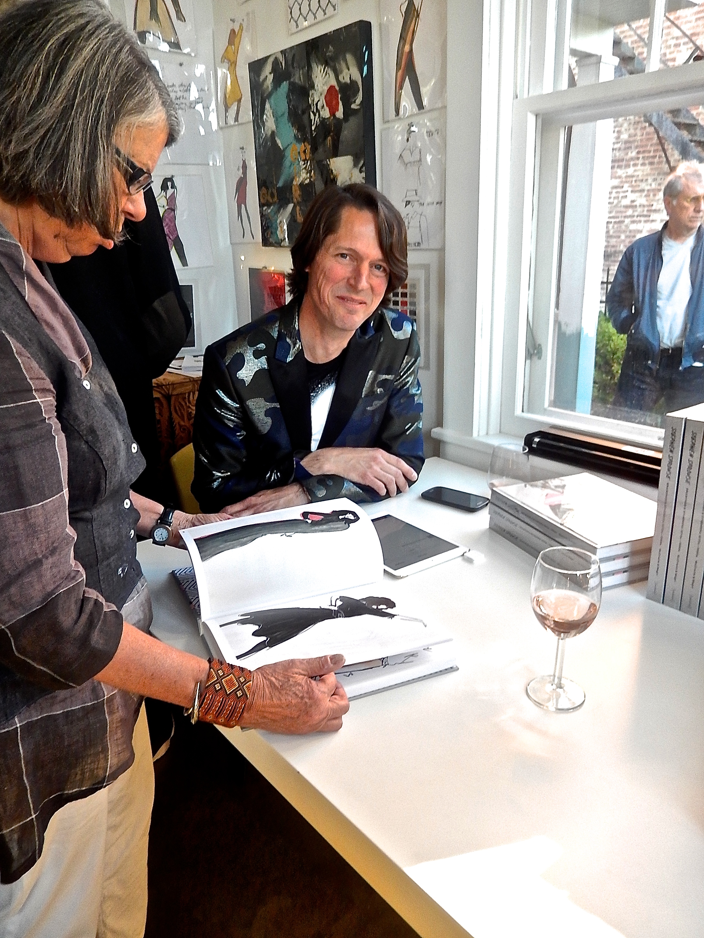
Books ready for signing and drawings by Stephen Sprouse

Books ready for signing and drawings by Stephen Sprouse

DSC_1926.jpg

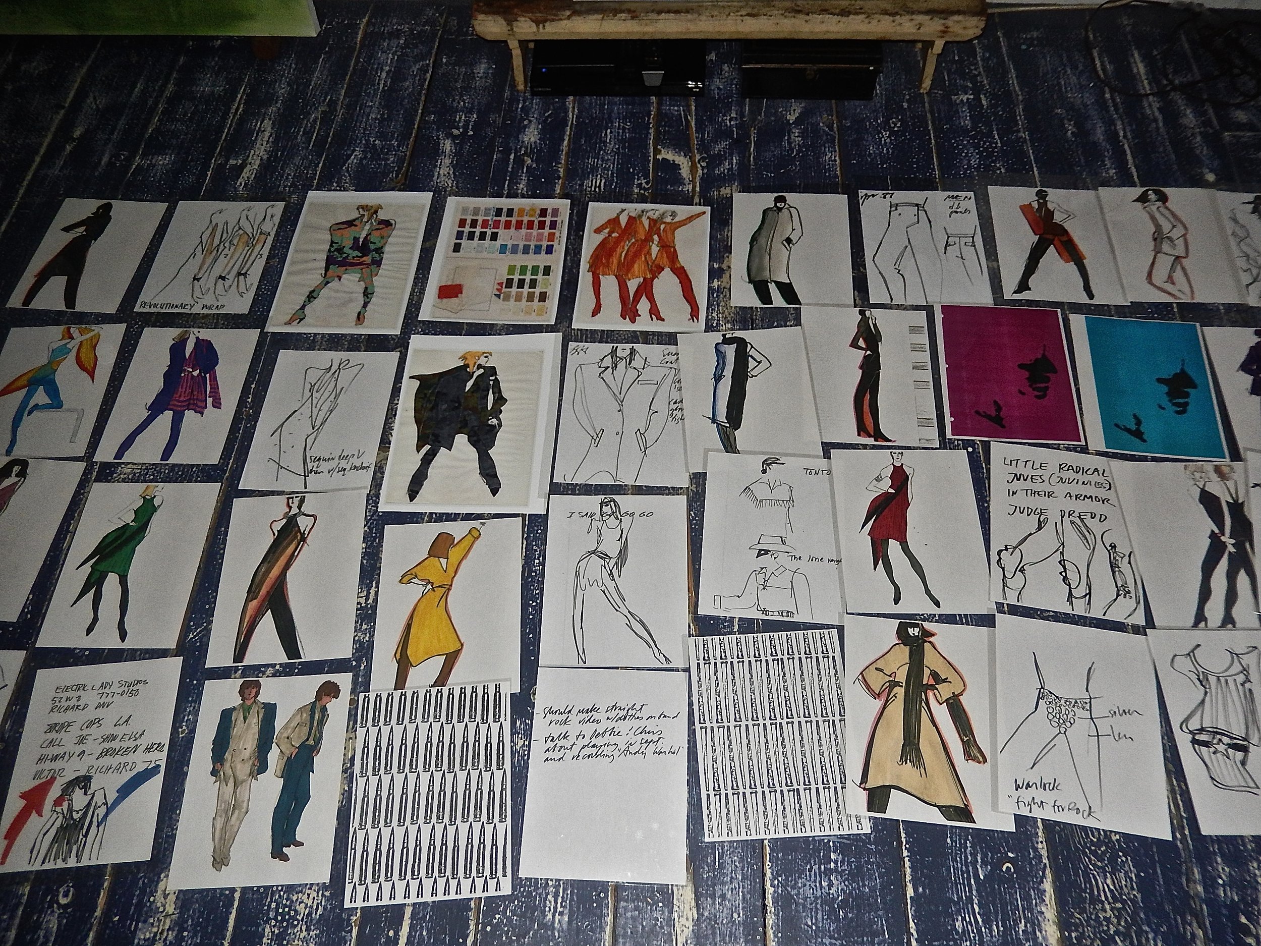
Fast forward to 2015 and Elizabeth Moore and I meet Carol McCranie, an art advisor and her husband Javier Magri who had recently purchased a house in Hudson, NY blocks away from our new gallery. In the depths of an otherwise empty dumpster on the day after a snowstorm in New York City Carol rescued an archive of Stephen Sprouses’ brilliant drawings from the mid-70’s to the late 80’s. More than 1500 trademark works categorized inside envelopes including fabric swatches have been beautifully edited by Carol and Javier into a tour de force book published by Damiani. Sprouse’s inspirations, Andy Warhol, Patty Smith, Debbie Harry, Jackie O and his other muses are all here and the book brilliantly captures the effortless cool of Stephen’s magnetic designs and electrifying drawings.

DSCN9785.jpg
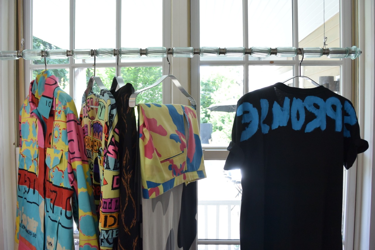
A selection of clothing designed by Sprouse and fabrics from his archive

A selection of clothing designed by Sprouse and fabrics from his archive

DSCN9849.jpg
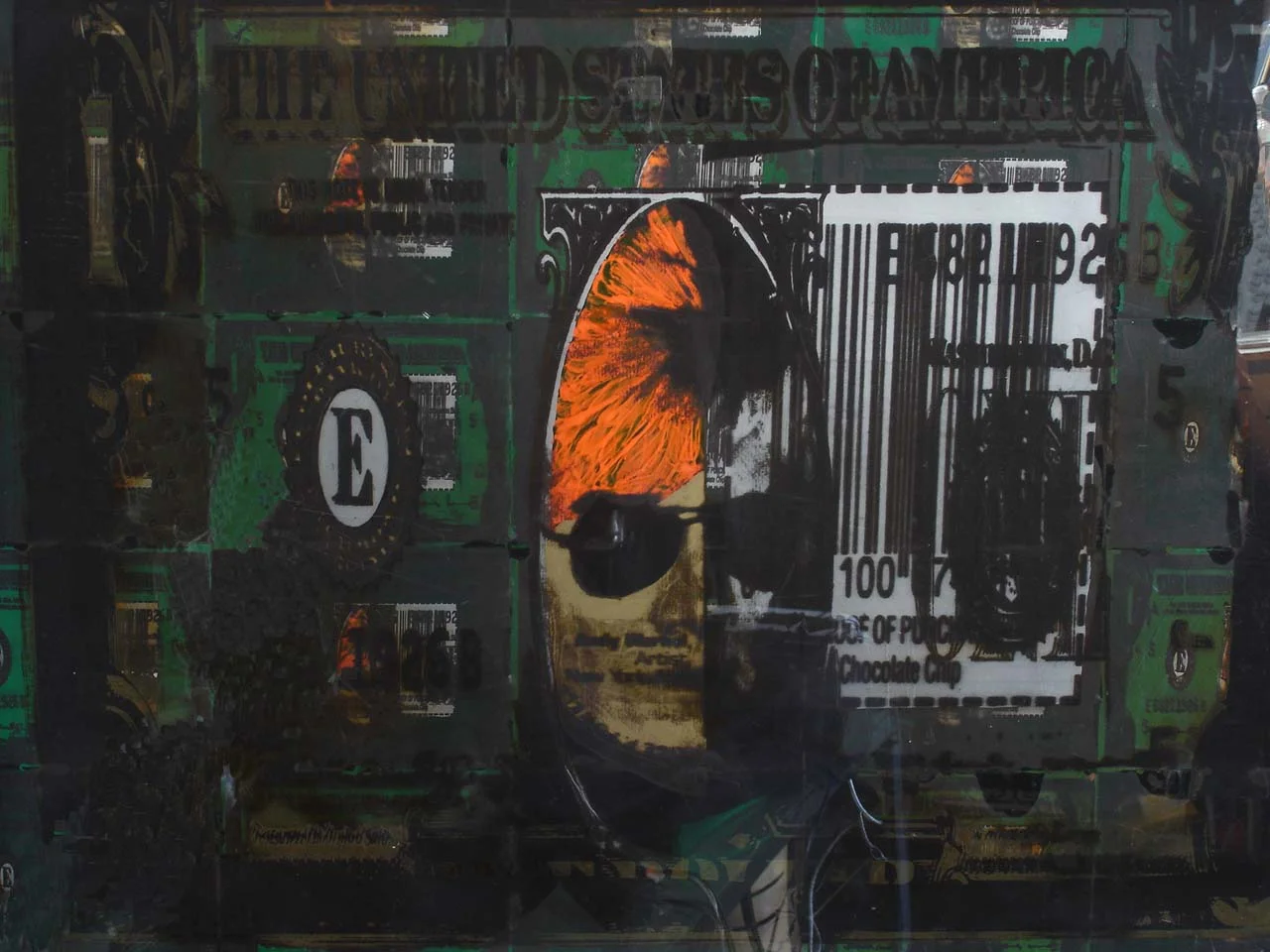
Stephen Sprouse “Gold Andy” 1980 in day-glo orange, gold, black and silver screen print on clear mylar mounted to panel under plexiglass

Stephen Sprouse “Gold Andy” 1980 in day-glo orange, gold, black and silver screen print on clear mylar mounted to panel under plexiglass

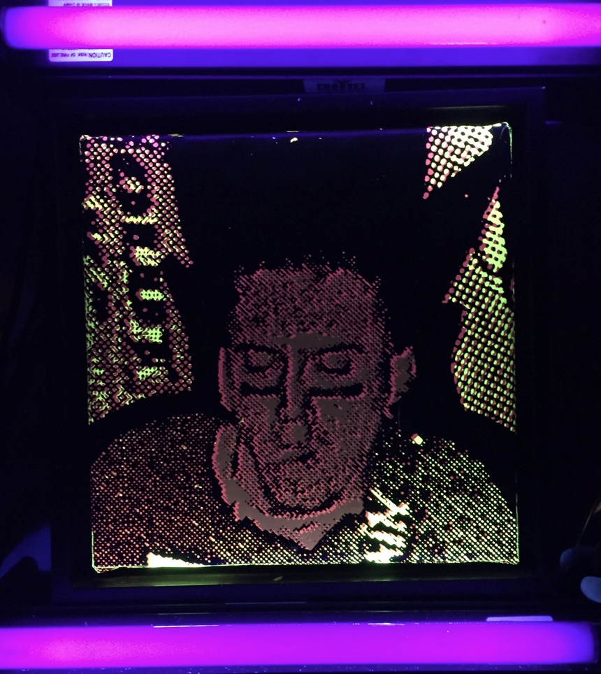
Stephen Sprouse “rocker detail” in day-glo screen printed on black canvas with blacklights

Stephen Sprouse “rocker detail” in day-glo screen printed on black canvas with blacklights

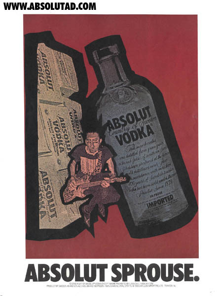
Absolut Sprouse ad campaign 1988

Absolut Sprouse ad campaign 1988

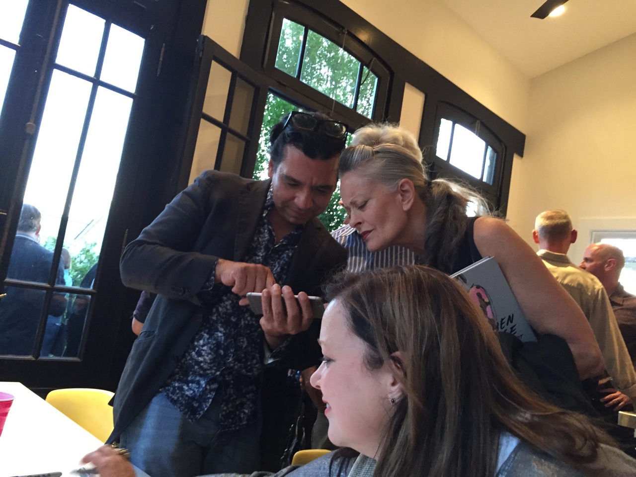
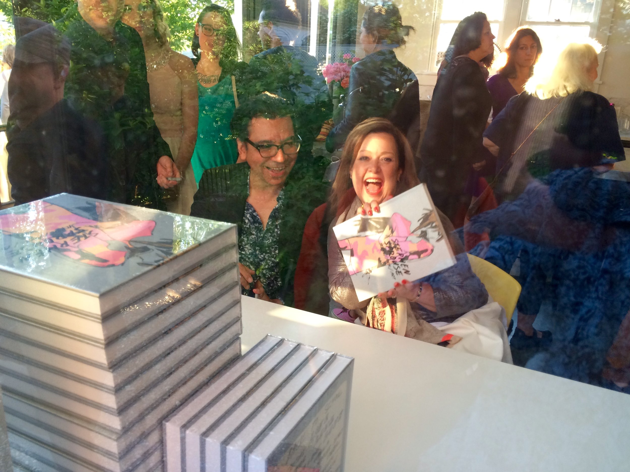
On Saturday, June 6th over 200 people gathered to celebrate the launch of the Damiani/DAPbook Stephen Sprouse Xerox/Rock/Art by Carol McCranie and Javier Magri. I carefully tried to re-create a combination of Stephen’s last apartment, studio and his infamous silver shop on Wooster Street. Black lights are a little tougher to come by these days but I was able to get 20 of them and black out the windows from the exterior to capture the intensity of the clothing collaborations he did with Andy Warhol and the day-glo ink used in two of his iconic paintings. “Gold Andy” the largest work he did of Andy Warhol depicts Andy as the president on a dollar bill with multiples surrounding the main image on silkscreened clear mylar with day-glo orange hair and a gold metallic face. Another Sprouse work was given as Christmas presents in 1988 when he did a second collaboration with Absolut Vodka. Stephen created small works 15″ square of his iconic rocker in pink and yellow day-glo ink on a black ground.

Gallery view with original Sprouse framed drawings

Gallery view with original Sprouse framed drawings

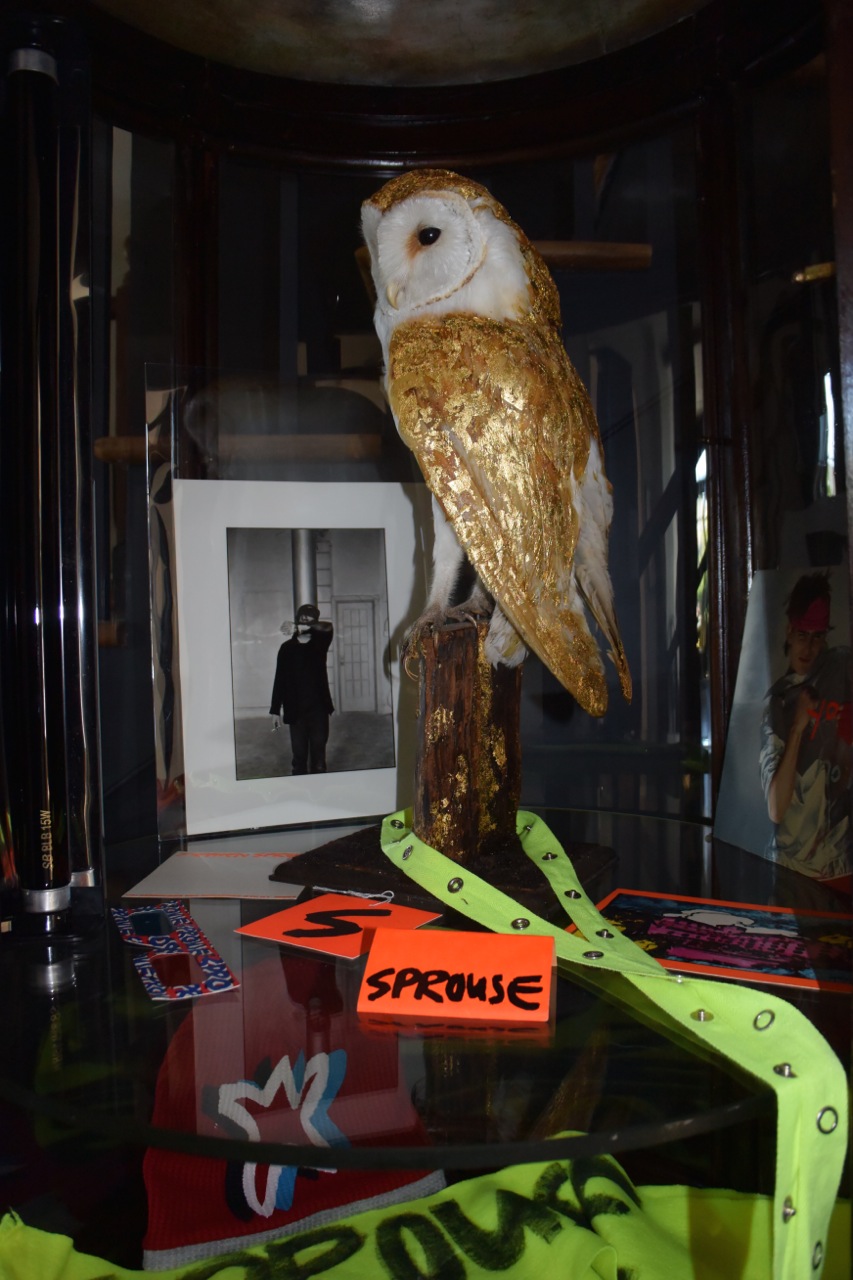
Sprouse portrait and memorabilia

Sprouse portrait and memorabilia

DSCN9847.jpg
Javier Magri and Carol Mccranie co authors of Stephen Sprouse xerox / rock / art with Jane Forth (center) Andy Warhol factory superstar

Javier Magri and Carol Mccranie co authors of Stephen Sprouse xerox / rock / art with Jane Forth (center) Andy Warhol factory superstar

Javier Magri and Carol Mccranie, co authors of Stephen Sprouse xerox / rock / art

Javier Magri and Carol Mccranie, co authors of Stephen Sprouse xerox / rock / art

DSCN9809.jpg

Elizabeth and I also featured works by Julian Schnabel, Keith Harings last editioned prints from 1989 and a Karl Wirsum work as well as furniture and lighting by Massimo Vignelli for Knoll and Mario Botta to capture the mood and feeling of Stephen’s aesthetic. Stephen Sprouse Xerox/Rock/Art and 80’s design through July 4th weekend at The Gilded Owl.

Many thanks to our amazing bar staff headed by Devin Whittaker. You guys rocked!

Many thanks to our amazing bar staff headed by Devin Whittaker. You guys rocked!

Javier Magri, Elizabeth Moore with Louise, R.J. John and Wendy Kennealy

Javier Magri, Elizabeth Moore with Louise, R.J. John and Wendy Kennealy

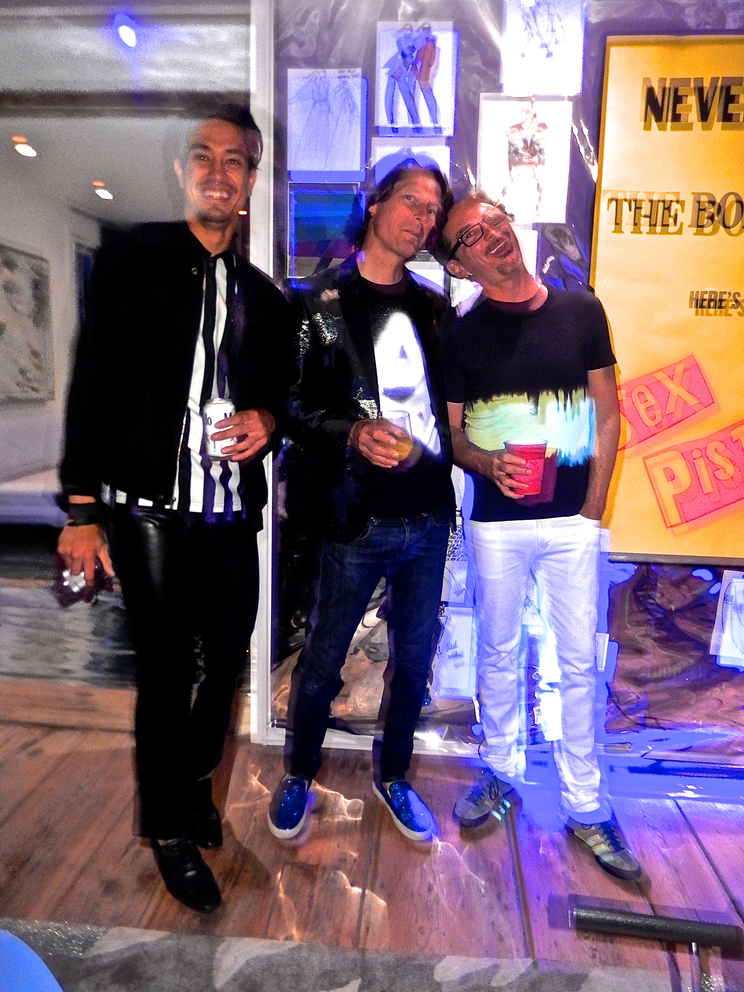
Tomm Roesch, me and Mark Barnett

Tomm Roesch, me and Mark Barnett

THE GILDED OWL GALLERY OPENING by Andy Goldsborough

DSC_0525-Version-2.jpg

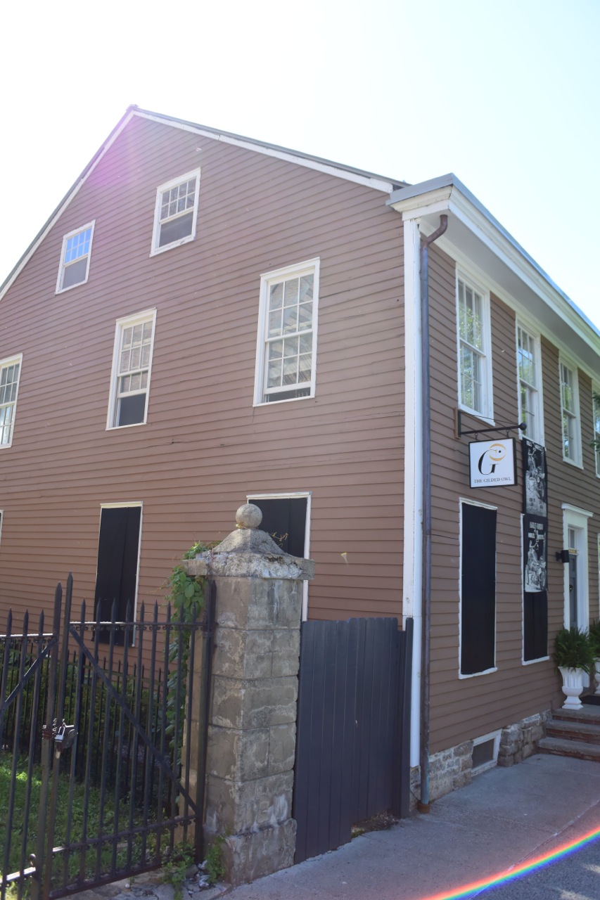
On Saturday November 22nd THE GILDED OWL gallery officially opened at 105 Warren Street in Hudson, NY.  After exactly one year of renovation and construction Elizabeth Moore and I welcomed over one hundred and eighty five guests to celebrate our inaugural show in the 1785 Federal style house that is a now home to a realized version of our design, art, fashion and music journal. The brilliant Hudson based photographer Tomm Roesch documented our preparations and was on hand with us to capture the opening with his thoughtful eye.  Thank you to all who made the journey to our beautiful new gallery and here’s a glimpse into THE GILDED OWL.

https://www.youtube.com/watch?v=opYNxM24DFs

2014 THE YEAR AHEAD by Andy Goldsborough

littlegildy.jpg

As I begin a new year I can’t help but look back on 2013 and think about all of the amazing people I have met through the world of interior design and blogging, a place that I never thought I belonged or would be able to contribute to in a meaningful way.  I started The Gilded Owl with the idea of creating a journal about craftsmanship in design, a travel log of significant places of interest and in the process brought along some friends I respected tremendously to contribute on art, fashion and music as well, personal interests of mine.  Elizabeth Moore, art advisor extraordinaire and my best friend for twenty four plus years has tipped me off to the most significant art openings in New York and beyond.  Erin Hazelton, my first design assistant and the most fashionable and stunningly beautiful friend writing with wit and thoughtfulness about her fashion experiences.  And David Shebiro, another friend of twenty plus years that I have attended numerous concerts I will never forget but who has an ear for music like no one else and the coolest record store in New York, Rebel Rebel Records.  I thank you all and am grateful for being part of this journey.

Erin shooting the Casa Mollino in Turin and me capturing her. one of our many journeys together in 2013 and a future post.

Erin shooting the Casa Mollino in Turin and me capturing her. one of our many journeys together in 2013 and a future post.

It took a lot of nudging from my colleagues and friends to get me motivated to spend the time and energy needed to write from a personal perspective about design but it’s one of the most rewarding things I’ve ever done.  After years of teaching at Parsons School of Design and Auburn University where I studied under Gaines Blackwell, Sheri Schumacher, Bobby McAlpine, David Braly and so many other architecture and design heroes of mine I hope that I can give back some of the things they instilled in me when I was an eager student with eyes open to all the design world had in store for me.

Detail of an exquisite mural by my auburn university professor, mentor and friend David Braly

Detail of an exquisite mural by my auburn university professor, mentor and friend David Braly

But through this blog the people that I’m so thankful to have met in the past year are my fellow designers and bloggers who have encouraged me and enhanced my life in so many ways.  Their words and images that they put into the social media stratosphere have enriched my life and perspective on design so much and for that I am truly blessed.  Following these extraordinary designers, writers and thinkers have pushed me to new levels in the past year and I look forward to the year ahead.   Here’s to 2014 and all that it has in store and follow these innovators for more inspiring design!  I thank you all for your friendship and for inspiring me!
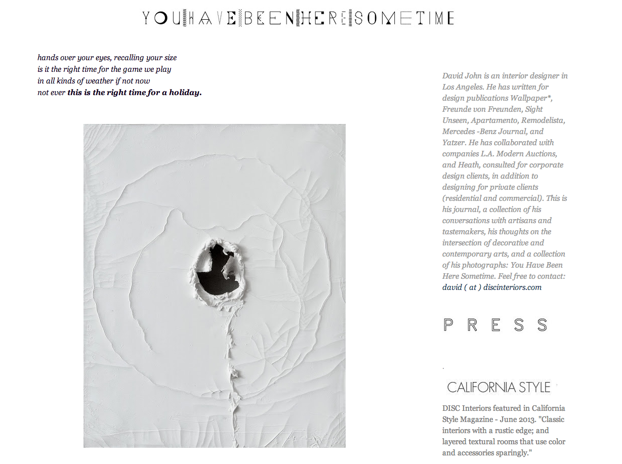
David John / You Have Been Here Sometime

A visual masterpiece in blogging in my opinion, David writes from the heart and with a sensitive eye on detail in design from past to present.

Screen-Shot-2014-01-01-at-10.14.42-AM.png

Carl J Dellatore / cjdellatore.com

Thank you for writing about my design work this year and your friendship means the world to me.  But it’s the thoughtful and enlightening things you write about design and your introduction to Carl Lana and Anthony Costa that I am so grateful for.

Screen-Shot-2014-01-01-at-10.21.17-AM.png

Erin Hazelton / The People I Like

Another great year for us and our travels throughout Switzerland, France and Italy I will never forget, nor working together on yet another Interior Design project!  Her blog is a personal look into the lives of the most fashionable including her own.  Can’t wait for you to get back to New York!

Screen-Shot-2014-01-01-at-10.23.26-AM.png

Caroline Mattar and Margot Weller of Knoll / Knoll.com/shop/inspiration

Caroline for the introduction and Margot for including me in the new Knoll.com and personal inspirations feature on their beautifully redesigned website.

Patrick J Hamilton / Ask PatrickOne of the nicest, most talented guys I have met in my career and someone everyone should have the good fortune of meeting.

Patrick J Hamilton / Ask Patrick

One of the nicest, most talented guys I have met in my career and someone everyone should have the good fortune of meeting.

Screen-Shot-2014-01-01-at-10.36.08-AM.png

STEPHEN APPLEBY-BARR by Andy Goldsborough

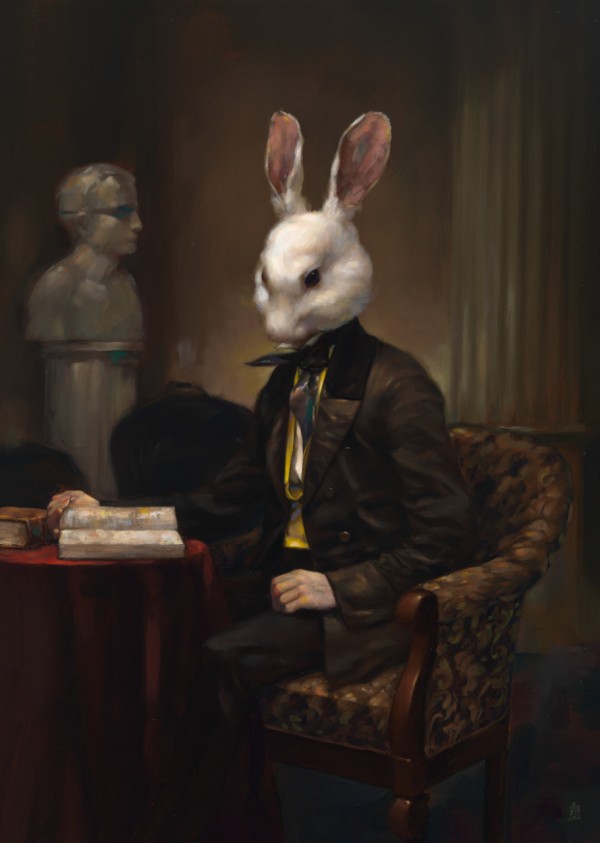
Two years ago, my partner and I purchased our first painting by Stephen Appleby-Barr from Nicholas Metivier Gallery at the PULSE Art Fair in New York. We were both drawn to the old world mysterious quality of his painting but also to the play of light that it captured on the canvas. We were told by the gallery that only black and white oil paint was used and built up to get this eerie glow which seems to illuminate the “Little Lord Dulac” work 2010. As a collector of chairs, I also liked the positioning of the figure on this larger than life chair, or throne, as I like to think of it. I was hypnotized by the work of this talented rising art star that has created a new, modern and exciting form of extraordinary portraiture painting.

Little Lord Dulac, 2010

Little Lord Dulac, 2010

Neither of us had met the artist prior to acquiring the painting but we both were fascinated by the technique and amount of detail captured by Stephen’s hand. One year later, we revisited the PULSE fair and purchased our second Appleby-Barr painting entitled “The Tradition Pit” 2011. It is larger than the first work and much more complicated but still has this mysterious, haunting quality and captures the light in such detail that it has an amazing depth to the surface.

The Tradition pit, 2011

The Tradition pit, 2011

Stephen and I tried to meet last month for the Armory Show but missed seeing each other so I caught up with him by phone to discuss his work.

Squire of Squalor, 2011 (self portrait)

Squire of Squalor, 2011 (self portrait)

Where did you study? Sheridan College, Oakville, Canada. What happened first? Along with 4 friends, he formed a collective of illustrators called “Team Macho”. They have had numerous exhibitions and share a studio together. In 2007 they published a book called “Fancy Action Now”. The group was like a fraternity of sorts to “keep their heads in the game, a way to keep up with their peers”.

Team Macho’s book

Team Macho’s book

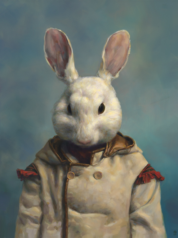
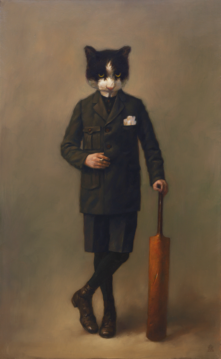
Stephen focused primarily on illustration and draftsmanship in the beginning but evolved into oil painting as a medium to capture what he wanted to express in these beautiful old images he discovered going through his grandmother’s yearbooks. His first works also evoked some sense of a fraternity, complete with a mascot named Punchy who reappears in many of the paintings.

Punchy Cloaked, 2011

Punchy Cloaked, 2011

The Pledge, 2010

The Pledge, 2010

Who were his heroes in painting? John Singer Sargent and Diego Velazquez were there in the beginning but Rembrandt and Goya became significant influences as his work evolved as well as van Dyck and Vermeer. Appleby-Barr references daguerreotypes, the first commercially successful photography technique.

Leaving the Path, 2010

Leaving the Path, 2010

Carolyn Gordon, 2010

Carolyn Gordon, 2010

His subjects seem to stare back at the viewer and the scale of the works averaging 11″ x 14″ are very intimate capturing every detail of the subjects clothing and surroundings.

The King’s Library, 2011

The King’s Library, 2011

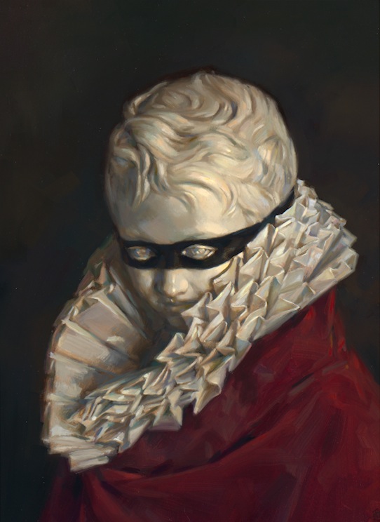
Dulac Bust, 2011

Dulac Bust, 2011

In March-April of 2011, Stephen sold out a show of new work and is currently working on another solo show to be announced. I cannot wait to see what his magic brush will come up with next!

Stephen Appleby-Barr is represented exclusively by Nicholas Metivier Gallery in Toronto. Thank you to Rita Stuart at www.metiviergallery.com for generously allowing me to share these images on The Gilded Owl!

Punchy Cricket Bat, 2011

Punchy Cricket Bat, 2011