LANVIN / MR ARCHITECTURE + DECOR by Andy Goldsborough

utf-8DSC07360-e13580193674031.jpg

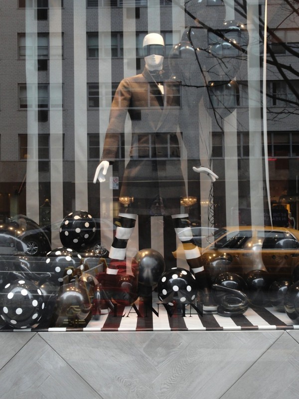
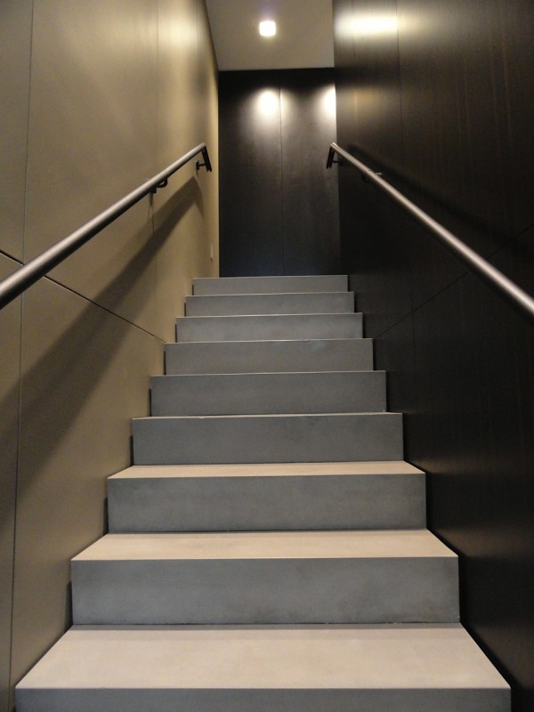
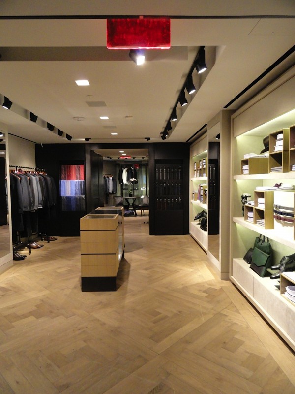
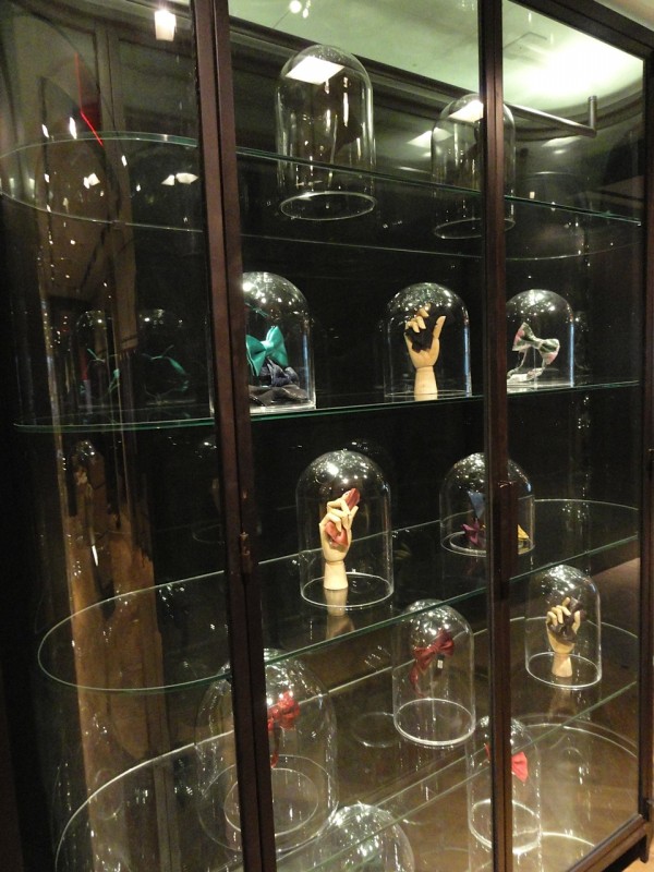
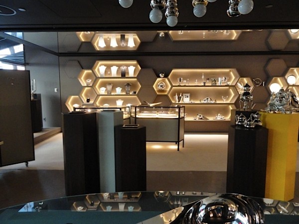
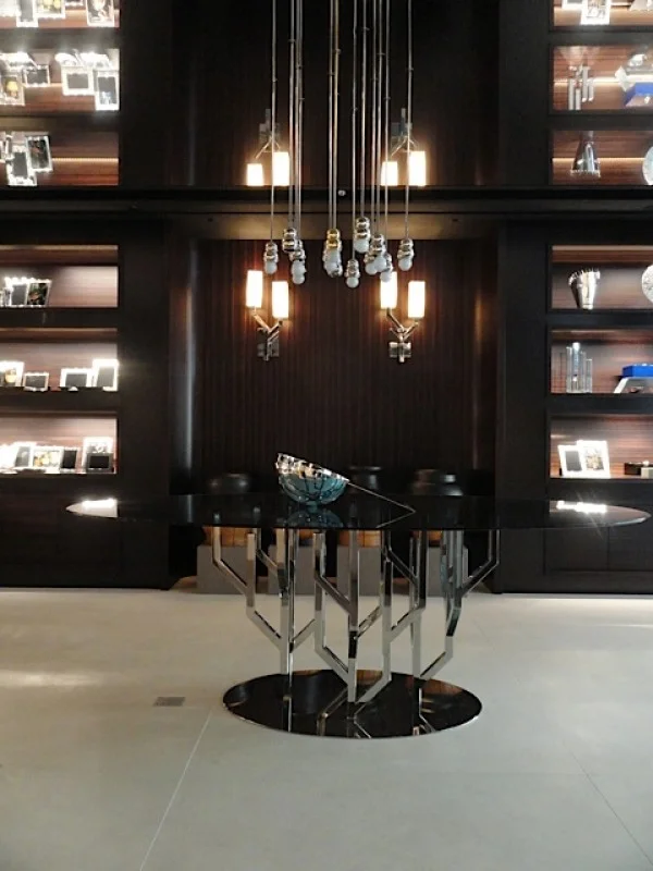
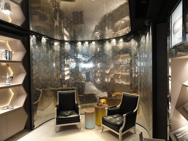
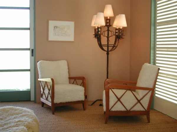
The new Lanvin men’s store opened Saturday in New York and I was there to get a first glimpse. Designed by David Mann / MR Architecture + Decor, it is a stunning addition to Madison Avenue and takes menswear to another level. From the minute you enter there is a sense of design mastery with the double height rosewood paneled wall, the polished tinted concrete that looks as smooth as suede and a multi-tier custom crystal and steel chandelier which sets the tone for the rooms beyond. The first level focuses on outerwear with a steel cubicle display wall for shoes and a lounge like area in the back with more casual wear highlighted by an Italian chandelier and mid-century furnishings. As you ascend the concrete and steel staircase that is separated from the outer walls with razor like precision you enter the formal wear area highlighted by a curved glass and steel display vitrine full of the most beautiful bowties I have ever seen. The back of the second level contains a pair of art deco chairs and a custom chagrin table flanked by minimalist dressing rooms with suede upholstered walls and felt benches. But the shop needs to be seen in person to appreciate the thoughtfulness and masculine material selection that create a whole new look for the brand while keeping the Lanvin aesthetic intact!

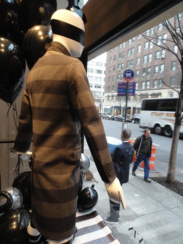
Window display with grey oak woodwork detail

Window display with grey oak woodwork detail

utf-8DSC07355-e1358021187766-600x800.jpg
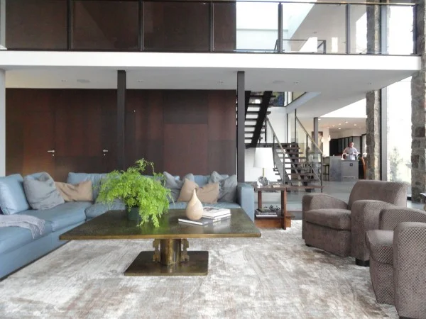
Ground floor with cowhide rug and vintage furnishings

Ground floor with cowhide rug and vintage furnishings

utf-8DSC07356-600x800.jpg
Shoe boutique with custom bench

Shoe boutique with custom bench

utf-8DSC07358-600x800.jpg
Detail of steel handrail

Detail of steel handrail

Landing on upper level overlooking the entrance

Landing on upper level overlooking the entrance

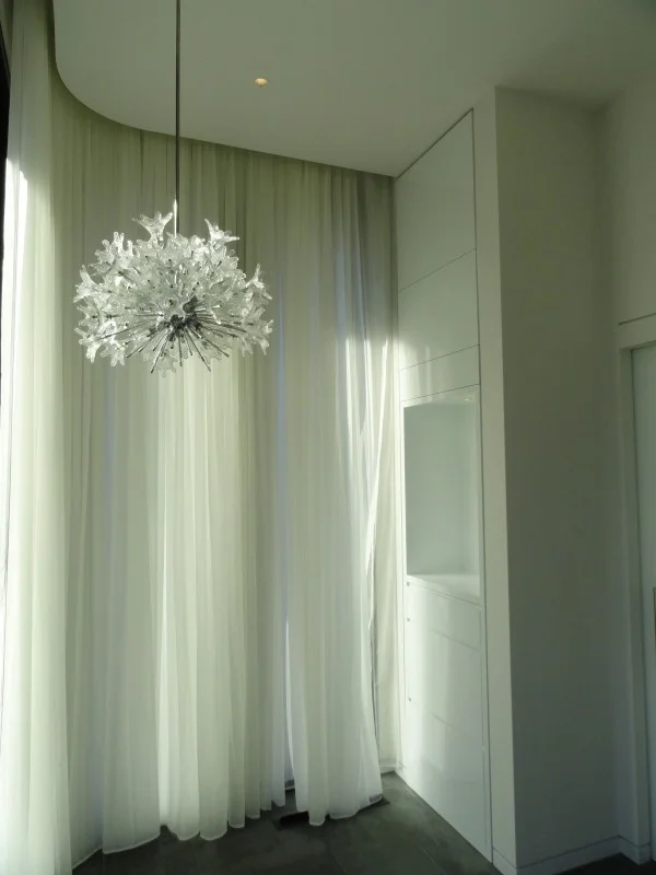
Entry chandelier from second floor

Entry chandelier from second floor

Upper level accessories and formal wear

Upper level accessories and formal wear

Bowties displayed in glass and steel vitrine

Bowties displayed in glass and steel vitrine

utf-8DSC07366-600x800.jpg
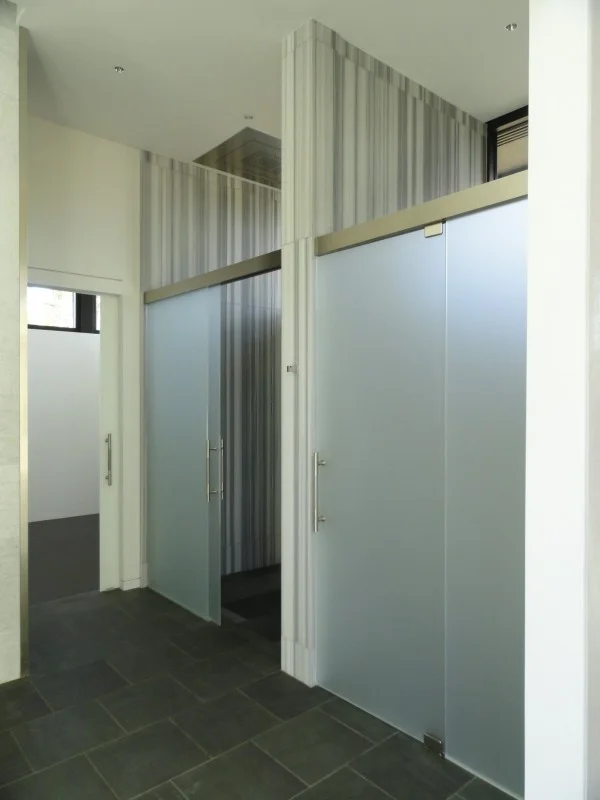
Dressing room with suede upholstered walls and custom felt and leather bench

Dressing room with suede upholstered walls and custom felt and leather bench

utf-8DSC07368-600x800.jpg

Lanvin www.lanvin.com
David Mann / MR Architecture + Decor www.mrarch.com

BIRMINGHAM, AL RESIDENCE by Andy Goldsborough

DSC07220-e13571738152651.jpg

One of the projects that has proven to be the most rewarding I have designed is a house for my best friend, her husband and their family in Birmingham, Alabama. It is also the first project I have done in Alabama, which has special meaning to me being that it’s home. The house was built in the 60’s and I started the project in 2006 with an addition of a playroom and three new children’s bedrooms as well as a double height family room and custom kitchen. The first phase took approximately two years to complete and the clients decided to take a much needed break and focus on their family afterwards. Phase two began in 2010 and involved updating the existing house and adding a new entrance and master bedroom suite and bath as well as a new powder room. Following are a few of the images of the house nearing completion that I photographed over the holidays and furniture installation will happen over the next few months. Thank you to my wonderful clients and friends for this labor of love project!

New copper and stone entry

New copper and stone entry

Entry with vintage Poliarte sconce in metal and glass

Entry with vintage Poliarte sconce in metal and glass

Living room and dining room

Living room and dining room

Dining room with custom embroidered wallpaper from Fromental and Angelo Lelli chandelier for Arredoluce

Dining room with custom embroidered wallpaper from Fromental and Angelo Lelli chandelier for Arredoluce

Stilnovo chandelier in foyer outside the master bedroom

Stilnovo chandelier in foyer outside the master bedroom

View from master bedroom to the pool

View from master bedroom to the pool

Master bath shower

Master bath shower

Master bath vanities with Fontana Arte sconces from Donzella

Master bath vanities with Fontana Arte sconces from Donzella

DSC07246-600x450.jpg
DSC07203-e1357597957477-600x800.jpg
Dressing area with Venini chandelier

Dressing area with Venini chandelier

Powder room with etched aluminum mirror by Lorenzo Burchiellaro, 1970 and carrara marble sink by Stone Forest.

Powder room with etched aluminum mirror by Lorenzo Burchiellaro, 1970 and carrara marble sink by Stone Forest.

Family room with Philip and Kelvin Laverne coffee table and kitchen beyond

Family room with Philip and Kelvin Laverne coffee table and kitchen beyond

Wenge, glass and bronze staircase

Wenge, glass and bronze staircase

Thank you to all of the amazing craftsmen and fabricators that made this project so special. As well as my favorite furniture dealers and friends in New York. I can’t wait to install all of the beautiful furniture and objects my clients and I have collected over the past year!

Credits:
Stephen Dorsky / Day Star Construction www.daystarconstruction.com
Stone Source, NY / www.stonesource.com
K. Flam Associates, NY
Donzella, NY / www.donzella.com
Bernd Goeckler Antiques, NY / www.bgoecklerantiques.com
Fred Silberman, NY / www.fredsilberman.com
Van Den Akker, NY / www.vandenakkerantiques.com
Le Lampade, Sag Harbor / www.lelampade.1stdibs.com
BDDW, NY / www.bddw.com

LE CORBUSIER CABANON 1952 / CASSINA by Andy Goldsborough

ricostruzione-Cabanon01-e13551842157811.jpg

At Design/Miami this year Cassina rebuilt a replica of Le Corbusier’s Cabanon interior designed in 1952 and I was thrilled to attend a preview of the show. Le Corbusier has always been a constant inspiration in my work and to see this masterpiece recreated with such exacting detail was a revelation! Exclusive rights to Le Corbusiers’ work have been held by Cassina since 1965 and this project truly shows the craftsmanship and innovative design ideas of this master architect. Conceived as a birthday present for his wife, Le Corbusier designed the entire cabin in a cafe and ended up using the space frequently himself. Le Corbusier had always been fascinated by boats and made the cabin in the likeness of a ships interior, sitting above the French Riviera in Cap-Martin overlooking the Bay of Monaco. Even the brightly colored ceiling panels were removable for storage above since the space was designed at the most minimal size to live comfortably. The only function he left out of the cabin was a kitchen since he and his wife dined at the local L’Etoile de Mer restaurant nearby. This remarkable example of micro-architecture truly shows that less is much, much more.

Drawings of the Cabanon

Drawings of the Cabanon

Le Corbusier in the 1952 Cabanon

Le Corbusier in the 1952 Cabanon

The original Cabanon exterior

The original Cabanon exterior

Entry into the cabin with Le Corbusiers’ original painting and coat hooks

Entry into the cabin with Le Corbusiers’ original painting and coat hooks

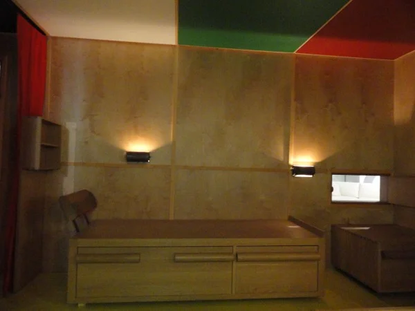
Bed with pull out storage

Bed with pull out storage

DSC07083-600x450.jpg

Cassina has reintroduced the LC 14 01 Tabouret Cabanon stool in chestnut and oak finishes to coincide with the reconstruction. Openings on each side create handles and the unique dovetail joint on each corner is exclusive and highlights the workmanship of the solid wood and exalts its qualities.

Lc 14 01 Tabouret Cabanon

Lc 14 01 Tabouret Cabanon

Lc 14 01 Tabouret Cabanon detail

Lc 14 01 Tabouret Cabanon detail

Le Corbusier’s mark in the cabin entry

Le Corbusier’s mark in the cabin entry

Le Corbusier: The Interior of the Cabanon. The Cassina reconstruction will remain on view in the Miami Showroom: 3800 NE Miami Court, Miami Design District December 6, 2012- January 12, 2013

DESIGN AT FAIRCHILD SITTING NATURALLY by Andy Goldsborough

DSC07166-e13552236422351.jpg

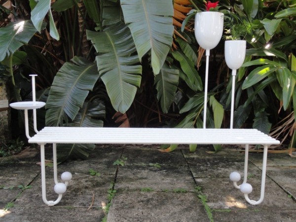
This year as part of Design/MiamiThe Fairchild Tropical Botanic Garden asked Cristina Grajales Gallery to commission seven of her brightest design stars to create site specific outdoor furniture (mostly benches) for its inaugural design initiative. I toured the gardens with Cristina and two of her artists, Sebastian Errazuriz and Sam Baron, a group of design admirers, and Nannette Zapata and Paula Fernandez de los Muros of the Fairchild and it was one of the major high points of the fair. We started the tour in the newly opened Butterfly Conservatory which is truly magical. We continued by tram and the first stop was Sebastian Errazuriz’s “Dawn Before Time Bench”. Using wood, iron and crystal, Errazuriz created a bench that resembles a traditional garden bench but has incorporated his trademark sense of humor and romance with the addition of a crystal chandelier that has been anchored to the bench and able to withstand the outdoor elements. Next up was Sam Baron’s “La Marie-Lou” and “La Georgette” benches. Made of white lacquered metal and ceramic, they both invite the user to add their own portion of the garden into one of the planters integrated into the design and the La Georgette offers shade with a movable umbrella as well.


Dawn Before Time bench by Sebastian Errazuriz

Dawn Before Time bench by Sebastian Errazuriz

La Marie-Lou Bench by Sam Baron in lacquered metal wood and ceramic

La Marie-Lou Bench by Sam Baron in lacquered metal wood and ceramic

La Georgette bench by Sam Baron

La Georgette bench by Sam Baron

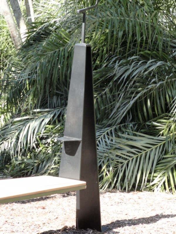
Around the bend seeing rare palms that are nearing extinction John Paul Philippe’s “Bird Perch Benches” elegantly provide a place for the native birds of the garden to sit upon steel perches that become part of the frame that supports the generous mahogany platforms. Michele Oka Doner used Australian Pine to create her organic “Chitra Benches” that blend harmoniously into the environment.


Bird perch benches by John Paul Philippe

Bird perch benches by John Paul Philippe

Detail of Bird Perch bench by John Paul Philippe

Detail of Bird Perch bench by John Paul Philippe

Chitra Bench by Michele Oka Doner

Chitra Bench by Michele Oka Doner

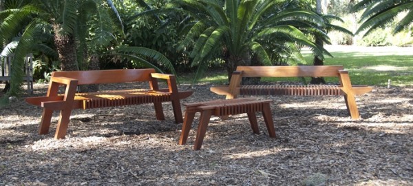
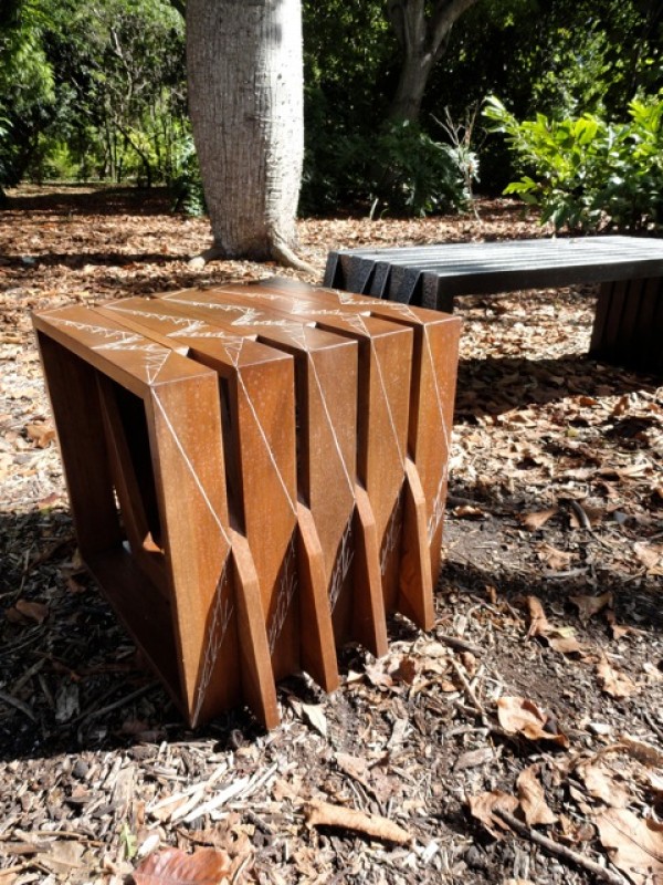
Gael Appler crafted Honduran Mahogany into a slatted “Salt Point Bench” that is molded to comfort sitting in the garden as well as the “Salt Point Table”. Pedro Barrail used steel and marble to create his animated “Keep Walking Benches” and burned-in wood etching technique used by the the Pai-Tavytera Amazonian tribe in the “Melancholia Stool”. Both of Barrail’s designs were situated beneath an enormous tree that Jorge Pardo has illuminated with hundreds of red orange and white powder coated lanterns reminiscent of blooming flowers. Upon our return to the pavilion Sebastian Errazuriz’s second design “The Guardian Bench” was nestled at the edge of the rainforest along the south edge of the Bailey Palm Glade, one of the most photographed areas of the gardens. Again Sebastian cleverly referenced past civilizations being overturned, placing two busts of Caesar beneath a marble plinth.

Salt Point Bench (2) and Salt Point Table by Gael Appler

Salt Point Bench (2) and Salt Point Table by Gael Appler

Melancholia Stool and Keep Walking Bench by Pedro Barrail

Melancholia Stool and Keep Walking Bench by Pedro Barrail

Detail of Keep Walking Bench in marble by Pedro Barrail

Detail of Keep Walking Bench in marble by Pedro Barrail

Garden lights by Jorge Pardo

Garden lights by Jorge Pardo

Detail of Jorge Pardo’s garden lights

Detail of Jorge Pardo’s garden lights

We ended our tour with Christophe Come’s Infinity and Post Benches, both made of mahogany and iron using techniques he has employed in his furniture designs in Paris. All of these works will remain on view at Fairchild Tropical Botanic Garden through May 31, 2013.

Detail of Christophe Come’s Infinity bench

Detail of Christophe Come’s Infinity bench

DSC07164-600x450.jpg

The “Sitting Naturally” works are available through Cristina Grajales Gallery in limited editions.

EMILIO PUCCI NEW YORK by Andy Goldsborough

DSC06992-e13551412485201.jpg

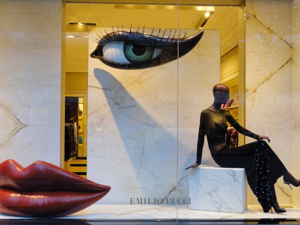
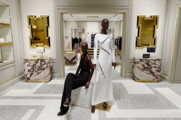
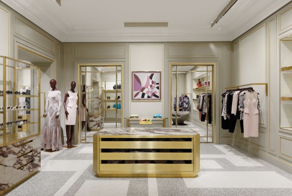
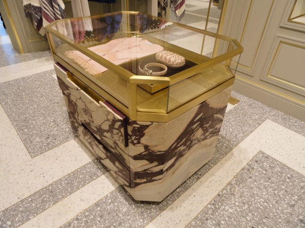
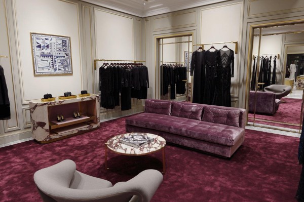
The new Emilio Pucci store on Madison Avenue designed by Joseph Dirand opened last month and was inspired by the palazzo in Florence, Italy. A collaboration between the new Creative Director Peter Dundas and French architect Joseph Dirand, the design combines classical elements with modern sensibilities. The marble windows on Madison Avenue create a facade within a facade in this elegant landmark building. Inside a color palette of purple, cream and gold create the perfect backdrop for the colorful, patterned clothing that Pucci is known for. Breccia dei Medici purple veined marble found in the Palazzo Pucci has been used in combination with brass and glass to create display cases set upon a patterned two tone terrazzo floor to create the ultimate shopping experience.

Two tone grey and white terrazzo entry with Breccia dei Medici display cabinets and brass and gold glass mirrors

Two tone grey and white terrazzo entry with Breccia dei Medici display cabinets and brass and gold glass mirrors

621228_10151137074150267_1273811965_o-600x404.jpg
Detail of brass shelving display

Detail of brass shelving display

“The new concept screams sophistication, craftsmanship and luxury totally in line with the history of the House”, adds Emilio Pucci Vice President and Image Director Laudomia Pucci, “all of which are key Made in Italy values. But they have been considered through a very fresh lens. It’s a great moment for us, and a superb evolution for the brand.”

The eveningwear room with Pierre Paulin “Ribbon Chairs from 1966 and custom aubergine silk carpet and sofa

The eveningwear room with Pierre Paulin “Ribbon Chairs from 1966 and custom aubergine silk carpet and sofa

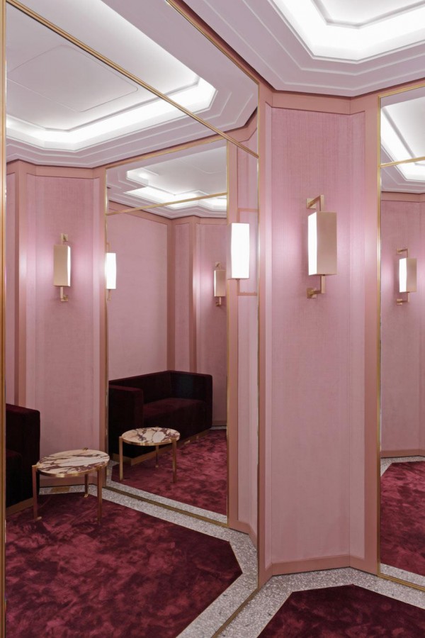
The oversize fitting rooms with pink velvet upholstered walls, silk carpet and custom brass light fixtures and details

The oversize fitting rooms with pink velvet upholstered walls, silk carpet and custom brass light fixtures and details

DSC06989-e1355142376546-600x800.jpg

www.emiliopucci.com

FOUR FREEDOMS PARK / LOUIS KAHN by Andy Goldsborough

utf-8DSC06931-e13532765234141.jpg

On September 24th, 1973, Nelson A. Rockefeller, Governor of New York, and John V. Lindsay, Mayor of New York City, invited 800 guests for the renaming of Welfare Island to Roosevelt Island in honor of Franklin Delano Roosevelt. Historian Arthur M. Schlesinger Jr. and former Governor Averell Harriman spoke at the ceremony and announced their plans for a memorial that would be built on the four southernmost acres of the island and that Louis Kahn would design the park. Kahn’s design for the park was completed in 1974 but he died unexpectedly of a heart attack and at the time New York City verged on bankruptcy and the project was put on hold for almost thirty years. After Louis Kahn’s son, Nathaniel, produced a documentary about his father’s work entitled “My Architect”, interest was regenerated to begin fund raising mostly from the private sector.

Approach to the stairs and the triangular lawn

Approach to the stairs and the triangular lawn

Stainless steel scroll handrail detail

Stainless steel scroll handrail detail

The park was built with absolute precision by a passionate construction crew who were guided and motivated by the genius of Louis Kahn’s design for this project. The memorial is a distillation of Kahn’s thoughts on architecture and pure form. The project was built in phases beginning with the south end or “The Room” as it was named by Kahn where Roosevelt’s Four Freedoms are inscribed into the massive slabs of granite. These 36-ton slabs are placed one inch apart and become a floating, contemplative space anchored by the buildings of the United Nations. The granite disappears into the sky on a gray day and becomes one with the water and on a clear day the stunning whiteness of the stone contrasts the blue sky and the city’s colors.

The triangular lawn framed by allees of littleleaf linden trees

The triangular lawn framed by allees of littleleaf linden trees

Littleleaf linden tree walk to the “room” and roosevelt bronze sculpture

Littleleaf linden tree walk to the “room” and roosevelt bronze sculpture

The colossal bronze of President Roosevelt by Jo Davidson

The colossal bronze of President Roosevelt by Jo Davidson

The four freedoms inscribed on the reverse side of the Roosevelt sculpture inside “the room”

The four freedoms inscribed on the reverse side of the Roosevelt sculpture inside “the room”

Inside “the room” facing west

Inside “the room” facing west

Inside “the room” facing south

Inside “the room” facing south

Detail of the 36-ton granite blocks placed one inch apart

Detail of the 36-ton granite blocks placed one inch apart

The scale of the granite blocks and the meaning of everything about architecture that Kahn contends with is captured in the design of the park: majesty, shelter, protection, perspective, relativity, and history. But it must be experienced to fully perceive this work that will continue to inspire all who visit.

Exiting the park through one of the forced receding perspectives created by the sloped garden plane

Exiting the park through one of the forced receding perspectives created by the sloped garden plane

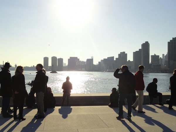
Aerial view of the four freedoms park from the Roosevelt Island tram

Aerial view of the four freedoms park from the Roosevelt Island tram

The Four Freedoms Park can be accessed by the Roosevelt Island Tram and the Queens bound F train. Details at www.fdrfourfreedomspark.org

ALI TAYAR / PARALLEL DESIGN by Andy Goldsborough

DSC06113-e1348523091905.jpg

I recently visited architect Ali Tayar’s exquisite apartment and offices to go behind the scenes and find out what inspires the details and construction techniques in his work. I’ve known Ali for over twenty years and since the minute we met I’ve always been in awe of the complexity behind his architecture, furniture and product designs. On the surface, the connections and production techniques look simple, but the curved forms and perforated metal and wood that compose much of his work are the results of masterful planning and machine-made materials and finishes engineered with major impact!

Ali was born in Istanbul and began his architecture career at the University of Stuttgartfollowed by a Masters in Architecture at M.I.T. When he was eighteen years old and visited the Museum of Modern Art for the first time, standing in the sculpture garden he looked up at the Rockefeller Apartments across the street and thought, “That’s where I want to live.” The stunning views and curving brick facade of this building designed by Harrison & Fouilhoux in 1937 to many architects is one of the most beautiful residential buildings in New York.

The Rockefeller Apartments built in 1937

The Rockefeller Apartments built in 1937

Luckily for Tayar, his dream came true when he was able to buy one of the apartments and begin a year long transformation of the space, restoring every detail to it’s original state. While doing this, he created a museum of his own, furnishing the apartment and injecting his design sensibility into every piece of furniture, light fixture and accessory. The fireplace was one of the only pieces that was not original so he cast an aluminum Brancusi inspired mantelpiece that looks as if it was always there. When Tayar begins a design or furniture project his focus “is on the manufacturing process and the link between the structural concept and production.” He considers all of the furniture, objects and light fixtures he’s designed “little structures and larger projects have become more object-like relating the smaller scale studies.” Following are the images of Tayar’s apartment, furniture and details.

Carbon Fiber and mahogany strathisla console in the foyer , above a painting by Nuri Iyem

Carbon Fiber and mahogany strathisla console in the foyer , above a painting by Nuri Iyem

Perforated aluminum supports and mahogany and maple combine to form Anna’s shelving

Perforated aluminum supports and mahogany and maple combine to form Anna’s shelving

Detail of Anna’s shelving with a collection of cast aluminum fittings and wood prototypes

Detail of Anna’s shelving with a collection of cast aluminum fittings and wood prototypes

Tayyar’s bridge table with vintage chairs and seats covered in maharam Gio Ponti fabric. The table is a cube that has been carved away to create legs in laminated plywood.

Tayyar’s bridge table with vintage chairs and seats covered in maharam Gio Ponti fabric. The table is a cube that has been carved away to create legs in laminated plywood.

The dining room with Tayar’s maryana table and rasamny chairs faces the Moma sculpture garden.

The dining room with Tayar’s maryana table and rasamny chairs faces the Moma sculpture garden.

Cast aluminum and white oak ice bucket for omnia hotel project

Cast aluminum and white oak ice bucket for omnia hotel project

Kitchen with wood and yellow laminate and custom pulls by Ali Tayar

Kitchen with wood and yellow laminate and custom pulls by Ali Tayar

Detail of kitchen cabinetry and Tayar designed pulls

Detail of kitchen cabinetry and Tayar designed pulls

Tayar designed the laminated mdf bed and nightstands

Tayar designed the laminated mdf bed and nightstands

Hawkeye system nightstand in cast aluminum, laminated plywood and mahogany veneer with solid mahogany doors

Hawkeye system nightstand in cast aluminum, laminated plywood and mahogany veneer with solid mahogany doors

Nick’s Trivet table in mahogany with glass top and Rasamny chair

Nick’s Trivet table in mahogany with glass top and Rasamny chair

Detail of Rasamny chair in laminated oak and aluminum

Detail of Rasamny chair in laminated oak and aluminum

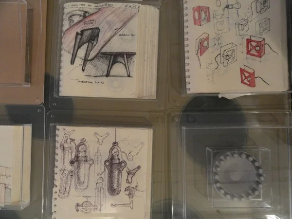
Tayar’s office looks like a design laboratory with fittings, models and furniture prototypes that have been built for clients projects as well as a MOMA installation “Workspheres”.

Ali Tayar/Parallel Design Offices

Ali Tayar/Parallel Design Offices

Drawings and prototypes by Ali Tayar

Drawings and prototypes by Ali Tayar

Thank you Ali for sharing your apartment and studio and continuing to inspire me and others with your architecture and design work!
For more information on Ali Tayar / Parallel Design go to www.alitayar.com

KOHEI NAWA by Andy Goldsborough

DP268871-e13485946824881.jpg

Currently on view at the Metropolitan Museum of Art in New York is Kohei Nawa’s PixCell-Deer #24. As part of the “Designing Nature, the Rinpa Aesthetic in Japanese Art” exhibit this work can be seen through January 13. I discovered Kohei Nawa’s work when Scai The Bathhouse showed him for the first time in March of 2004 at the Armory Show. I couldn’t leave without purchasing his 2003 work PixCell (Toy-Stealth) 2003. I was mesmerized by the dark stealth bomber plane captured inside this intricate assemblage of glass beads and to date it’s one of my favorite pieces in my personal collection.

DP268868-e1348595097281.jpg

The scale and craftsmanship of the PixCell-Deer at the Met is worth the trip alone. Nawa completely transformed a taxidermied deer through various sized glass beads (PixCells), a term he invented. PixCell is the combination of cell and pixel, the smallest unit of a digital image. The sculpture was included in the current Rinpa show as it relates to a religious painting “Kasuga Deer Mandala”, which features a deer-the messenger animal of Shinto deities- posed similarly with its head turned to the side. Painters of the Rinpa school traditionally depicted the deer as a companion of ancient sages and had auspicious or poetic associations.

DP268869-e1348595132261.jpg
DP268870-e1348595159550.jpg
Kohei Nawa Pixcell (Toy Stealth) 2003

Kohei Nawa Pixcell (Toy Stealth) 2003

For more information visit www.metmuseum.org and www.kohei-nawa.net. Kohei Nawa is represented by Scai The Bathhouse in Tokyo.

ANTONIO AZZUOLO S/S 13 by Andy Goldsborough

DSC06024-e13472262451061.jpg

At the Antonio Azzuolo Spring/Summer 2013 show yesterday, the look was a mix of New York swagger street fashion and the art of being well dressed. At Milk Studios with the Hudson River as a backdrop, Azzuolo showed a stunning collection full of energy and detail. With every collection Azzuolo explores the archetypes of youth, while expanding on the concept of building the basic foundation of a men’s wardrobe. Colors ranged from white, ivory, blue, navy and black with accents of pink, coral and neon multi-colored panels. The craftsmanship was impeccable and there were details of platinum leather trim on the lapels of jackets and intricate jacquards that made the garments luxurious. But the day-glo soled nike sneakers kept the looks fresh and modern making the transition from casual day and work to evening easy. These hand-tailored pieces are new classics with a poetic edge.

DSC06022_2-600x651.jpg
DSC06037-600x450.jpg
DSC06026-e1347233180931.jpg
DSC06018_2-600x348.jpg
DSC06021-600x450.jpg
DSC06016-600x450.jpg
DSC06028-e1347288441154.jpg
DSC06037_2-600x405.jpg
DSC06020-600x450.jpg

See the full collection at Style.com. Thanks to Antonio Azzuolo and Matt Kays at Bradbury Lewis for inviting me to the show!

CHRISTOFLE STEPHANE PARMENTIER by Andy Goldsborough

utf-8DSC05753-e13460229726531.jpg

The first time I remember discovering Christofle was in college seeing a Gio Ponti designed mask, Il Diavolo in a design magazine and that began my life long admiration of the architect and designer’s work.

Gio Ponti Il Diavolo Mask

Gio Ponti Il Diavolo Mask

Recently, at the ICFF off-site show Wanted Design I was re-introduced to Christofle and met the new flagship store designer Stephane Parmentier. Charles Christofle founded the company in 1830 in Paris and ten years later it became one of France’s most important jewelry companies. In 1842 he acquired the patents for gold and silver plating electolysis, creating a new material. Christofle began producing silverplate objects as well as sterling silver creations for Napoleon III and the Czar of Russia. One of the most notable commissions were the statues that sit atop the Paris Opera. As early as 1928, Gio Ponti began collaborating with Christofle on a variety of objects, flatware, and serving pieces. Stephane Parmentier, the French interior designer of the new store on Madison Avenue has created a space that combines Ponti’s design aesthetic and the Art Deco style of New York’s Chrysler Building. Following is a visual tour of Parmentiers’ Christofle flagship store bringing together the companies rich tradition with a new modernism. Parmentier wanted to create a space full of atmosphere and sensorial stimulation “A venue bursting with the sparks that fly when you fall in love,” and it certainly feels that way.

Christofle 846 Madison Avenue storefront

Christofle 846 Madison Avenue storefront

Aborescence table and wall sconces by Ora-Ito reflected in the mirrored ceiling

Aborescence table and wall sconces by Ora-Ito reflected in the mirrored ceiling

Interior view with Stephane Parmentier designed Altair collection wood tables

Interior view with Stephane Parmentier designed Altair collection wood tables

Detail of Stephane Parmentier Altair collection tables

Detail of Stephane Parmentier Altair collection tables

The store is a masterfully crafted contrast of materials and finishes combining rich, warm polished wood and highly reflective silver details complementing the flatware, jewelry and objects which Christofle created. Although the ceiling height is kept at a minumum, the mirrored surface overhead gives the illusion of an endless space above and visually reflects all of the product in an innovative way.

utf-8DSC05751-e1346023936968.jpg
Christofle jewelry collection

Christofle jewelry collection

utf-8DSC05747-600x450.jpg
Christofle bee symbol of hard work and excellence etched into the curved wall

Christofle bee symbol of hard work and excellence etched into the curved wall

Visit Christofle and Stephane Parmentier for more information as well as Ormond Editions. The Gilded Owl will feature Parmentier’s brilliant furniture design in an upcoming post, stay tuned.

FREDERICK MCSWAIN / BRAD ASCALON by Andy Goldsborough

Turntable-2-e13433347449681.jpg

At this year’s ICFF in New York, Elizabeth Moore and I met Brad Ascalon at the Wanted Design off site show in Chelsea. He and Frederick McSwain were showing their first collaborative furniture and product line together made of primarily CNC milled and anodized aluminum. I’ve known Frederick for many years from Cappellini in Soho but had not met Brad until the show. They teamed with NFS / Neal Feay Studio, a sixty-plus year old state of the art industrial design production company in Goleta, California. NFS is primarily known for making music production products in metal and when Frederick and Brad collaborated with NFS on their first line of colorful aluminum furniture and objects the results were truly sensational. I recently sat down with them for lunch to learn more about both their backgrounds and the thought process behind “Reinvention; Writing History in Aluminum”.

Lift-1-copy-600x401.jpg
Frederick Mcswain

Frederick Mcswain

Brad Ascalon

Brad Ascalon

Frederick McSwain grew up in Elizabethtown, North Carolina and studied at the University of North Carolina at Wilmington. Majoring in Biology and Fine Arts, he graduated and began working with a restauranteur in his hometown. They came to New York to the ICFF in 1997 and 1998 and began buying and reselling examples of mid-century design. His interest grew and he decided to move to New York and start a career in design. Working in galleries in Chelsea and at Conran’s he started honing in on his own design work and then took a position with Cappellini, the famed Milan based Italian furniture furniture company, known for it’s prestigious designer roster including Shiro KuramataJasper Morrison and Marcel Wanders.

An early work by Frederick Mcswain

An early work by Frederick Mcswain

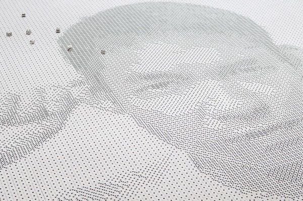
When Tobias Wong, the innovative designer and Frederick’s close friend passed away, he created “Die” assembling 13,138 dice on the floor to create a portrait of the artist.

“Die” portrait of Tobias Wong by Frederick Mcswain

“Die” portrait of Tobias Wong by Frederick Mcswain

Brad Ascalon grew up outside Philadelphia in Cherry Hill New Jersey and studied at Rutgers undergrad majoring in Communications and then received his masters in industrial design from the Pratt Institute. Brad’s father, David Ascalon, is a sculptor and stained glass artist as was his grandfather, Maurice Ascalon, a sculptor and industrial designer so design definitely runs in the family. Brad began his career in New York working in advertising and the music industry. His love of music and thoughtful connections of materials inspired some of his first designs for Ligne RosetBernhardt and Fasem as well as the Turntable collaboration with Frederick.

Untitled Square, an early work by Brad Ascalon

Untitled Square, an early work by Brad Ascalon

Menorah by Brad Ascalon for Design Within Reach

Menorah in polished carrera marble by Brad Ascalon / Permanent collection of the National Museum of American Jewish History

Menorah in polished carrera marble by Brad Ascalon / Permanent collection of the National Museum of American Jewish History

Both Frederick and Brad were part of a group show called “Love It Or Leave It” at Gallery R’Pure during the ICFF as well. Each piece was a designer’s personal interpretation of some aspect of American life, celebratory, critical or simply observational. The exhibition was intended to question what American life is, whether real or perceived.

A detail of “Cells” by Frederick Mcswain

A detail of “Cells” by Frederick Mcswain

A detail of “The Dream” by Brad Ascalon

A detail of “The Dream” by Brad Ascalon

Frederick’s work titled “Cells” was a series of 84 polaroids taken by his mother, a bail bondsman along with 3 beautiful machined anodized aluminum crates evoking his memory as a child waiting on his mother on the dairy crates outside the jail. The word ‘Cells’ commonly refers to the smallest unit of living matter, but it’s also synonymous with subjects ranging from statistical spreadsheets to terrorist organizations. In language, as in life, environmental factors play a vital role in shaping one’s self-identity and perception of the world. From the moment of birth, each of us is exposed to a continuous stream of information. Collectively, these people, places, and things guide not only our emotions but also our practical decision-making. Meticulously organized, the human brain has the incredible ability to decipher and store these real-world snapshots for retrieval at a later time. We’re all simply the sum of our parts and that was the exploration of McSwain’s intriguing work.

“Cells” by Frederick Mcswain from the “Love it or Leave it” exhibition

“Cells” by Frederick Mcswain from the “Love it or Leave it” exhibition

Brad’s installation called “The Dream” inverted the typical Suburban symbol of a white picket fence in order to make a commentary about the state of the American Dream today, “nearly impossible for most Americans to realize.” “Within the boundaries of a society largely living above its own means, an unregulated banking system that plays by its own rules, and a government that idly stands by as millions of homes are being foreclosed upon, there lies an absolute truth, the direction we’re moving as a society has become unsustainable. This is the new promise of the American dream.”


“The Dream” by Brad Ascalon for the “Love it or Leave it” exhibition

“The Dream” by Brad Ascalon for the “Love it or Leave it” exhibition

Frederick and Brad both had a great love of music and were interested in creating furniture and products that had a sense of history to them. When they found NFS, they realized the potential to make very precise aluminum forms that would have optical effects as the viewer walks around the pieces. They wanted the pieces to have a 3D effect and to expose the manufacturing process in the completed products. The colors are limitless in anodizing since the pigment is added to a chemical acid bath and depending on the length of time the pieces are submerged they can go from pale pastel to vibrant intense color. Following are the pieces that comprise the new collection they designed together and fabricated with Neal Feay Studio.

Turntable in grey/gold

Turntable in grey/gold

Turntable detail

Turntable detail

The Timber table was based on rural farmland across the country which have become strip malls over the past decades, depicting nature trying to re-establish itself in these areas. McSwain and Ascalon detailed the table legs in natural woods piercing the textured aluminum table tops in such an elegant way and saying “nature will always defeat the manmade”.

Timber table

Timber table

Timber-2-600x400.jpg
Timber table detail

Timber table detail

The anodized aluminum shoe horn in a range of colors

Lumen was inspired by the “Memphis” movement in Italy in the early 1980’s and was designed as a geometric prism of the elements of air, water and fire.

Lumen was inspired by the “Memphis” movement in Italy in the early 1980’s and was designed as a geometric prism of the elements of air, water and fire.

Lumen vase, candle holder and ashtray

Lumen vase, candle holder and ashtray

Suspension light fixture in gold and turquoise anodized aluminum

Suspension light fixture in gold and turquoise anodized aluminum

Matter will carry the Turntable and Timber tables and CHCM will soon stock the shoe horn.
Click on Frederick McSwain and Brad Ascalon for more of both of these innovators inspiring work. Thank you to Frederick and Brad for sharing your new collection with The Gilded Owl!

EAST HAMPTON RESIDENCE by Andy Goldsborough

DSC02373-e1340372862768.jpg

This summer Andy Goldsborough Interior Design is nearing completion on a project in East Hampton. For my first design post on my own work I am sharing a special project and some of the process and details encompassing the design and fabrication. This project is for a couple that I previously designed an apartment for in New York and this is their first house. Repeat clients are always my favorite as you develop a level of trust and friendship, and this particular couple both have incredibly refined taste and eye for great design. They wanted a house that had a very quiet color palette and was a relaxing getaway from the city, but also kept in mind kid-friendly materials since they have three young children. Following are the images in progress and I hope to update later in the summer when the project is complete.

DSC03421-600x450.jpg
Sun bleached walnut selected for the Living Room fireplace mantle and surround

Sun bleached walnut selected for the Living Room fireplace mantle and surround

Marble selected for Living Room fireplace

Marble selected for Living Room fireplace

Waxed bleached walnut and marble fireplace detail

Waxed bleached walnut and marble fireplace detail

Detail of custom crown moulding in Living Room

Detail of custom crown moulding in Living Room

DSC02351-600x450.jpg
Powder Room almost complete

Powder Room almost complete

Selecting paint color for wainscotting in the Dining Room

Selecting paint color for wainscotting in the Dining Room

Wainscotting painting complete and Gino Sarfatti chandelier installed in the Dining Room

Wainscotting painting complete and Gino Sarfatti chandelier installed in the Dining Room

Alvar Aalto A110 by Artek chosen for Kitchen island pendants

Alvar Aalto A110 by Artek chosen for Kitchen island pendants

Kitchen complete

Kitchen complete

Breakfast Room with Le Corbusier LC6 in gloss light blue with textured glass top, Eames chairs and Aalto Beehive pendant

Breakfast Room with Le Corbusier LC6 in gloss light blue with textured glass top, Eames chairs and Aalto Beehive pendant

Rich Brilliant Willing “Branch Chandelier” chosen for Guest Bedroom

Rich Brilliant Willing “Branch Chandelier” chosen for Guest Bedroom

Guest Bedroom with Rich Brilliant Willing chandelier and table lamps

Guest Bedroom with Rich Brilliant Willing chandelier and table lamps

Bocci chandelier above stairs

Bocci chandelier above stairs

Knoll Bertoia Bird Lounge Chair and Ottoman in a yellow boucle fabric for the Master Bedroom

Knoll Bertoia Bird Lounge Chair and Ottoman in a yellow boucle fabric for the Master Bedroom

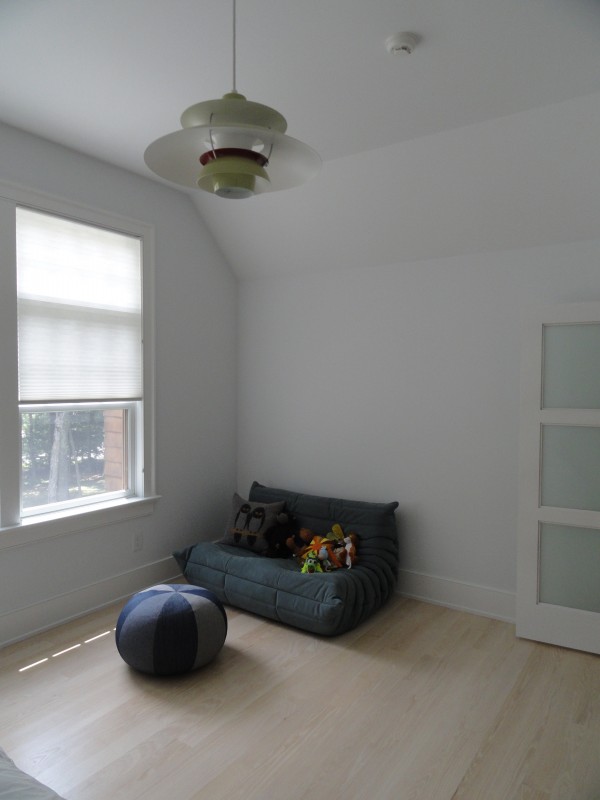
Ligne Roset Mini Togo loveseat and Louis Poulsen light fixture in one of the twins bedroom.

Ligne Roset Mini Togo loveseat and Louis Poulsen light fixture in one of the twins bedroom.

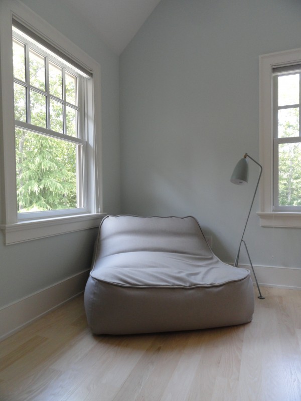
Paola Lenti chair in the son’s bedroom

Paola Lenti chair in the son’s bedroom

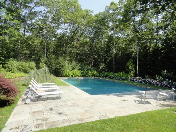
Richard Schultz furniture installed at the pool

Richard Schultz furniture installed at the pool

Outdoor dining

Outdoor dining

BDDW / TYLER HAYS by Andy Goldsborough

When I first started thinking about writing a blog it was mainly to document travel diaries of important design destinations and to share information on craftsmanship in design. Tyler Hays, the founder of BDDW, is one of the main reasons I began this new facet in my design career. As a professor full time at Auburn University and part time at Parsons School of Design for 8 years I taught Advanced Materials and Finishes to the 3rd year Interior Design students. I always wanted to learn new ways of integrating materials into my projects and through teaching I gained an even better understanding of what materials work best in certain applications. Tyler Hays is a master craftsman and materials engineer that began his career as a painter and sculptor at the University of Oregon.

Tyler Hays, seven-year-old artist

Tyler Hays, seven-year-old artist

When he moved to New York in the early 90’s he worked mainly as a contractor and did painting and sculpture on the side as a creative outlet. That creative component and thorough understanding of materials and engineering is what drove him to create his current line of classic modernist furniture with an heirloom feel. His journey began in Greenpoint, Brooklyn and outside his first studio there was a brick factory chimney with the letters BDDW on one side and the company was founded in 1994. He realized later that the letters actually read EDDW but his business was already off the ground and stuck with the name. After that, he moved to Rivington Street in what is now Freeman’s Sporting Club Barber. It was mostly a workshop that he built custom pieces for everyone from Kate Spade to Ralph Lauren and was the go-to contractor for beautiful custom furniture. As his business began to grow he opened his first shop at 5 Crosby Street a week before September 11, 2001.

DSC05725-600x800.jpg
DSC05703-600x800.jpg
Lake low credenza flanked by Tyler’s custom walnut speakers

Lake low credenza flanked by Tyler’s custom walnut speakers

Not the best time for a new business to get off the ground, but with a small collection of 6 or 7 pieces he began what is now an 80 person operation. Some of the first pieces and soon to be classics in the collection included the Lake Credenza, Captain’s Mirror, Simple Chair, Tripod Lamp and the Slab Bed. I met Tyler over 10 years ago and have been buying his exquisitely elegant furniture for clients ever since. In fact, most end up buying multiple pieces which have become favorites that will be handed down for generations to come.

Detail of Lake credenza in holly with ebony pulls

Detail of Lake credenza in holly with ebony pulls

Tripod lamp in american holly and two captain’s mirrors

Tripod lamp in american holly and two captain’s mirrors

Ladder chairs in oxidized maple surround a Tobin table

Ladder chairs in oxidized maple surround a Tobin table

Hays uses American indigenous woods such as maple, Claro walnut, pear and holly as well as stone, bronze and cast iron to create these timeless shaker-inspired pieces that are completely original. When constructing his furniture, if he can’t produce them with his current machinery he simply creates a new piece of equipment to assemble the work. Following are images of materials and details of Tyler’s master craftsmanship, showing the engineering skills he continues to perfect.

Detail of dining table top with bronze inlay

Detail of dining table top with bronze inlay

Detail of oxidized maple table top

Detail of oxidized maple table top

Although he maintains an apartment in New York, the factory and his main residence are in Philadelphia, enabling him to have 300,000 square feet of manufacturing and engineering space for his furniture production. Tyler is continuing to expand the line and recently added upholstered furniture including sofas, chairs and custom mattresses. Even the way the textiles that he hand picks and works with manufacturers to produce are displayed in an innovative way.

Abel sofa with cast blackened bronze legs

Abel sofa with cast blackened bronze legs

Abel sofa arm detail in claro walnut with hand rubbed natural oil finish

Abel sofa arm detail in claro walnut with hand rubbed natural oil finish

Berin club chair

Berin club chair

Custom handmade leather mattress handle

Custom handmade leather mattress handle

Textiles displayed on custom fixture with leather tabs

Textiles displayed on custom fixture with leather tabs

Another one of Tyler’s passions is creating audio equipment ranging from custom speakers and mind-blowing turntables that he produces with Phila Audio Corp.

Turntable set into a walnut slab table

Turntable set into a walnut slab table

Claro walnut speaker

Claro walnut speaker

Tyler sees his business as “a group of closely knit people making things that will last for 100 hundred years and that mean something”. Judging by the success of his recent 10 year anniversary auction, collectors worldwide are already acknowledging BDDW’s furniture as timeless and truly meaningful design. I asked Tyler what was next on his design agenda and surprisingly he said “a toilet, coffee maker and blender as well as kids toys”. I’m looking forward to the introduction of each of these and can only imagine how special his design aesthetic will transform these things we use everyday. A special thank you to Jon Thorson and Tyler Hays for sharing his inspiring design story with The Gilded Owl.

DSC05701-600x450.jpg

THE MORGAN LIBRARY & MUSEUM by Andy Goldsborough

DSC05482-e1338334715794.jpg

Although I have lived directly behind the Morgan Library for more than 5 years, I had not fully rediscovered the library and museum until recently at the Dan Flavin Drawing show. Last week after seeing the incredible drawings and a few select light sculptures by Dan Flavin I decided to revisit the library and study the details of this McKim, Mead and Whitearchitectural masterpiece. Pierpont Morgan, a great financier of the turn-of-the-century assembled a collection of artistic objects, rare books and manuscripts beginning in 1890 and within a decade his collections grew so large he needed a place to house the works.

DSC05491-600x450.jpg

The grandest and largest room in the building is the library with ceilings soaring to thirty feet and lined with triple tier bookcases of bronze and inlaid Circassian walnut. Two concealed staircases in the corners of the room provide access to the balconies and a pair of stained glass casement windows illuminate the room from the north.

DSC05486-e1338336664615-600x800.jpg
Detail of circassian walnut and bronze bookcase

Detail of circassian walnut and bronze bookcase

DSC05489-600x450.jpg

The original library on 36th Street between Madison and Park Avenues was completed in 1906 by architect Charles McKim and was designed as a Renaissance-style palazzo with very elegant details and considered by many to be his masterpiece. Adjacent to Morgan’s home on the corner of 36th Street and Madison, the library was constructed of Tennessee pink marble. The construction of the building was so precise that the blocks of stone were set with virtually no mortar. A pair of lionesses flank the recessed portico featuring double ionic columns and a bronze door.

Model of the Morgan Library by Mckim, mead & white

Model of the Morgan Library by Mckim, mead & white

Above the entry artist Andrew O’Connor (1874-1941) created the sculpted lunette with two putti supporting the logo of Aldus Manutius, the great Renaissance scholar and the dedicatory panel on the cornice. A student of Augustus Saint-Gaudens, Adolph Weinman (1870-1952) sculpted the reliefs on the facade and the Assyrian lionesses were the work of Edward Clark Potter (1857-1923). Potter later created the pair of lions that guard the entry to the New York Public Library.

Edward Clark Potter’s lioness guards the old entrance to the library

Edward Clark Potter’s lioness guards the old entrance to the library

The mantelpiece on the east wall of the Library is carved of Istrian marble in the Renaissance style. Above is a tapestry, The Triumph of Avarice, with a moralizing Latin inscription that translates, “As Tantalus is ever thirsty in the midst of water, so is the miser always desirous of riches.” The tapestry belongs to a series depicting the Seven Deadly Sins, designed by Pieter Coecke van Aelst (1502–50), the father-in-law of Pieter Bruegel the Elder. It was produced in Brussels in 1545 by the workshop of Willem de Pannemaker (active 1535–78). Four other tapestries from the series are in the Spanish royal collections, and a complete series of seven is in Vienna’s Kunsthistorisches Museum.

Istrian marble mantelpiece and “triumph of avarice” tapestry

Istrian marble mantelpiece and “triumph of avarice” tapestry

Renaissance style Istrian marble mantelpiece in the library

Renaissance style Istrian marble mantelpiece in the library

Morgan Library rotunda

Morgan Library rotunda

View into the library from the rotunda

View into the library from the rotunda

Librarian’s office

Librarian’s office

Detail of bronze handrail in the librarian’s office

Detail of bronze handrail in the librarian’s office

The Morgan Annex was built in place of the original Morgan home at the corner of 36th and Madison west of the McKim, Mead and White library in 1928. Project architect Benjamin Wistar Morris’ mission was to design a building that would double the size of the original library and integrate architecturally with the library. The main entry was also moved to 29 East 36th Street once the addition was completed.

Morgan Campus Annex built in 1928

Morgan Campus Annex built in 1928

New entry for Morgan Campus

New entry for Morgan Campus

Ceiling of the new entry

Ceiling of the new entry

The Morgan house at the corner of 37th and Madison was acquired in 1988 as a residence for Morgan’s son Jack and his family. It was the only surviving brownstone from the original Morgan complex and is a New York City landmark.

Morgan Brownstone

Morgan Brownstone

Morgan Brownstone music room now serves as the museum bookstore

Morgan Brownstone music room now serves as the museum bookstore

In 1991 the Renzo Piano garden court conservatory opened connecting all three structures centrally.

Renzo Piano present day entry connecting the Morgan Brownstone and Annex

Renzo Piano present day entry connecting the Morgan Brownstone and Annex

Renzo Piano conservatory and stairs leading to Morgan library

Renzo Piano conservatory and stairs leading to Morgan library

The Dan Flavin drawing show runs through July 1st at the Morgan Library.

JUSSARA LEE by Andy Goldsborough

DSC05643-e13381203858521.jpg

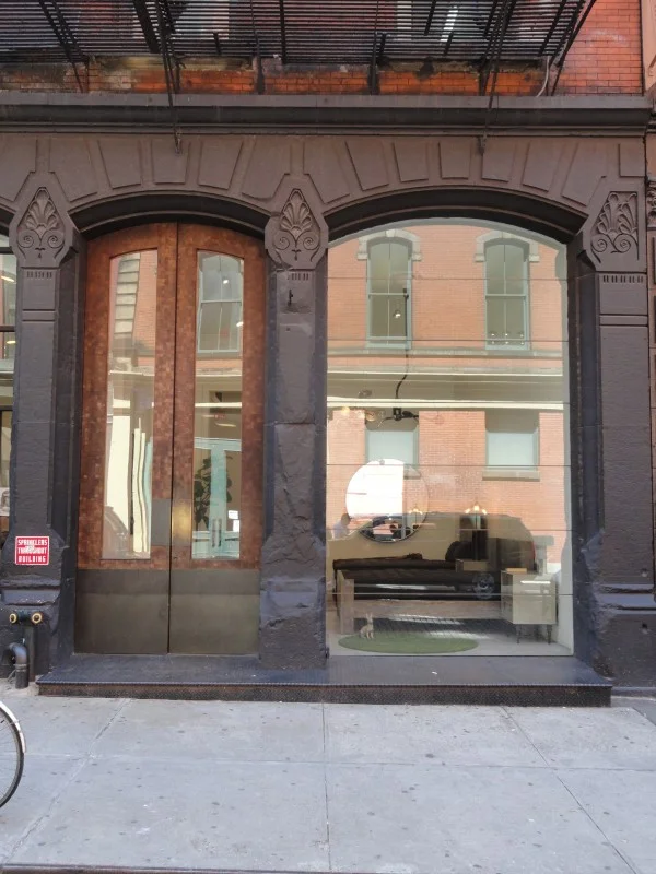
I met Jussara Lee 11 years ago at her perfectly appointed minimally furnished shop on Little West 12th Street. This was before the Meat-packing district had become another retail destination and I lived a couple of blocks away. A camouflage blazer would be my first hand tailored purchase from her shop and to this day, still one of my favorites. Not only because of how I feel when I wear it, but because it’s so incredibly beautiful to look at the stitching, the working buttons on the sleeves and it was made for me! Jussara Lee’s heritage is Korean but her parents immigrated to Brazil and she grew up with fashion on her mind. Even as a child, she would take apart the outerwear that her parents would bring home and restructure and tailor the clothes into something that she deemed stylish.

DSC05559-600x450.jpg

In 1991 Jussara launched her signature line of highly structured clothing based on fit, proportion and craftsmanship and Bergdorf Goodman and Barney’s soon placed orders. Japan and Hong Kong soon followed and the line began to grow at a rapid pace. After many years of designing collections for mass production, she decided to scale down and get back to what she originally started out doing, making beautiful hand made clothing and perfecting her patterns one by one.

DSC05641-600x450.jpg
DSC05647-e1338133508891-600x800.jpg
Pants from the men’s Spring/Summer collection with top stitch pocket detail

Pants from the men’s Spring/Summer collection with top stitch pocket detail

DSC05651-e1338133841244-600x800.jpg

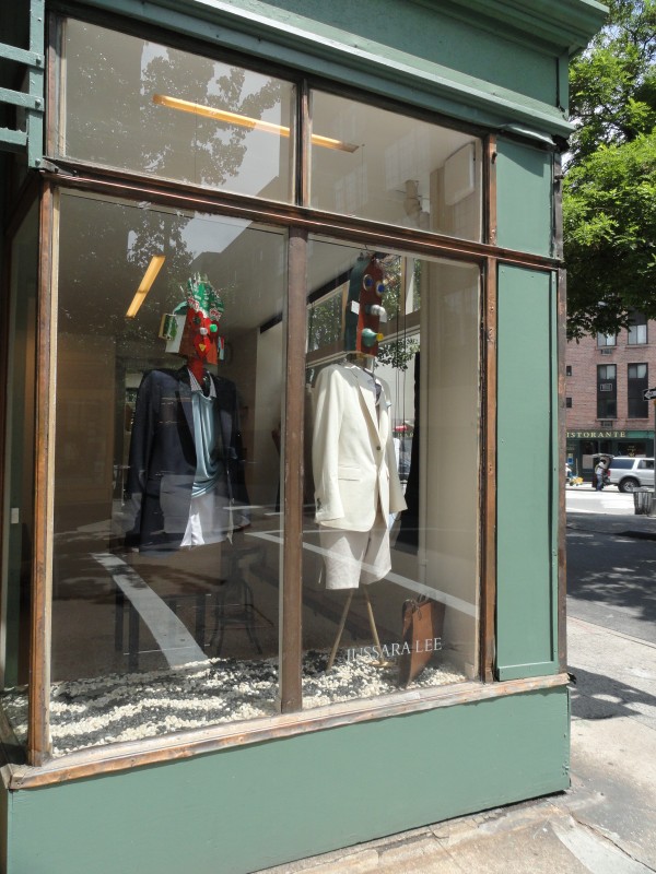
The new shop at the corner of Bedford and Morton Streets in Greenwich Village is sparingly furnished with classic pieces from Espasso by famed Brazilian furniture designer Sergio Rodriques. The Bianca chest functions as a working counter to pin clothing and as a standing desk while the Katita lounge chair and Mac side table with glass top give the shop a warm, relaxed feeling.

Sergio Rodrigues Bianca chest of drawers from Espasso

Sergio Rodrigues Bianca chest of drawers from Espasso

Custom hanger detail

Custom hanger detail

The thoughtfulness that Jussara places on every single item down to the custom charcoal cotton jersey wrapped hangers that are each stitched by hand is evident throughout the shop. There are no scratchy labels inside shirt collars, instead she sews a hand screen-printed soft cotton band inside of each garment. All of the clothing is made locally in Long Island City and in the shop.

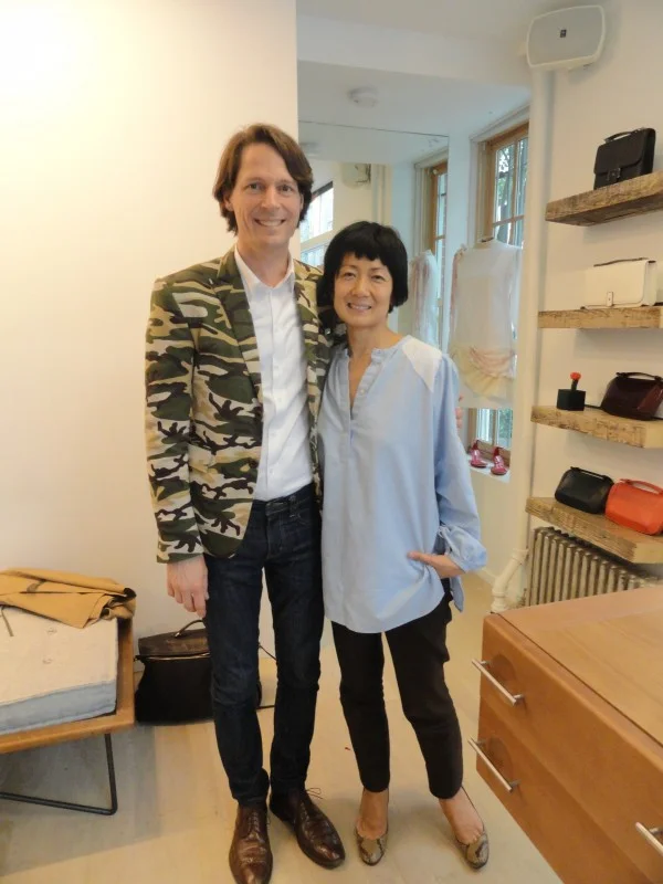
In my bespoke camouflage jacket with Jussara

In my bespoke camouflage jacket with Jussara

DSC05648-e1338133264766-600x800.jpg

A special thank you to Jussara for spending an afternoon with me and sharing her new collection!
Jussara Lee 60 Bedford Street New York, NY 10014 Telephone 212-242-4128

CRISTINA GRAJALES by Andy Goldsborough

DSC1466-e13365125786241.jpg

Cristina Grajales is the most passionate design enthusiast you will ever meet! She founded her eponymous gallery in January of 2001 and has since become a true visionary for what is both relevant and beautiful in the realm of creative types all over the world. When she left DeLorenzo Gallery and started her new venture she set out to be a “decorative arts advisor” sensing that there was something missing from the design world.

Cristina’s fantastic current show New York, New York

Cristina’s fantastic current show New York, New York

Sam Baron, Bouquet de Tables

Sam Baron, Bouquet de Tables

Christophe Come table in iron with moongold leaf, glass roundrels and white gold leaf

Christophe Come table in iron with moongold leaf, glass roundrels and white gold leaf

Christophe Come Exhibition at Duke & Duke Gallery

Christophe Come Exhibition at Duke & Duke Gallery

Architect and designer Jean Prouve’s daughter, Simone Prouve, was the first textile designer Cristina was seduced by and began to represent. Grajales says she has to be “completely in love, be completely seduced” by an artists work to show them in the gallery. She really understands artists but cares deeply about the craftsmanship of what’s being made and the story behind the artists’ work. Cristina’s first client, Sandy Hill, asked her to build a furniture collection for a 4000 square foot house in Santa Ynez Valley and she began what would become an amazing collaboration as design curator and advisor.

Winery, Santa Ynez Valley, California

Winery, Santa Ynez Valley, California

Following are some of the incredible furniture designers, artists and textile designers at Cristina Grajales’ gallery as well as installation shots from past gallery shows and exhibitions.

Sebastian Errazuriz, Nature Morte Dining Table

Sebastian Errazuriz, Nature Morte Dining Table

Pedro Barrail , Tattoo Breakfast Table

Pedro Barrail , Tattoo Breakfast Table

Philip & Kelvin LaVerne, Chan Bar

Philip & Kelvin LaVerne, Chan Bar

Cristina’s artists always have a story behind their work and honesty and integrity in the materials being used. There’s an “authenticity, honesty and originality” that she looks for when selecting new artists and designers for the gallery. She’s consistent in her selections but is also known to take risks and experiment with the juxtapositions of styles and periods of design that she shows making her exhibitions all the more exciting and seeing things in a way that wouldn’t typically be considered.

Pavilion of Art and Design, New York 2011

Pavilion of Art and Design, New York 2011

Hechizoo textile made of palm, aluminum and copper

Hechizoo textile made of palm, aluminum and copper

Mark Welsh, Unnatural Curiosities VI

Mark Welsh, Unnatural Curiosities VI

Cristina’s new show “Pegasus” will open in the gallery on May 16th through July 13th.

James Salaiz, Blind Horned Owl Bisqued earthenware with gilt varnish, 2010

James Salaiz, Blind Horned Owl Bisqued earthenware with gilt varnish, 2010

Eric Rhein, Hummingbird Wire on paper, 2011

Eric Rhein, Hummingbird Wire on paper, 2011

In December, Cristina has been asked by the Fairchild Gardens to show benches by 7 of her artists. Each artist will also exhibit another bench in the Design Miami show along with Hechizoo and Suzanne Tick, two extraordinary textile designers bringing the gardens inside. Worth visiting Design Miami this year for sure!

A big thank you to Lindsay Johnson for sharing these images with The Gilded Owl as well as the always inspiring Cristina Grajales, my friend and constant source for design inspiration!!

ZAHA HADID / LIQUID GLACIAL by Andy Goldsborough

BJORN WIINBLAD by Andy Goldsborough

75213.jpg

I discovered Danish designer Bjorn Wiinblad in college and was immediately drawn to his figures and porcelain objects. He was born in Copenhagen in 1918 and graduated from the Royal Academy of Arts in Copenhagen. I started collecting his Rosenthal Studio Line pieces shortly thereafter and then his noire series. He was an incredibly versatile artist, beginning his career as a painter and illustrator but expanding into glass, poster design, set design, textiles and even furniture design. Here, I’ve focused on the extraordinary porcelain pieces that he created for Rosenthal’s Studio Line and the dinnerware they still produce today.

Bjorn Wiinblad in his studio

Bjorn Wiinblad in his studio

Wiinblad’s studio

Wiinblad’s studio

Rosenthal Studio Line “Magic Flute” Sarastro candlesticks and lidded bowls

Rosenthal Studio Line “Magic Flute” Sarastro candlesticks and lidded bowls

Magic Flute Sarastro Milk and Sugar

Magic Flute Sarastro Milk and Sugar

Large serving bowl for Rosenthal Studio Line

Large serving bowl for Rosenthal Studio Line

5181543830_d2afb0f74f_b-600x400.jpg
A collection of gold embellished vases for Rosenthal Studio Line

A collection of gold embellished vases for Rosenthal Studio Line

A selection of pieces from my collection of black and white Wiinblad for Rosenthal

A selection of pieces from my collection of black and white Wiinblad for Rosenthal

x-600x600.jpg

Philipp Rosenthal started his porcelain company at Schloss Erkersreuth Castle in Selb, Germany in 1879. After his death in 1937, his son Philip succeeded him and in the next 20 years would turn Rosenthal into an almost unchallenged force in the design world for ceramics. Many other designers collaborated on Rosenthal series in the 1960’s and early 1970’s including Raymond Loewy, Timo Sarpaneva and Tapio Wirkkala. In later years, they continued to collaborate with artists and designers Andy Warhol, Jasper Morrison and Karl Lagerfeld to name a few. The company celebrated its 125 years anniversary in 2004.

l377_1-600x706.jpg
2049-Rosenthal-Wiinblad-1-600x450.jpg
A lidded bowl from my collection

A lidded bowl from my collection

The figures that Wiinblad created and the imagery in his work are immediately recognizable. His work is popular the world over and especially admired in Japan.

A Wiinblad print with gold details

A Wiinblad print with gold details

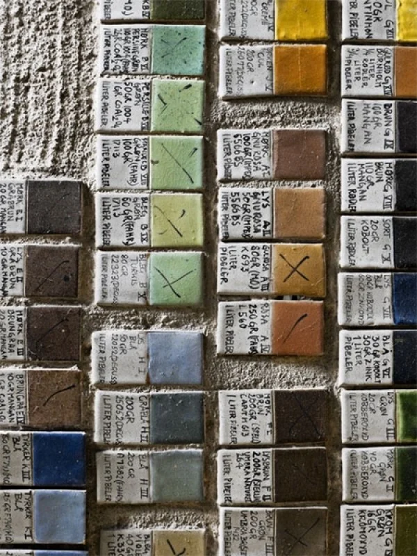
Ceramic color samples

Ceramic color samples

From the Arabian Nights series

From the Arabian Nights series

He was named Man of the Year in New York in 1985 and awarded the Cultural Prize of 1995 by the Scandinavian-American Foundation.  Bjørn Wiinblad (1918-2006)

He was named Man of the Year in New York in 1985 and awarded the Cultural Prize of 1995 by the Scandinavian-American Foundation.
Bjørn Wiinblad (1918-2006)

Magic Flute Sarastro for Rosenthal

Magic Flute Sarastro for Rosenthal

EMMA BENNETT by Andy Goldsborough

Bennett-Ardour-Oil-on-canvas-122x91.5cm-20111.jpg

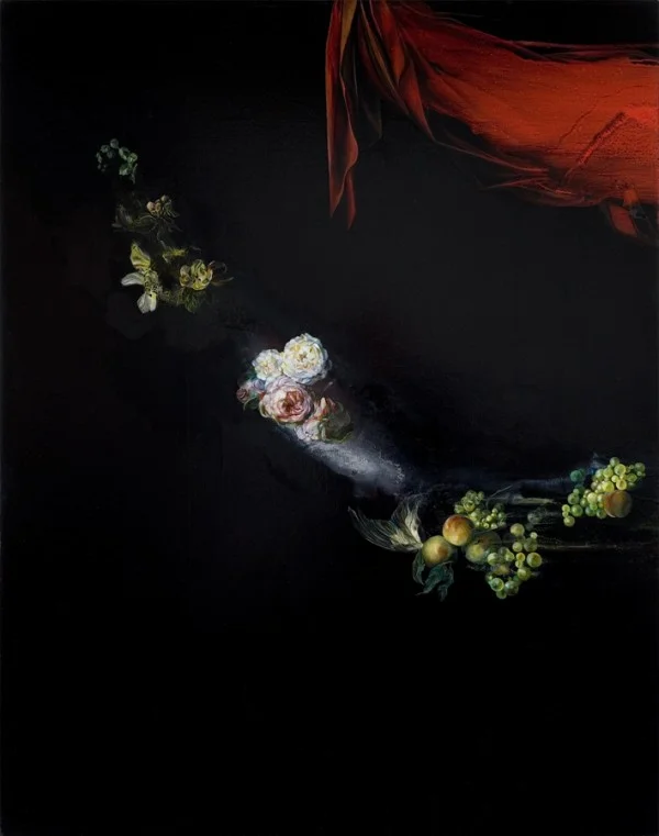
For my next post, I immediately thought of Emma Bennett, an artist from Wales, working in London that I think is sensational! The first time I saw Emma’s work was in 2005 at the Armory Show in New York where she had two paintings with Charlie Smith london Gallery. I asked her to answer a few questions about her work and following are the responses:

When did you start painting and tell me about your training? I started painting in school, the art room was always my favorite place so I applied to art college and came to London in 1992 to do my foundation work and BA degree at Central Saint Martin’s and a few years later my MA at Chelsea College of Art.

A Night in November, 2011

A Night in November, 2011

And Afterwards, 2009

And Afterwards, 2009

Death and Co, 2008

Death and Co, 2008

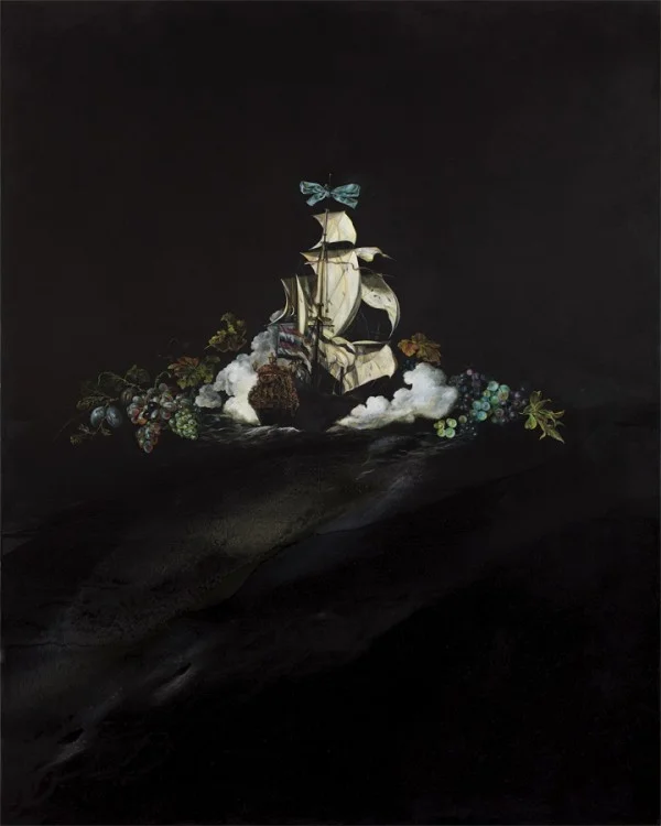
What inspires your work? I’m inspired by both contemporary and historical art along with film and literature, but also my own life experiences and the narratives of the lives of people around me. Within my work I make a direct reference to 17th and 18th century Dutch and Italian painting and 20th century abstraction. My favorite painters include Jan Weenix, Abraham Mignon, Caravaggio, Robert Ryman, Morris Louis, Sigmar Polke and Ross Bleckner.

Hollowed (unhallowed), 2009

Hollowed (unhallowed), 2009

Ghost Story 2, 2007

Ghost Story 2, 2007

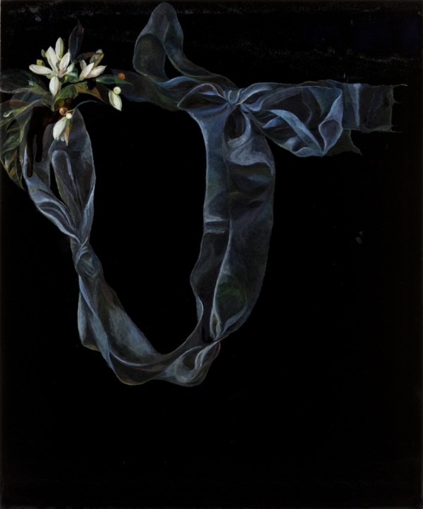
The Blue Strap, 2008

The Blue Strap, 2008

How did you develop your technique and style of painting? My painting has developed as a result of being playful with the medium and exploring its many physical properties and the characteristics that enable it to produce illusions of light and space. I don’t endeavor to employ the techniques of old masters, but I play with the substance of oil paint so as to create paintings with both the abstract and figurative qualities of images that interest me.

Stung, 2012

Stung, 2012

Another Year, 2012

Another Year, 2012

For Want of Sleep, 2010

For Want of Sleep, 2010

How would you describe your work? I’d describe my paintings as playful explorations of paint and painting; as personal investigations into the emotions associated with death and dying; and as contemplations on the value of life and living things.

Darkling, 2011

Darkling, 2011

What’s coming up next for you? I’m currently working on a new body of work for my upcoming solo show that opens at Charlie Smith london on the 6th of September.

Ghost Story 1, 2007

Ghost Story 1, 2007

Voyage 2, 2009

Voyage 2, 2009

Slow Time, 2011

Slow Time, 2011

Thanks so much to Zavier at Charlie Smith London for the amazing images shown here and to the incredible, amazing Emma Bennett. The Gilded Owl looks forward to your next inspiring show!

Some Slender Rest Part 2, 2009

Some Slender Rest Part 2, 2009