GIO PONTI / PARCO DEI PRINCIPI SORRENTO by Andy Goldsborough

DSC03927-e13347982409281.jpg

Recently, I took my mom on a trip to Italy that I will never forget. We started in Rome (more on that later) and then traveled south to Sorrento for a weekend at Gio Ponti’s Parco dei Principi, designed in 1962. The approach to the hotel is through a lush garden that feels much more like a tropical Brazilian landscape but once you reach the blue and white facade, it’s unmistakably Ponti.

Entry gate to the Parco dei Principi

Entry gate to the Parco dei Principi

Garden approach to the hotel

Garden approach to the hotel

Parco dei Principi facade

Parco dei Principi facade

After checking in, we dashed up to the room and I was truly speechless, gazing at the view and the spare but 100% Ponti designed furnishings and tile floor. Gio Ponti has influenced my design work since college and I will cover his architecture, furniture and lighting, accessories and ceramics in a future post.

Gio Ponti vanity/desk and superleggera chair

Gio Ponti vanity/desk and superleggera chair

Wardrobe

Wardrobe

Console table and valet

Console table and valet

Headboard detail

Headboard detail

Mom making a quick call before we head downstairs for a drink……the view of the ocean beyond

Mom making a quick call before we head downstairs for a drink……the view of the ocean beyond

Next, we were off to the bar but the weather was so beautiful a waiter asked if we’d like to sit outside?

Mom at the bar

Mom at the bar

Of course, but we didn’t see any furniture by the pool.

Pool

Pool

DSC03816_2-600x450.jpg

He disappeared and all of sudden we had our own table on the veranda with the pool behind us and the view of the Amalfi Coast in front of us.

DSC03919-600x450.jpg

Following are my pictures of the interior and exterior during taken over our 3 day stay in one of Gio Ponti’s most iconic buildings.

Jetty below the hotel

Jetty below the hotel

Lounge

Lounge

DSC03861_2-600x450.jpg
View of hotel from the jetty below

View of hotel from the jetty below

DSC03843-600x800.jpg
DSC03851_2-600x800.jpg
DSC03933-600x800.jpg
The blue lounge at night

The blue lounge at night

DSC03872-600x450.jpg
Lobby and reception desk

Lobby and reception desk

Restaurant

Restaurant

mailbox designed by gio ponti

mailbox designed by gio ponti

Link to the hotel below

Hotel Parco dei Principi

VILLA NECCHI CAMPIGLIO MILAN by Andy Goldsborough

DSC04398-e13348342093881.jpg

On my recent trip to Chiavari, I also spent a few days in Milan and visited the magnificent Villa Necchi.
This architectural masterpiece at no. 12 Mozart was designed by Piero Portaluppi between 1932 and 1935 for Angelo Campiglio and the Necchi sisters, Nedda and Gigina, Angelo’s wife.They were important producers of cast iron and enameled sewing machines. In the mid 1940’s Tomaso Buzzi was brought in to renovate and decorate the house as the Necchi family’s tastes changed. Thankfully, in 2001 the residence was given to the Italian Fund for the Environment and opened to the public in 2008. Now, you can take a tour of the entire house and examine every detail as I did. Following are the images I took in sequential order capturing a truly inspiring tour of the Villa Necchi.


Approach through the garden from via Mozart

Approach through the garden from via Mozart

Entry and facade

Entry and facade

Entry hall with L’amante Morta (Deceased Lover) by Arturo Martini at foot of the stairs

Entry hall with L’amante Morta (Deceased Lover) by Arturo Martini at foot of the stairs

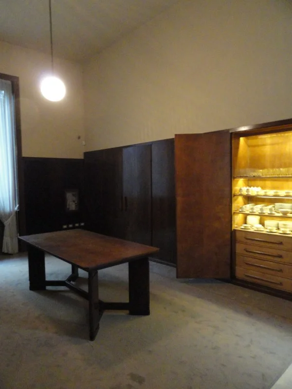
The library featuring rosewood bookcases and game table by Guglelmo Ulrich

The library featuring rosewood bookcases and game table by Guglelmo Ulrich

The intricate stucco ceiling of the library

The intricate stucco ceiling of the library

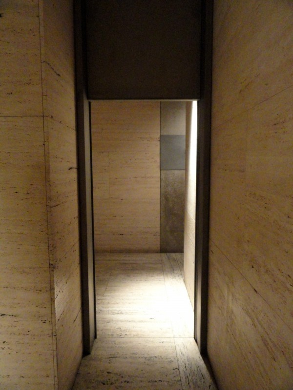
The veranda with travertine and green marble in a pattern of wide interwoven bands

The veranda with travertine and green marble in a pattern of wide interwoven bands

Original ‘s’-shaped sofa in the veranda

Original ‘s’-shaped sofa in the veranda

Custom lapis lazuli table in the veranda

Custom lapis lazuli table in the veranda

Custom Lapis Lazuli table in the veranda

Custom Lapis Lazuli table in the veranda

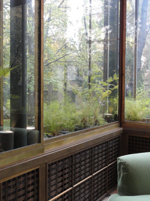
Light filtering through the double glass wall greenhouse with brass radiator detail

Light filtering through the double glass wall greenhouse with brass radiator detail

Detail of window hardware at double walled glass panels

Detail of window hardware at double walled glass panels

German silver sliding doors from the veranda into the library

German silver sliding doors from the veranda into the library

Dining room centerpiece by Alfredo Ravasco in lapis lazuli, agate and coral

Dining room centerpiece by Alfredo Ravasco in lapis lazuli, agate and coral

Butler’s pantry (second office) exposes china designed by Portaluppi as well

Butler’s pantry (second office) exposes china designed by Portaluppi as well

The gallery separating the sisters’ bedrooms identically composed

The gallery separating the sisters’ bedrooms identically composed

Sitting area outside the master bedroom

Sitting area outside the master bedroom

Master bath

Master bath

Guest bedroom with walnut and briarwood furnishings

Guest bedroom with walnut and briarwood furnishings

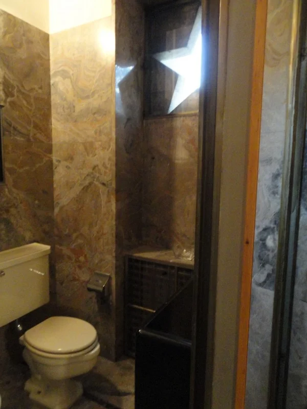
Bathroom with star window detail in marble

Bathroom with star window detail in marble

Descending the stairs to the entry hall

Descending the stairs to the entry hall

DSC04407-600x450.jpg

Tilda Swinton starred in “I Am Love” last year in which the house played an important role.

Link to the Villa Necchi Campiglio Museum
The Villa Necchi


TADAO ANDO / THE MODERN FORT WORTH by Andy Goldsborough

DSC05224-e13346107081491.jpg

Once I had taken in the Kimbell, I strolled over to the Modern Museum of Art by Tadao Ando, completed in 2002. The museum is a series of 5 glass and concrete pavilions floating on a 1.5 acre pond.

Concrete cantilevered roof

Concrete cantilevered roof

As you approach the building Richard Serra’s Vortex, a tall swirling kaleidoscope of steel.

Richard Serra “Vortex” 2002

Richard Serra “Vortex” 2002

View inside Richard Serra’s “Vortex”

View inside Richard Serra’s “Vortex”

The modern entrance

The modern entrance

The main entrance has an enormous cantilevered concrete entry with views onto the pond in the distance. Once inside, I was struck by the forty foot tall Y-shaped concrete columns that support the elegant roof and walls of glass reflecting in the water.

DSC05227-600x450.jpg
DSC05238-600x800.jpg

Hidden from view are clerestory windows that bring light into the galleries much like the skylights in the Kimbell but on a much grander scale.

DSC05243-600x450.jpg

The permanent collection works on view included Anselm Kiefer’s Book with Wings and Martin Puryear’s Ladder for Booker T. Washington as well as Andy Warhol and Donald Judd to name a few.

Anselm Kiefer “Book with Wings” 1992-1994

Anselm Kiefer “Book with Wings” 1992-1994

Martin Puryear “Ladder for Booker T. Washington” 1996

Martin Puryear “Ladder for Booker T. Washington” 1996

Donald Judd “Untitled” 1967

Donald Judd “Untitled” 1967

The restaurant at The Modern is also a great place for lunch and the round pavilion floating on the lake offers the best views of Tadao Ando’s elegant building.

DSC05231-600x800.jpg

LOUIS KAHN / KIMBELL ART MUSEUM by Andy Goldsborough

DSC05193-e13345946809361.jpg

I’ve just returned from Dallas, Texas and visited the Kimbell Art Museum by Louis Kahn. I’ve always admired Kahn’s work and studied the building in architecture school, but visiting the museum in person took my admiration to a whole new level after seeing the details of this incredible building designed in 1972.

Exterior view of vaults

Exterior view of vaults

DSC05191-600x800.jpg

Kahn designed the museum with the idea of creating a space that evoked “the luminosity of silver” and that was certainly what I felt on this cloudy day looking at the Impression show currently on view.

Central vault with museum shop at right

Central vault with museum shop at right

Maillol’s “l’ air” cast bronze 1967, designed 1938 in the courtyard

Maillol’s “l’ air” cast bronze 1967, designed 1938 in the courtyard

The concrete, unfilled travertine and stainless steel used in the construction of the museum further expand on this vision and come together beautifully.

Concrete vault and stainless steel lighting diffuser detail

Concrete vault and stainless steel lighting diffuser detail

Stainless steel and mesh lighting diffuser

Stainless steel and mesh lighting diffuser

Exterior concrete detail

Exterior concrete detail

Unfilled travertine

Unfilled travertine

The craftsmanship of the interior and exterior create galleries that are illuminated in a soft but effective way with no glare from the natural light that comes in through slits in the tops of the vaults and washes the concrete ceiling. Gently curved stainless steel and mesh panels with concealed lighting further enhance this silvery light quality throughout the galleries.

DSC05194-600x450.jpg

One of the details that I found most intriguing was the stainless steel handrail which is made from one piece of formed stainless steel and felt so incredible to my hand. The light that reflects on the shiny surface of the handrail travels all the way from the upper to the lower levels, truly inspiring!

Double vault view with handrail in foreground

Double vault view with handrail in foreground

DSC05204-600x800.jpg

Renzo Piano, who worked in Kahn’s office has been chosen to design a new building extenision scheduled for completion in 2013. The building will also utilize concrete and stainless steel as the primary construction materials. I highly recommend a trip to the Kimbell Museum of Art and The Modern Museum of Art by Tadao Ando across the street and will write further about it in my next post.

STEPHEN APPLEBY-BARR by Andy Goldsborough

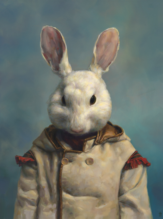
Two years ago, my partner and I purchased our first painting by Stephen Appleby-Barr from Nicholas Metivier Gallery at the PULSE Art Fair in New York. We were both drawn to the old world mysterious quality of his painting but also to the play of light that it captured on the canvas. We were told by the gallery that only black and white oil paint was used and built up to get this eerie glow which seems to illuminate the “Little Lord Dulac” work 2010. As a collector of chairs, I also liked the positioning of the figure on this larger than life chair, or throne, as I like to think of it. I was hypnotized by the work of this talented rising art star that has created a new, modern and exciting form of extraordinary portraiture painting.
Little Lord Dulac, 2010

Little Lord Dulac, 2010

Neither of us had met the artist prior to acquiring the painting but we both were fascinated by the technique and amount of detail captured by Stephen’s hand. One year later, we revisited the PULSE fair and purchased our second Appleby-Barr painting entitled “The Tradition Pit” 2011. It is larger than the first work and much more complicated but still has this mysterious, haunting quality and captures the light in such detail that it has an amazing depth to the surface.

The Tradition pit, 2011

The Tradition pit, 2011

Stephen and I tried to meet last month for the Armory Show but missed seeing each other so I caught up with him by phone to discuss his work.

Squire of Squalor, 2011 (self portrait)

Squire of Squalor, 2011 (self portrait)

Where did you study? Sheridan College, Oakville, Canada. What happened first? Along with 4 friends, he formed a collective of illustrators called “Team Macho”. They have had numerous exhibitions and share a studio together. In 2007 they published a book called “Fancy Action Now”. The group was like a fraternity of sorts to “keep their heads in the game, a way to keep up with their peers”.

Team Macho’s book

Team Macho’s book

Stephen focused primarily on illustration and draftsmanship in the beginning but evolved into oil painting as a medium to capture what he wanted to express in these beautiful old images he discovered going through his grandmother’s yearbooks. His first works also evoked some sense of a fraternity, complete with a mascot named Punchy who reappears in many of the paintings.

Punchy Cloaked, 2011

Punchy Cloaked, 2011

The Pledge, 2010

The Pledge, 2010

Who were his heroes in painting? John Singer Sargent and Diego Velazquez were there in the beginning but Rembrandt and Goya became significant influences as his work evolved as well as van Dyck and Vermeer. Appleby-Barr references daguerreotypes, the first commercially successful photography technique.

Leaving the Path, 2010

Leaving the Path, 2010

Carolyn Gordon, 2010

Carolyn Gordon, 2010

His subjects seem to stare back at the viewer and the scale of the works averaging 11″ x 14″ are very intimate capturing every detail of the subjects clothing and surroundings.

The King’s Library, 2011

The King’s Library, 2011

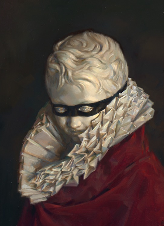
Dulac Bust, 2011

Dulac Bust, 2011

In March-April of 2011, Stephen sold out a show of new work and is currently working on another solo show to be announced. I cannot wait to see what his magic brush will come up with next!

Stephen Appleby-Barr is represented exclusively by Nicholas Metivier Gallery in Toronto. Thank you to Rita Stuart at www.metiviergallery.com for generously allowing me to share these images on The Gilded Owl!

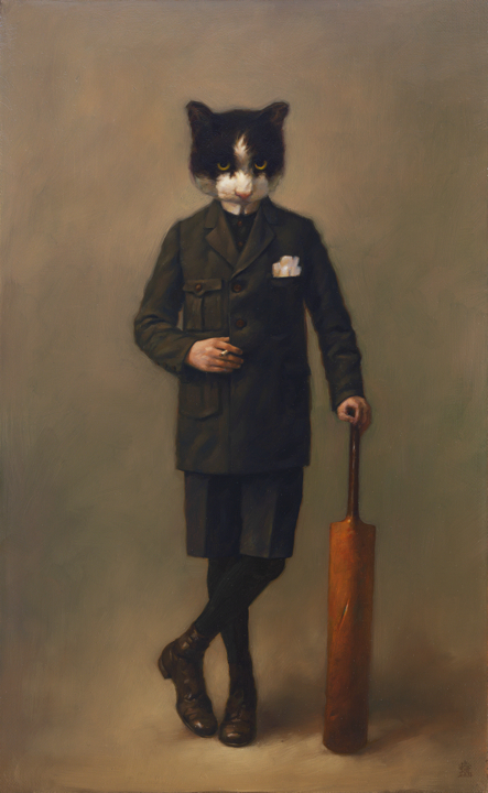
Punchy Cricket Bat, 2011

Punchy Cricket Bat, 2011

THE CHAIRS OF CHIAVARI by Andy Goldsborough

'.jpg

In November I was lucky enough to take a guided tour of the Podesta Sedie chair factory in Chiavari, Italy with Elizabeth Moore, Private Art Advisor extraordinaire and my dearest friend in New York.

We set out to meet Fabio Don and Domenico Rocca who founded Segno Italiano in 2010, along with Alberto Nespoli and Paolo Tarulli. They shared my interest in handcrafted Italian furniture and after collecting Chiavari chairs for most of my life I discovered Fabio and Domenico online.

Segno Italiano

Segno Italiano

A favorite chair from my collection

A favorite chair from my collection

map-liguria.gif

After months of emails they agreed to meet us and Domenico took us on a wild ride 2 hours south of Milan through the most incredibly treacherous rain they have ever seen in that part of Italy. We arrive in this picturesque seaside town that I had dreamed of visiting for a very long time. Jet lagged and tired from our journey (although Elizabeth managed to sleep in the back seat) Domenico takes us directly to the Podesta Sedie factory to meet Adriano and Stefania Podesta, the father and daughter who still make these magnificent handmade chairs. As we enter the factory the only sun that broke through the clouds the entire time we were there stream in through the windows highlighting hundreds of spindles and chair backs in a variety of wood species. It was one of the most thrilling moments of my life to see these chairs that I’ve managed to collect over 16 of and see how they are made.

father-daughter-600x335.jpg
431550_238765436208638_103534823065034_557892_385162623_n-600x336.jpg
The Podesta Sedie showroom

The Podesta Sedie showroom

The “sedie artistiche di Chiavari” began in 1796 when the “Economic Society” (a group of intellectual noblemen) challenged the local craftsmen to find a new style of chair. This first chair was created in 1800 by Gaetano Descalzi and was called Campanino.

A name still today identified as the oldest model of those developed. So were born the chair now famous all over the world for their excellent form and characteristic lightness and robustness.

DSC04297-600x800.jpg

After our tour of the factory we had the good fortune of meeting Franco and Jacopo Casoni who published an extensive hardcover book last year on the history of these chairs in all of their various forms “Le Sedie leggere di Chiavari”.

sediedichiavari1-.jpg
sediedichiavari3-.jpg

Franco is also a renowned wood sculptor and has one of the largest collections of Chiavari chairs. His son Jacopo is a talented architect and they have lived in Chiavari all their lives and treated us to an incredible lunch in the center of town. Afterwards Franco was able to get us into the Villa Rocca, which is now a gallery and houses many of the different Chiavari chair models and chaises.

three-chairs-600.jpg
DSC04329-600x800.jpg

We then continue for coffee at a nearby cafe and as soon as we enter see another building filled with these chairs.

DSC04310-600x800.jpg
DSC04307_2-600x487.jpg

As I walk further into the building I discover the Rotary Club of Chiavari and am in awe of so many in one room and contemplate moving there so I can enjoy these chairs daily and become a Rotary member myself.

DSC04345-600x450.jpg

As we end the day Elizabeth and I retire to the hotel and more chairs await us in the lobby and restaurant. Chiavari is a place I will never forget and to be surrounded so many of these delicate yet deceptively sturdy chairs was truly a dream come true!

I share this video narrated by Franco and Jacopo Casoni featuring Adriano and Stefania Podesta and the making of the Chiavari chair produced by Segno Italiano. Segno Italiano will debut a collection of Chiavari chairs at GD Cucine 227 West 17th Street during the ICFF in New York May 19th-22nd. Ciao!