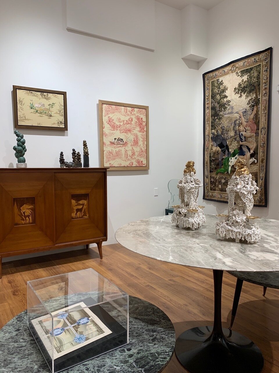
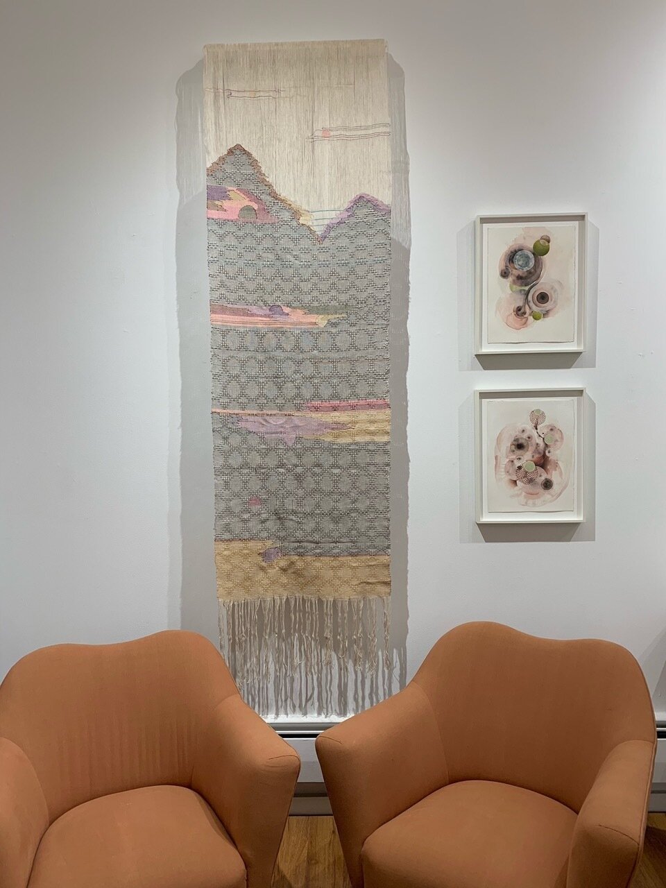
We are thrilled to announce the opening of Scenes from a Winter Garden this Saturday, November 28th from 11-6. This exhibition, curated by Richard Saja, will run through to the end of the year.
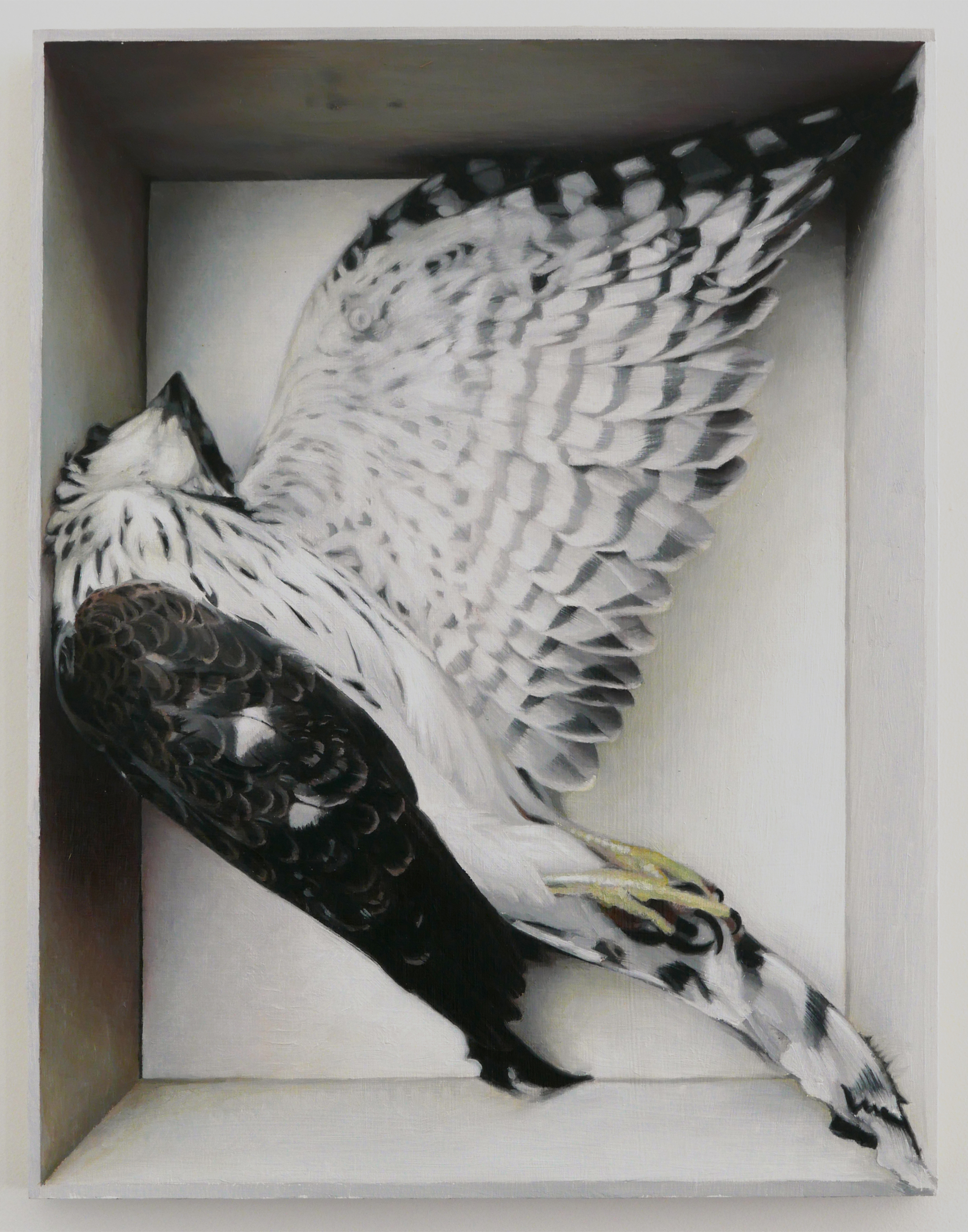
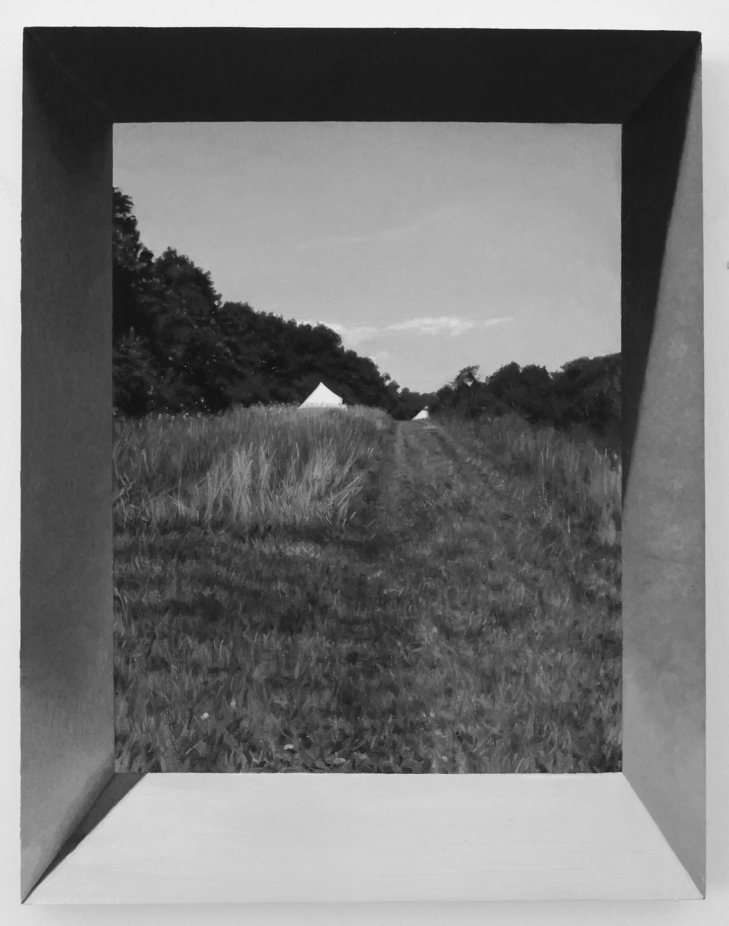
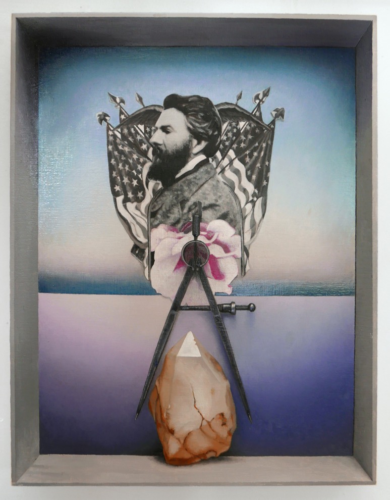
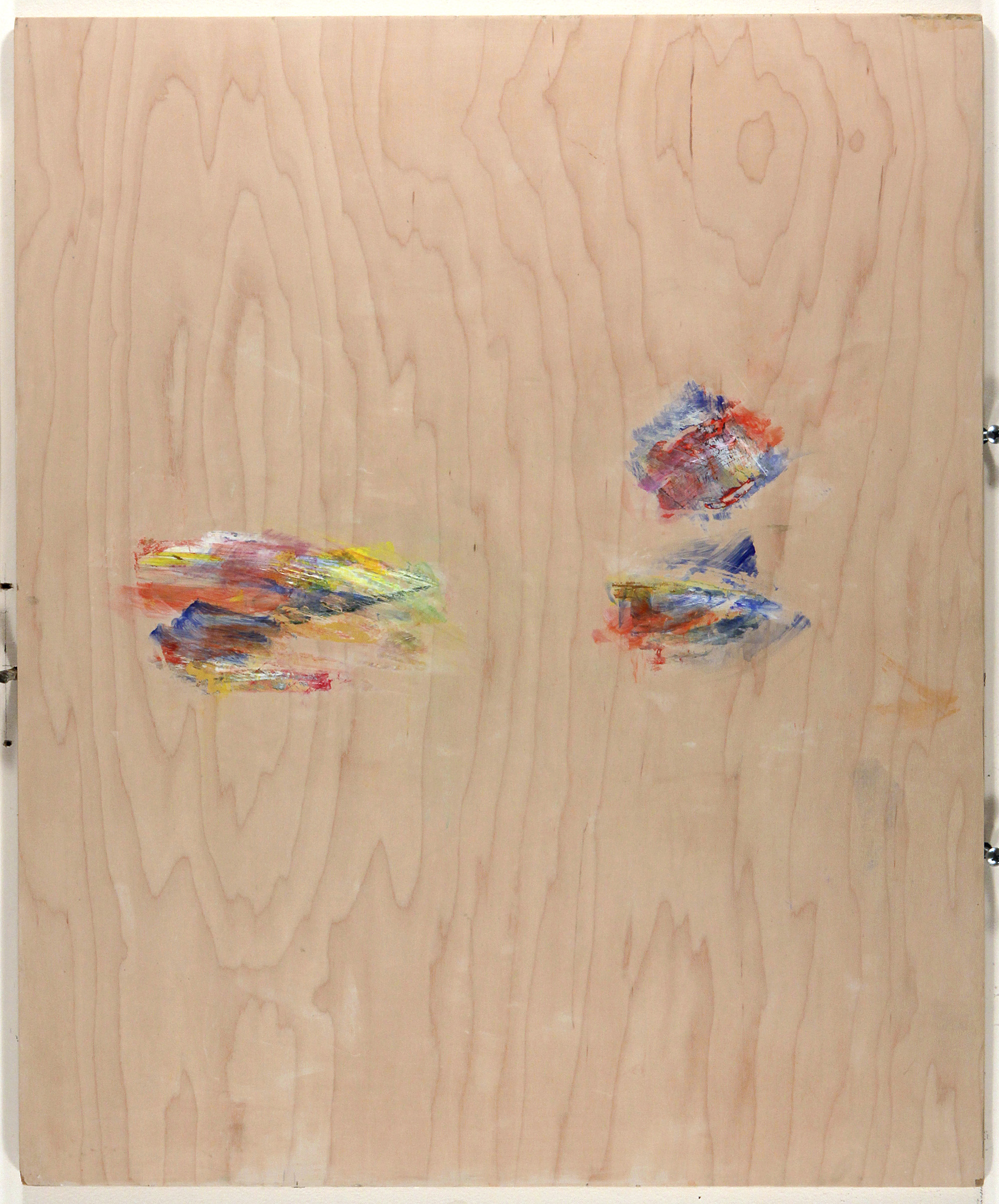
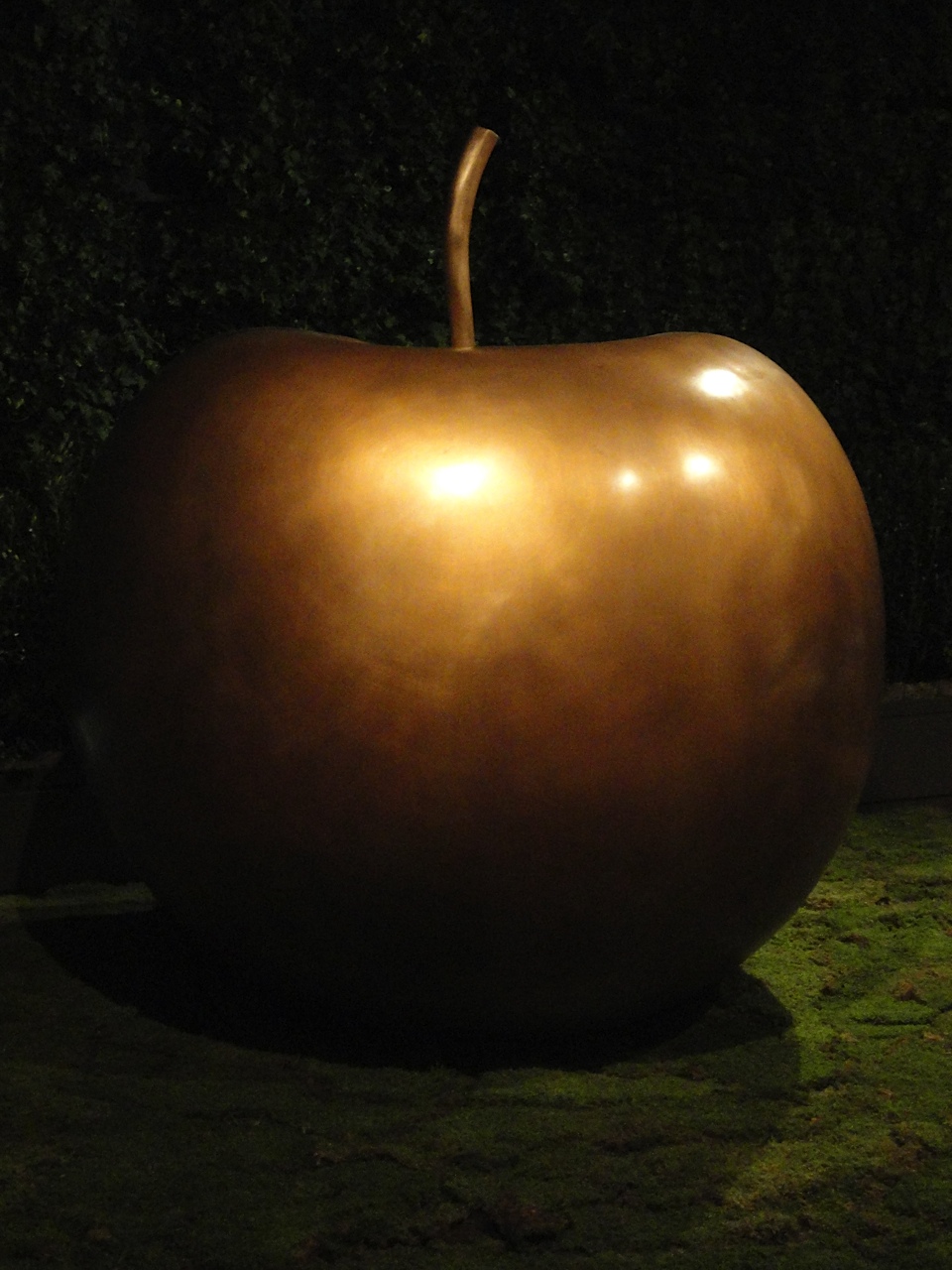
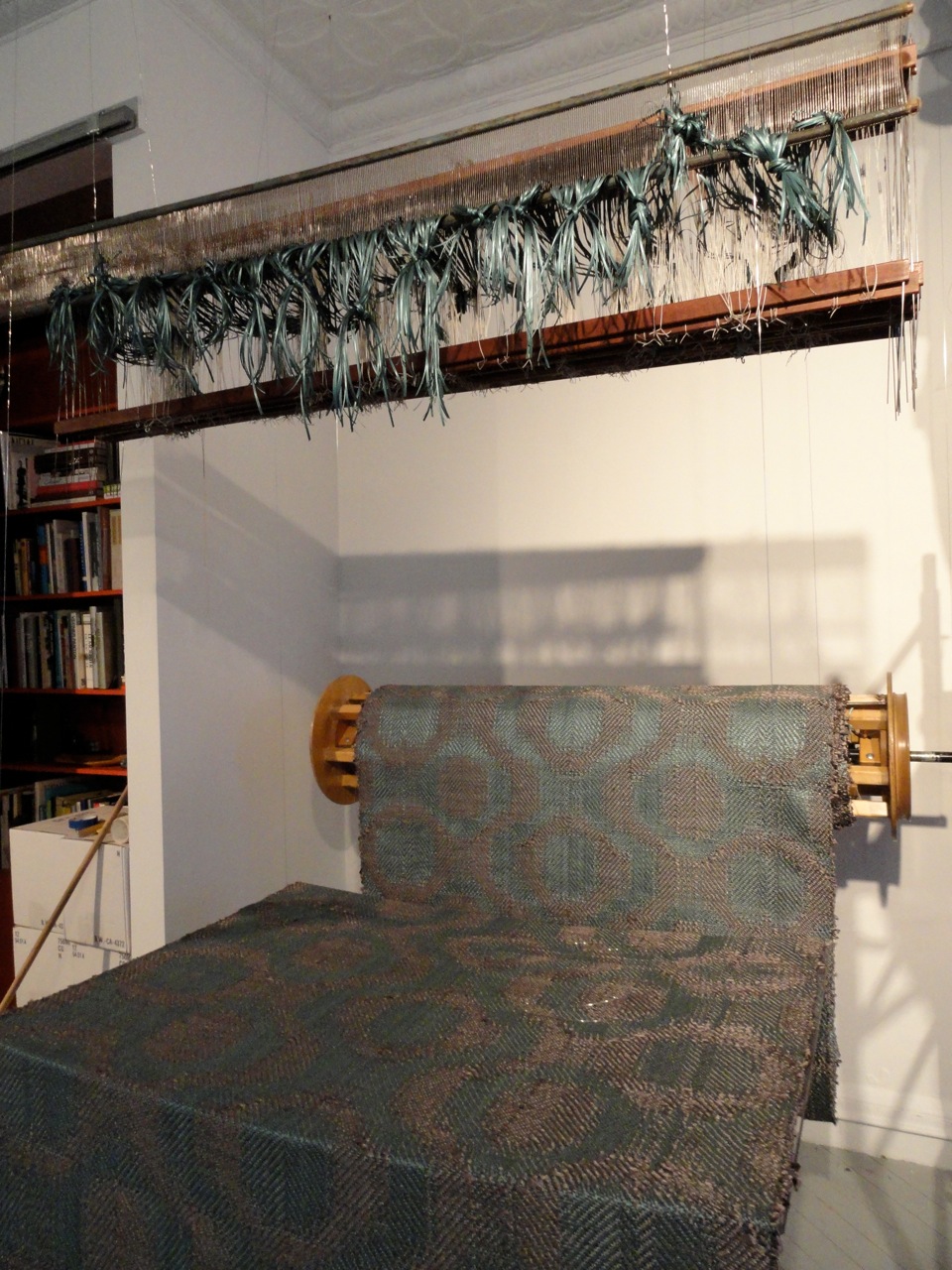
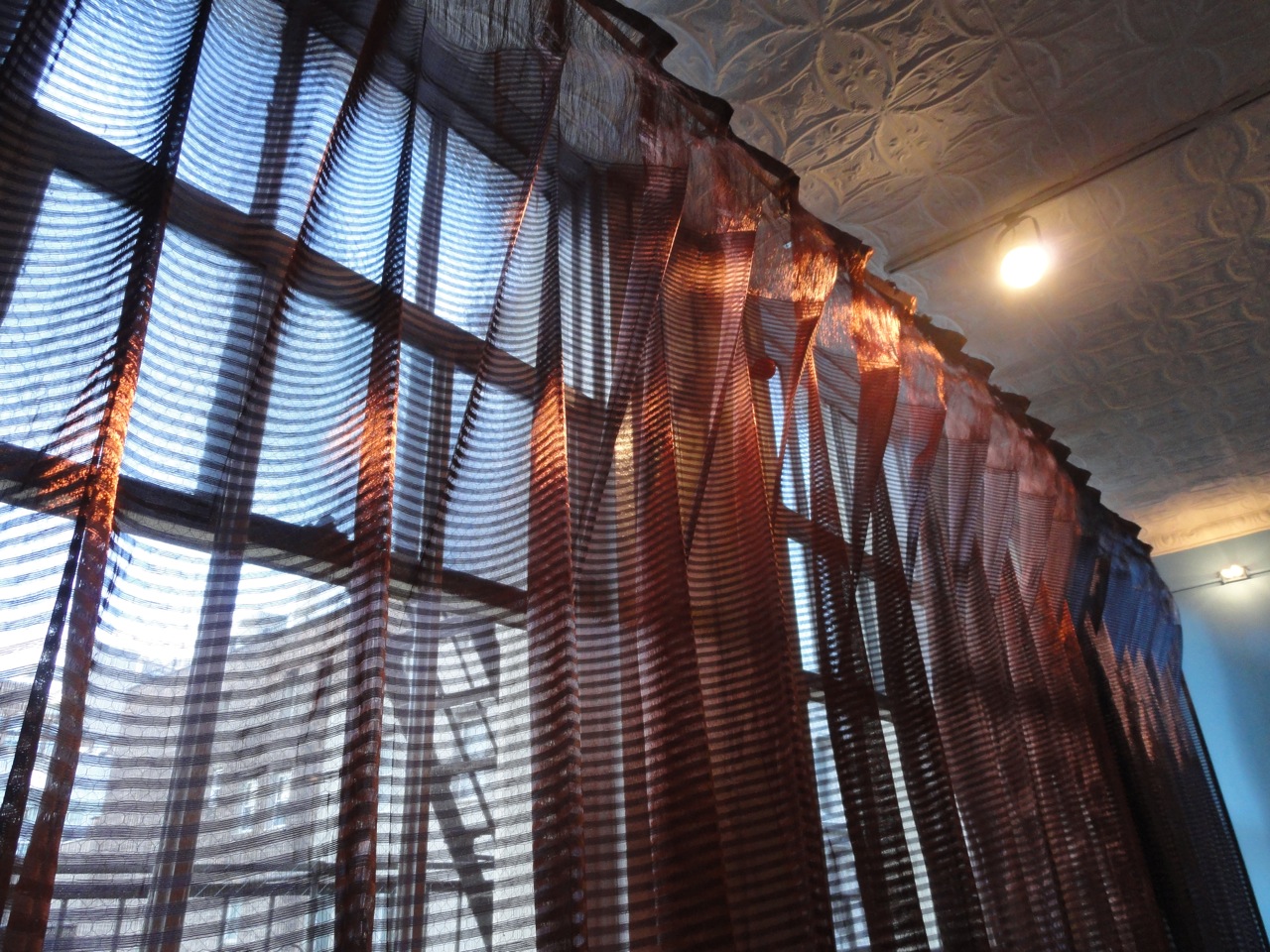
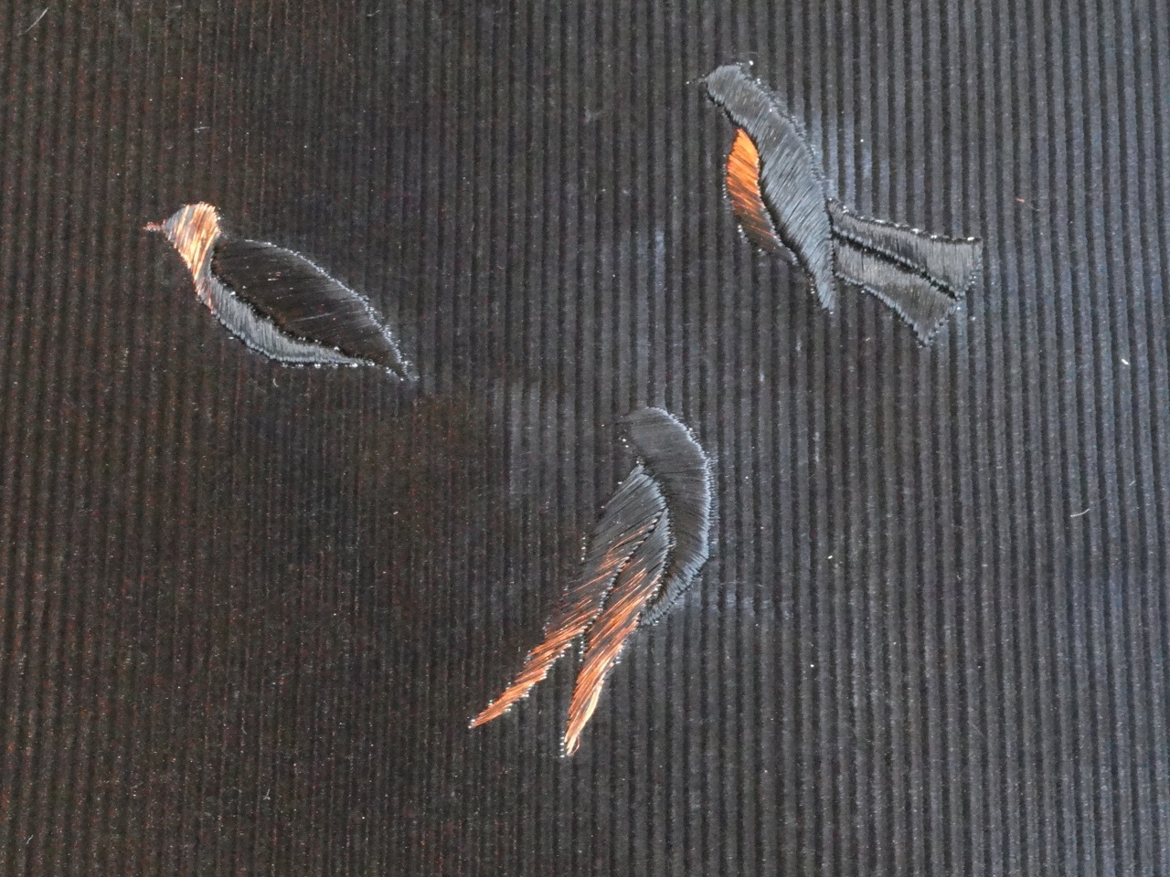
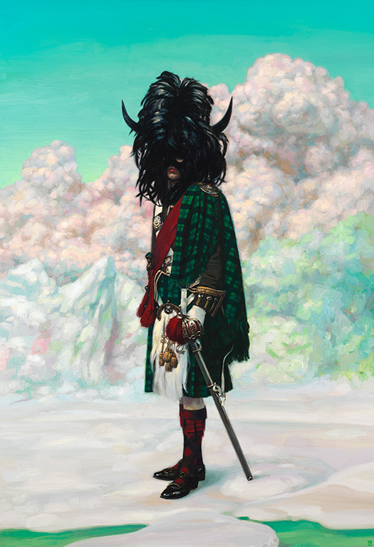
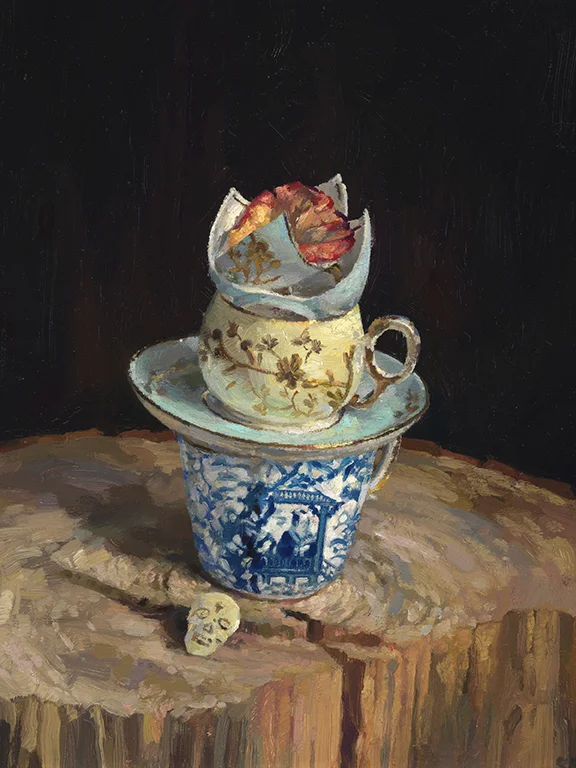
Inspired by the poetry of Pablo Neruda, Saja has brought together the works of Margot Becker, Christina Bolt, Amanda Clyne, Brandon Downing, Judy Engel, Julie Evans, Jacob Fossum, Elliot Green, Helen Grimm, Ellen Jouret-Epstein, Will McLeod, Tess Michalik, Richard Saja, Richard Scott, Anthony Sonnenberg, and Eric Wolf.


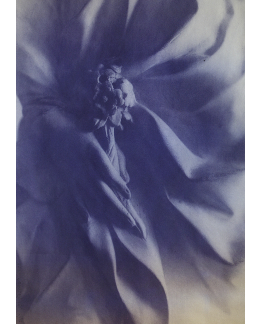
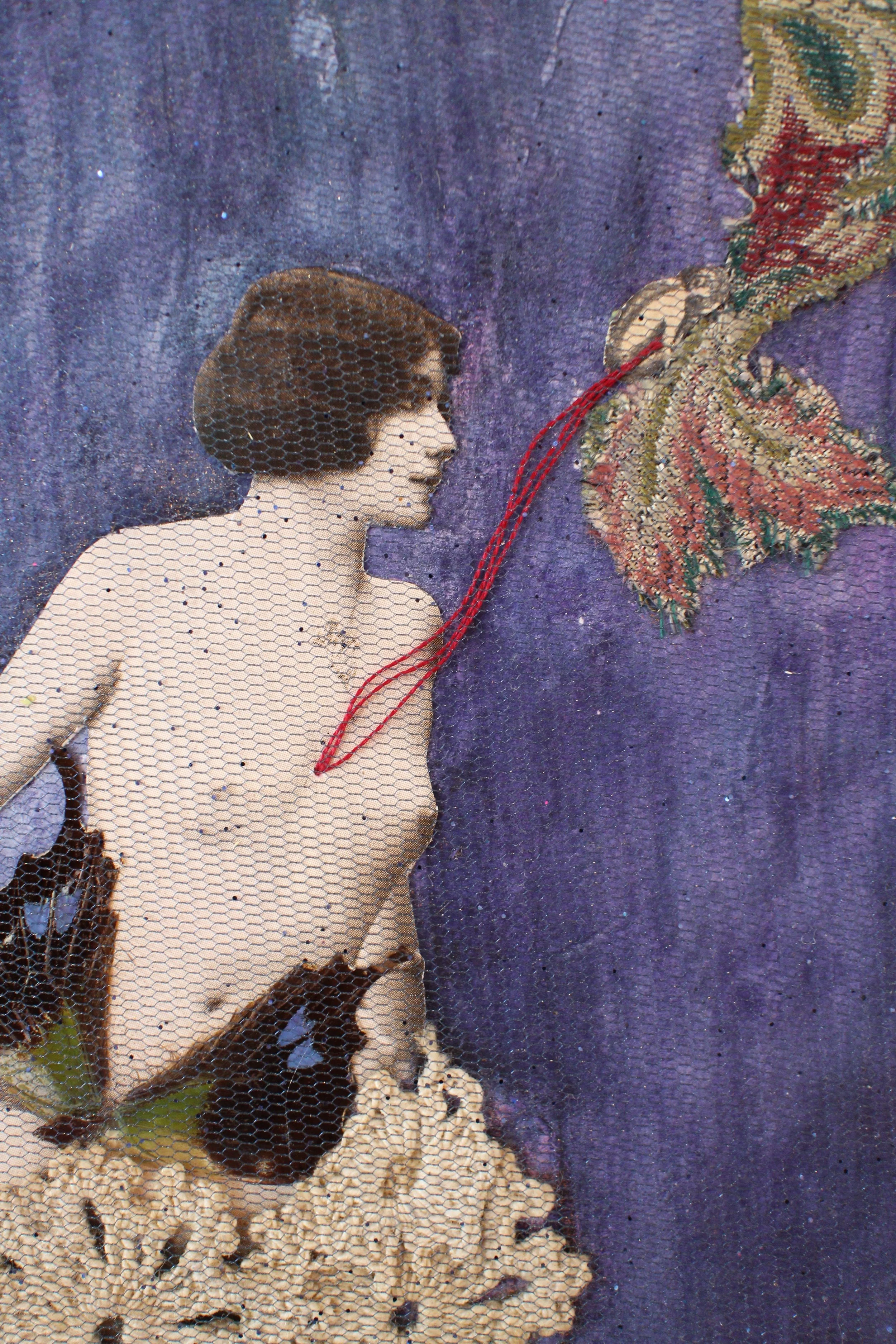
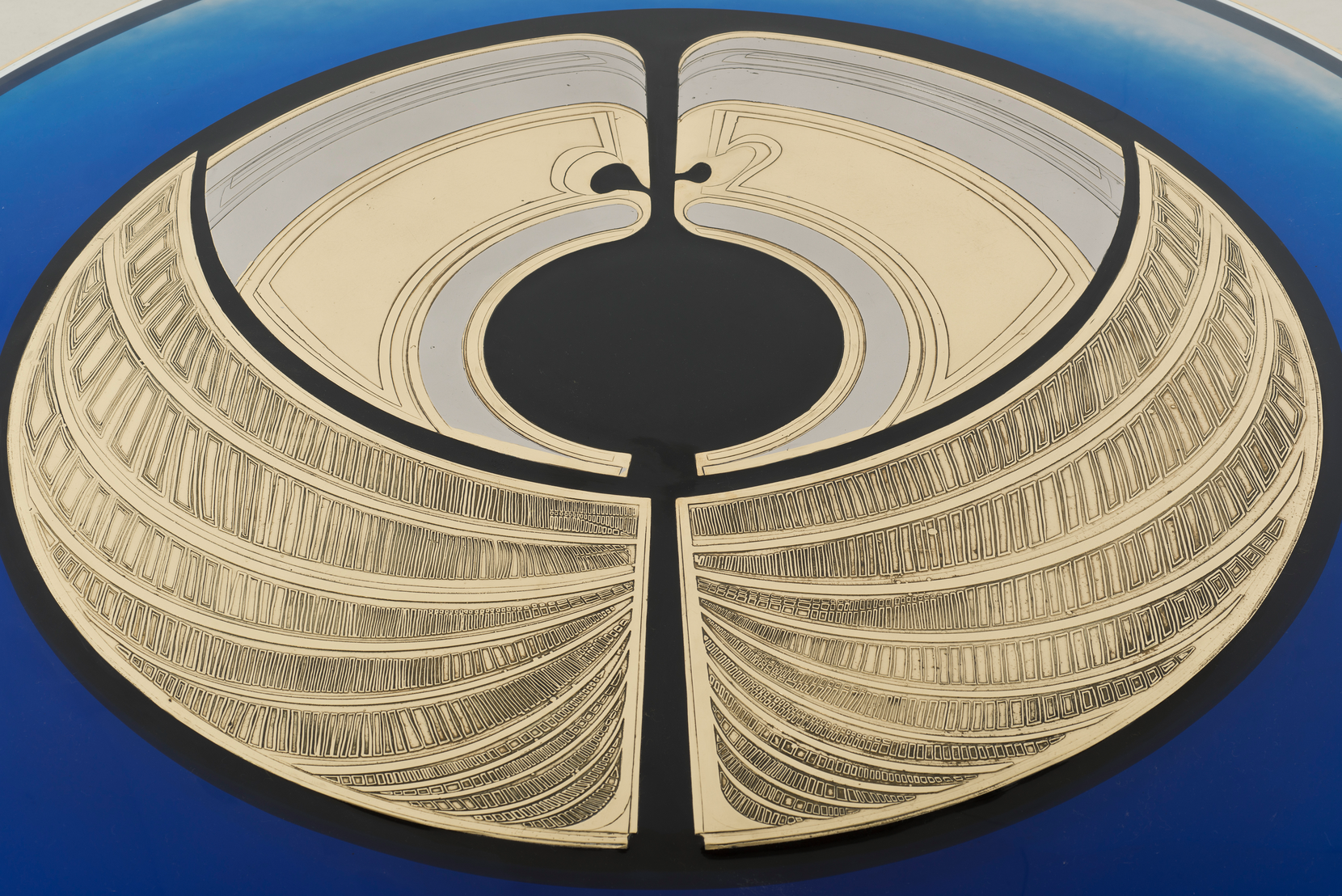
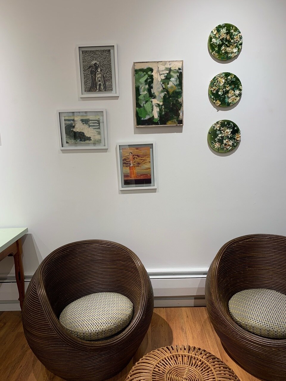
July Evans, Blush Stalk (2010), 18 1/8” x 14 3/8” (framed), acrylic, mica, gouache, and colored pencil on paper.

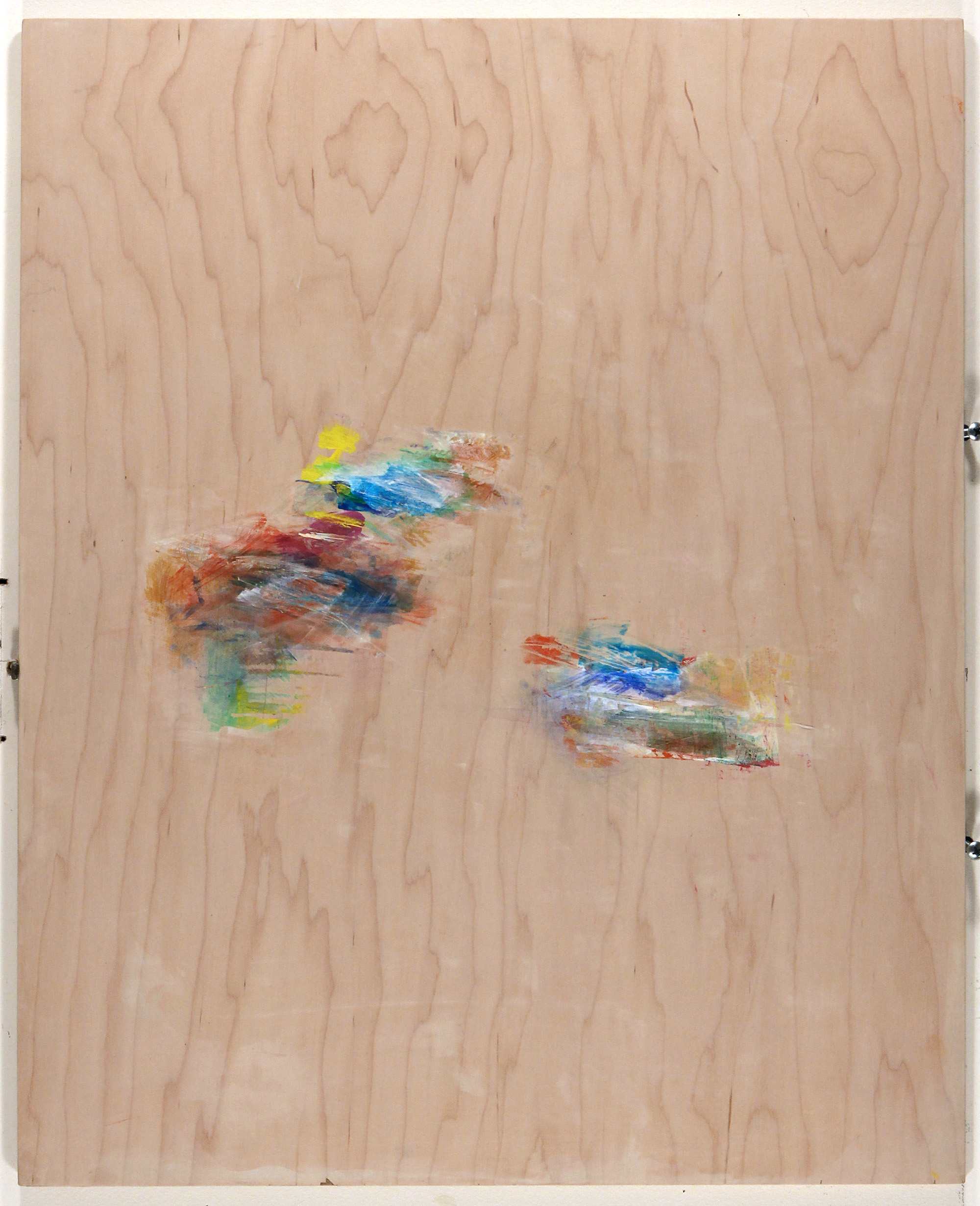
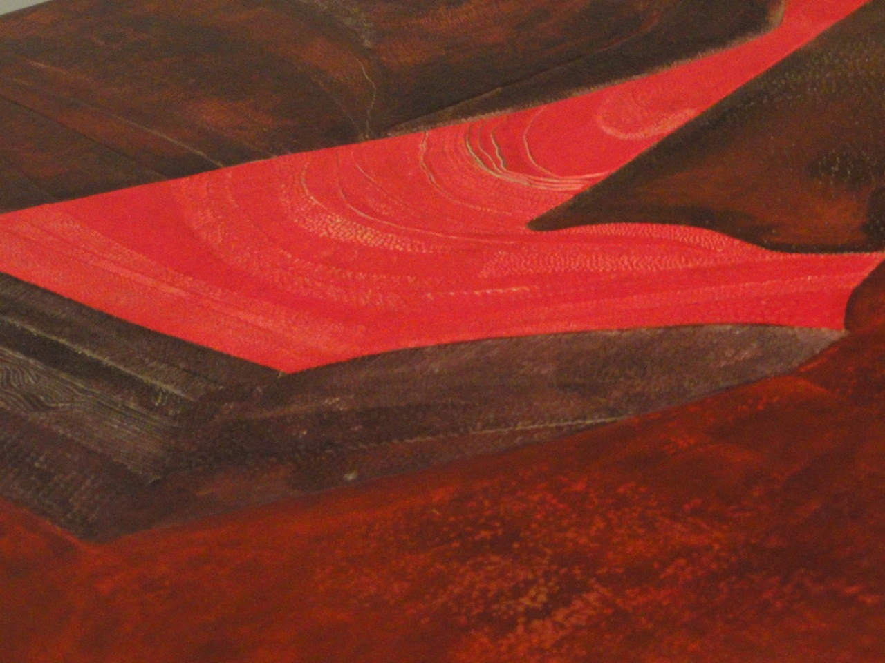
Elliot Green, Interesting Dirt (2019), 40 x 30”, oil on linen.

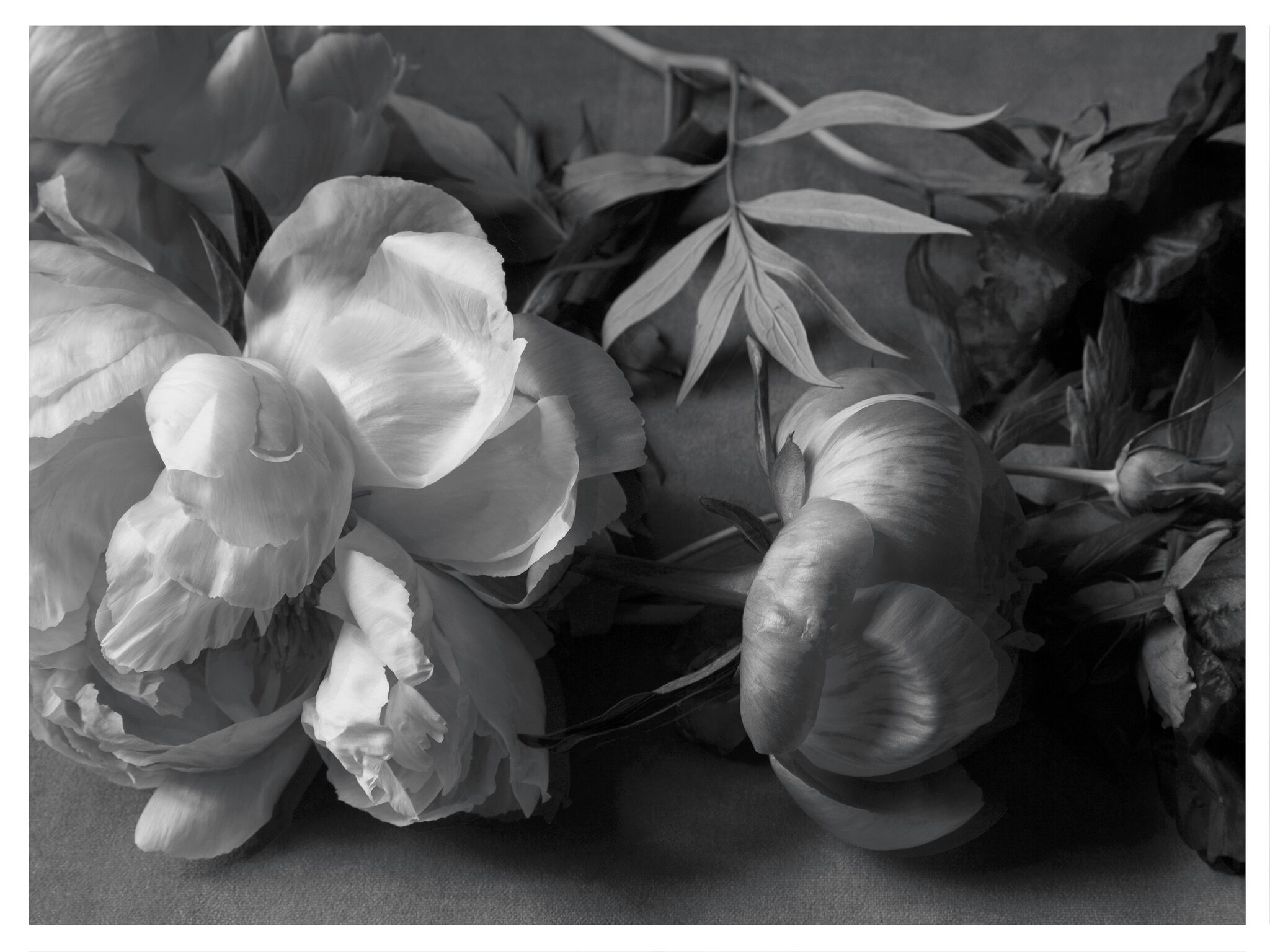
Helen Grimm, Snail Rd. (2020), 14 x 18”.
Our Hudson, NY gallery is open on weekends and by appointment with safety precautions in place.
Masks must be worn and are available as well as hand sanitizer and we are cleaning the gallery regularly as per New York state regulations.
We will be available through our website or please contact 917-270-2480.